Intercom
01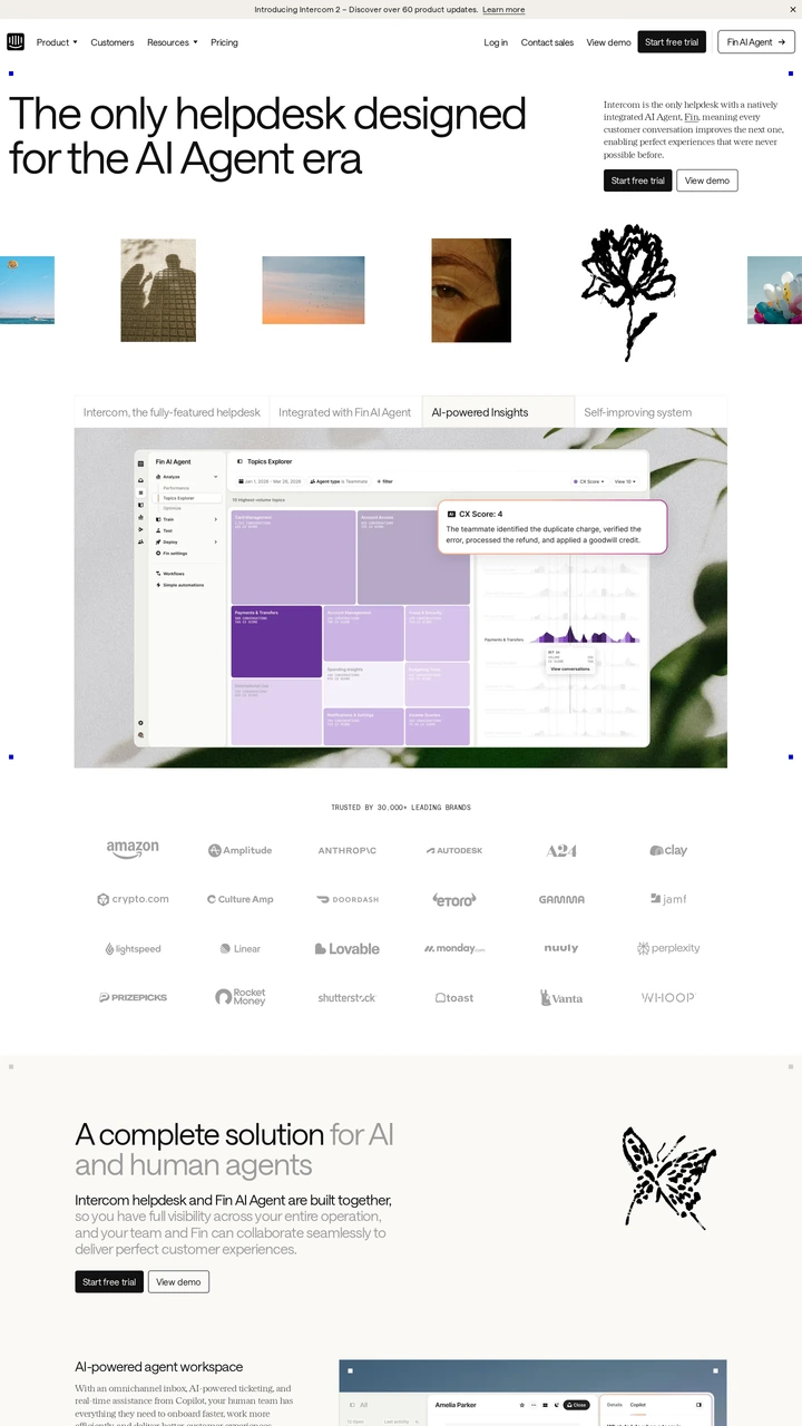
intercom.comclean
Compare 19 websites for SaaS products and hosted software platforms. The selection ranges from analytics and scheduling to CRM, developer infrastructure and enterprise planning. Each note focuses on visible choices in the captured page: how the product is shown, where customer proof appears and how the next action is introduced. Start with a product serving a similar audience, then contrast it with a different approach. Screenshots record a point in time; visit the source to check current interactions, pricing and accessibility. Waastly maintains this gallery and is labelled as an affiliated example.
Open a website to explore the full capture and design details.
Intercom pairs a large left-aligned headline with a short explanation and actions on the right. A colourful illustration strip leads into a much larger support-product preview. Compare how the page moves from brand expression to an interface that makes the service concrete.
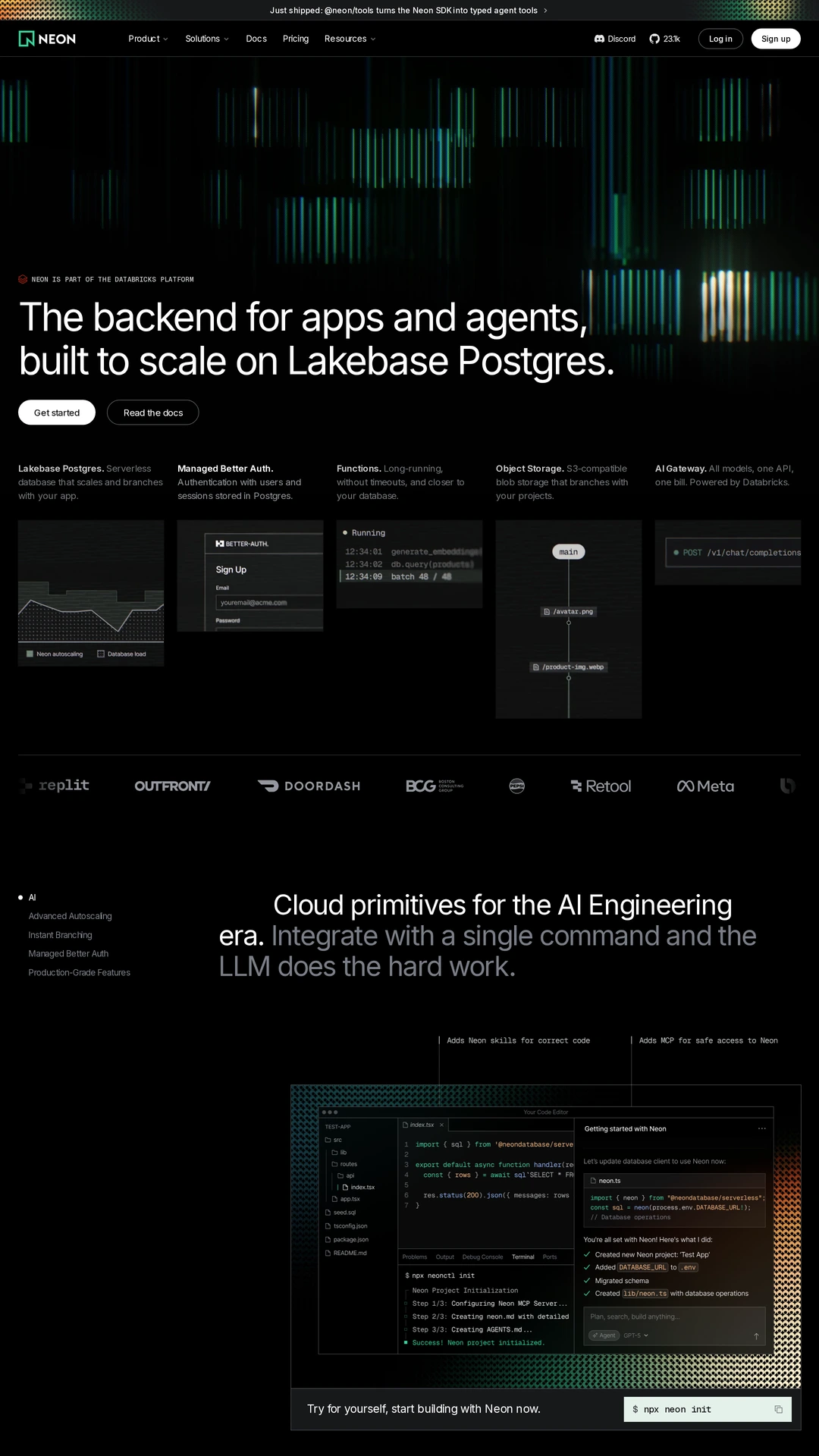
Neon uses mint vertical bars against black to establish a technical visual identity, then breaks the product story into smaller panels. The live page also contains moving media. Study whether the product explanation and sign-up path stay readable alongside that activity.
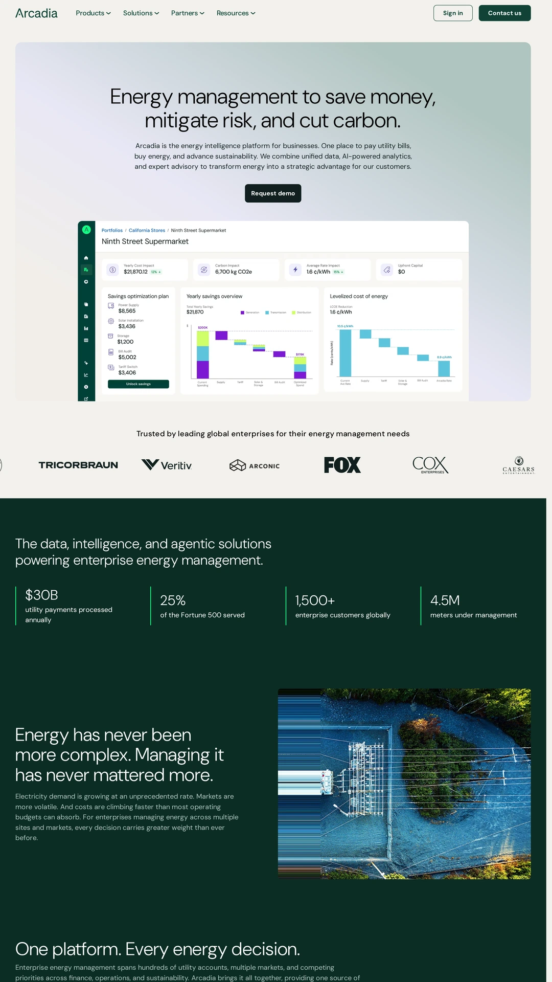
Arcadia places a dark green headline and an interface chart inside a pale gradient hero. Customer logos follow before a darker section changes the rhythm. The useful comparison is how a data-heavy energy platform presents one overview before introducing more detail.
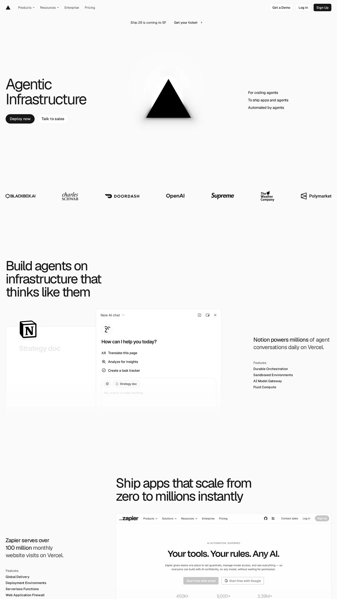
Vercel combines generous white space, a short infrastructure proposition, a central brand mark and customer logos. A larger customer example develops the story below. Compare this restrained opening with Neon's darker, more visually dense approach to developer infrastructure.
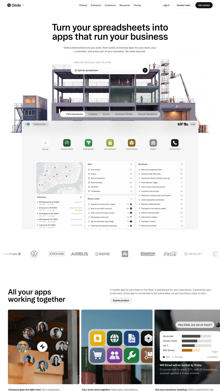
Glide places a software interface over an illustrated warehouse scene, connecting the product to a concrete business setting. Integration marks and customer logos sit nearby. Consider whether a contextual illustration or a plain interface screenshot explains your own use case more clearly.
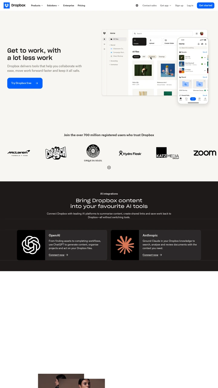
Dropbox pairs left-aligned copy with a file interface on the right, then follows with customer logos and a dark integration section. The page offers a useful comparison of product evidence, recognition and section contrast within one software story.
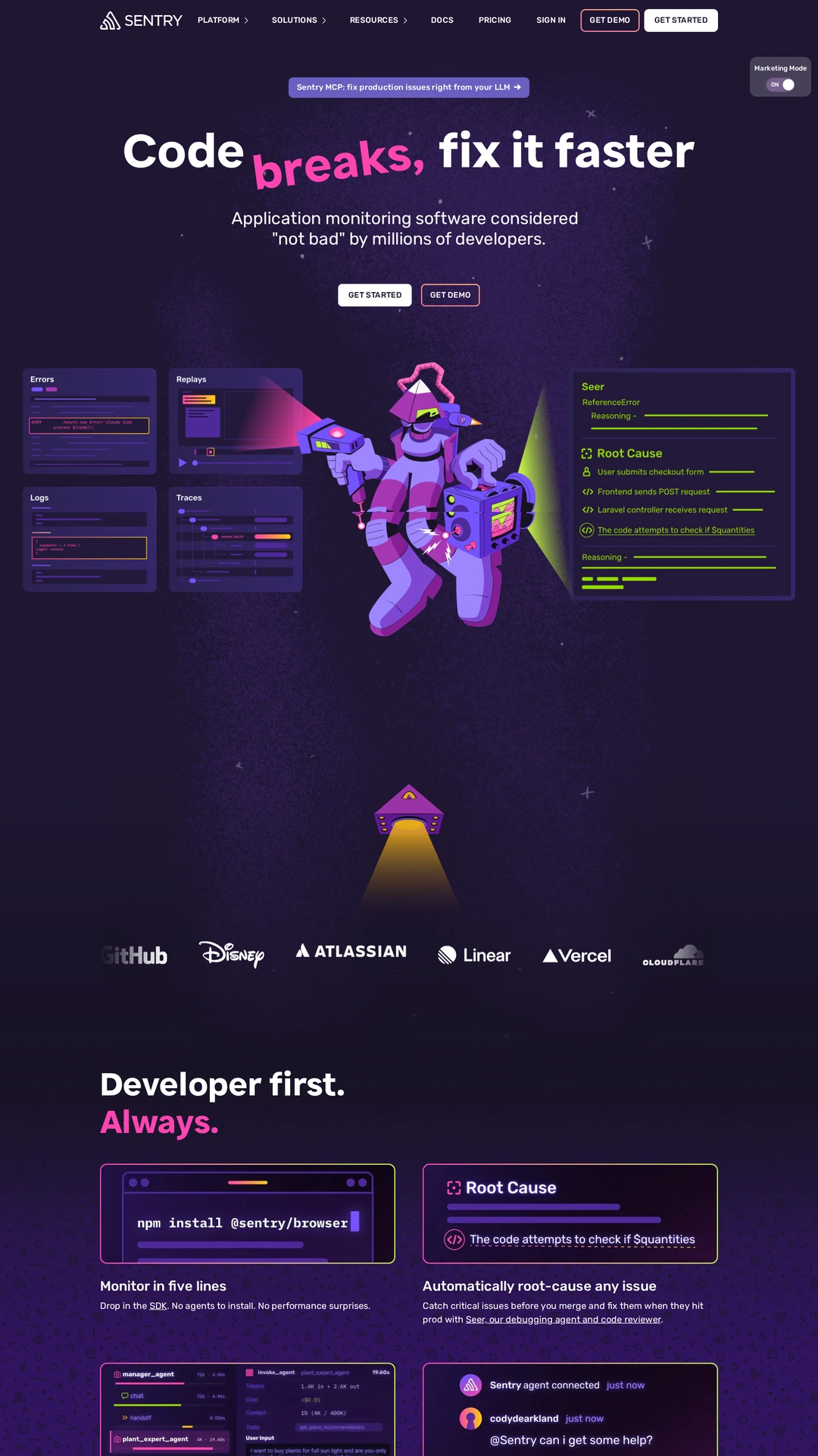
Sentry uses a dark purple background, bright magenta type and illustrated debugging characters. Interface panels bring that expressive opening back to the product. Study the balance between a memorable developer brand and a clear explanation of the monitoring workflow.
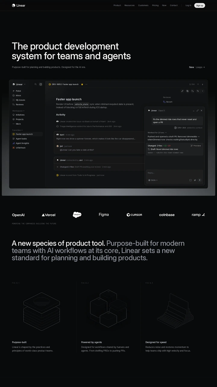
Linear puts a wide issue-management interface beneath a short headline on a near-black background. Customer logos and explanatory copy follow. The screenshot is useful for comparing how much product detail a hero can reveal while maintaining a clear hierarchy.
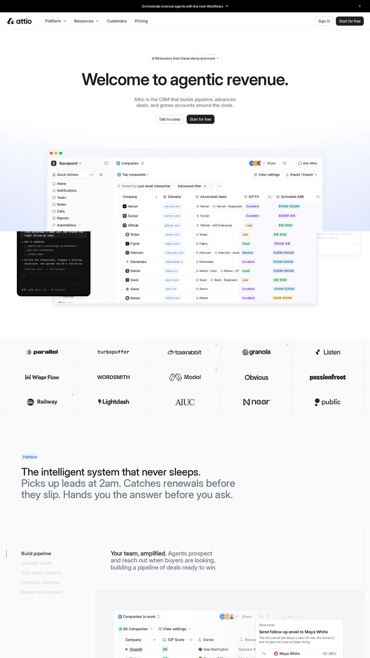
Attio centres its proposition above a large CRM interface, with a compact dark interface layered over the larger preview. Customer logos support the introduction. Compare how the product views provide context for different tasks without requiring separate landing pages.
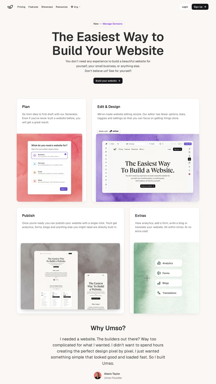
Umso organises its opening into four panels for planning, editing, publishing and extras, with coloured interface previews. This makes the workflow itself the visual structure. Use it to compare a sequence-led explanation with the single large product screenshot used by other examples here.
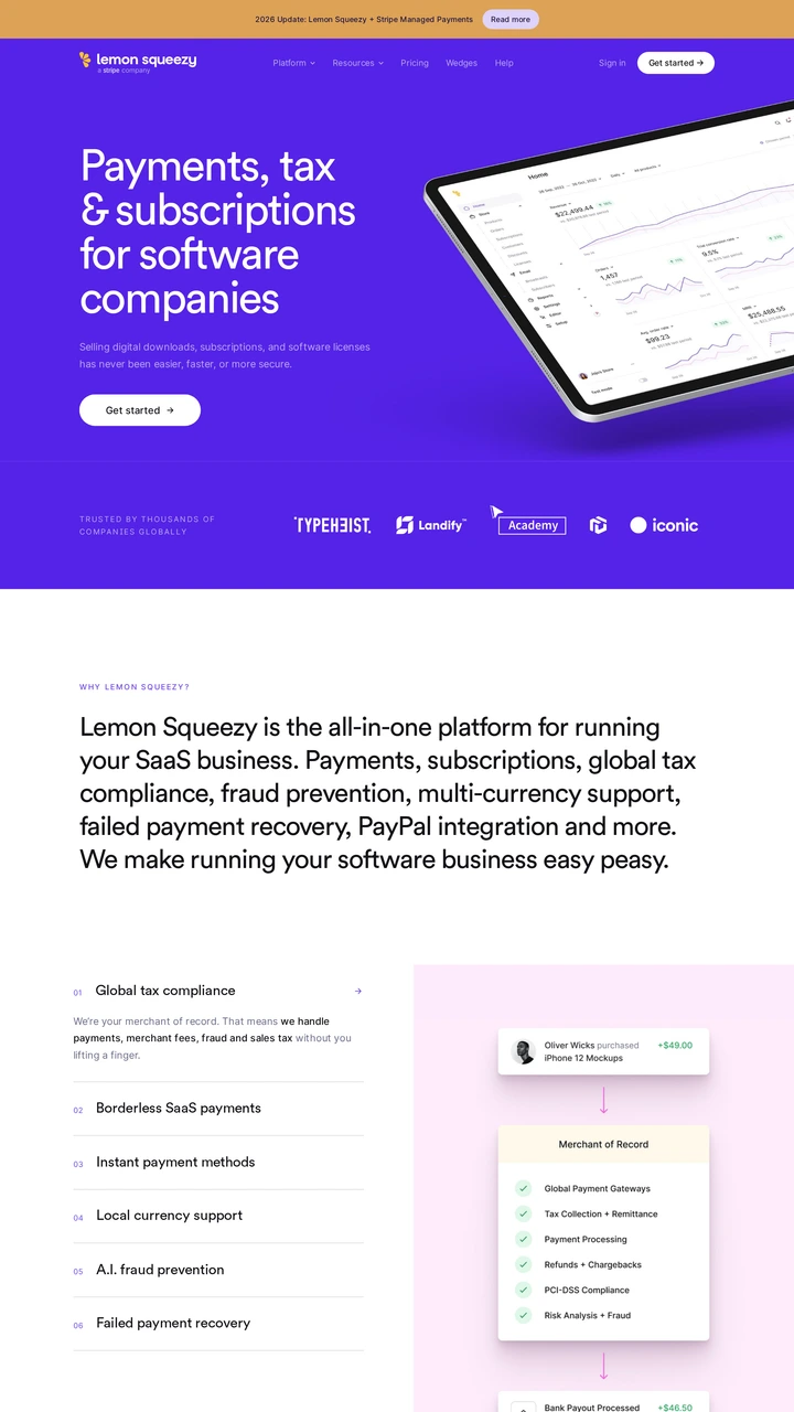
Lemon Squeezy places white copy on a purple hero beside a tilted analytics interface. Logos and a large white explanatory section follow. The composition gives the commerce platform a distinct brand surface before moving into a more conventional product explanation.
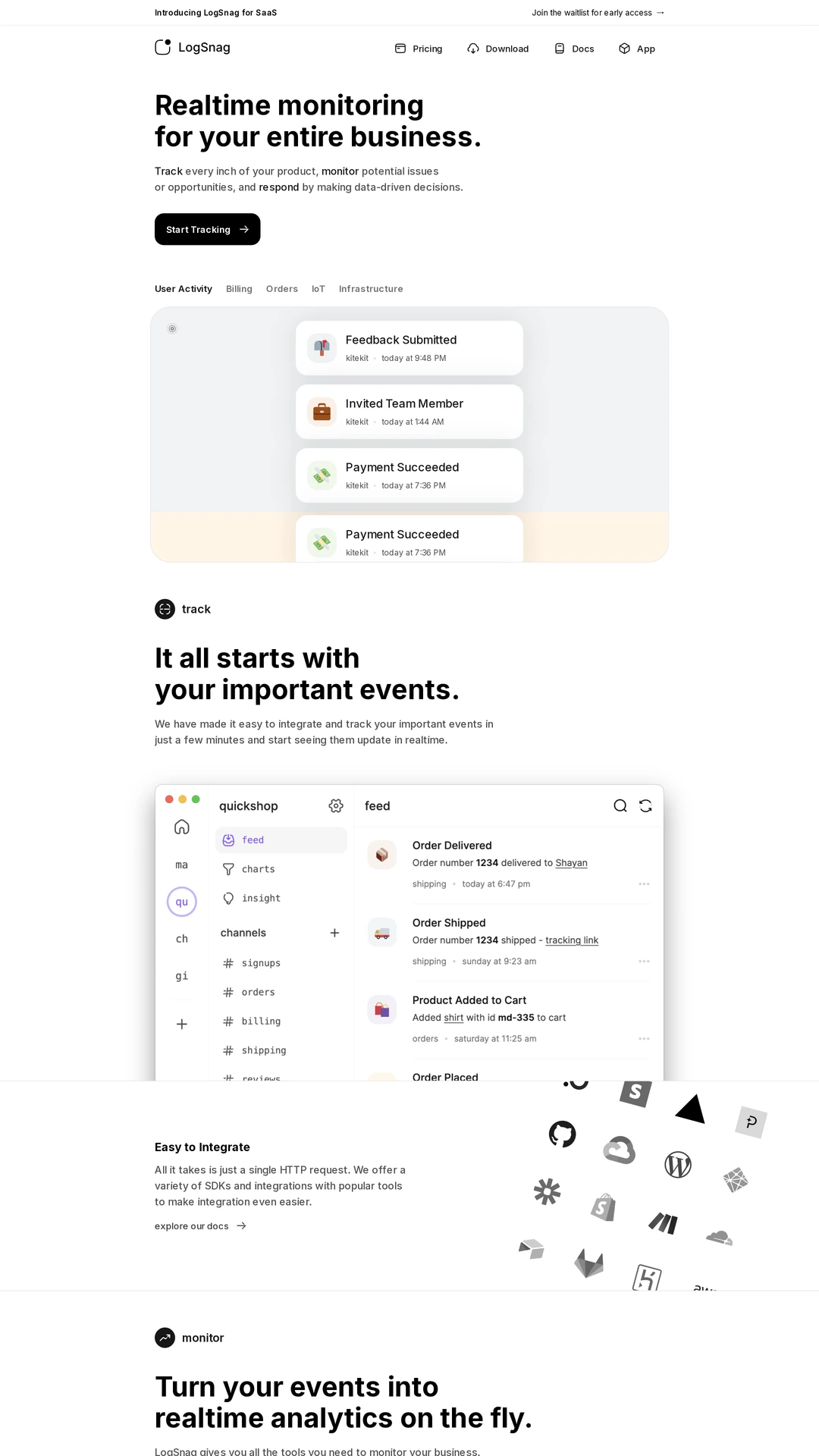
LogSnag follows a compact, left-aligned proposition with a notification timeline, then shows an event-feed interface below. The sequence makes an abstract monitoring service visible through individual events. Compare how much explanation the example UI provides before adding more copy.
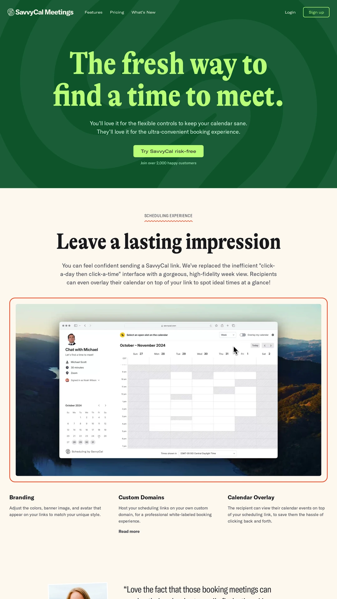
SavvyCal combines lime serif type and a patterned dark green hero, then switches to cream with an orange-framed calendar preview. The change in colour and typography creates a recognisable personality around a familiar scheduling task. Check that the calendar remains the main explanatory evidence.
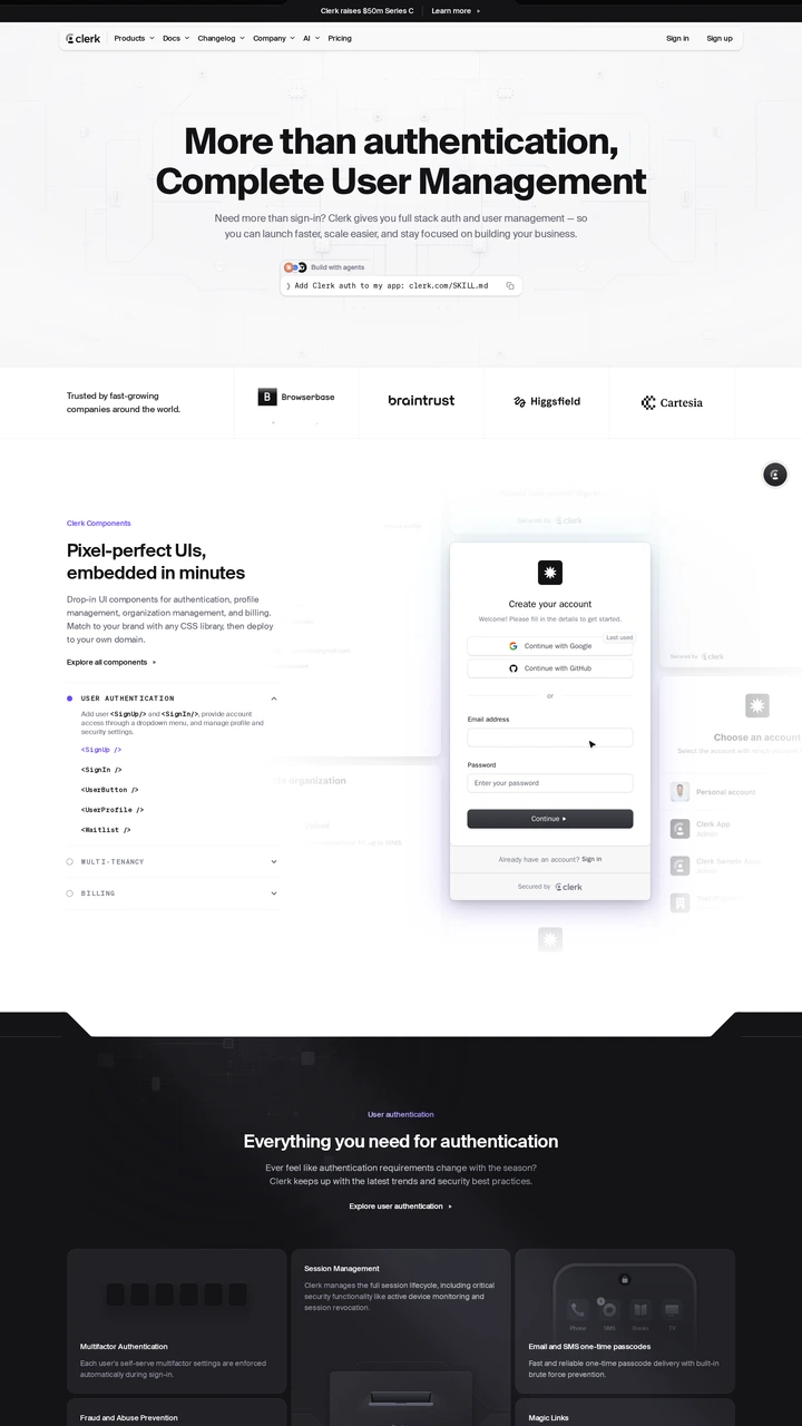
Clerk follows its centred proposition with an installation command, customer logos, and a sign-in form beside code. These are concrete entry points for a developer evaluating authentication. Compare the order of implementation evidence and customer proof with Vercel and Neon.
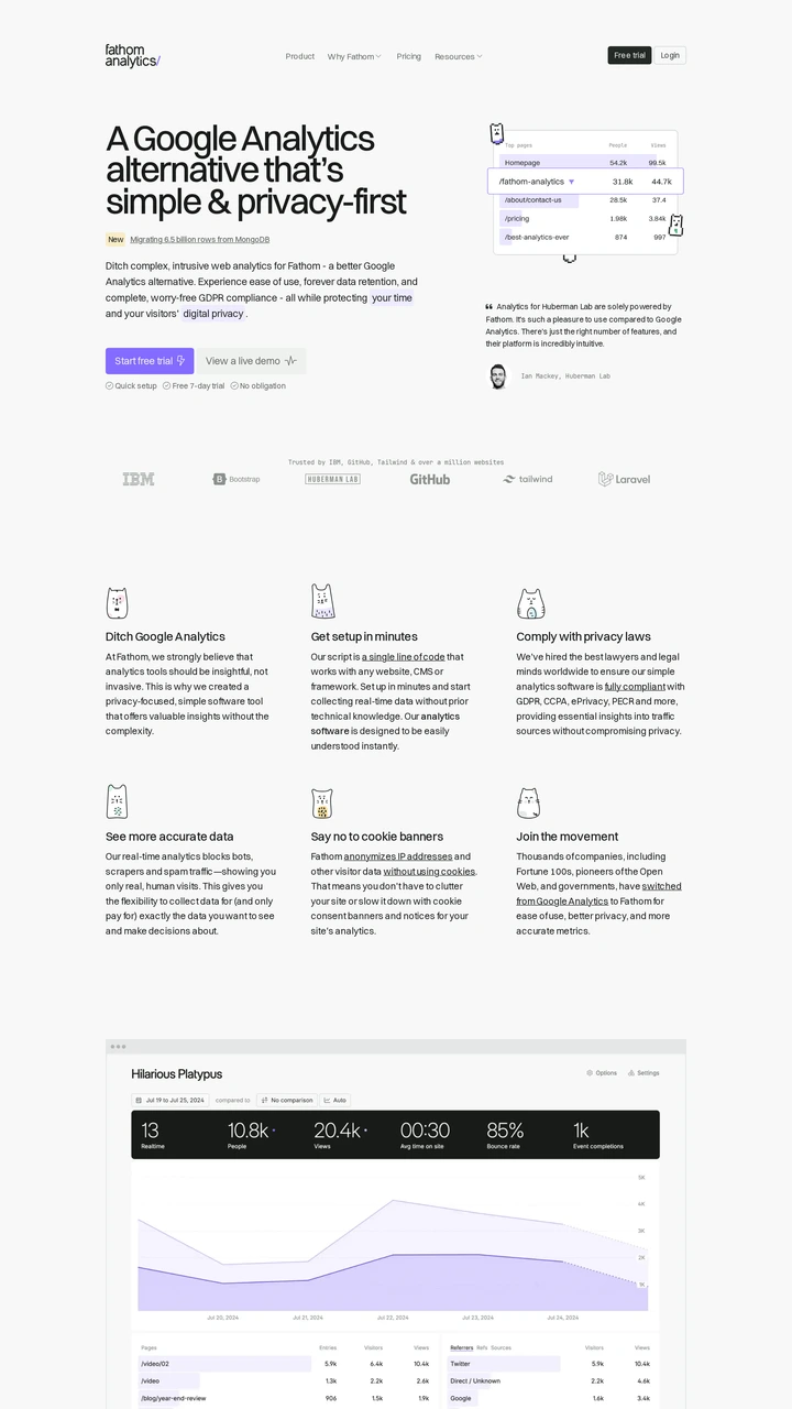
Fathom places a concise analytics proposition beside a small interface preview, followed by customer logos and a six-part benefits grid. Purple actions stand out against the white page. The layout is useful for studying a simple product explanation with limited visual ornament.
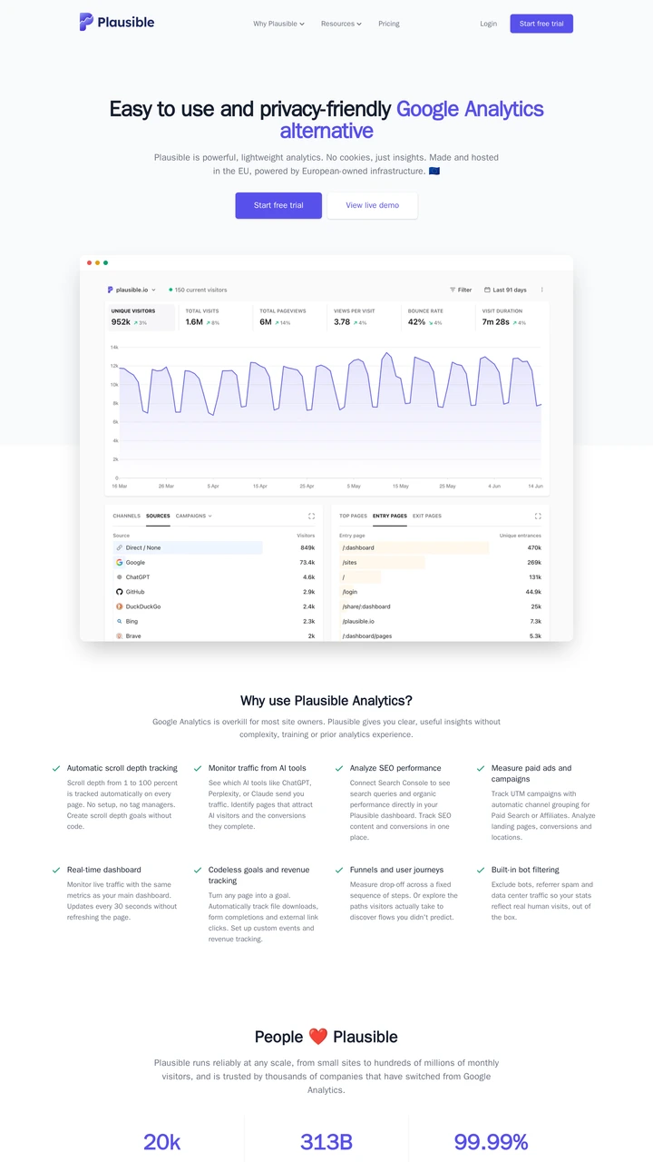
Plausible centres a purple action above a large analytics dashboard and continues with a feature list. The dashboard supplies much of the initial explanation. Compare its information density with Fathom before deciding how much real product UI to show in a hero.
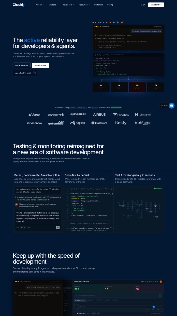
Checkly uses a dark navy surface, blue highlighted words and a code-oriented visual to address developers. Customer logos lead into feature explanations below. Study how the language and interface evidence establish technical context before the page asks for a deeper commitment.
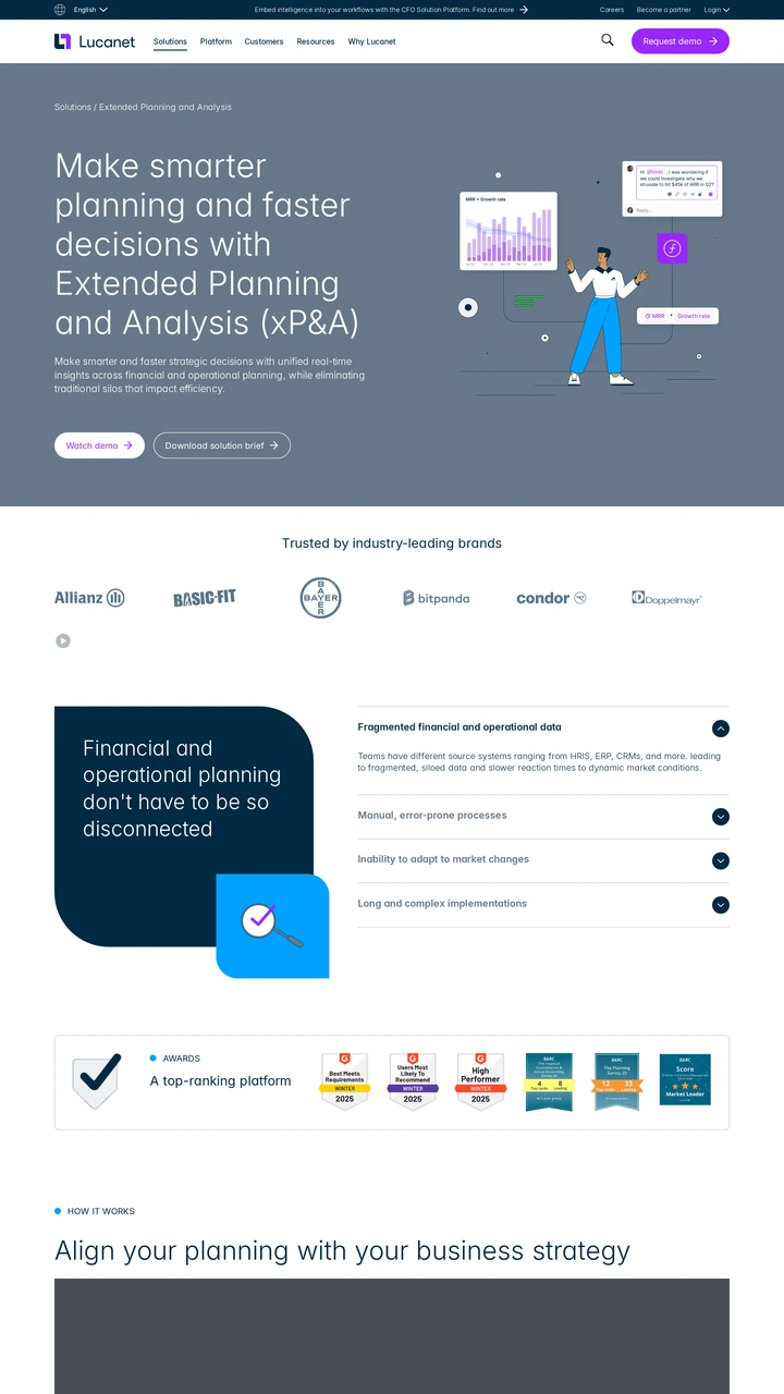
Lucanet combines an enterprise planning proposition with financial metrics and an illustrated data surface. Purple actions and customer logos organise the next steps. This is a useful contrast to self-service SaaS pages when evaluating how an enterprise product introduces a broader buying conversation.
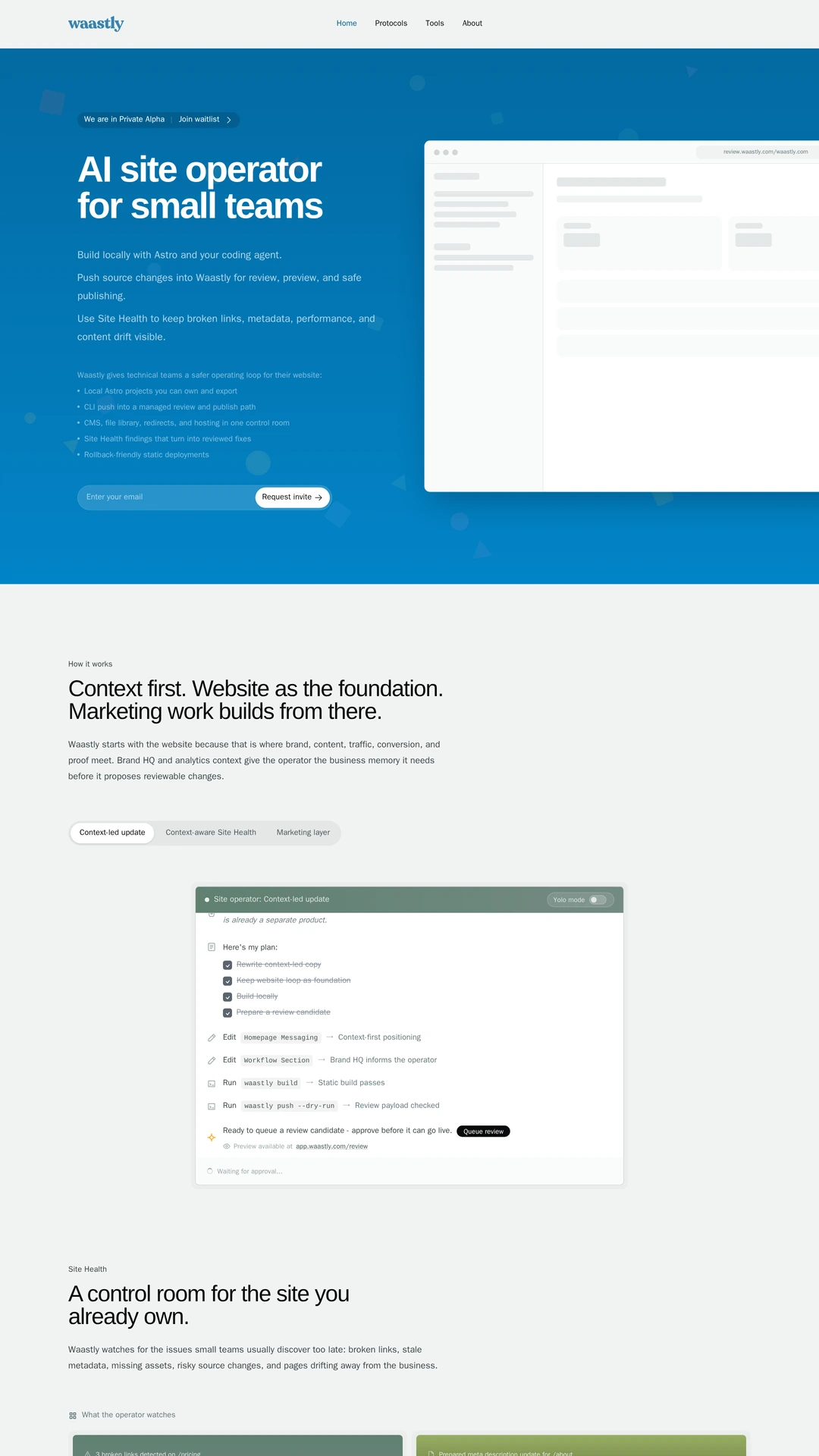
Waastly places a blue-accented proposition beside a marketing-product preview, with an alpha label and waitlist field in the opening. This is an early-stage positioning example rather than evidence of a mature customer base. Disclosure: Waastly maintains Imaginewebcraft.