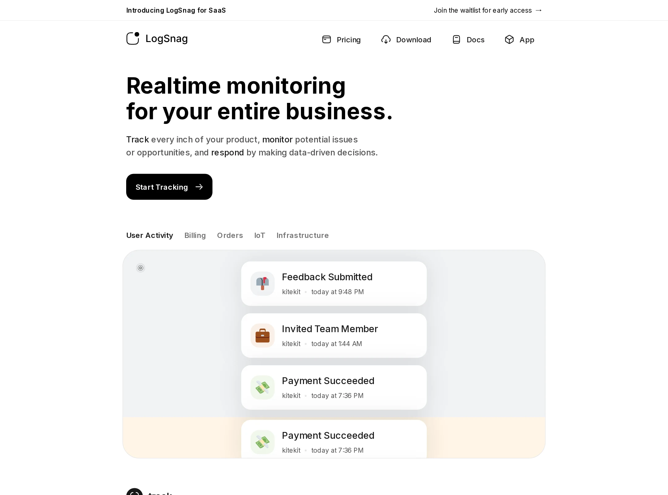


LogSnag website analysis
A detailed critique of the homepage's craft, originality, usability, and ability to move visitors toward its intended goal.
Our observations
A strong, polished SaaS showcase with a clear monochrome identity and convincing product visualization. It merits gallery consideration after accessibility and heading-structure cleanup.
Best practices
The page has a clear main region, strong contrast sampling, descriptive product imagery, repeated calls to action, and a coherent navigation/footer structure. The supplied audit flags structural accessibility problems that prevent an unqualified best-practices score.
What works
- Contrast testing reported no sampled failures.
- The hero communicates the product category quickly and provides an immediate primary action.
- A single main landmark and semantic navigation/footer regions are present.
- Product screens demonstrate concrete functionality instead of relying only on abstract claims.
Opportunities
- Replace the unnamed link identified by the audit with a meaningful accessible name.
- Correct the skipped heading level in the footer or supporting content.
- Reduce the document to one meaningful H1 and use an appropriate heading hierarchy for subsequent feature sections.
- Verify keyboard focus visibility, image alternative text, reduced-motion behavior, and mobile reading order in a full accessibility review.
Design
The visual system is unusually consistent for a long SaaS homepage. Strong typographic hierarchy, generous whitespace, and restrained color keep a feature-heavy page composed and legible.
What works
- The monochrome foundation gives the product a confident, technically focused character.
- Dashboard demonstrations are consistently framed and scaled, creating a recognizable visual rhythm.
- Black primary actions are prominent without introducing a competing accent color.
- The page balances repeated layout patterns with varied product states, charts, and mobile views.
Opportunities
- Introduce more pronounced section-level contrast or navigation cues to help users orient within the very long page.
- Use a small number of stronger editorial moments to distinguish strategic benefits from the feature tour.
- Ensure decorative integration marks do not compete with nearby explanatory content at smaller sizes.
Uniqueness
The page has a distinctive level of product evidence and a focused black-and-white presentation, although the broad structure remains familiar within contemporary developer SaaS marketing.
What works
- The product UI is the primary storytelling asset, giving the page more specificity than a generic SaaS template.
- The sequence moves beyond a basic event feed into funnels, journeys, metrics, notifications, and mobile access.
- The restrained visual identity is carried consistently from navigation through footer.
Opportunities
- Add a more ownable narrative device or point of view beyond the feature-by-feature sequence.
- Use outcome-oriented proof, technical benchmarks, or a memorable workflow illustration to create stronger differentiation.
- Clarify which capability is the core wedge versus which features are supporting the platform story.
User experience
The reading path is straightforward and the interface demonstrations are easy to understand at a glance, but the page length and heading issues create usability and accessibility costs.
What works
- The hero-to-feature progression follows a logical product-discovery path.
- Short copy blocks sit close to the interface evidence they describe.
- Repeated calls to action reduce the need to return to the top of the page.
- Mobile screenshots help communicate availability beyond the desktop dashboard.
Opportunities
- Add persistent section navigation or a compact contents treatment for users scanning the long page.
- Shorten or group feature sections so the page communicates priority rather than presenting every capability with similar weight.
- Repair the heading hierarchy and unnamed link before treating the page as fully accessible.
- Confirm that animated interface cues pause or simplify when users request reduced motion.
Conversion optimization
The primary action is visible, repeated, and consistent, making the page effective as a product-led acquisition funnel. Conversion confidence is limited by the lack of visible proof, qualification detail, and prioritization around the main buyer decision.
What works
- The hero places a clear Start Tracking action near the initial product promise.
- The repeated CTA at the end gives users a natural next step after reviewing the feature set.
- The interface demonstrations help reduce uncertainty about what the product actually does.
- The concise navigation includes practical paths such as pricing, documentation, download, and app access.
Opportunities
- Add concise customer proof, usage outcomes, or recognizable trust signals near the first major product demonstration.
- Make pricing or plan expectations easier to evaluate before the final CTA.
- Frame the feature tour around a few audience-specific use cases rather than a largely linear inventory.
- Test whether a stronger secondary path, such as documentation or a guided demo, serves visitors who are not ready to start tracking.
What we'd improve
- 01high
Repair semantic structure and accessible naming
Consolidate the page around one descriptive H1, assign subsequent feature sections an appropriate heading level, and provide an accessible name for the audit-identified unnamed link.
- 02high
Add page orientation for the long feature tour
Introduce a compact contents rail, section index, or stronger in-page navigation so visitors can jump directly to analytics, funnels, notifications, or mobile access.
- 03medium
Strengthen trust and decision support
Place concise customer evidence, concrete outcomes, security or reliability context, and clearer pricing guidance near the hero or early product sections.
- 04medium
Clarify the product narrative
Group the many capabilities into a few user problems or workflows, making the core value proposition more prominent than the feature inventory.
- 05low
Validate motion and responsive states
Run keyboard, screen-reader, narrow-screen, and reduced-motion checks to confirm that transitions, decorative marks, dashboards, and mobile previews remain understandable and usable.