

Sort website analysis
A detailed critique of the homepage's craft, originality, usability, and ability to move visitors toward its intended goal.
Our observations
A polished and distinctive product landing page with strong editorial positioning and a clear conversion path. It is suitable for publication, with accessibility and hierarchy refinements recommended.
Best practices
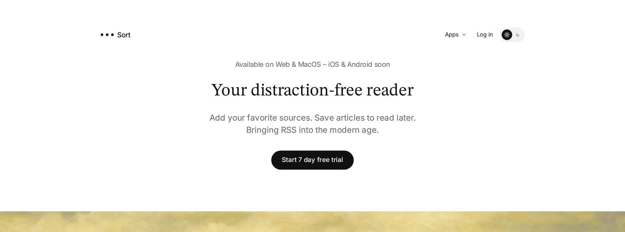
The page has a coherent semantic structure, one detected H1, a clear primary action, distinct pricing and product sections, and a strong content progression. Automated evidence reports a high accessibility score of 94, though it also identifies one heading-level skip and one serious contrast failure.
What works
- Clear hero proposition and prominent trial CTA.
- Consistent section structure spanning features, pricing, platforms, and roadmap.
- Semantic main and footer regions are present, with no duplicate IDs detected.
- Pricing includes a monthly/yearly choice and a visible free-trial action.
Opportunities
- Resolve the detected heading-level skip so the feature hierarchy is navigable in order.
- Correct the footer link contrast failure, particularly against the footer background image.
- Verify focus states, keyboard operation, image alternatives, and reduced-motion behavior with manual and assistive-technology testing.
Design
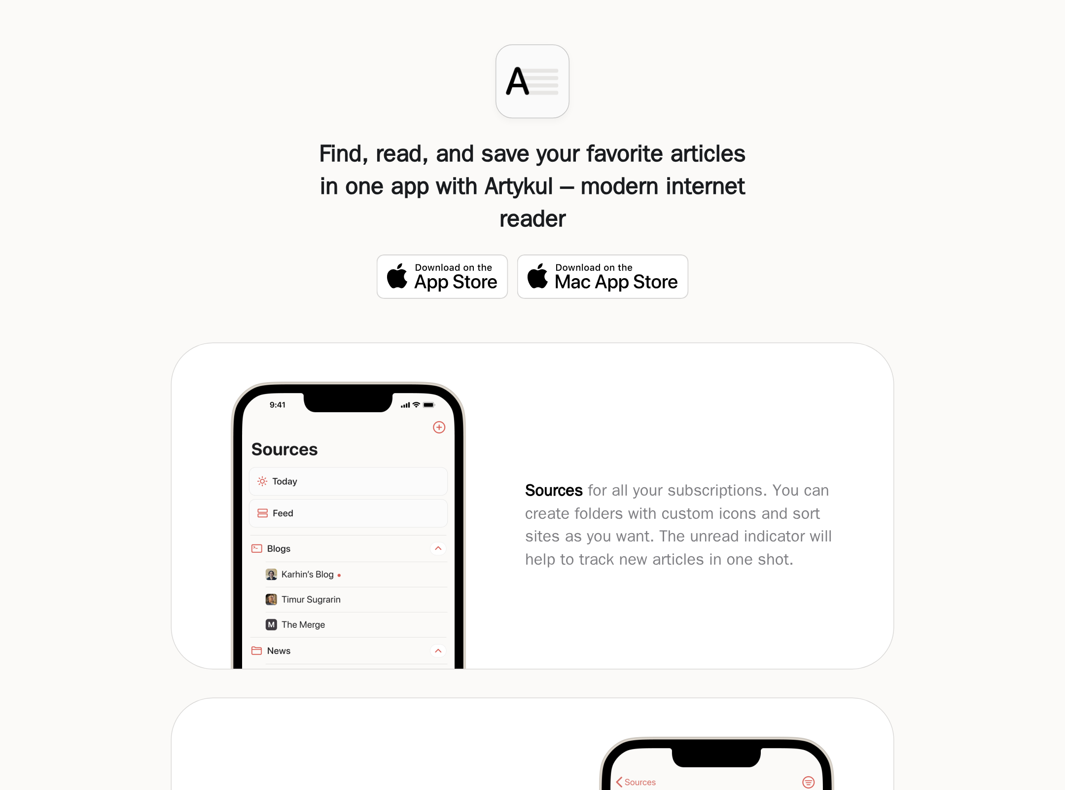
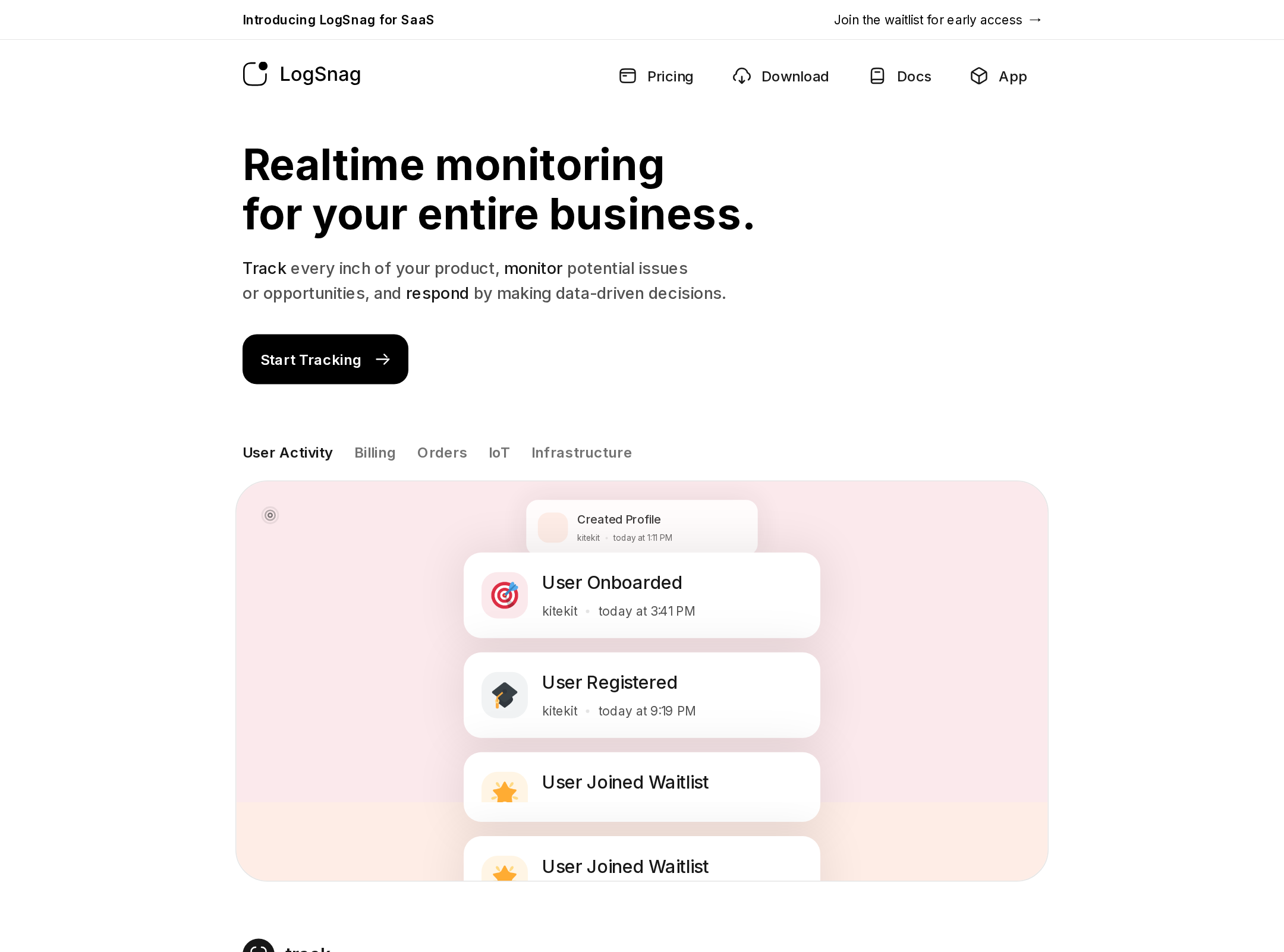
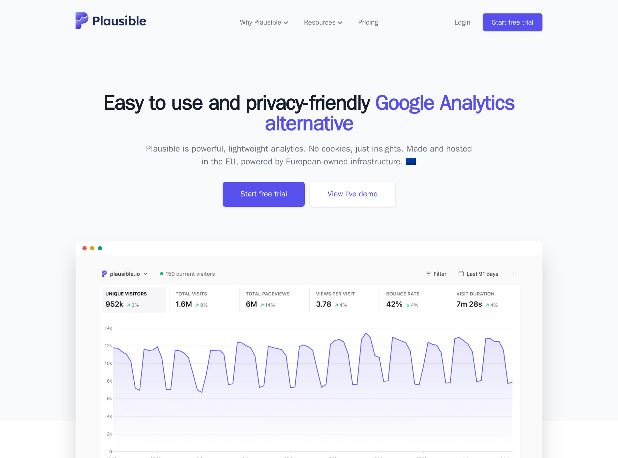
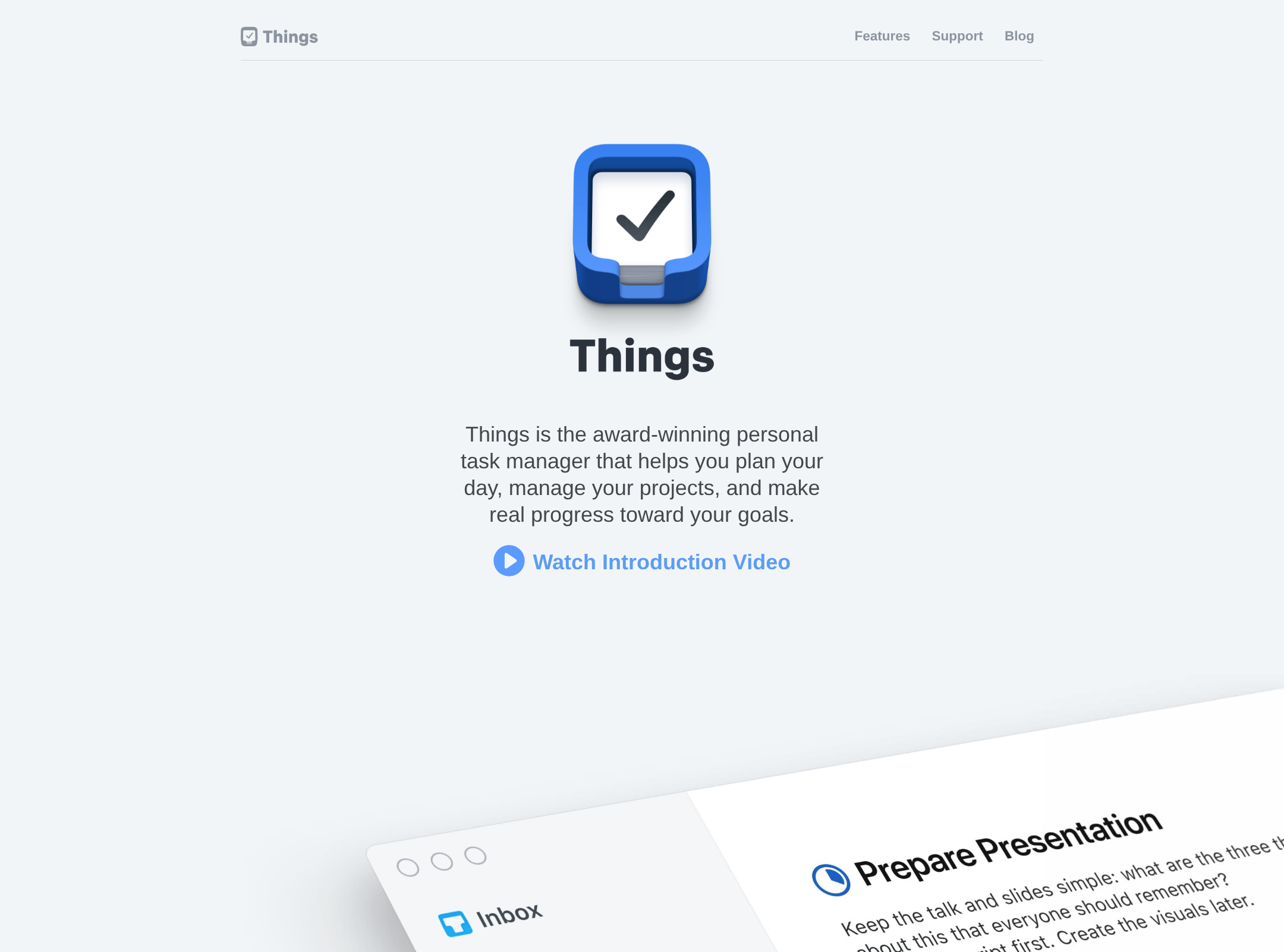
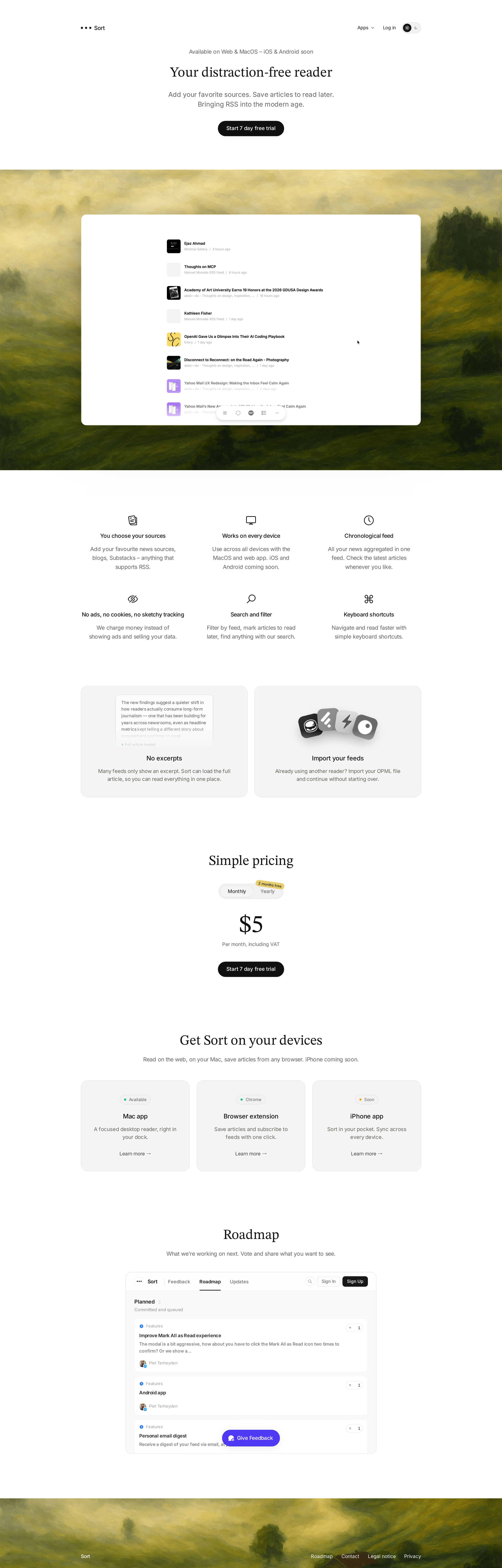
The visual system is disciplined and well matched to a reading product. Serif display typography, generous spacing, subtle card surfaces, and the landscape-backed product preview create a calm, premium presentation.
What works
- Strong contrast between the expressive product showcase and restrained information sections.
- Typography establishes an appropriate editorial tone without sacrificing interface clarity.
- Rounded cards, pill controls, thin borders, and restrained shadows form a cohesive component language.
- The page maintains visual calm despite containing substantial product and pricing information.
Opportunities
- Increase the visual distinction of supporting text and low-emphasis cards so important information is not lost in the pale layout.
- Give the footer and roadmap a slightly stronger visual endpoint to avoid a weak final impression.
- Clarify the relationship between the hero product preview and the later feature claims with more explicit captions or annotations.
Uniqueness
The combination of an RSS reader proposition, literary typography, and a painterly landscape showcase gives the page a recognizable identity. The overall SaaS structure remains familiar, but the art direction keeps it from feeling generic.
What works
- The landscape image is a memorable brand device rather than a generic gradient or abstract blob.
- The serif/sans pairing supports a clear reading-focused positioning.
- The roadmap section communicates openness and product participation, which is distinctive for a small productivity product.
Opportunities
- Strengthen distinctive brand assets beyond the hero artwork so the identity remains recognizable in smaller sections and product surfaces.
- Make the core point of difference from conventional RSS readers more concrete through a concise comparison or product-specific proof point.
User experience
The page is easy to scan and follows a sensible discovery path from promise to product evidence, benefits, pricing, availability, and roadmap. The restrained density supports the distraction-free positioning, although small type and understated controls may affect comprehension for some visitors.
What works
- The primary action appears early and is repeated at the pricing decision point.
- Features are grouped into concise, scannable benefits with familiar labels.
- Cross-platform availability is presented in a dedicated section rather than buried in navigation.
- The pricing block is simple and avoids a crowded tier comparison.
Opportunities
- Add stronger explanatory context around what the reader actually looks like in daily use, especially for visitors unfamiliar with RSS.
- Ensure the monthly/yearly selector has an unambiguous selected state and remains clear at smaller sizes.
- Test the long vertical spacing and small supporting copy on mobile and with browser zoom.
Conversion optimization
The page has a direct trial-oriented funnel and supports the decision with product imagery, feature benefits, pricing, and platform information. Conversion confidence is reduced by limited visible reassurance around payment, cancellation, onboarding, and the practical difference between Sort and competing readers.
What works
- A single, consistent trial CTA reduces decision complexity.
- The product preview appears before the feature and pricing details, helping visitors understand the offer visually.
- Import support addresses a meaningful switching barrier for existing RSS users.
- The device section helps visitors assess whether the product fits their workflow.
Opportunities
- Add concise reassurance near the trial CTA covering cancellation, payment timing, or what the seven-day trial includes.
- Surface a short differentiation statement near pricing rather than relying on feature labels alone.
- Make the import workflow and supported feed compatibility more prominent for visitors migrating from another reader.
What we'd improve
- 01high
Repair footer contrast and heading hierarchy
Increase the contrast of the affected footer link against the photographic background and change the feature-heading structure so it follows the page’s heading order without skipping a level.
- 02high
Add trial reassurance
Place brief, plain-language reassurance beside the primary and pricing CTAs explaining trial duration, billing timing, and cancellation expectations, if applicable.
- 03medium
Clarify product differentiation
Add one concise section or comparison statement explaining why Sort is preferable to a conventional RSS reader, focusing on its distraction-free reading workflow and cross-device experience.
- 04medium
Strengthen small-screen verification
Test the pricing toggle, navigation controls, feature grid, roadmap preview, and footer at narrow widths and browser zoom levels; confirm readable text, visible focus states, and comfortable touch targets.
- 05low
Improve the closing experience
Give the roadmap and footer a clearer closing CTA or product prompt so the page ends with an actionable next step rather than primarily navigational links.