

Drams website analysis
A detailed critique of the homepage's craft, originality, usability, and ability to move visitors toward its intended goal.
Our observations
A visually disciplined and distinctive component showcase that merits gallery consideration after accessibility, labeling, and catalog-navigation issues are addressed.
Best practices
The page has a clear heading structure and a recognizable navigation and form, but automated checks identify several serious implementation weaknesses.
What works
- The page has one clear H1 and no detected heading-level skips.
- Navigation, hero, and form regions are structurally identifiable from the supplied evidence.
- The large component collection is presented consistently across repeated modules.
Opportunities
- Add a main landmark and correct the duplicate ID before release.
- Give both unnamed links accessible names and provide explicit labels for both form controls.
- Resolve the 12 detected contrast failures, especially for secondary labels and light headings.
- Verify keyboard focus states, form error messaging, image alternatives, and reduced-motion behavior manually.
Design
The visual direction is cohesive, restrained, and well matched to a component showcase, with a particularly effective catalog of quiet interface specimens.
What works
- The sparse canvas keeps attention on the component work rather than decorative branding.
- The orange accent provides a memorable counterpoint to the otherwise monochrome system.
- The principles section gives the showcase a conceptual frame beyond simple asset listing.
- Repeated cards and consistent spacing create a strong sense of collection and authorship.
Opportunities
- Increase the visual scale or local contrast of component labels so the catalog remains legible at a glance.
- Create clearer section transitions within the long catalog to reduce visual monotony.
- Use more explicit visual cues for which specimens are interactive, inspectable, or remixable.
Uniqueness
The combination of a high-volume interface specimen library, Rams-oriented framing, and community submission invitation gives the page a recognizable identity.
What works
- The page treats a component library as an editorial collection rather than a conventional documentation site.
- The design-principles content reinforces the product concept and makes the gallery feel authored.
- The restrained presentation is consistent with the stated minimal design influence.
Opportunities
- Differentiate the browsing experience further with component categories, states, or provenance without compromising the minimal aesthetic.
- Make the remix and submission pathway more prominent and specific so the community angle becomes a stronger part of the identity.
User experience
The purpose is evident and the visual catalog is engaging, but the long, dense inventory and accessibility defects create friction for scanning and interaction.
What works
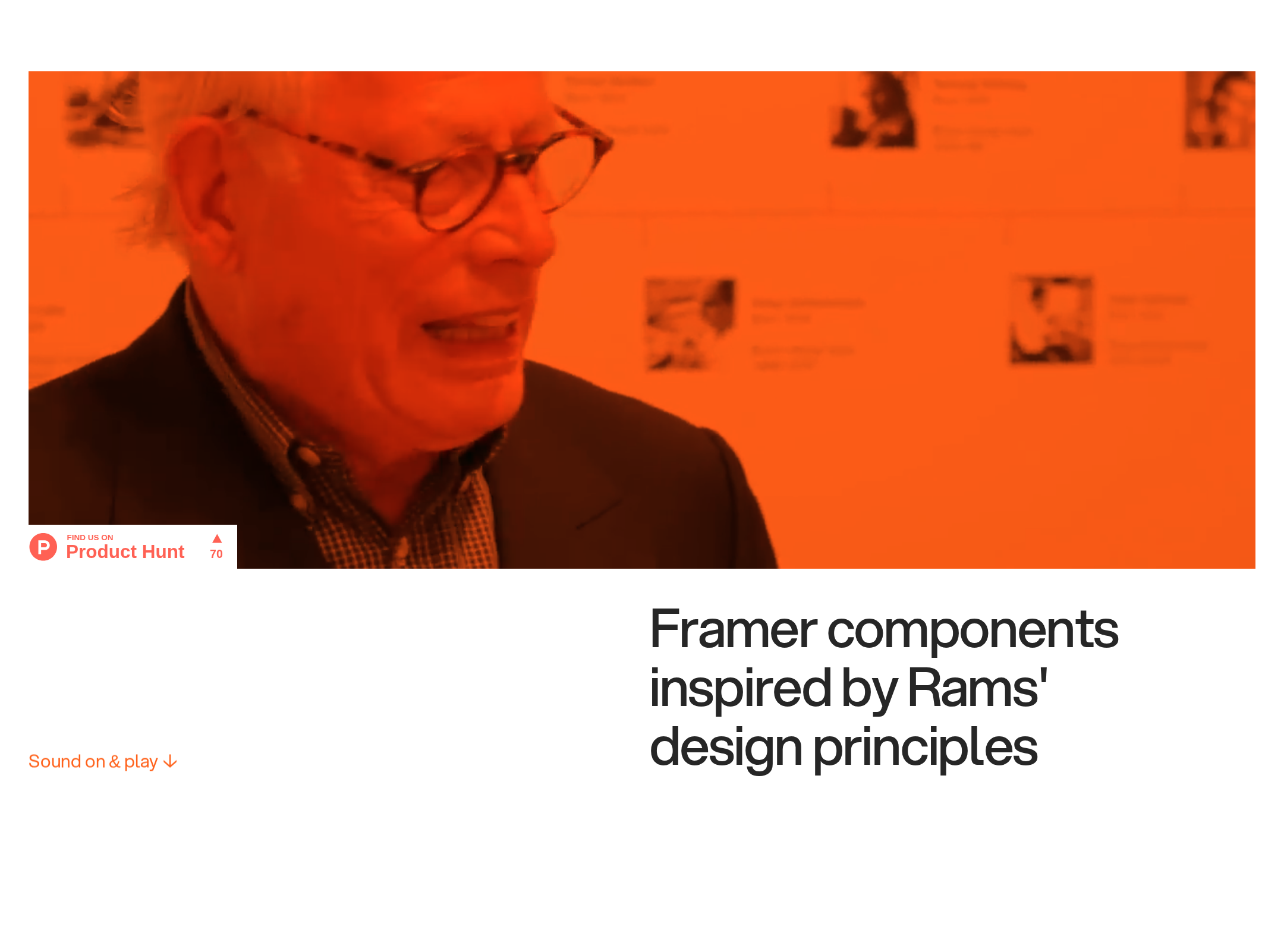
- The hero communicates that the page contains Framer components inspired by design principles.
- The navigation exposes several useful destinations, including the store, journal, and contact areas.
- The catalog provides immediate visual evidence of the breadth of the collection.
Opportunities
- Add category filters, search, or a compact index to make a large component inventory easier to navigate.
- Provide accessible names and descriptions for every interactive specimen and form control.
- Improve contrast and label sizing so low-vision users can distinguish component names and supporting information.
- Test the page at mobile widths and with keyboard and screen-reader navigation; these behaviors cannot be established from the supplied evidence alone.
Conversion optimization
For a showcase whose conversion goal appears to be exploration, remixing, submission, and updates, the page establishes credibility through volume but leaves key next steps under-explained.
What works
- The extensive catalog acts as proof of depth and ongoing work.
- The submission invitation offers a clear community-oriented action.
- The footer includes an update-oriented form and reinforces the brand with a strong orange close.
Opportunities
- Add a persistent or repeated action for viewing, copying, remixing, or submitting a component.
- Clarify what happens after submission and what users receive by joining the updates form.
- Use stronger descriptive labels and previews so visitors can select a component based on purpose, not only appearance.
- Reduce the distance between the hero promise and the first meaningful browse or action opportunity.
What we'd improve
- 01high
Repair the accessibility foundation
Add a semantic main landmark, unique IDs, accessible names for the two unnamed links, explicit labels for both inputs, and visible keyboard focus states. Re-run automated checks and complete manual keyboard and screen-reader review.
- 02high
Resolve contrast failures
Audit the 12 reported contrast failures across secondary labels, headings, links, and component captions. Darken weak text or strengthen its surface treatment while preserving the minimal visual language.
- 03high
Make the component catalog easier to browse
Introduce lightweight categories, a filter or search control, and a visible index. Preserve the quiet grid but give visitors a way to reach relevant component types without scanning the entire page.
- 04medium
Clarify component actions
Give each interactive specimen a descriptive accessible name and visible action language such as preview, inspect, remix, or copy. Make the submission route equally explicit near the catalog and footer.
- 05medium
Strengthen the update form
Label the email field, state the purpose and frequency of updates, provide clear validation and success feedback, and ensure the submit control remains understandable without relying on visual styling alone.
- 06low
Validate responsive and motion behavior
Test narrow and wide viewports, touch target sizes, canvas and image fallbacks, focus order, and reduced-motion settings. The supplied evidence confirms transitions but does not establish their behavior across devices.


