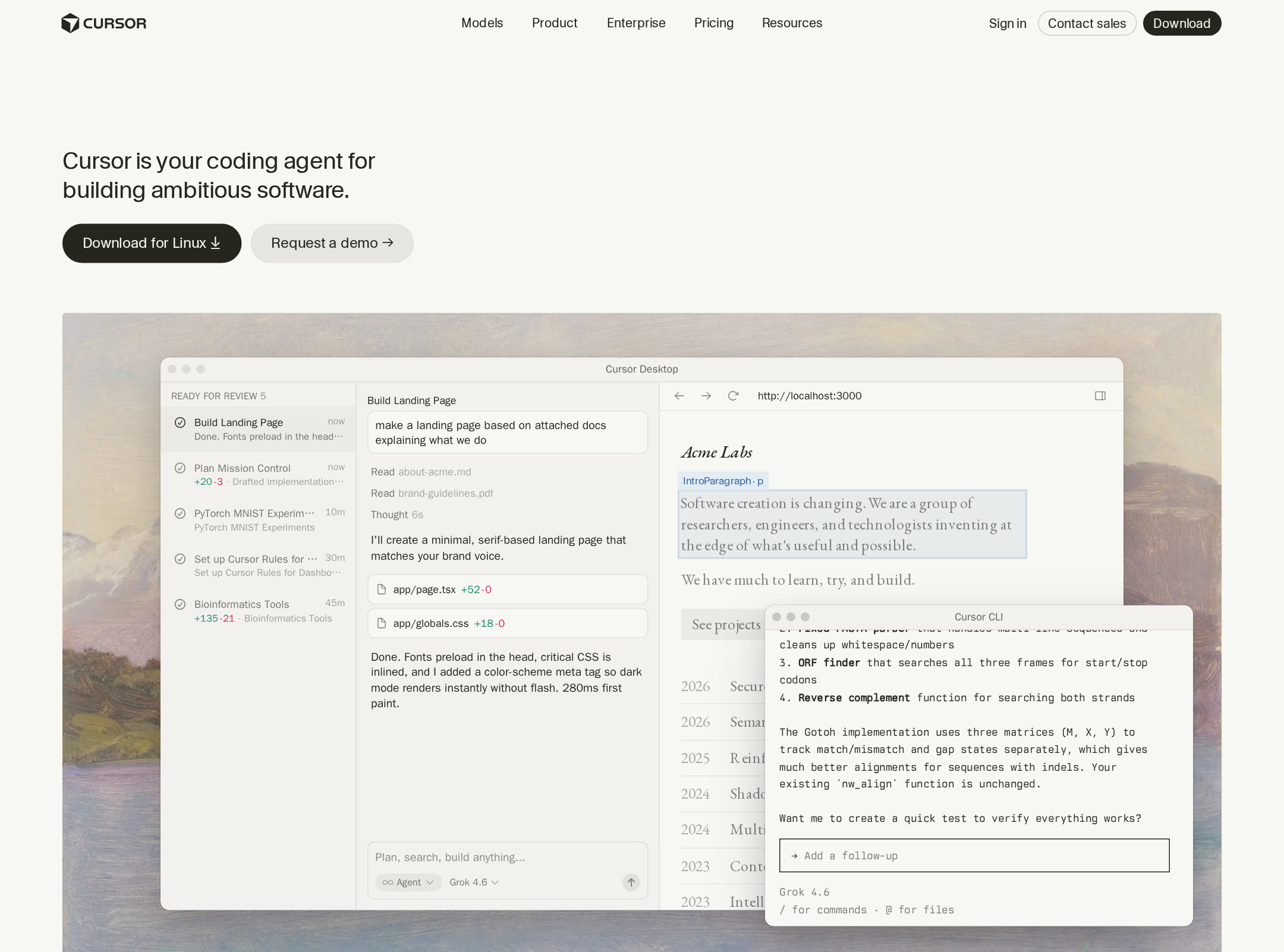


Cursor website analysis
A detailed critique of the homepage's craft, originality, usability, and ability to move visitors toward its intended goal.
Our observations
Excellent visual and narrative execution with meaningful accessibility debt in the interactive product demonstrations. The homepage is a strong gallery candidate, subject to review rather than an unconditional publish recommendation.
Best practices
The page has a clear semantic marketing structure, a single primary heading, logical heading progression, a skip-navigation element, a main landmark, and a dedicated footer. However, automated checks identify serious control-label and contrast issues, plus a duplicate ID.
What works
- Clear hero-to-proof-to-feature-to-CTA progression.
- One detected H1 and no detected heading skips.
- Semantic navigation, main, and footer landmarks are present.
- Primary and secondary actions are visually distinct and repeated at useful points.
Opportunities
- Label all interactive demo controls and text inputs programmatically.
- Resolve the 23 detected contrast failures, especially colored syntax and secondary interface text.
- Remove the duplicate demo-window ID and verify unique identifiers across repeated demos.
- Audit focus order, keyboard operation, accessible names, and live-region behavior in interactive demonstrations.
Design
A refined and coherent visual system combines editorial pacing with convincing product visualization. The restrained palette and consistent framing give a very long page strong compositional control.
What works
- Distinctive warm neutral palette avoids generic blue-purple SaaS styling.
- Large product demonstrations make the offering concrete and visually memorable.
- Typography, borders, spacing, and card treatment remain consistent across varied sections.
- The page uses whitespace and alternating layouts to create rhythm without excessive decoration.
Opportunities
- Some interface-heavy sections are visually dense and may require stronger local captions or signposting.
- The repeated pale cards and demos could benefit from slightly clearer section-level differentiation on long scrolls.
- Ensure product screenshots remain legible when scaled down on narrow screens.
Uniqueness
Cursor differentiates itself through the editorial presentation of real-feeling coding workflows rather than relying on abstract AI imagery. The combination of software demos, warm paper tones, and restrained typography is recognizable.
What works
- Product UI is the central storytelling device rather than a supporting screenshot.
- Editorial composition gives the developer-tools category a more cultural and considered tone.
- The page balances technical interface detail with human proof, testimonials, and team imagery.
Opportunities
- Several patterns—logo wall, feature cards, testimonials, changelog, and final CTA—remain familiar to modern SaaS marketing.
- Distinctive product-demo sections should continue to carry the brand so the surrounding modules do not feel interchangeable.
User experience
The information architecture is understandable and the page provides multiple ways to learn about the product, but the long scroll and complex demos create accessibility and comprehension risks. Interaction and responsive behavior were not directly tested.
What works
- The hero communicates the product category and intended audience immediately.
- Feature sections pair short explanations with visual evidence and contextual links.
- Navigation includes broad product, resource, and community pathways.
- A closing trial prompt gives the long page a clear endpoint.
Opportunities
- Provide concise alternative descriptions or equivalent text summaries for interactive demos.
- Reduce or segment the cognitive load of long product-interface sequences with clearer progress cues.
- Confirm that all demo controls have visible focus states, accessible names, and usable keyboard behavior.
- Test narrow layouts for code readability, horizontal overflow, and touch target sizing.
Conversion optimization
The page builds conversion intent effectively through early product framing, customer trust, repeated feature proof, and a direct final trial CTA. Its main conversion risk is that the visual demonstrations may be difficult to interpret or operate for some users.
What works
- The hero offers a direct product action alongside a lower-commitment secondary path.
- Recognizable customer references appear early enough to support trust.
- Feature explanations are paired with contextual learn-more links rather than forcing one generic CTA.
- The closing 'Try Cursor now' moment is visually isolated and easy to identify.
Opportunities
- Clarify the expected first step after the primary download/trial action for different audience segments.
- Add concise plan, platform, or onboarding reassurance near the main CTA if those details are important to first-time visitors.
- Use accessible text equivalents for demo content so conversion messaging is not dependent on visual interaction.
- Measure whether the number and length of feature sections delays action for high-intent visitors.
What we'd improve
- 01high
Repair interactive-demo accessibility
Add programmatic labels and accessible names to the nine reported unlabeled controls and inputs, provide keyboard-operable states, and expose equivalent text for the major product demonstrations.
- 02high
Resolve contrast and identifier defects
Correct the 23 reported contrast failures across syntax colors, tertiary links, and secondary UI text, then remove the duplicate demo-window ID and rerun automated checks.
- 03medium
Validate responsive demo comprehension
Test the product windows at narrow widths and with zoom, checking code legibility, horizontal overflow, touch targets, focus visibility, and whether the narrative remains understandable without hover or animation.
- 04medium
Strengthen long-page orientation
Add clearer section signposting or a lightweight progress structure so visitors can understand where they are within the feature, proof, update, and CTA sequence.
- 05low
Improve non-visual product proof
Pair each major interactive demo with a short static summary of the workflow, outcome, and relevant user benefit so the page remains persuasive when media is paused, unavailable, or inaccessible.