

Next.js website analysis
A detailed critique of the homepage's craft, originality, usability, and ability to move visitors toward its intended goal.
Our observations
A strong, publishable developer-tools homepage with an unusually coherent information architecture and polished visual restraint. It merits gallery inclusion, subject to accessibility and implementation follow-up.
Best practices
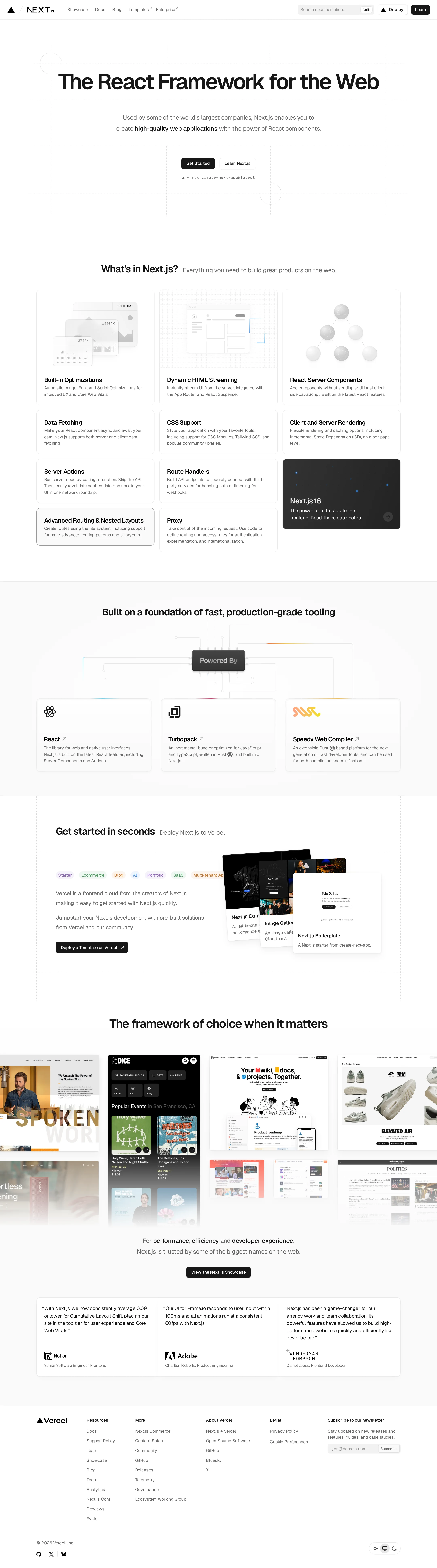
The page has a clear single H1, semantic navigation and footer regions, a coherent heading progression, direct calls to action, and a substantial content path for different developer needs. The automated audit reports 16 contrast failures and duplicate IDs, which materially reduce the score.
What works
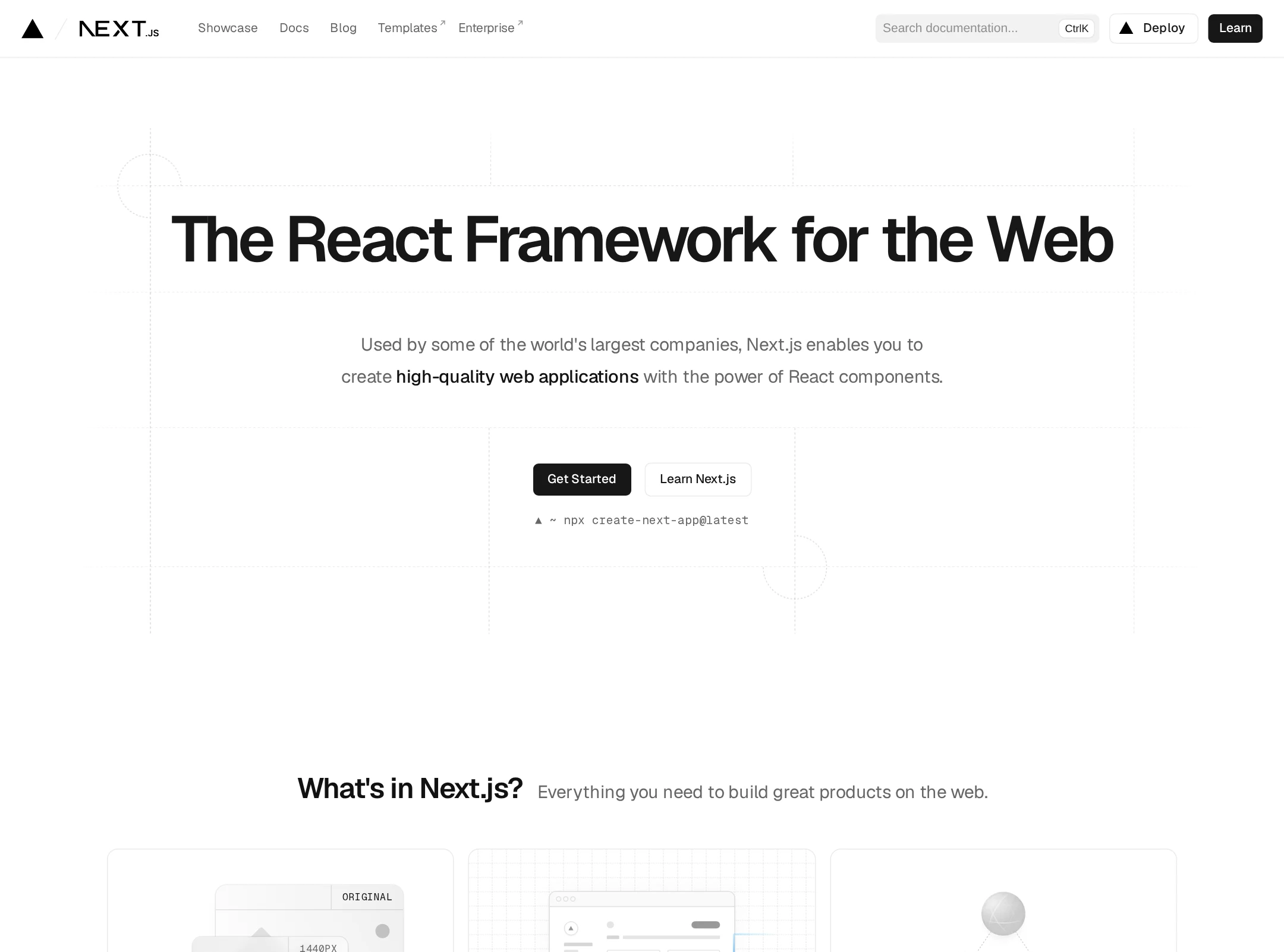
- The hero establishes the product category and audience immediately.
- Navigation, content sections, testimonials, newsletter, and footer create a complete marketing structure.
- The page offers both immediate onboarding and deeper exploration through documentation, templates, and ecosystem content.
- The heading hierarchy has one H1 and no reported heading skips.
Opportunities
- Resolve the reported duplicate IDs, especially in repeated interface and preference controls.
- Audit all 16 reported contrast failures, prioritizing secondary labels, badges, and modal or overlay controls.
- Verify focus indicators, accessible names, form labels, and keyboard operation in the live interface.
- Test the full page at mobile widths and with reduced-motion preferences.
Design
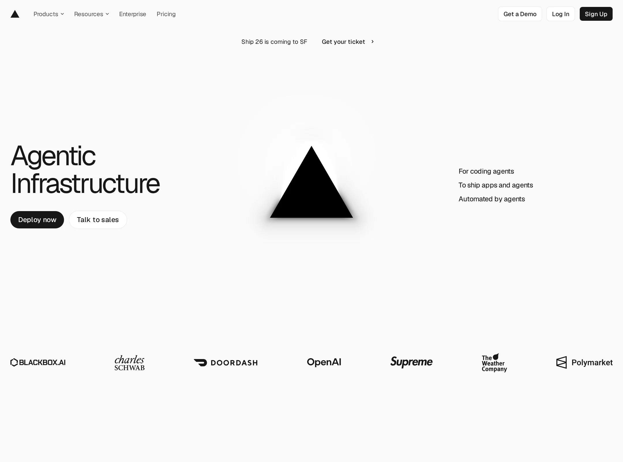
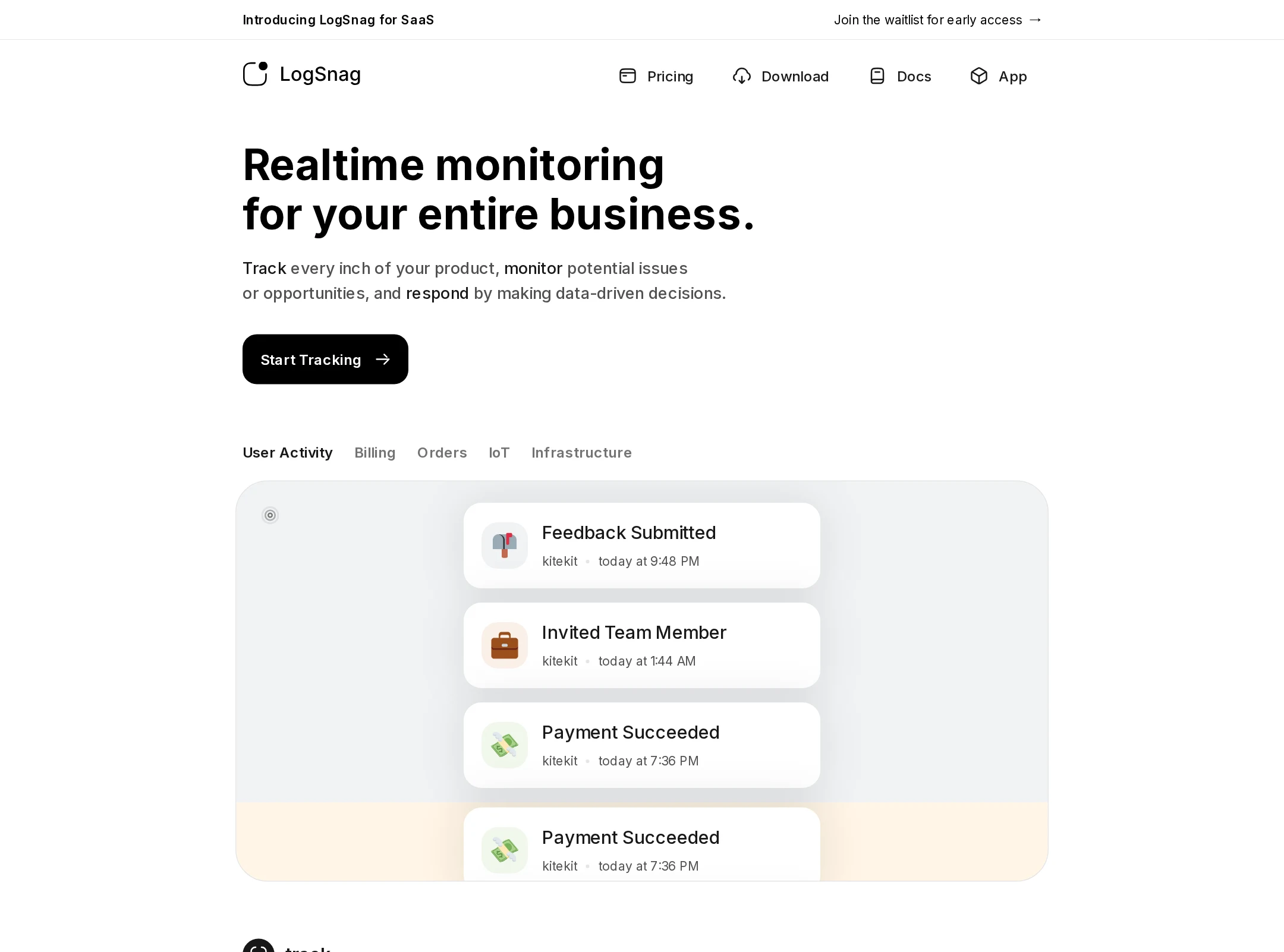
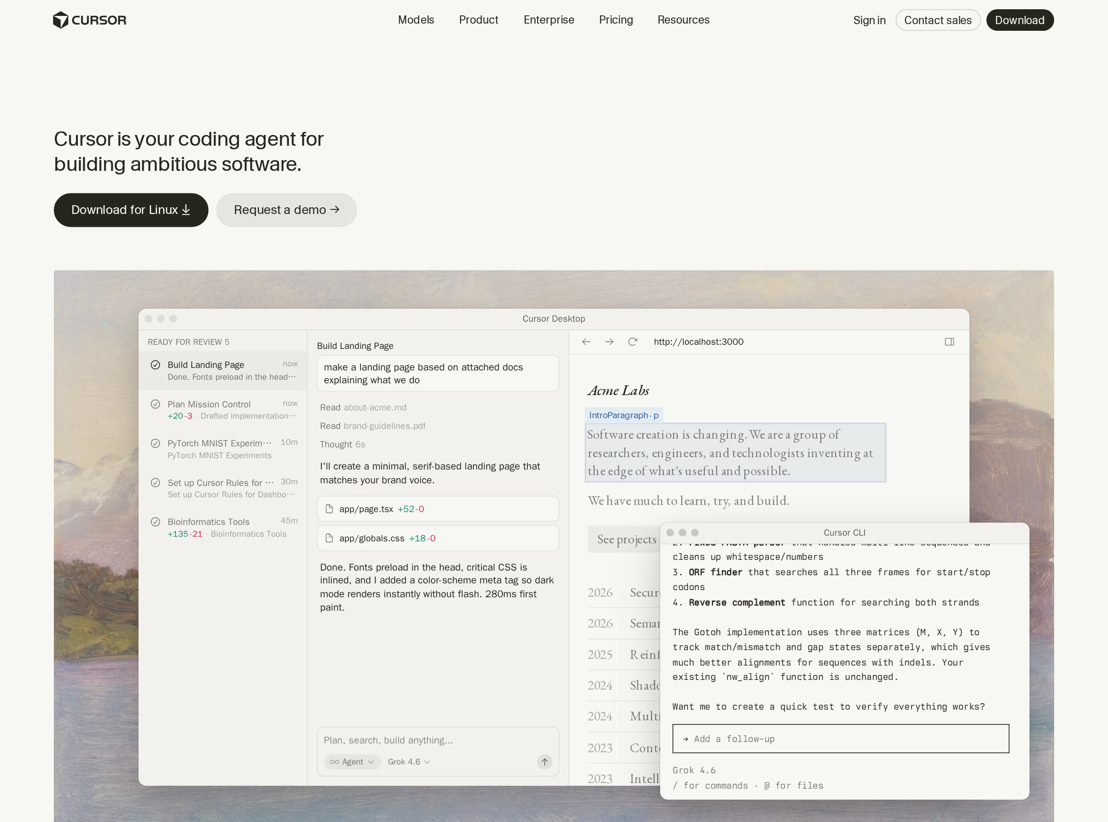
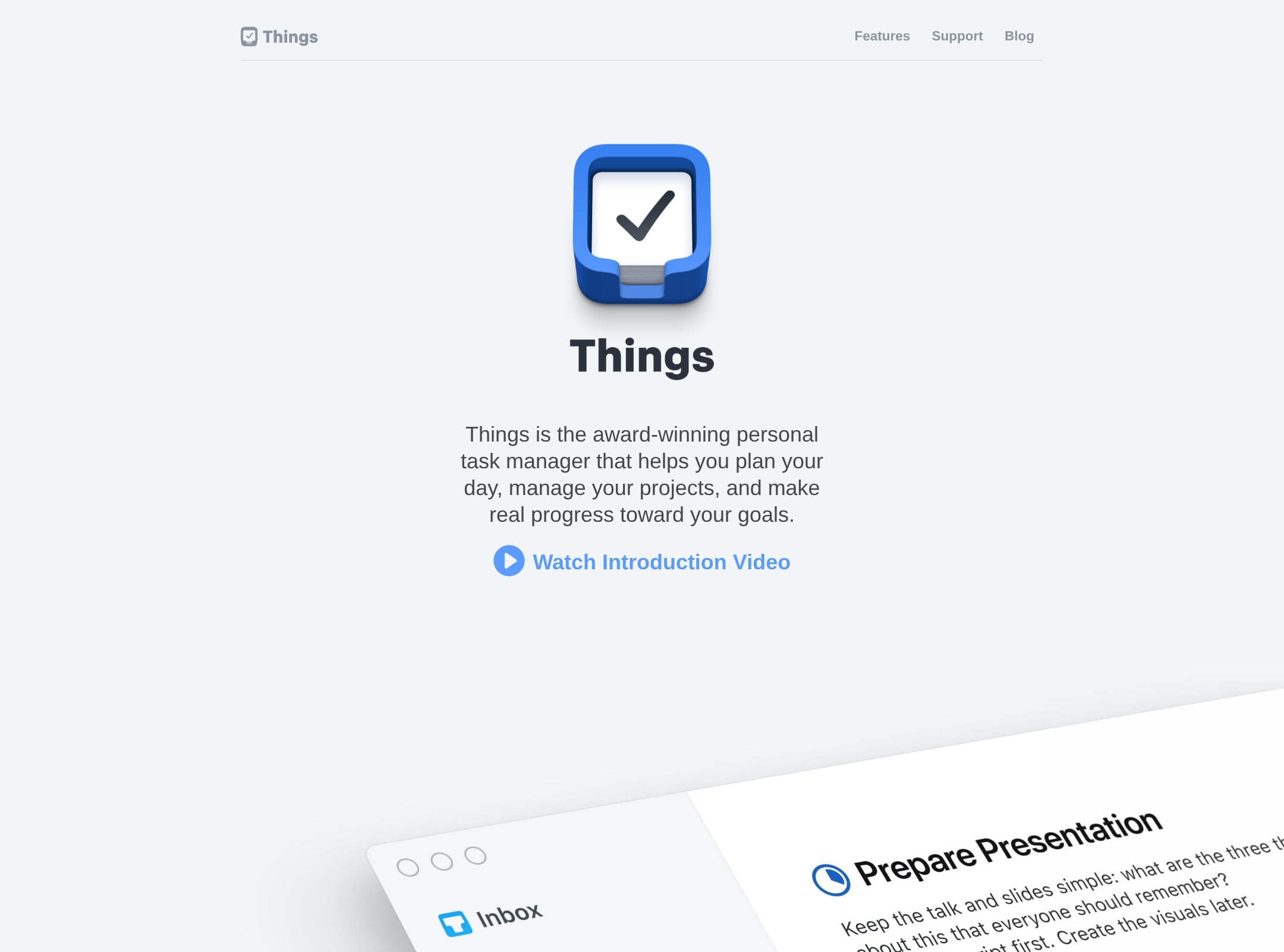
A highly polished, disciplined visual system combines editorial spacing with technical product visualization. The page is confident without relying on excessive color or decorative effects.
What works
- Strong hierarchy from the large hero statement through progressively smaller supporting content.
- Feature cards, diagrams, screenshots, and customer examples add visual explanation to technical claims.
- Consistent borders, radii, spacing, and typography create a unified product language.
- The restrained palette makes the colorful ecosystem and category accents feel intentional.
Opportunities
- Increase visual differentiation between the many similarly weighted card and link treatments.
- Give the primary conversion path slightly more prominence within later sections.
- Consider stronger section-level contrast where long runs of pale surfaces make boundaries less apparent.
Uniqueness
The execution is exceptionally refined, but its monochrome developer-platform vocabulary, modular cards, ecosystem logos, and customer collage sit within a recognizable category convention.
What works
- The technical diagrams and interactive-looking previews provide more product specificity than a generic SaaS layout.
- The progression from framework capabilities to tooling and real-world sites gives the page a credible, ecosystem-centered identity.
- The typography and restrained art direction feel cohesive rather than assembled from unrelated marketing patterns.
Opportunities
- Develop one or two more unmistakable visual motifs tied specifically to the framework's architecture or developer workflow.
- Reduce reliance on familiar logo grids and testimonial conventions by using more distinctive proof formats.
User experience
The page is easy to scan and supports multiple intents, from learning what Next.js is to starting a project or browsing examples. The audit findings introduce uncertainty around accessibility for some users.
What works
- The content sequence follows a sensible learning path from definition to capabilities, tooling, setup, and validation.
- Feature cards make a broad technical surface area scannable without requiring a long uninterrupted text block.
- Search is prominent in the navigation and the hero provides both a quick-start action and a learning action.
- The footer groups resources and related destinations in a predictable way.
Opportunities
- Improve low-contrast secondary content and badge text identified by the automated audit.
- Clarify which cards are educational destinations versus interactive demonstrations through more explicit affordances.
- Confirm that dense visual showcases have meaningful alternative text and remain understandable without imagery.
- Validate reading order and touch interaction at narrow widths.
Conversion optimization
For a framework adoption page, conversion is defined by starting a project, reading documentation, exploring templates, and building confidence. The page supports each of these actions effectively, though the number of destinations can diffuse focus.
What works
- The hero places quick-start and educational actions together for different levels of intent.
- A copyable project-creation command lowers friction for technically ready visitors.
- Starter templates and customer examples provide practical proof beyond feature claims.
- Testimonials and ecosystem tooling reinforce trust without overwhelming the primary message.
Opportunities
- Make the preferred first action more visually dominant for visitors arriving with high implementation intent.
- Add clearer contextual labels or outcomes to secondary calls to action so users can predict where each path leads.
- Repeat a concise start-building action after the proof sections for visitors who decide later in the page.
- Ensure the newsletter form has a visible, accessible label and clear feedback after submission.
What we'd improve
- 01high
Repair accessibility defects
Remove duplicate IDs and remediate the 16 reported contrast failures, then retest controls, badges, overlays, and secondary text with keyboard and assistive-technology checks.
- 02high
Validate responsive and reduced-motion behavior
Review the hero, card grids, customer collage, navigation, and footer at narrow widths and under prefers-reduced-motion; confirm that visual previews do not obscure or reorder essential content.
- 03medium
Strengthen the primary adoption path
Choose one dominant first-step action for the hero and reinforce it after the customer-proof section while retaining documentation as the clear secondary path.
- 04medium
Improve content affordances
Use more explicit labels or supporting cues for cards and showcases so visitors can distinguish documentation, templates, demonstrations, and external examples before activating them.
- 05low
Add a more distinctive signature motif
Tie a recurring visual device to framework architecture or the developer workflow to make the page more recognizable beyond its polished monochrome developer-platform conventions.