Minwook Shin — Design Engineer website analysis
A detailed critique of the homepage's craft, originality, usability, and ability to move visitors toward its intended goal.
Our observations
A polished, distinctive minimalist portfolio homepage with strong hierarchy and excellent restraint. It is suitable for publication, though project context and small-scale readability could be improved.
Best practices
The page has a single main landmark, one H1, no detected heading skips, no duplicate IDs, and no sampled contrast failures. Its compact structure also keeps the primary task—understanding the person and exploring work—clear.
What works
- Semantic structure is clean in the supplied observations, with one H1 and one main region.
- The introduction, contact actions, and project choices form a logical reading order.
- The restrained visual system avoids clutter and unnecessary decorative sections.
Opportunities
- Verify focus visibility and target sizing across the small inline controls, especially on touch devices.
- Test text enlargement and narrow viewports because the design uses compact type and inline link treatments extensively.
- Confirm that all project imagery has useful alternative text and that animated or transitioning states remain understandable without motion.
Design
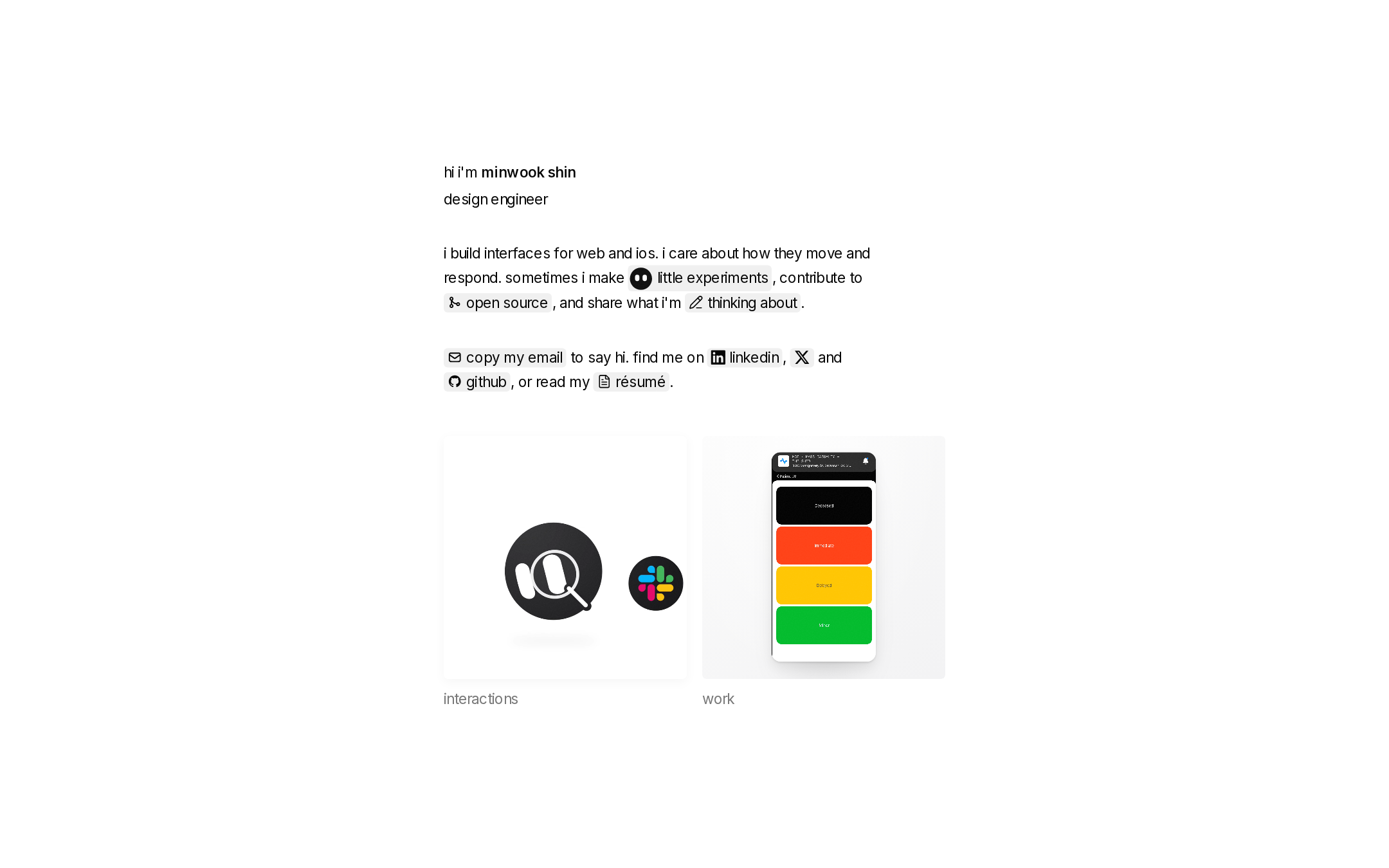
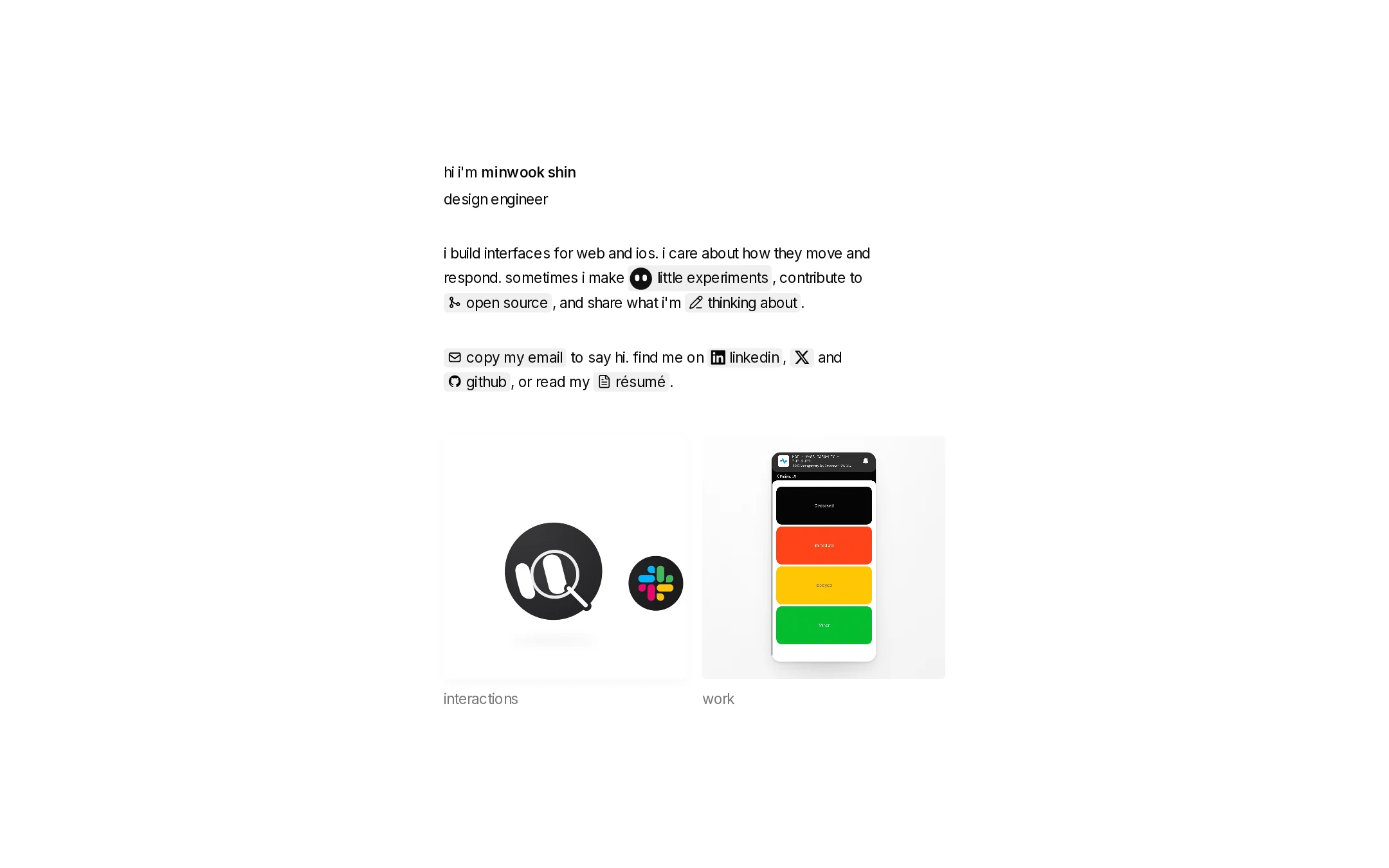
The homepage demonstrates unusually strong compositional restraint. Its centered editorial layout, monochrome palette, and carefully integrated project imagery create a memorable personal identity without relying on excess decoration.
What works
- Generous negative space gives the introduction and project selection clear visual priority.
- The pale inline surfaces distinguish actions while preserving the calm monochrome character.
- The two project cards create a balanced visual anchor beneath the text-led hero.
- Small icons and signature treatment provide personality within an otherwise highly minimal system.
Opportunities
- Increase the visual distinction between secondary labels and actionable card titles if more projects are added.
- Consider slightly stronger separation or framing for project metadata so the work’s context is legible at a glance.
- Ensure the signature-like identity treatment has a clear text equivalent in every state.
Uniqueness
The page feels authored rather than template-driven, particularly in its conversational introduction, inline editorial links, and unusually sparse portfolio structure. Its minimalism is familiar in broad terms, but the combination of micro-interactions and personal voice gives it a distinct point of view.
What works
- The inline narrative turns navigation into part of the personal introduction.
- The small icon-led actions and custom name treatment make the page recognizable without a large logo.
- The page prioritizes interaction experiments and work as two deliberate categories rather than a generic project grid.
Opportunities
- Use project-specific framing or short outcome statements to make the portfolio’s distinct perspective more evident to first-time visitors.
- A small amount of authored context around the featured work could differentiate the experience further without compromising restraint.
User experience
The core journey is direct: visitors can identify the designer, understand the focus, contact them, and choose between experiments and work. The understated presentation is elegant, although some labels and controls may require careful reading.
What works
- The primary content is visible in the initial viewport and follows a natural sequence.
- Contact pathways are immediately available and include several professional destinations.
- The two-card choice architecture is simple and easy to scan.
- The screenshot shows no obvious visual breakage, and the deterministic accessibility checks found no reported structural issues.
Opportunities
- Make the distinction between experiments and client or professional work more explicit for visitors scanning quickly.
- Provide a stronger preview of what each destination contains, such as format, role, or topic.
- Validate mobile wrapping and touch interaction for the many inline links and compact controls.
Conversion optimization
For a personal portfolio, conversion means creating confidence and encouraging contact or work exploration. The page offers clear contact routes and prominent project entry points, but it could communicate professional value and next steps more explicitly.
What works
- Email contact is placed directly within the introductory content rather than hidden in a footer.
- LinkedIn, GitHub, résumé, and other contact destinations support different visitor intents.
- The featured work cards appear before the end of the visible composition, making exploration easy.
Opportunities
- Add a concise proof point near the work selection, such as the type of products, teams, or outcomes represented.
- Clarify the intended contact action for potential collaborators or hiring teams.
- Use project labels and summaries that answer what was built and what the designer contributed before the visitor clicks.
What we'd improve
- 01high
Add outcome-oriented project context
Give each featured card a short, visible descriptor indicating the project type, contribution, or result. Preserve the minimal layout but reduce the amount visitors must infer from the imagery alone.
- 02high
Test compact controls on mobile and with enlarged text
Run viewport, keyboard, touch, and text-scaling checks on the inline links, copy-email control, social links, and project cards. Confirm that wrapping remains readable and focus states remain visible.
- 03medium
Strengthen the portfolio’s professional signal
Introduce one concise statement near the work section that explains the kinds of collaborations or roles the designer is seeking, without turning the page into a conventional sales pitch.
- 04medium
Clarify reduced-motion behavior
Because the page reports transitions and interactive visual components, verify that state changes remain legible with reduced motion enabled and that no essential information depends on animation.
- 05low
Improve destination previewing
Consider subtle metadata or a one-line preview for experiments and work so visitors can choose a path with more confidence while retaining the two-card composition.