

Raca Design Studio website analysis
A detailed critique of the homepage's craft, originality, usability, and ability to move visitors toward its intended goal.
Our observations
A visually distinctive and credible studio portfolio with a memorable blue editorial treatment, but it needs substantial accessibility and hierarchy refinement before it can be considered exemplary.
Best practices
The page has a single main landmark, consistent controls, a clear project-oriented purpose, and a coherent visual system. However, the audit identifies serious accessibility defects and missing document structure.
What works
- The page has one main landmark and no duplicate IDs.
- Project filters, carousel controls, and project links provide multiple routes into the work.
- The visual system is applied consistently across navigation, gallery, about content, and CTA areas.
Opportunities
- The audit reports 71 contrast failures, including repeated carousel controls.
- Nine links are missing accessible names, including logo and social links.
- There is no H1 and the HTML element has no declared language.
- Add semantic heading structure, meaningful accessible names, explicit language metadata, and verified focus states.
Design
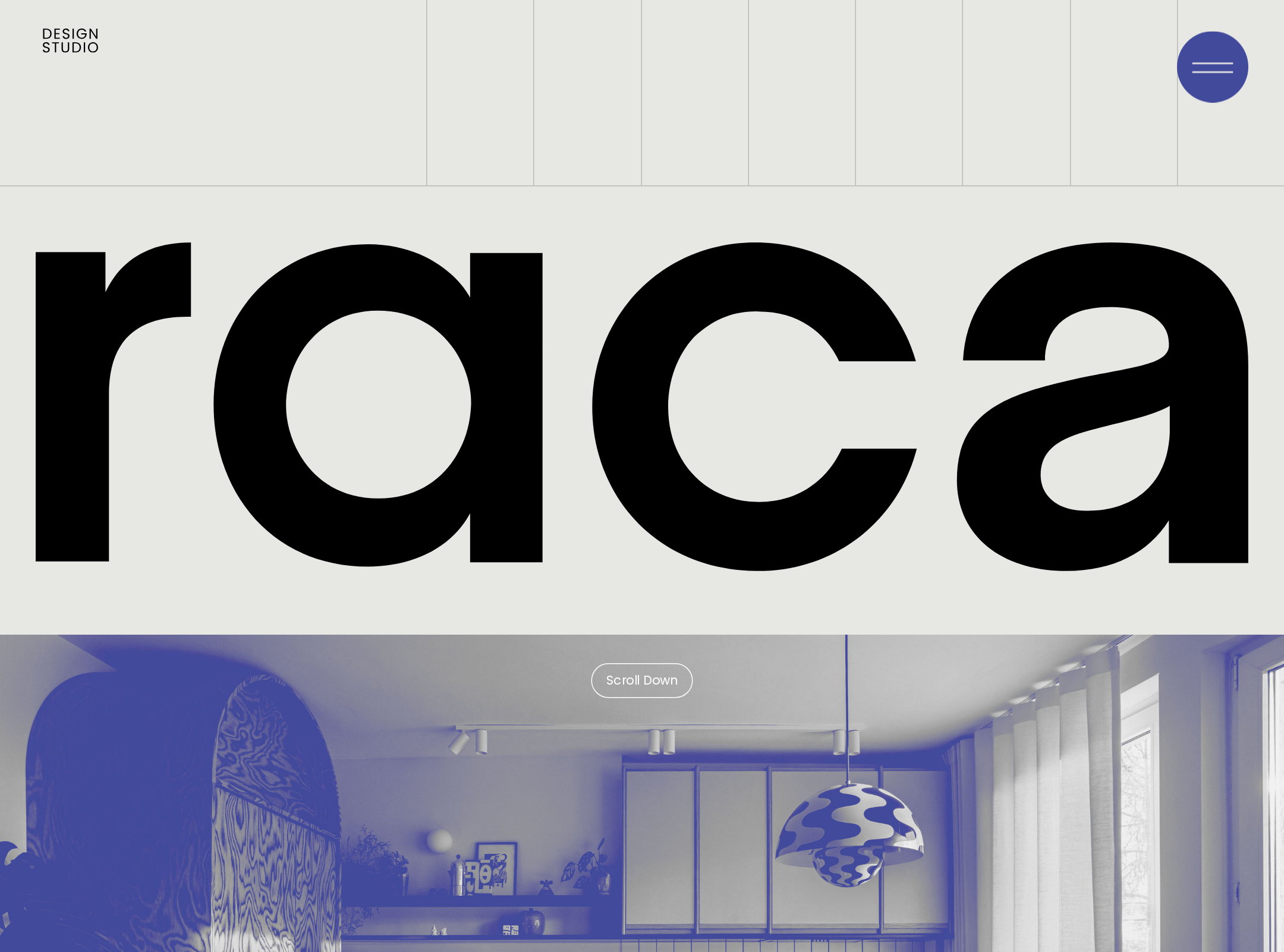
The art direction is strong: oversized branding, a limited palette, repeated blue image processing, and a long editorial gallery create a recognizable studio presence.
What works
- The oversized lowercase wordmark gives the page an immediate and memorable identity.
- The project grid presents a broad body of work without relying on decorative UI chrome.
- Architectural illustrations break up the photographic sequence and reinforce the studio’s design subject matter.
- The restrained use of indigo across imagery, branding, and CTA details creates cohesion.
Opportunities
- The very long project sequence can flatten hierarchy by giving many projects similar visual weight.
- Small captions beneath images are difficult to scan in the narrow screenshot.
- Clarify the relationship between featured work, filtered work, and supporting content with stronger section-level emphasis.
Uniqueness
The combination of blueprint-like indigo imagery, large typographic branding, and interior-design documentation feels more authored than a generic agency portfolio template.
What works
- The duotone treatment functions as a recognizable editorial signature.
- Line-based architectural studies add a distinctive visual category alongside photographs.
- The page’s repeated wordmark framing gives the experience a strong beginning and ending.
Opportunities
- The treatment is applied so broadly that individual projects can lose their own character.
- Allow selected projects or case studies to retain more natural imagery where material detail and color are important.
User experience
The page communicates that the studio has a substantial portfolio, but the experience is long, visually dense, and weakened by inaccessible controls and limited structural hierarchy.
What works
- The project collection is immediately available and visually browsable.
- Filtering by project type gives visitors a way to narrow the portfolio.
- The inquiry CTA appears after the studio introduction and supporting content, providing a clear next step.
Opportunities
- Add a visible, descriptive H1 that explains the studio’s offering rather than relying on the logo alone.
- Give every logo, social, reset, carousel, and image link a meaningful accessible name.
- Improve contrast for pagination, controls, and low-emphasis text; the audit currently reports widespread failures.
- Provide clearer project metadata and stronger focus indicators so visitors can understand and operate the grid without depending on image recognition.
Conversion optimization
For a design-studio portfolio, the page successfully establishes visual credibility and ends with a direct project invitation. Conversion is moderated by the lack of an immediately explicit value proposition and the amount of browsing required before contact.
What works
- The supplied meta description clearly positions the studio around personalized, durable forms and spaces.
- The portfolio volume provides evidence of capability and range.
- The closing question about a project creates a relevant inquiry moment rather than an unrelated sales pitch.
Opportunities
- State the studio’s services, location, and ideal client more explicitly near the beginning of the page.
- Expose a contact or consultation route earlier for visitors who are ready to engage.
- Add concise project descriptors, roles, and outcomes to turn visual browsing into stronger proof of expertise.
- Ensure the final CTA and its supporting links remain legible and keyboard-accessible across image and color contexts.
What we'd improve
- 01high
Repair the accessibility foundation
Add a real H1, set the document language, provide accessible names for the nine unlabeled links, and audit keyboard focus and carousel announcements. Resolve the repeated contrast failures before publication.
- 02high
Improve project hierarchy
Separate featured work from the full archive, make project titles and categories easier to scan, and provide concise descriptive metadata so the gallery is not experienced as one uninterrupted image stream.
- 03medium
Clarify the opening proposition
Pair the oversized logo with a short, visible statement of services and audience based on the studio’s positioning, then offer an early contact path for high-intent visitors.
- 04medium
Reduce visual monotony in the image treatment
Use the indigo treatment as a signature layer while allowing selected case studies to show natural material, lighting, and color detail.
- 05low
Make the mobile gallery easier to navigate
Review caption sizing, spacing, touch targets, carousel controls, and the length of the page at narrow widths; test intermediate breakpoints and reduced-motion behavior explicitly.