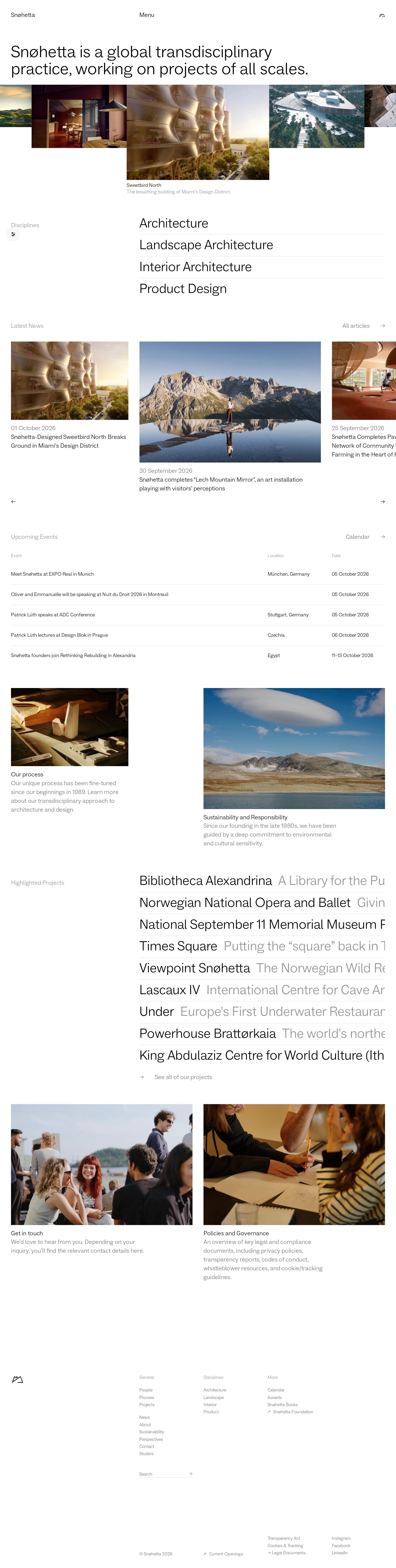
Snøhetta website analysis
A detailed critique of the homepage's craft, originality, usability, and ability to move visitors toward its intended goal.
Our observations
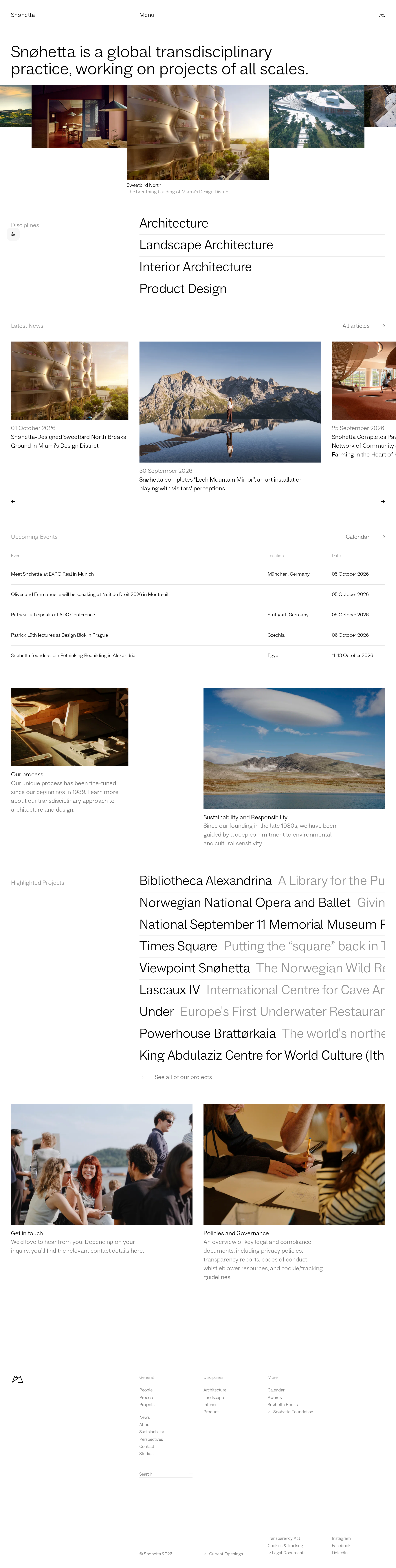
A distinctive and professionally art-directed architecture practice homepage with strong editorial structure and image curation. It merits gallery inclusion, subject to attention to contrast and long-page usability.
Best practices
The page has a clear single H1, one main landmark, no duplicate IDs, and no heading skips in the supplied audit. Navigation, search, carousel controls, event rows, and footer groupings are represented semantically. The principal weakness is serious text contrast performance.
What works
- Clear primary positioning statement and coherent section hierarchy.
- One H1, one main landmark, no duplicate IDs, and no detected heading skips.
- Consistent use of linked imagery, lists, event rows, and footer groupings.
- Controls have descriptive supplied labels such as previous slide, next slide, search, and open preferences.
Opportunities
- Resolve the 31 detected contrast failures, especially muted captions, navigation text, and secondary metadata.
- Verify keyboard focus visibility and carousel operation; these behaviors are not established by the supplied evidence.
- Test image alternative text and heading semantics against the actual rendered content, which cannot be confirmed from the screenshot alone.
Design
The design is disciplined, distinctive, and closely aligned with the visual culture of architecture publishing. Photography, typography, negative space, and ruled lists form a coherent system without relying on ornamental styling.
What works
- Strong opening statement with immediate explanation of the practice.
- Excellent integration of project photography into an editorial information architecture.
- Purposeful variation between image scales, lists, tables, and paired content cards.
- Restrained black-and-white framework gives the work a recognizable professional character.
Opportunities
- Improve the visibility of secondary labels so the minimalism does not become visual ambiguity.
- Clarify section transitions and active states in the long scrolling composition.
- Review tightly constrained project-list lines and captions where text appears clipped or difficult to read in the screenshot.
Uniqueness
The page feels authored rather than template-led. Its combination of transdisciplinary positioning, irregular image sequencing, architecture photography, and project-index typography creates a credible practice-specific identity.
What works
- The image-led editorial approach is appropriate to the subject and more distinctive than a conventional agency grid.
- Irregular image proportions and overlap create a curated, exhibition-like rhythm.
- The page gives equal importance to disciplines, current work, events, projects, and governance.
Opportunities
- Make the practice’s transdisciplinary point of view even more explicit through a stronger relationship between disciplines and featured work.
- Introduce a clearer signature interaction or navigational cue only if it improves orientation without diluting the restrained identity.
User experience
The information architecture is broad and understandable, but the page is exceptionally long and depends heavily on subtle typography and continuous scrolling. The screenshot indicates strong content coverage with some discoverability and legibility costs.
What works
- Content is grouped into recognizable sections such as Disciplines, Latest News, Upcoming Events, and Highlighted Projects.
- A combination of carousels, lists, and cards supports different browsing modes.
- Search and calendar/article pathways provide secondary routes into the content.
Opportunities
- Add stronger wayfinding for the long homepage, such as persistent section context or a more explicit jump-navigation pattern.
- Ensure carousel controls and partially visible neighboring cards remain understandable and usable with keyboard and touch input.
- Increase contrast and text size or spacing for captions, dates, and supporting descriptions.
- Validate mobile behavior, especially horizontal content, event rows, and the large project index.
Conversion optimization
For an architecture practice, the page’s conversion objective is likely reputation building, project discovery, recruitment or contact rather than immediate purchase. It communicates credibility effectively, but the most action-oriented pathways are visually subordinate to the editorial flow.
What works
- The opening statement quickly establishes the organization’s scope and positioning.
- News, events, projects, and governance content provide multiple credibility signals.
- The footer includes organizational navigation, search, and contact-oriented pathways.
Opportunities
- Give the primary contact or inquiry pathway more prominence near relevant project and practice content.
- Make the relationship between disciplines and case studies more actionable for prospective clients or collaborators.
- Use clearer calls to explore selected projects rather than requiring users to infer links from image tiles or text lists.
What we'd improve
- 01high
Repair muted-text contrast
Replace the faintest gray captions, dates, navigation labels, and metadata with accessible contrast against their actual backgrounds, then rerun contrast testing across image overlays and fixed navigation states.
- 02high
Audit the long-page navigation model
Add a clear way to move between major sections and preserve orientation while scrolling, without compromising the editorial composition.
- 03medium
Strengthen contact and inquiry pathways
Surface a more explicit contact route near the practice introduction and relevant project content, while retaining the footer as a secondary destination.
- 04medium
Validate responsive and input behavior
Test the news carousel, event rows, project index, image links, and text wrapping at mobile and tablet widths, including keyboard navigation and touch interaction.
- 05low
Improve project discovery cues
Use consistent, visible affordances for image-linked work and clarify when a title, image, or adjacent arrow leads to a project or article.