

AREA 17 website analysis
A detailed critique of the homepage's craft, originality, usability, and ability to move visitors toward its intended goal.
Our observations
A highly distinctive agency homepage with strong art direction and a credible content structure, held back from an unequivocal top-tier rating by serious accessibility defects, sparse information presentation, and limited visible conversion guidance.
Best practices
The page has a single detected H1, one main landmark, and a logical progression from introduction to industries and updates. Implementation quality is weakened by form and document-structure issues identified in the supplied audit.
What works
- A single H1 is present and the supplied heading data shows no heading-level skips.
- The page includes a main landmark and a semantic footer.
- Content is organized into recognizable sections, including industries and latest updates.
- The page exposes recent content rather than functioning only as a promotional hero.
Opportunities
- Add explicit labels to the three controls identified as missing labels: message, company, and phone.
- Remove duplicate IDs, particularly among newsletter and form fields, so labels, focus behavior, and assistive technology relationships remain reliable.
- Resolve the eight detected text-contrast failures, especially in hero, industry, update, and utility-link treatments.
- Recheck small text sizes and muted gray treatments in the rendered layouts, rather than relying on color alone to establish hierarchy.
Design
The visual language is assured and recognizable, using typography, scale, black-and-white fields, and selective bright color to create an agency-appropriate editorial experience.
What works
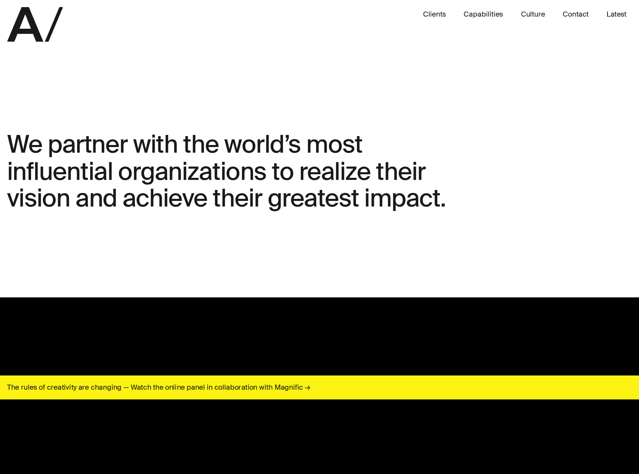
- The large opening statement gives the page a clear visual anchor and communicates positioning immediately.
- Strong black, white, and saturated color transitions create memorable sectional rhythm.
- The update list uses repeated image modules and horizontal separators to create a coherent editorial pattern.
- The restrained SuisseIntl-based typography keeps the otherwise expressive layout controlled.
Opportunities
- Reduce or better justify the extensive empty vertical areas visible in the supplied screenshot so the page feels more intentional at common viewport sizes.
- Increase the visual prominence of key navigation and calls to action without compromising the minimalist system.
- Use a more consistent contrast strategy for text placed over changing backgrounds.
Uniqueness
The page feels materially more art-directed than a standard agency template, particularly through its oversized typographic framing, color-blocked transitions, and editorial update treatment.
What works
- The combination of sparse composition, large-scale statements, and abrupt color fields gives the homepage a strong signature.
- The industries section appears to pair textual categories with changing visual treatments, adding an experiential layer beyond a conventional service grid.
- The recent-update feed supports the agency’s authority without relying exclusively on client-logo decoration.
Opportunities
- Make the distinctive interaction or visual concept more legible to first-time visitors through subtle cues or short explanatory labels.
- Ensure the art direction remains equally effective on smaller screens and in reduced-motion conditions; the supplied evidence confirms transitions and video elements but does not establish their responsive behavior.
User experience
The information architecture is understandable, but the screenshot suggests a slow, highly scroll-dependent experience with limited content density and several accessibility risks.
What works
- The opening message establishes the agency’s purpose before the visitor reaches deeper content.
- Industries and latest updates are easy to identify as separate content groups.
- Update cards provide recognizable image, title, and metadata patterns.
- The page appears to include contact/newsletter form elements, creating potential routes beyond passive browsing.
Opportunities
- Provide clearer section navigation or stronger progress cues for a homepage with substantial vertical length.
- Improve readability of low-contrast and very small text, including industry links and update metadata.
- Test the transitions and four videos with reduced motion enabled; the supplied audit reports transitions and video elements but does not verify their behavior in that mode.
- Correct the form labeling and duplicate-ID defects before treating the contact experience as production-ready.
Conversion optimization
For an agency homepage, the page communicates credibility through positioning and editorial activity, but the supplied view shows relatively understated action paths and no prominent project or contact prompt near the opening statement.
What works
- The hero makes the agency’s role and ambition clear without excessive copy.
- The capabilities statement and industry list help qualify the agency for prospective clients.
- Recent updates provide evidence of ongoing thinking and activity, supporting trust and authority.
- The visual polish is appropriate for a premium creative-services positioning.
Opportunities
- Place a clearly identifiable contact or start-a-conversation action closer to the hero and repeat it after the capabilities section.
- Add concise links from the capabilities or industry content to representative work, outcomes, or case studies.
- Clarify what each update leads to and make the update-feed action more prominent than a low-visibility utility button.
- Validate every form field with accessible labels and unambiguous IDs before using the form as a lead-generation path.
What we'd improve
- 01high
Repair form semantics and identifiers
Add visible or programmatically associated labels for #message, #company, and #phone_non_hp, then make every newsletter and form ID unique. Verify label-for, error-message, and focus relationships after the change.
- 02high
Resolve contrast failures
Adjust the eight flagged text treatments to meet readable contrast targets across hero, industry, update, and utility-link states. Recheck both static and color-transition backgrounds.
- 03medium
Strengthen the primary conversion path
Add a high-visibility contact or project-enquiry link within or immediately below the hero, and repeat it after the capabilities section so visitors do not need to reach the footer to act.
- 04medium
Improve long-page orientation
Introduce clearer scroll or section cues and review the unusually large blank intervals visible in the supplied screenshot, preserving the editorial pacing while reducing uncertainty about what comes next.
- 05low
Make motion intent clearer
Audit the four videos and 171 transition elements for loading cost, keyboard/focus stability, and reduced-motion behavior. Provide meaningful static fallbacks where motion carries content or navigation context.