A Practice for Everyday Life website analysis
A detailed critique of the homepage's craft, originality, usability, and ability to move visitors toward its intended goal.
Our observations
A visually confident and gallery-worthy studio portfolio with exceptional restraint and strong editorial direction. It should be published, with semantic structure and clearer project discovery identified as the main areas for refinement.
Best practices
The page demonstrates strong visual discipline, readable contrast, a clear navigation landmark, and a focused portfolio purpose. Semantic heading structure is the principal detected weakness.
What works
- Contrast testing reported no failures across the supplied samples.
- A single main landmark and semantic navigation were detected.
- The page establishes a clear visual priority around featured work rather than competing calls to action.
- The limited palette and consistent typography support legibility and brand coherence.
Opportunities
- Add a meaningful H1 that identifies the studio and its primary offering.
- Ensure the carousel exposes clear accessible names, slide state, keyboard controls, and focus treatment.
- Verify that the fixed navigation remains usable at smaller viewport sizes and under zoom.
Design
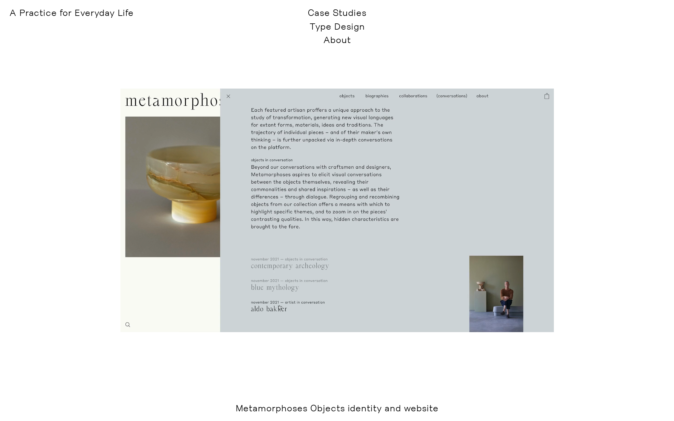
The design is highly resolved, with an unusually calm portfolio composition that makes the featured case study feel like an editorial spread rather than a conventional agency grid.
What works
- Generous white space creates a strong sense of confidence and authorship.
- The custom-looking type treatment gives the identity a memorable voice.
- The case-study preview balances image, interface detail, and supporting project text effectively.
- Neutral UI framing allows the work itself to supply visual variety.
Opportunities
- Introduce a slightly clearer visual distinction between navigation, project metadata, and primary project titles without losing restraint.
- Consider making the studio’s service proposition more visible on the first screen for visitors who do not already understand the work from imagery alone.
Uniqueness
The homepage feels distinctive because of its editorial pacing, typographic restraint, and use of a curated project interface as the hero object. Its uniqueness comes from composition and art direction rather than novelty effects.
What works
- The presentation avoids the familiar agency pattern of a logo, oversized slogan, and tiled work grid.
- The restrained fixed navigation and offset project composition create a recognizable point of view.
- The featured cultural-project imagery reinforces a specific audience and practice.
Opportunities
- Add one or two unmistakable brand signatures beyond typography and whitespace, such as a recurring editorial convention or authored studio statement.
- Make the breadth of the practice easier to understand without diluting the curated presentation.
User experience
The visual hierarchy is clear for an image-led portfolio, but the supplied evidence leaves uncertainty around discoverability, carousel orientation, and non-visual access.
What works
- The primary content is immediately visible and visually prioritized.
- The navigation is short and easy to scan.
- The featured project appears substantial enough to invite further exploration.
Opportunities
- Provide explicit, persistent cues for moving through or opening project work; no prominent carousel controls are visible in the supplied screenshot.
- Pair project imagery with concise, scannable labels and descriptive alternative text.
- Test reading order, focus order, keyboard operation, and reduced-motion behavior across the carousel.
Conversion optimization
For a reputation-building design studio, the homepage makes a strong impression and showcases the quality of the work. Conversion intent is comparatively understated because an inquiry or contact route is not visible in the supplied first-screen view.
What works
- The featured work functions as persuasive proof of capability.
- The restrained presentation is well matched to a specialist cultural design audience.
- Case Studies, Type Design, and About provide the beginnings of a clear path through the practice.
Opportunities
- Expose a direct contact or collaboration route in the primary navigation or near the end of the featured presentation.
- Add concise project descriptors that clarify the studio’s role, not only the project’s visual identity.
- Use a visible next-step prompt after the featured work so interested visitors do not need to infer how to continue.
What we'd improve
- 01high
Add a meaningful primary heading
Introduce one visible H1 that states the studio name or core offering while preserving the quiet typographic hierarchy. This addresses the detected zero-H1 issue and improves orientation for assistive technology users.
- 02high
Clarify carousel interaction
Provide accessible previous/next controls, slide labels, current-position feedback, keyboard support, and a clearly discoverable way to open the active case study. Confirm that motion can be reduced or disabled.
- 03medium
Strengthen the first-screen proposition
Add a short, original statement explaining the studio’s creative direction, design, and type practice so visitors can understand the offer before interpreting the featured visual.
- 04medium
Make contact discovery more direct
Include an unmistakable collaboration or contact link in the persistent navigation or immediately after the featured project, especially for prospective cultural clients.
- 05low
Validate responsive and zoom behavior
Review the large media composition, fixed navigation, text wrapping, and project overlays at mobile widths and increased text sizes; these behaviors are not verifiable from the supplied desktop evidence.