

Warren & Mahoney Architects website analysis
A detailed critique of the homepage's craft, originality, usability, and ability to move visitors toward its intended goal.
Our observations
A visually distinctive and publishable architecture portfolio with excellent art direction, held back from exceptional status by accessibility defects and a demanding long-scroll information structure.
Best practices
The page has a coherent heading structure and one identified H1, but automated evidence flags meaningful accessibility shortcomings.
What works
- A single H1 and sequential heading levels provide a reasonable document hierarchy.
- The page presents a clear portfolio purpose through projects, ideas, people, and social content.
- Duplicate IDs were not detected, and the supplied evidence indicates responsive/mobile-specific structures.
- Images, video, sliders, and editorial text are integrated into a consistent publishing experience.
Opportunities
- Resolve nine detected text-contrast failures, especially gray or overlay text used against variable imagery and pale backgrounds.
- Add accessible names to the two links identified as missing names, likely icon or SVG-based controls.
- Provide a semantic main landmark; the scan reports mainCount as zero.
- Audit keyboard focus, slider controls, video alternatives, image alt text, and reduced-motion behavior before treating the experience as production-ready.
Design
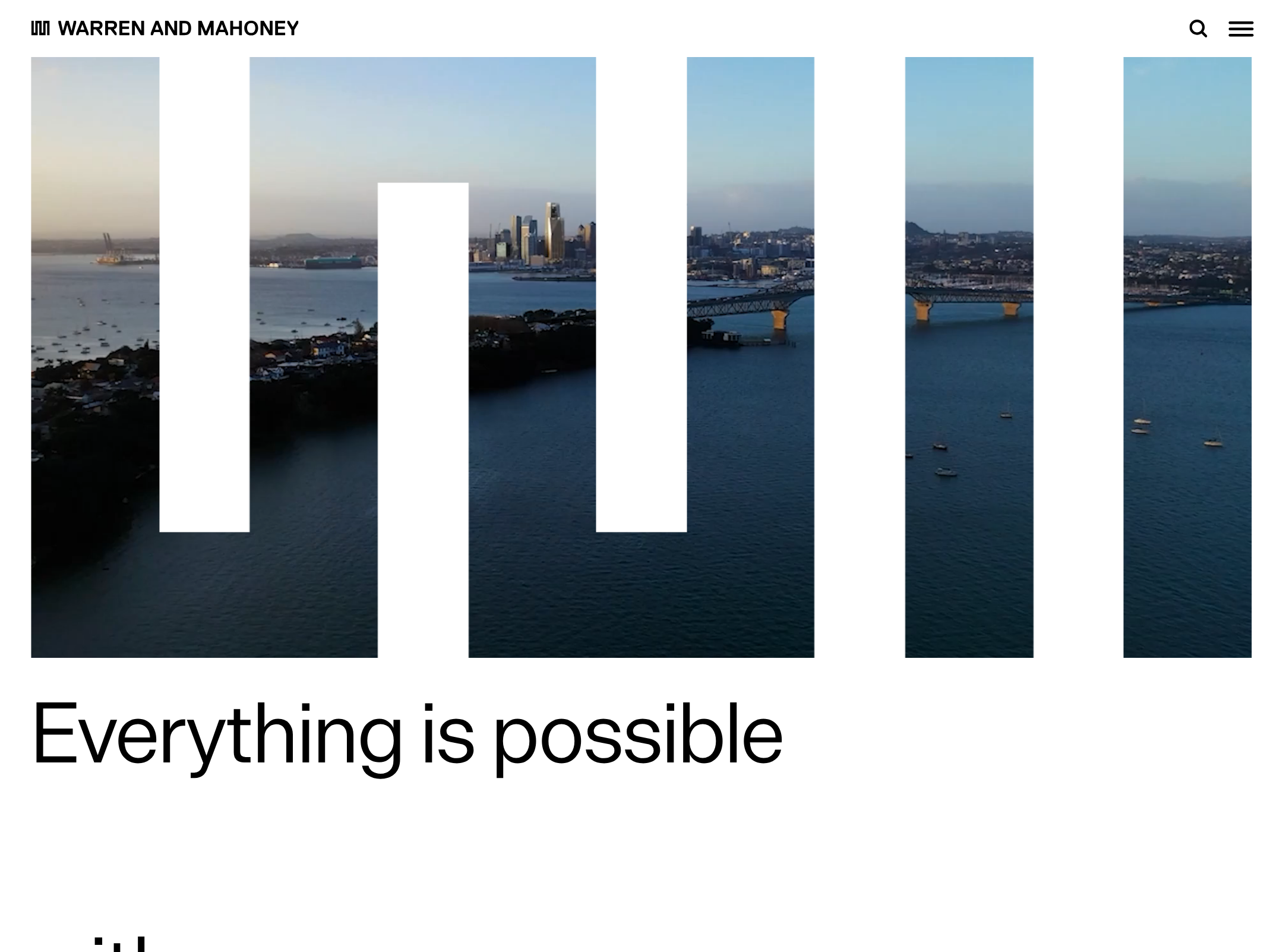
A highly authored visual identity with strong editorial pacing and an unusually effective relationship between architecture imagery and graphic color.
What works
- The geometric accent bars create a distinctive signature without overwhelming the photography.
- Large-scale type and generous negative space give the portfolio a confident, publication-like tone.
- Project imagery is varied and emotionally legible, balancing finished architecture with people and cultural activity.
- The flat, borderless component language feels appropriate to a contemporary architecture practice.
Opportunities
- Make section labels and navigation cues slightly more explicit so visual experimentation does not reduce orientation.
- Ensure graphic overlays never compete with project titles or critical metadata.
- Consider a persistent or periodic wayfinding cue on the very long homepage.
Uniqueness
The combination of architectural storytelling, irregular color geometry, and editorial scrolling feels strongly authored and differentiated from standard architecture-firm portfolio templates.
What works
- Color is used as a structural motif rather than a generic brand accent.
- The page avoids the familiar hero-plus-project-grid formula.
- The visual language connects cultural documentation, built work, and studio positioning in one continuous sequence.
Opportunities
- Develop a few additional signature conventions for project metadata or location information to make the system even more ownable.
- Keep future content additions within the established visual grammar so the homepage does not become a collection of unrelated experiments.
User experience
The experience is visually engaging and content-rich, but its long-scroll format, low-contrast treatments, and sparse navigation create avoidable friction.
What works
- The page communicates a clear point of view quickly through a strong opening statement and immediate imagery.
- Content variety supports multiple visitor intents, including prospective clients, collaborators, talent, and architecture audiences.
- Image-led sections make projects easy to recognize and provide strong browsing momentum.
Opportunities
- Improve contrast for gray labels and text placed near images or colored blocks.
- Expose stronger section landmarks or a compact contents mechanism for visitors who want to reach projects, people, ideas, or contact information directly.
- Make slider state and controls clearly perceivable and keyboard operable.
- Test the narrow and intermediate layouts for text wrapping, cropped imagery, and the placement of offset content.
Conversion optimization
For a practice portfolio, conversion is primarily about establishing credibility and enabling contact or deeper project exploration. The homepage performs well as an impression-making experience but makes next actions less prominent than the visual narrative.
What works
- The opening sequence establishes a recognizable point of view and professional credibility.
- Project and editorial content gives visitors multiple reasons to continue exploring.
- Social links and footer information provide downstream engagement routes.
Opportunities
- Give prospective clients a clearer path to selected work, capabilities, locations, and contact information without requiring a full-page scan.
- Use stronger labels or contextual calls to action around featured projects and practice information.
- Make contact and hiring pathways easier to locate from the header or an early section.
- Preserve the editorial tone while adding concise project metadata that helps visitors assess relevance faster.
What we'd improve
- 01high
Repair contrast and unlabeled controls
Address all nine detected contrast failures and add accessible names to the two unnamed links. Verify these fixes across image overlays, hover states, mobile layouts, and the menu.
- 02high
Add semantic page landmarks
Introduce a semantic main landmark and confirm that header, navigation, content sections, and footer are exposed clearly to assistive technologies.
- 03high
Create stronger homepage wayfinding
Add an accessible contents pattern, persistent section navigation, or clearer early links to projects, people, ideas, and contact so the long editorial scroll remains navigable.
- 04medium
Strengthen project conversion paths
Pair selected project imagery with concise, consistently placed metadata and explicit next actions such as viewing the project, exploring related work, or contacting the practice.
- 05medium
Audit motion and media alternatives
Test the two videos, sliders, transitions, and scroll effects with keyboard navigation and prefers-reduced-motion enabled; provide pause, status, captions, and static alternatives where appropriate.