Inflection AI website analysis
A detailed critique of the homepage's craft, originality, usability, and ability to move visitors toward its intended goal.
Our observations
A memorable and commercially credible AI homepage with unusually strong art direction, held back from gallery-exceptional status by accessibility defects, structural heading issues, and dense decorative composition.
Best practices
The page communicates a clear organization and includes direct product, app-store, research, and policy paths. However, the automated accessibility score is 64, with serious link naming and contrast issues, heading skips, duplicate H1 elements, and no main landmark detected.
What works
- Clear navigation labels and visible paths to Pi, Labs, Blog, and About Us.
- Product and research offerings are separated into understandable content areas.
- The footer exposes product, company, and policy destinations rather than hiding them.
- No duplicate IDs were detected in the supplied evidence.
Opportunities
- Give every linked image and icon-only link an accessible name.
- Resolve the two detected text-contrast failures, particularly in supporting copy.
- Use one logical H1 and repair the skipped H4/H5 heading sequence.
- Add a semantic main landmark and verify focus states, keyboard order, and alternative text.
Design
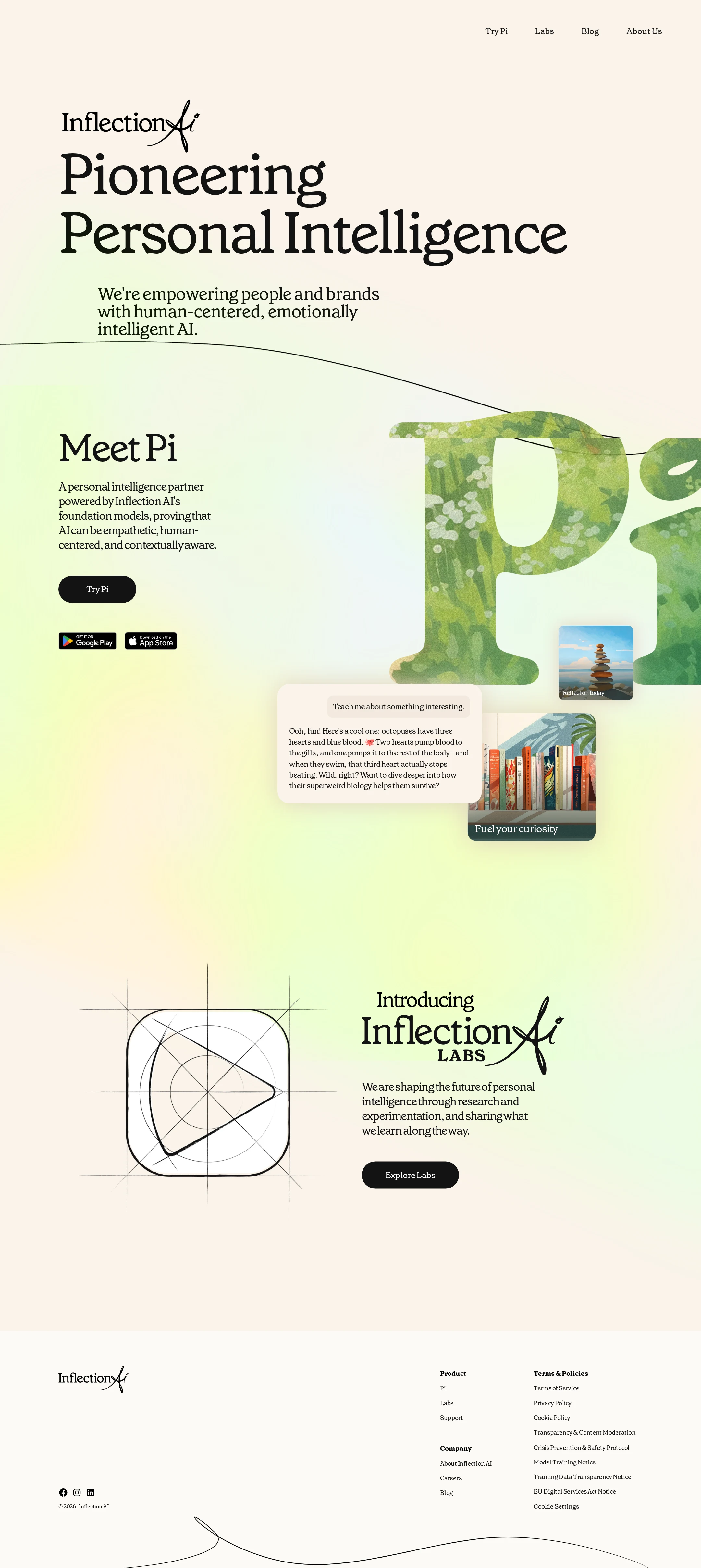
The visual system is confident and cohesive. Serif display typography, organic contours, pale color fields, and textured product imagery establish a recognizable emotional position for an AI company.
What works
- Strong contrast between monumental display type and restrained utility text.
- The Pi section turns product features into a tangible visual narrative instead of relying only on abstract claims.
- The Labs area adds a second visual rhythm and reinforces the research-oriented brand story.
- The warm palette and botanical imagery differentiate the page from typical dark or neon AI branding.
Opportunities
- Reduce competition between the oversized Pi artwork and the supporting product explanation.
- Make small body copy more comfortable to read without sacrificing the editorial character.
- Ensure decorative linework and collage elements do not obscure content or create ambiguity about interaction.
Uniqueness
The homepage has a distinctive point of view and avoids the familiar dark-dashboard language common to AI company sites. Its combination of literary typography, tactile imagery, and hand-drawn geometry is highly recognizable.
What works
- A clear editorial identity carries from the hero through the product and research sections.
- The product imagery feels specific to personal intelligence rather than generic abstract technology.
- Static linework and botanical textures create a coherent signature across otherwise different sections.
Opportunities
- Push the brand distinction into interaction and product proof, not only visual styling.
- Clarify which visual motifs are functional versus atmospheric so the originality also improves usability.
User experience
The information path is understandable on the supplied desktop view, but readability and semantic structure are weaker than the visual presentation. The evidence does not establish mobile usability, keyboard behavior, or interaction feedback.
What works
- The primary product is introduced early and supported by a visible Try Pi action.
- App-store badges are placed in the product context where visitors are likely to expect them.
- The Labs feature creates a clear secondary journey without overwhelming the main product message.
- Navigation remains visually quiet and easy to locate at the top of the page.
Opportunities
- Increase the size, contrast, and line spacing of supporting paragraphs and footer links where needed.
- Correct missing accessible names so screen-reader users receive equivalent navigation cues.
- Use a coherent heading hierarchy to improve scanning and assistive-technology navigation.
- Test the layered visual section at narrow widths and with zoom, since the supplied evidence only shows a wide desktop composition.
Conversion optimization
For a brand homepage whose apparent goals are introducing Pi and directing visitors toward Labs, the page provides appropriate calls to action and product context. Conversion is softened by the understated navigation, visual competition, and limited evidence of trust or product proof beyond the presentation itself.
What works
- The Try Pi action is visible alongside a concise product explanation and download badges.
- The Labs action gives research-oriented visitors a distinct next step.
- The product interface imagery helps make the offering more concrete than a purely abstract AI claim.
- The page maintains a focused set of primary journeys rather than presenting many competing buttons.
Opportunities
- Make the primary Pi action more prominent and reinforce it with a short, concrete benefit or product proof point.
- Improve CTA and link accessibility so all visitors can identify their destination and purpose.
- Add concise evidence of product capability, availability, or trust near the first conversion point if appropriate to the business goal.
- Consider a clearer visual distinction between informational navigation and conversion-oriented actions.
What we'd improve
- 01high
Repair the accessibility foundation
Add meaningful accessible names to the seven unnamed links, fix the two contrast failures, add a main landmark, and verify image alternative text and focus visibility across navigation, app-store badges, and decorative media.
- 02high
Normalize document structure
Reduce the page to one meaningful H1 and replace the skipped H4/H5 sequence with a logical heading hierarchy that reflects the hero, Pi, Labs, and footer sections.
- 03medium
Improve supporting-text legibility
Increase the readability of the small product and footer copy through stronger contrast, more generous line spacing, or slightly larger type while preserving the editorial display scale.
- 04medium
Strengthen the first conversion moment
Pair the Try Pi action with a sharper benefit statement or concise proof point, and make its visual priority clearer without introducing additional competing CTAs.
- 05medium
Validate responsive composition
Test the large type, curved linework, overlapping product cards, and app-store badges at mobile widths, browser zoom, and reduced-motion settings; provide a simpler fallback if the layered artwork compromises comprehension.
- 06low
Separate decorative and functional visual language
Use consistent affordances for interactive elements so the hand-drawn contours and collage surfaces remain expressive without suggesting that every prominent visual is clickable.