

Moonjar website analysis
A detailed critique of the homepage's craft, originality, usability, and ability to move visitors toward its intended goal.
Our observations
A visually persuasive and distinctive product landing page with strong screenshot storytelling, held back from top-tier gallery status by serious accessibility findings and overly small secondary text.
Best practices
The page has a clear heading structure and a coherent content sequence, but automated accessibility results reveal meaningful quality gaps.
What works
- One detected h1 and a consistent sequence of section headings support the overall information hierarchy.
- The page explains the product through concrete interface examples rather than relying only on abstract claims.
- Repeated visual patterns create a recognizable rhythm across the long-form landing page.
Opportunities
- Resolve the four links reported without accessible names, including links that appear to contain only imagery or iconography.
- Address the 33 reported text-contrast failures, prioritizing muted captions, labels, and supporting copy.
- Add or verify a main landmark and provide meaningful alternative text or adjacent descriptions for major product imagery.
- Test keyboard focus visibility, zoom, text resizing, and reduced-motion behavior; these outcomes are not established by the supplied evidence.
Design
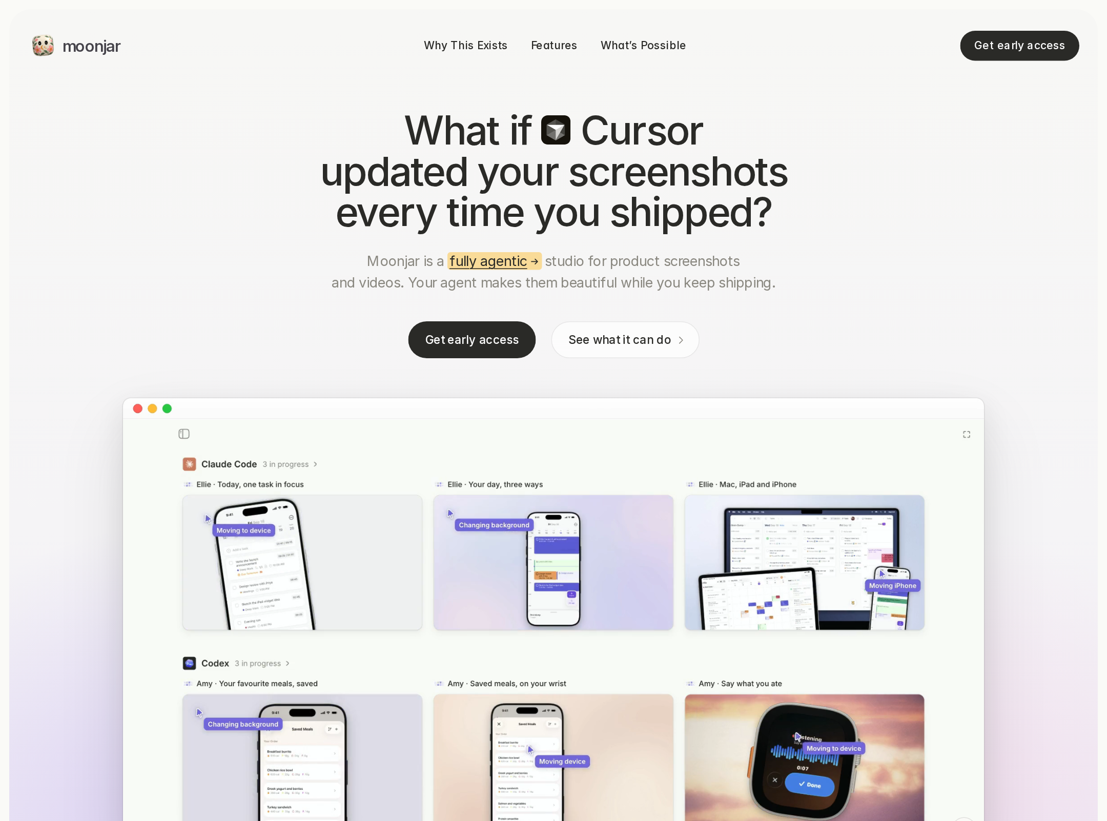
A refined, restrained visual system makes the product feel considered and credible, with interface imagery doing most of the persuasive work.
What works
- The warm neutral canvas gives the product screenshots visual prominence without the page feeling stark.
- Rounded media frames, subtle borders, and soft shadows create depth while preserving a lightweight Mac-software aesthetic.
- The progression from hero demonstration to workflow examples, use cases, differentiation, and founder context feels deliberately art-directed.
- Typography, spacing, and repeated screenshot treatments produce a cohesive editorial presentation.
Opportunities
- Increase the visual distinction between secondary copy and the background so the polished minimalism does not become faintness.
- Give the primary conversion action a more consistently prominent treatment across the page.
- Reduce the density of repeated screenshot panels in selected sections or introduce stronger labels to clarify the unique takeaway of each example.
Uniqueness
Moonjar stands out through its unusually specific focus on agent-generated marketing imagery and its use of real product output as the central narrative device.
What works
- The coding-agent workflow is a differentiated premise compared with generic screenshot or mockup tools.
- The page demonstrates a recognizable range of outputs, from app screens and device compositions to marketing-ready layouts.
- The founder section adds a human point of view without disrupting the product-focused visual language.
Opportunities
- Make the distinctive workflow more immediately understandable to visitors who do not already use coding agents.
- State the strongest differentiator in a concise, plain-language line near the first call to action rather than requiring visitors to infer it from the demonstrations.
User experience
The page is easy to scan visually and offers strong product proof, but small low-contrast text, unnamed links, and image dependence create avoidable barriers.
What works
- The vertical narrative has a sensible progression and gives visitors multiple opportunities to understand the product through examples.
- The section headings are concise and support rapid scanning.
- Replay or demo affordances suggest interactive exploration of selected examples.
Opportunities
- Increase body and caption legibility, especially in feature explanations and screenshot annotations.
- Give every image-only or icon-only link a descriptive accessible name and visible purpose.
- Provide concise text summaries for complex screenshot groups so the page remains understandable without visual inspection.
- Clarify what happens after the primary CTA and whether the app is available only for macOS before the visitor reaches the footer.
Conversion optimization
For a product marketing page, the visual proof is persuasive and the message is coherent, but conversion intent could be made more explicit and less dependent on technical familiarity.
What works
- The hero establishes a compelling relationship between coding agents and automatically maintained screenshots.
- Feature sections demonstrate tangible outcomes, which is valuable for a visually driven product.
- Founder context can strengthen trust for an early-stage or independent product.
Opportunities
- Use a direct primary CTA near the hero with clear platform or availability language.
- Add a short benefit-oriented explanation beneath the headline that translates the agent workflow into a familiar outcome: faster, consistent marketing assets after each release.
- Surface pricing, trial, availability, or setup expectations earlier if those details exist, reducing uncertainty before the final CTA.
- Use captions that explain the business or workflow benefit of each demonstration rather than only identifying what is shown.
What we'd improve
- 01high
Fix contrast and link naming failures
Audit all 33 reported contrast failures and replace faint secondary colors where needed. Add descriptive accessible names to the four unnamed links, including image-only and icon-only controls, then retest keyboard and screen-reader presentation.
- 02high
Strengthen the hero value proposition
Keep the distinctive headline, but add one plain-language sentence explaining that Moonjar turns agent-driven app changes into updated screenshots and store-ready marketing assets. Pair it with a clearly labeled primary CTA and platform availability.
- 03medium
Add text alternatives to visual demonstrations
Provide concise accessible descriptions or adjacent summaries for each major screenshot group, explaining the workflow and outcome rather than merely labeling the interface.
- 04medium
Improve small-text readability
Review captions, annotations, integration labels, and muted supporting copy at normal and enlarged text settings. Increase size, contrast, or spacing where the page currently relies on very small type.
- 05low
Verify motion and responsive states
Test the animated hero and transition-heavy elements with prefers-reduced-motion enabled. Check narrow layouts, text zoom, focus states, and screenshot panels at mobile widths before publication.