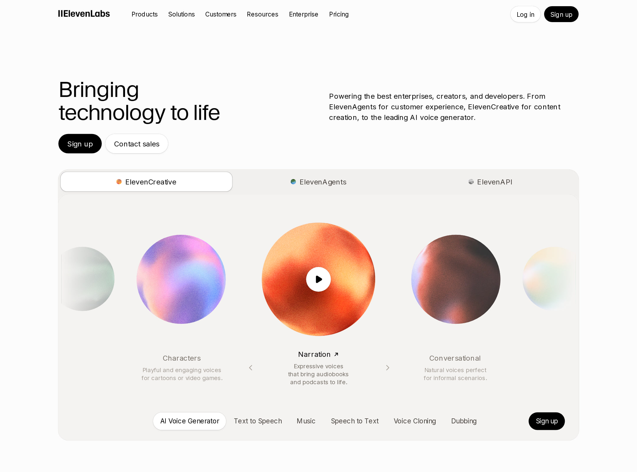
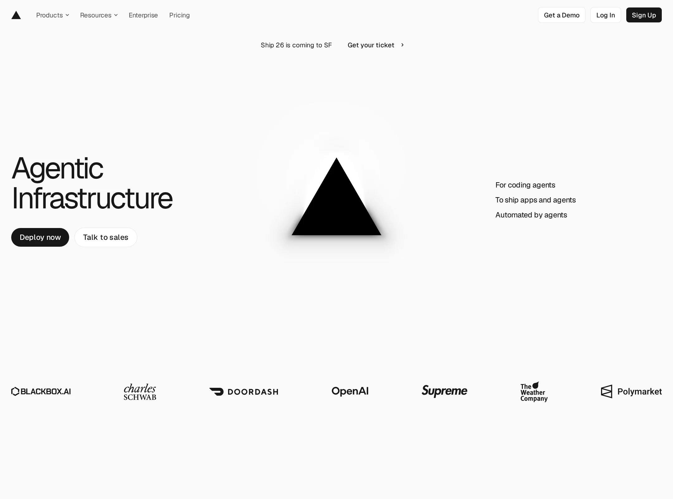
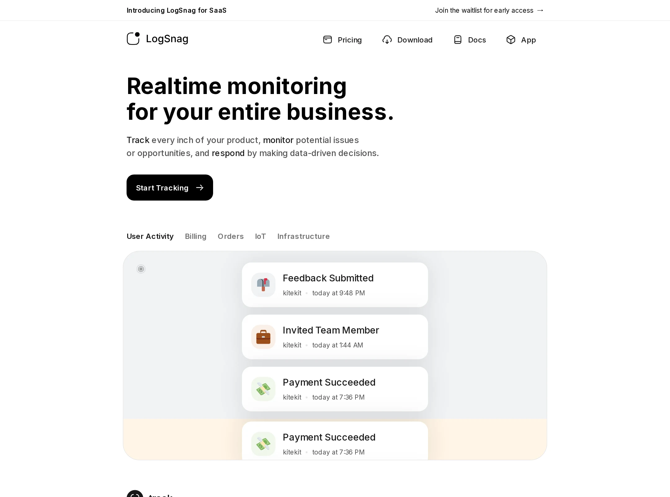
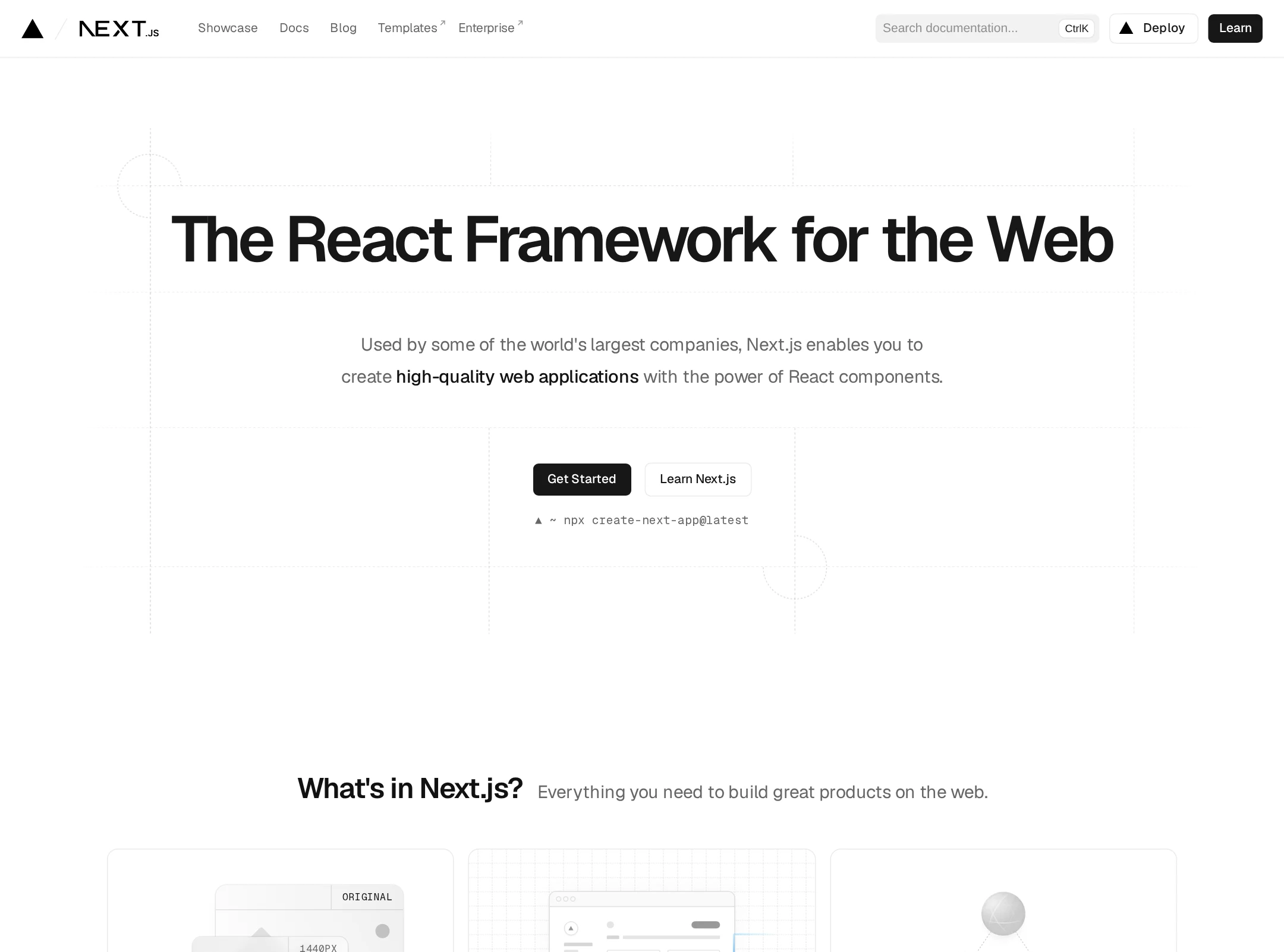
A refined, editorial-style homepage with strong whitespace, a predominantly black-and-white palette, and carefully arranged product demonstrations. The visual system feels cohesive across feature sections, UI mockups, code panels, customer imagery, and card-based content. Typography provides a clear hierarchy, while subtle warm neutrals soften the otherwise monochrome presentation. The page is visually compelling and commercially credible, though its extensive length makes the experience somewhat dense, and the reported contrast failures suggest that some secondary text may be difficult to read. One unlabeled control is also an accessibility issue.