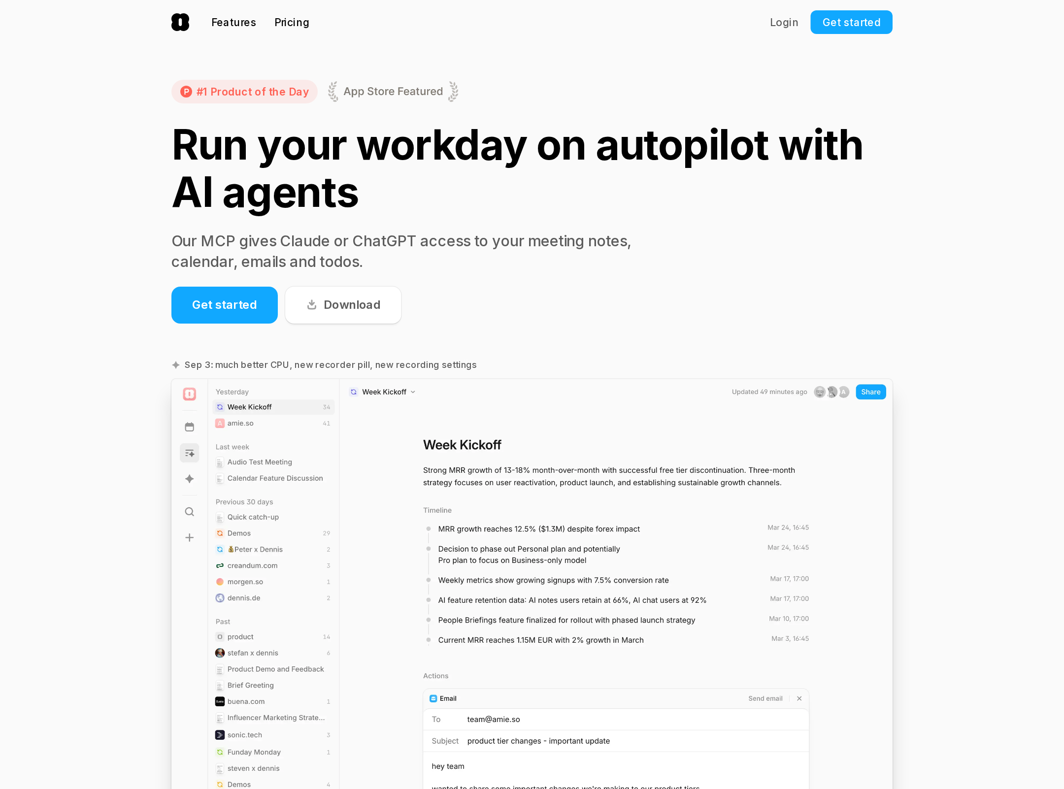


Amie website analysis
A detailed critique of the homepage's craft, originality, usability, and ability to move visitors toward its intended goal.
Our observations
A visually strong and commercially focused AI product landing page whose polished product storytelling is held back by meaningful semantic and contrast issues.
Best practices
The page has strong content coverage and a clear navigation-to-CTA path, but foundational accessibility and semantic issues materially reduce its quality score.
What works
- A sticky navigation includes feature access, pricing, login, and a prominent signup action.
- The page provides substantial product evidence through interface previews, workflow examples, integrations, and FAQs.
- The single main landmark and absence of duplicate IDs support a reasonably coherent document structure.
Opportunities
- Automated evidence reports no H1, leaving the primary page topic unclear to assistive technology and search systems.
- Thirty-five contrast failures are reported across navigation, secondary copy, buttons, and feature content.
- One navigation link has no accessible name, and the HTML document is missing a language attribute.
- The long page should be reviewed for heading hierarchy, keyboard focus visibility, and mobile reading order.
Design
The page has a cohesive, polished product-marketing aesthetic with credible interface-led storytelling and a disciplined component language.
What works
- The light neutral canvas and vivid blue CTA color create a recognizable, focused visual identity.
- Product screenshots and workflow diagrams make the feature story tangible rather than purely promotional.
- Repeated rounded panels, restrained shadows, and consistent typography produce strong visual continuity.
- Color accents help separate feature narratives while preserving a dominant primary action color.
Opportunities
- The extensive sequence of sections can feel visually repetitive because many rely on similar centered copy and product-panel compositions.
- Small supporting text and dense UI screenshots may lose legibility, especially at narrow widths.
- The visual hierarchy would benefit from stronger variation between primary product proof, supporting features, and secondary education.
Uniqueness
The page is more distinctive than a generic AI landing page because it explains workflows through product evidence, though its visual language remains close to current productivity SaaS conventions.
What works
- The emphasis on meeting capture without an intrusive call participant gives the product a specific positioning angle.
- The page connects notes, summaries, actions, integrations, and collaboration into a coherent workflow narrative.
- Color-coded interface demonstrations add character beyond a purely monochrome SaaS presentation.
Opportunities
- The overall combination of rounded cards, blue CTAs, light surfaces, and app screenshots is common across contemporary AI productivity sites.
- A sharper signature device, editorial motif, or more ownable visual metaphor could improve memorability without adding visual noise.
User experience
The information architecture supports exploration and trust-building, but the long scroll, dense content, and accessibility findings create friction for some visitors.
What works
- Visitors can move from an initial promise to concrete use cases, integrations, collaboration, and FAQs without relying on a single abstract explanation.
- The navigation exposes key paths early, while repeated signup prompts support users who convert at different points.
- FAQ controls and workflow examples address practical objections and product questions.
Opportunities
- Introduce stronger section landmarks or a compact contents mechanism so visitors can navigate the long page more efficiently.
- Ensure every small label and secondary action meets readable contrast requirements.
- Add an explicit, correctly structured H1 and confirm that all icon-only links have accessible names.
- Test the narrow layout with real content, keyboard navigation, zoom, reduced motion, and touch interaction.
Conversion optimization
The page is well set up for product-led conversion, using repeated signup prompts and increasingly specific evidence, but the central promise could be made more immediate and the path less lengthy.
What works
- Signup actions appear in the navigation and throughout the page, giving visitors multiple conversion opportunities.
- The page supports its CTA with product screenshots, workflow outcomes, integrations, and answers to common objections.
- The product-led narrative is appropriate for an AI assistant where seeing the workflow is important to adoption.
Opportunities
- Make the primary above-the-fold outcome more concrete for the highest-priority audience before introducing the full feature tour.
- Use a shorter proof path for returning or high-intent visitors, such as a focused trial CTA paired with concise trust and privacy information.
- Differentiate primary conversion prompts from lower-priority download, announcement, or educational actions so the page has a clearer dominant next step.
- Validate whether the page length improves qualified signup rate or causes drop-off between feature sections.
What we'd improve
- 01high
Repair semantic and contrast foundations
Add one descriptive H1, set the document language, provide an accessible name for the unnamed link, and remediate the reported contrast failures across secondary text, buttons, and feature labels. Recheck both light and colored interface surfaces.
- 02high
Clarify the first-screen value proposition
State the primary audience, the immediate meeting-to-workflow outcome, and the main trial action in a compact opening sequence. Keep supporting capabilities below the first product proof rather than making visitors infer the core use case.
- 03medium
Reduce long-page navigation friction
Add visible section navigation or a compact contents pattern, and use stronger visual differentiation between core workflow proof, secondary features, integrations, and FAQs.
- 04medium
Strengthen responsive and assistive interaction
Test the narrow layout at multiple viewport widths, with text zoom and keyboard navigation. Confirm that screenshots do not become unreadable, controls retain adequate touch area, accordions expose state correctly, and decorative animation respects reduced-motion preferences.
- 05low
Develop a more ownable visual signature
Retain the restrained product-led approach but introduce one distinctive recurring visual motif or interaction that is specific to Amie's workflow model, rather than relying primarily on familiar SaaS cards and app mockups.