

Archbee website analysis
A detailed critique of the homepage's craft, originality, usability, and ability to move visitors toward its intended goal.
Our observations
A strong, credible SaaS marketing homepage with effective product evidence and conversion structure. It merits inclusion, while accessibility labeling, duplicate identifiers, and greater visual differentiation remain important opportunities.
Best practices
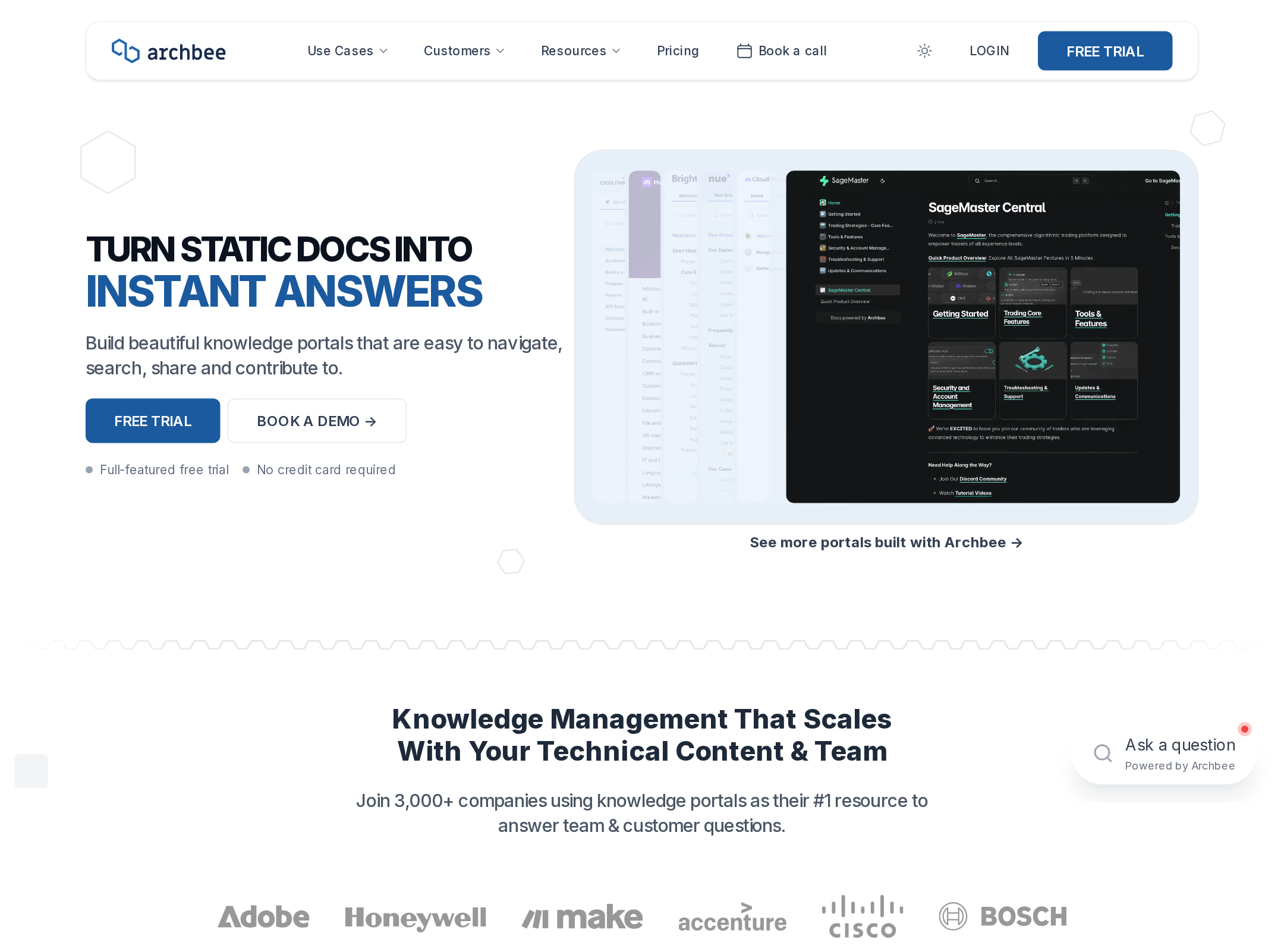
The page demonstrates disciplined hierarchy, semantic sectioning, consistent calls to action, and a coherent content progression. Automated evidence reports one H1, no heading skips, and one main landmark.
What works
- Clear primary and secondary actions appear in the header and hero.
- The page supports feature claims with visible product interfaces and customer evidence.
- Heading structure is orderly in the supplied evidence, with one H1 and no detected heading skips.
- Consistent spacing, borders, radii, and button treatment create a dependable system.
Opportunities
- Five links are reported without accessible names, including the logo and several content links.
- Duplicate IDs are reported for SVG-related elements and should be removed to prevent assistive-technology ambiguity.
- Verify focus visibility, keyboard access to menus and carousels, image alternative text, and reduced-motion behavior manually.
- Review the long page for repeated or low-information sections that may increase cognitive load.
Design
A polished and well-controlled visual system that uses product imagery effectively, though it stays close to established B2B SaaS conventions.
What works
- Strong contrast between dark headline typography, white space, pale product surfaces, and blue actions.
- Product screenshots are framed prominently and function as persuasive visual evidence.
- Alternating layouts and generous section spacing make the long page easier to scan.
- Small geometric and annotation details add energy without overwhelming the interface.
Opportunities
- Introduce a more ownable visual signature beyond the familiar SaaS layout pattern.
- Reduce visual repetition between feature sections by varying narrative formats or evidence types.
- Ensure the geometric decoration remains subordinate to content at all viewport sizes.
Uniqueness
The product-specific screenshots and knowledge-portal examples provide authenticity, but the broader page language is recognizable within the crowded SaaS category.
What works
- The portal examples make the offering feel tangible and differentiated from generic documentation claims.
- Annotated interface visuals communicate workflow concepts more specifically than abstract illustrations.
- The combination of customer portals, integrations, and technical use cases creates a credible category presence.
Opportunities
- Lead with a sharper point of view about why Archbee is meaningfully different from other documentation and knowledge platforms.
- Develop a more distinctive visual motif or editorial device that can carry across the full page.
- Replace some conventional logo-and-feature sequencing with stronger customer outcomes or focused stories.
User experience
The information architecture is understandable and the page offers multiple ways to learn or convert, but its length and unresolved link-label issues reduce confidence in the overall experience.
What works
- The narrative follows a sensible path from product promise to capabilities, proof, integrations, and demo.
- Hero CTAs serve both immediate trial intent and higher-consideration demo intent.
- Feature sections pair concise explanations with product visuals, supporting scanning.
- The fixed navigation keeps important destinations and actions available.
Opportunities
- Make section-to-section navigation or a clearer table of contents available for visitors with specific research goals.
- Clarify the distinction between free trial, login, and demo actions for different buyer stages.
- Audit carousel controls, overflow regions, and decorative animated elements for keyboard and screen-reader usability.
- Shorten or consolidate lower-priority sections to preserve momentum toward the primary conversion.
Conversion optimization
Conversion strategy is strong for a B2B SaaS product: the page establishes a promise, demonstrates the product, supplies proof, and repeats trial and demo opportunities. More outcome-focused evidence could make the path more compelling.
What works
- The hero communicates a specific transformation and places a free-trial action next to a demo option.
- Customer logos, portal examples, testimonials, and integrations address trust and adoption concerns.
- A dedicated demo section and final CTA provide conversion opportunities after product education.
- The page supports both self-serve and sales-assisted journeys.
Opportunities
- Add clearer qualification details around the trial, demo, implementation effort, or target team size.
- Use quantified customer outcomes where substantiated instead of relying primarily on logos and general endorsements.
- Make the strongest customer result or use case visible earlier for visitors who do not scroll deeply.
- Test whether the repeated CTA labels should be more context-specific at different stages of the page.
What we'd improve
- 01high
Repair accessible link naming
Give the logo, media-linked content, and other unnamed anchors explicit accessible names that describe their destination or action. Re-test with an accessibility tree and keyboard navigation.
- 02high
Remove duplicate IDs
Generate unique identifiers for repeated SVG clip paths and other referenced elements, then verify that fragment and ARIA references still resolve correctly.
- 03high
Validate interactive and motion behavior
Manually test dropdowns, carousels, overflow areas, focus states, and animated sections with keyboard navigation, screen readers, touch input, and prefers-reduced-motion enabled.
- 04medium
Strengthen category differentiation
Elevate a sharper Archbee-specific product point of view and carry it through the hero, feature sequencing, and visual storytelling rather than relying mainly on standard SaaS conventions.
- 05medium
Prioritize outcome-led proof
Bring a concrete customer result or use-case story closer to the hero, and support later capability sections with measurable outcomes when those claims can be substantiated.
- 06low
Improve long-page wayfinding
Consider a compact in-page navigation pattern or stronger section landmarks so visitors can move directly to integrations, security, publishing, or customer evidence.