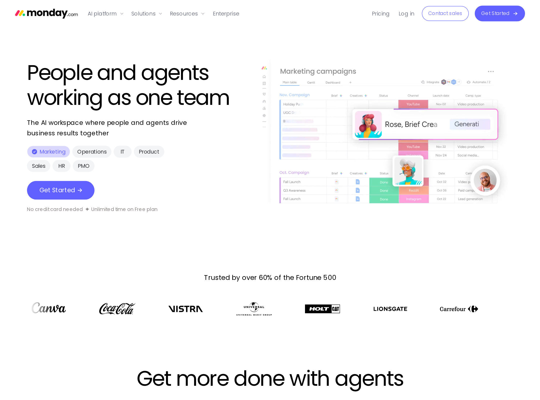
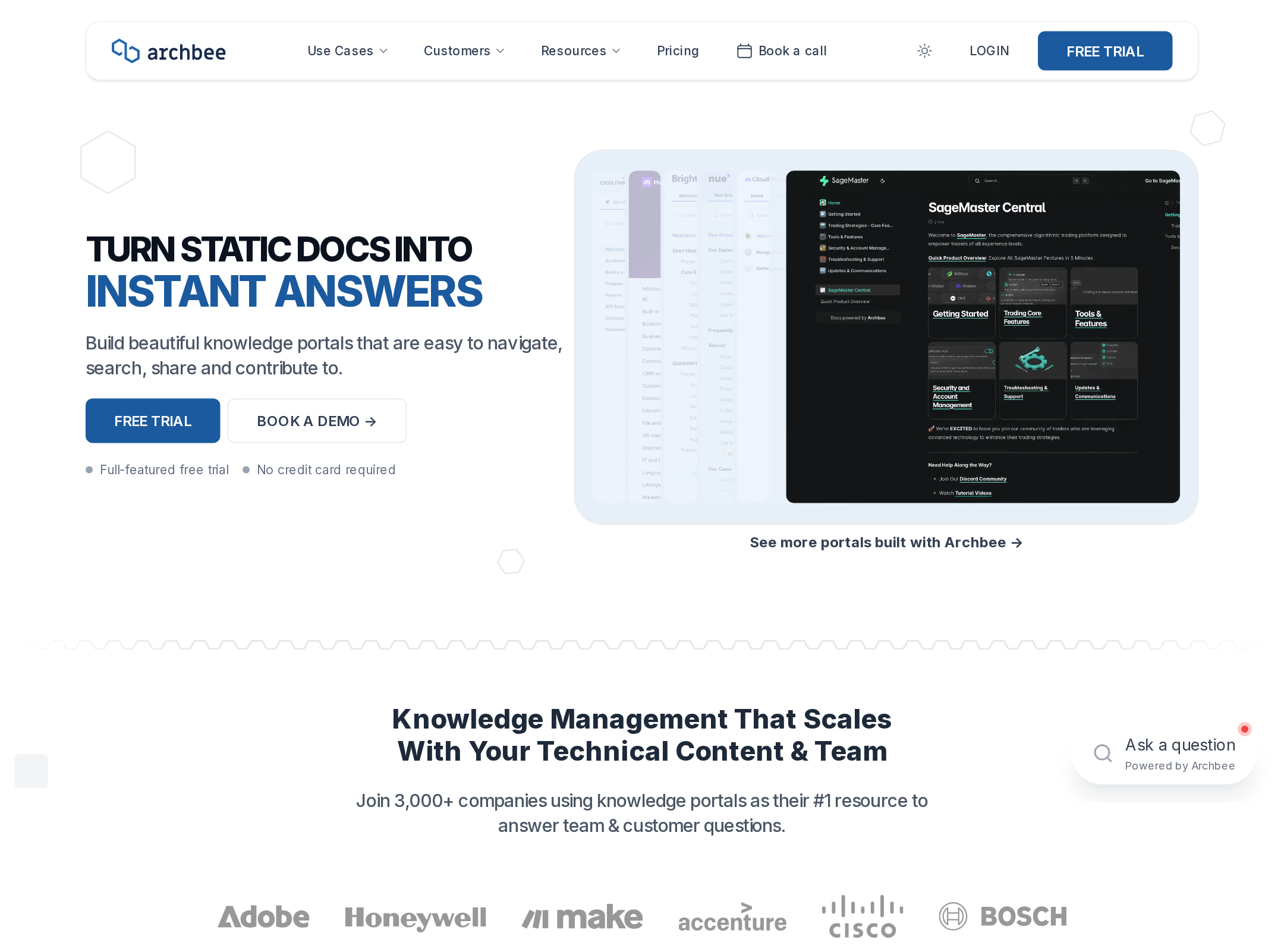
Waastly website analysis
A detailed critique of the homepage's craft, originality, usability, and ability to move visitors toward its intended goal.
Our observations
A strong, polished SaaS presentation with distinctive product visualization and a coherent workflow narrative. It merits gallery consideration after accessibility and legibility issues are addressed.
Best practices
The page has a single clear H1, semantic navigation and main content, repeated conversion opportunities, and an orderly heading hierarchy. Automated evidence identifies meaningful accessibility defects that prevent a higher score.
What works
- The page has one detected H1 and no heading skips.
- Navigation, main content, footer, forms, and product sections are structurally identifiable.
- The product is explained through concrete workflow stages rather than only broad marketing claims.
Opportunities
- Provide an accessible name for the unnamed navigation link.
- Resolve the duplicate waitlist IDs.
- Correct the six reported contrast failures, including low-contrast hero and interface text.
- Test focus states, keyboard navigation, zoom, and reduced-motion behavior before publication.
Design
The visual direction is confident and consistent, combining a saturated blue hero with quiet neutral sections and repeatable product-card treatments. The long page is well art-directed, though the smaller explanatory text and repeated card grids reduce visual ease.
What works
- The opening blue field creates an immediate visual anchor and separates the positioning section from the rest of the page.
- Interface mockups make the platform's operational concepts tangible.
- The recurring muted card palette creates continuity across many feature demonstrations.
- Display typography, spacing, borders, and restrained shadows form a cohesive SaaS system.
Opportunities
- Increase the size or contrast of supporting copy in dense sections.
- Reduce repetition in the long feature gallery or introduce stronger grouping to improve pacing.
- Ensure interface mockups remain legible when viewed on smaller screens or at increased zoom.
Uniqueness
The page stands out through its focus on reviewable website operations and through a broad set of custom interface mockups. Its overall SaaS structure remains familiar, but the workflow framing and operational-control emphasis give it a recognizable identity.
What works
- The watch, triage, draft, and publish progression provides a specific product story.
- The combination of site health, content operations, review, and publishing is more distinctive than a generic AI assistant pitch.
- The colored product panels and operational log treatments reinforce the platform's domain.
Opportunities
- Make the central differentiator more explicit above the fold, especially how the product differs from a general CMS, monitoring tool, or AI agent.
- Add stronger evidence of outcomes or use cases if available, without relying solely on interface previews.
User experience
The page offers a logical scroll journey and several accessible-looking form targets, but its length, compact typography, and reported accessibility problems create avoidable friction. Interactive behavior is only partially verifiable from the supplied evidence.
What works
- The content progresses from product promise to workflow, feature inventory, governance, and final signup.
- Multiple forms and clear button labels support different levels of visitor intent.
- Product previews help visitors understand the proposed workflows without requiring an account.
Opportunities
- Improve contrast in the reported failing elements and verify readability of all mockup labels.
- Give every navigational control a descriptive accessible name.
- Avoid duplicate IDs across waitlist forms.
- Provide a reduced-motion path and verify that animated status cues are not the only way to understand the interface.
Conversion optimization
Conversion intent is clear: the hero and later sections use email capture, while the private-alpha message establishes a concrete next step. The page could convert more efficiently by clarifying audience, value, and trust earlier.
What works
- The hero pairs a direct product promise with an email capture form.
- Private-alpha positioning creates a specific call to action rather than an ambiguous product tour.
- Repeated forms give visitors additional conversion points after learning about the product.
- Feature and workflow sections provide substantial product context before signup.
Opportunities
- Clarify who the product is for in the hero, such as site operators, marketing teams, or small web teams.
- State what happens after requesting an invite and set expectations for the alpha process.
- Add concise trust signals, implementation context, or proof of reliability if available.
- Ensure contrast and accessible naming issues do not undermine the primary signup path.
What we'd improve
- 01high
Repair accessibility blockers
Name the unnamed navigation link, remove duplicate waitlist IDs, and correct all six reported text-contrast failures. Recheck the hero CTA, headings, approval controls, and mockup badges after changes.
- 02high
Strengthen the above-fold proposition
Add a concise audience qualifier and a more specific explanation of the operational problem Waastly solves before the email form, while preserving the existing visual hierarchy.
- 03medium
Improve long-page scanning
Group the feature gallery into clearer categories or reduce redundant cards, and use stronger section-level summaries so visitors can understand the product without reading every mockup.
- 04medium
Validate motion and responsive states
Test the animated pulse, shimmer, spinner, and staged transitions with prefers-reduced-motion enabled. Review mockup legibility, card stacking, form layout, and keyboard focus at narrow widths and high zoom.
- 05low
Add conversion reassurance
Explain the invite flow and, where truthful, add concise evidence about supported stacks, review safeguards, or customer outcomes near the primary signup moments.