Notion website analysis
A detailed critique of the homepage's craft, originality, usability, and ability to move visitors toward its intended goal.
Our observations
A strong, distinctive SaaS homepage with excellent visual hierarchy and product storytelling, held back from top-tier gallery placement by serious automated contrast findings and unresolved duplicate IDs.
Best practices
The page has a clear semantic outline and strong content organization, but automated accessibility findings materially reduce its best-practices score.
What works
- Exactly one H1 and no detected heading-level skips.
- The page exposes semantic navigation, main content, and footer regions.
- Primary and secondary conversion actions are consistently available.
- Feature, proof, and closing CTA sections form a recognizable marketing narrative.
Opportunities
- Automated checks report 12 contrast failures across links, testimonials, and accreditation text, with serious impact.
- Two duplicate IDs are reported, including repeated product and resources targets, which can impair navigation and assistive technology relationships.
- Verify visible keyboard focus states, accessible names for media controls, and reduced-motion behavior in a full audit.
Design
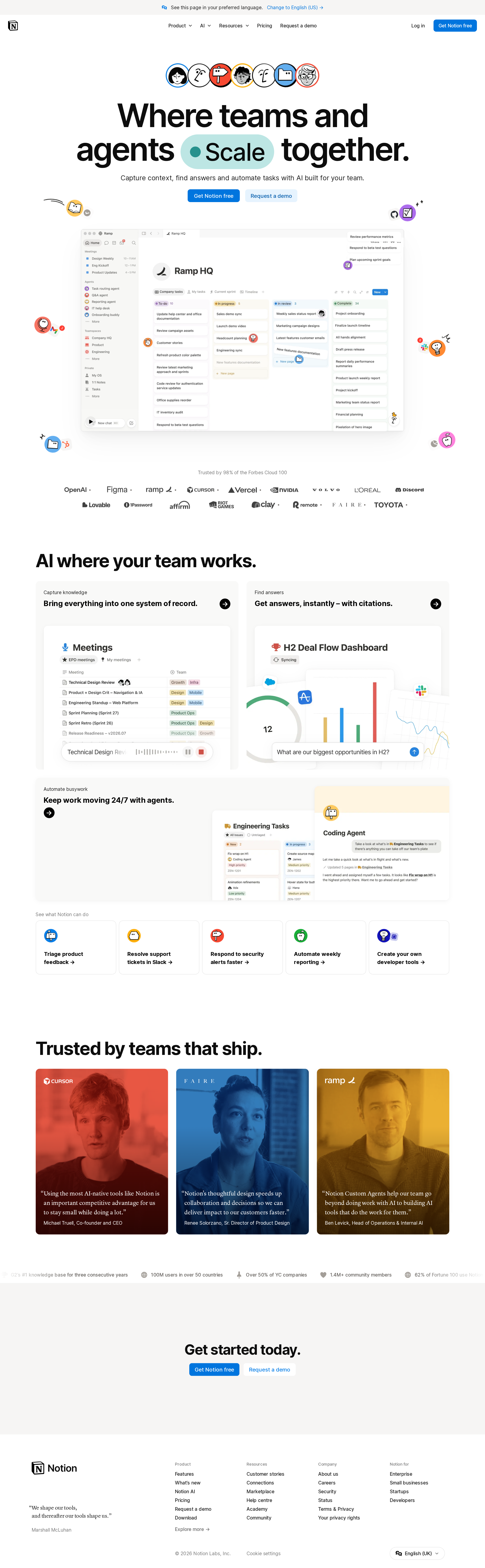
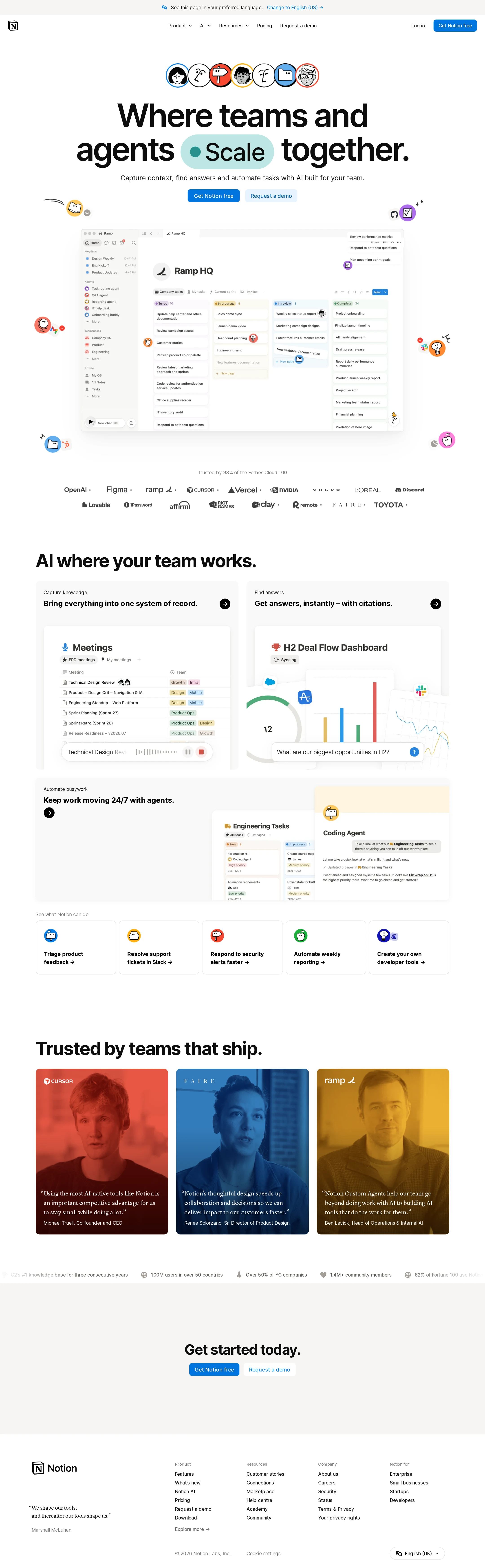
A highly resolved visual system balances editorial typography, detailed product imagery, and playful AI illustrations without losing the central product focus.
What works
- The hero establishes a clear visual priority through oversized type and a large product preview.
- The restrained monochrome base makes blue CTAs and colorful interface details easy to notice.
- Bento-style feature panels create variety while maintaining consistent rounded geometry and spacing.
- Customer proof is visually memorable through color-treated portrait cards.
Opportunities
- The page could reduce repetitive card patterns and introduce stronger visual transitions between major narrative chapters.
- The large hero and extensive imagery create a long scroll; more deliberate content compression could improve pacing.
Uniqueness
The combination of a workspace interface, illustrated AI agents, and editorial customer proof gives the page a recognizable identity within the SaaS category.
What works
- Decorative agent characters make an otherwise familiar productivity-software layout more ownable.
- The central product preview is integrated into the hero rather than treated as a detached screenshot.
- The testimonial treatment has a stronger editorial character than standard logo strips or plain quote cards.
Opportunities
- The general bento-grid structure remains common across current SaaS marketing sites.
- A more distinctive narrative device could connect the agent illustrations to specific user outcomes rather than using them primarily as decoration.
User experience
The page communicates the product’s broad value quickly and offers multiple routes for exploration, though the breadth of capabilities may increase cognitive load.
What works
- The hero combines a concise positioning statement, product evidence, and two clearly differentiated actions.
- Feature headings communicate distinct jobs: capture knowledge, find answers, and automate work.
- Use-case links provide concrete entry points for visitors with different operational needs.
- Customer proof appears before the final conversion prompt, supporting evaluation.
Opportunities
- The navigation contains several top-level categories and the page introduces many AI concepts in succession; clearer audience pathways could reduce decision friction.
- The evidence does not establish mobile behavior, so hero scaling, card stacking, and decorative element placement need validation.
- Contrast failures may make secondary copy and testimonial attribution difficult to read for some users.
Conversion optimization
The homepage follows a strong product-led conversion structure, using an accessible free entry point alongside a higher-intent demo route and repeated calls to action.
What works
- The primary signup CTA is visible in both navigation and hero contexts.
- A secondary demo CTA supports larger teams or higher-consideration buyers without competing with signup.
- Product screenshots, feature explanations, use cases, and named customer proof address several stages of evaluation.
- The closing CTA provides a clear endpoint for users who reach the bottom of the page.
Opportunities
- Clarify the distinction between the free signup and demo paths with short supporting qualifiers, especially for enterprise visitors.
- Add concise evidence near the first CTA about setup effort, plan scope, or what happens after signup if those claims are available.
- Ensure testimonial text and attribution remain sufficiently legible, since contrast failures directly affect trust-building content.
What we'd improve
- 01high
Remediate contrast failures
Review the 12 reported failures across arrow links, testimonial quotations, and accreditation text. Darken low-emphasis text or adjust surfaces and overlays, then rerun contrast testing across default, hover, and focus states.
- 02high
Remove duplicate navigation IDs
Assign unique IDs to repeated Product and Resources targets and verify that every menu control references the intended destination exactly once.
- 03high
Audit motion and media controls
Test the animated agent illustrations and marquee with prefers-reduced-motion enabled. Confirm that the product preview pause control has a clear accessible name, state, and keyboard operation.
- 04medium
Strengthen audience pathways
Group or label feature and use-case routes for individual users, teams, and larger organizations so visitors can reach the most relevant proof without scanning the entire capability set.
- 05medium
Validate responsive composition
Test the hero grid, product preview, testimonial cards, marquee, and repeated CTAs at narrow widths. Prioritize readable heading wraps, non-overlapping decorative elements, horizontal overflow prevention, and usable touch targets.
- 06low
Reduce visual repetition
Vary the treatment of one or two lower-page sections, such as the use-case links or social proof, to create stronger pacing after the repeated rounded-card modules.