

Fathom Analytics website analysis
A detailed critique of the homepage's craft, originality, usability, and ability to move visitors toward its intended goal.
Our observations
A strong, polished SaaS marketing page with clear product communication and credible social proof. It is suitable for gallery inclusion, but accessibility defects and a somewhat conventional, lengthy structure keep it below exceptional.
Best practices
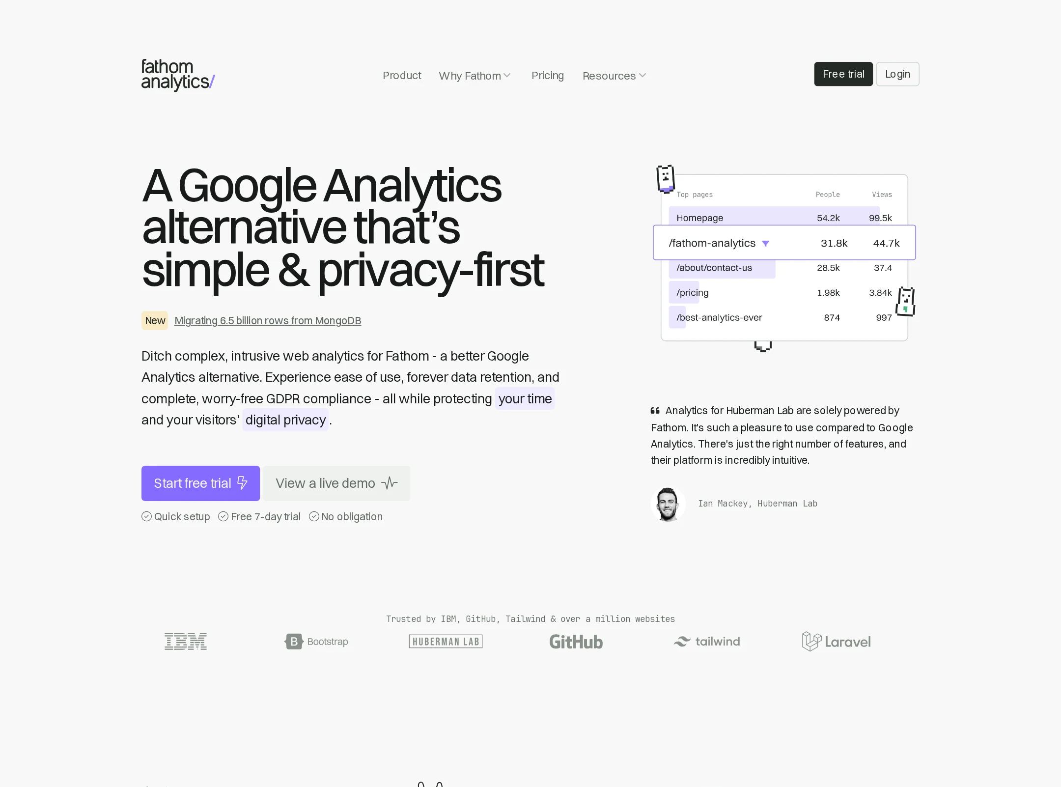
The page has a coherent information hierarchy, a single detected H1, no detected heading skips, and a clearly repeated primary action. However, automated checks report serious text-contrast problems and multiple links without accessible names.
What works
- The main proposition is immediately visible in the H1 and supporting copy.
- The page has one detected H1 and no detected heading-level skips.
- Content is organized into recognizable sections covering benefits, setup, features, integrations, proof, and the closing CTA.
- Primary actions are visually repeated throughout the page rather than being confined to one location.
Opportunities
- Resolve the eight detected text-contrast failures, particularly muted navigation, card, and supporting text.
- Provide accessible names for the ten detected unnamed links, including icon-only or visually empty link elements.
- Audit focus states, hover states, and the expanded navigation experience; these behaviors are not established by the screenshot or supplied observations.
- Check text sizing and line lengths across mobile layouts before publication.
Design
A highly controlled, modern visual system that makes a complex analytics product feel approachable. The restrained palette, strong dashboard imagery, and generous spacing create a credible premium impression.
What works
- The violet accent is used selectively for key actions and product highlights against a neutral interface.
- The dashboard screenshot gives the hero and feature sections an immediate product anchor.
- The page uses consistent grids, cards, borders, and spacing across a long scroll.
- The dark integration callout creates useful contrast and gives the page a visual change of pace.
Opportunities
- The many feature grids and testimonial rows create a repetitive rhythm over the long page.
- Consider introducing one more distinctive visual device or stronger art direction to make the brand more memorable beyond the product UI.
- Some small supporting text appears visually faint, which contributes both to the contrast findings and to reduced visual hierarchy.
- The page could be shorter or more modular, with secondary details progressively disclosed rather than presented in several similar sections.
Uniqueness
The privacy-first positioning and deliberately plain analytics presentation provide a clear point of view, but the execution uses familiar SaaS conventions: hero CTA, benefit grid, interface mockups, testimonials, integrations, and final conversion panel.
What works
- Privacy and simplicity are carried consistently from the headline through the feature and compliance sections.
- The product UI is used as evidence rather than relying only on abstract illustrations.
- The restrained, almost anti-dashboard tone differentiates the proposition from complex analytics competitors.
Opportunities
- Make the privacy philosophy more visually ownable through a distinctive diagram, data-flow explanation, or branded interaction.
- Reduce generic SaaS patterns in the testimonials and logo sections by giving customer evidence a more specific format.
- Clarify a single memorable narrative thread connecting privacy, simplicity, and data ownership across the page.
User experience
The page supports a straightforward evaluation journey: understand the promise, inspect the product, learn setup and features, then review trust signals and sign up. Its length and low-contrast secondary content may make scanning less efficient.
What works
- The hero communicates audience-relevant benefits before asking visitors to explore details.
- The three-step setup section lowers perceived implementation effort.
- Product screenshots, integration references, customer quotes, and the customer-count claim address common evaluation questions.
- The page includes several routes for visitors at different stages of consideration.
Opportunities
- Add stronger section navigation or a persistent contextual CTA for visitors moving through the long page.
- Improve the visual distinction between primary information, supporting copy, and tertiary metadata.
- Ensure every icon-only or decorative link has an appropriate accessible label or is removed from the link structure.
- Use concise summaries or expandable details for dense feature and testimonial content.
Conversion optimization
For a self-serve analytics SaaS product, the page provides a persuasive progression from problem framing to product proof, ease of setup, capabilities, integrations, and social validation. Conversion intent is clear, although the screenshot does not prove CTA performance or pricing clarity.
What works
- The opening CTA appears alongside a lower-commitment alternative, supporting visitors with different readiness levels.
- The dashboard preview makes the product easier to evaluate before sign-up.
- Setup steps directly answer the likely objection that migration or installation will be difficult.
- Testimonials, recognizable integration marks, and a large customer-count statement strengthen trust near the lower half of the page.
Opportunities
- Make pricing, trial length, or commitment expectations more visible before the final sign-up decision if those details are not available elsewhere.
- Use a short, concrete proof point beside the hero CTA to complement the broad privacy and simplicity claims.
- Differentiate the primary CTA more consistently from secondary actions while preserving the restrained visual style.
- Test whether the long feature and testimonial sections delay the main conversion action; consider a sticky CTA or shorter decision path.
What we'd improve
- 01high
Fix contrast and link naming defects
Address all eight detected contrast failures and add meaningful accessible names to the ten unnamed links. Verify icon-only controls, navigation cards, and footer links with a screen reader and keyboard-only pass.
- 02high
Strengthen above-the-fold proof
Place one concise, verifiable product or customer proof point near the hero CTA—such as setup time, a representative reporting benefit, or a clearly sourced customer result—without adding more dense copy.
- 03medium
Reduce repetitive page rhythm
Consolidate overlapping feature, benefit, and testimonial sections or add stronger visual grouping so visitors can reach product proof and sign-up decisions with less scrolling.
- 04medium
Clarify the conversion path
Surface trial, pricing, or commitment information close to the primary CTA, and label the secondary action according to its actual purpose, such as demo, product tour, or comparison.
- 05low
Develop a more ownable brand motif
Extend the privacy-first idea into a distinctive visual explanation of data collection and ownership, giving the page a memorable element beyond standard SaaS grids and UI screenshots.