Snøhetta
snohetta.com
A footer helps visitors recover a route after reaching the end of a page. These eight captured examples show different approaches to that job: a sparse studio index, broad software navigation, contact and subscription paths, and more expressive closing graphics. Compare the grouping, labels and visual weight of useful links before borrowing a layout. The screenshots record the footer at capture time; linked source websites provide the current content and behavior.
Open a website to explore the full capture and design details.
snohetta.com
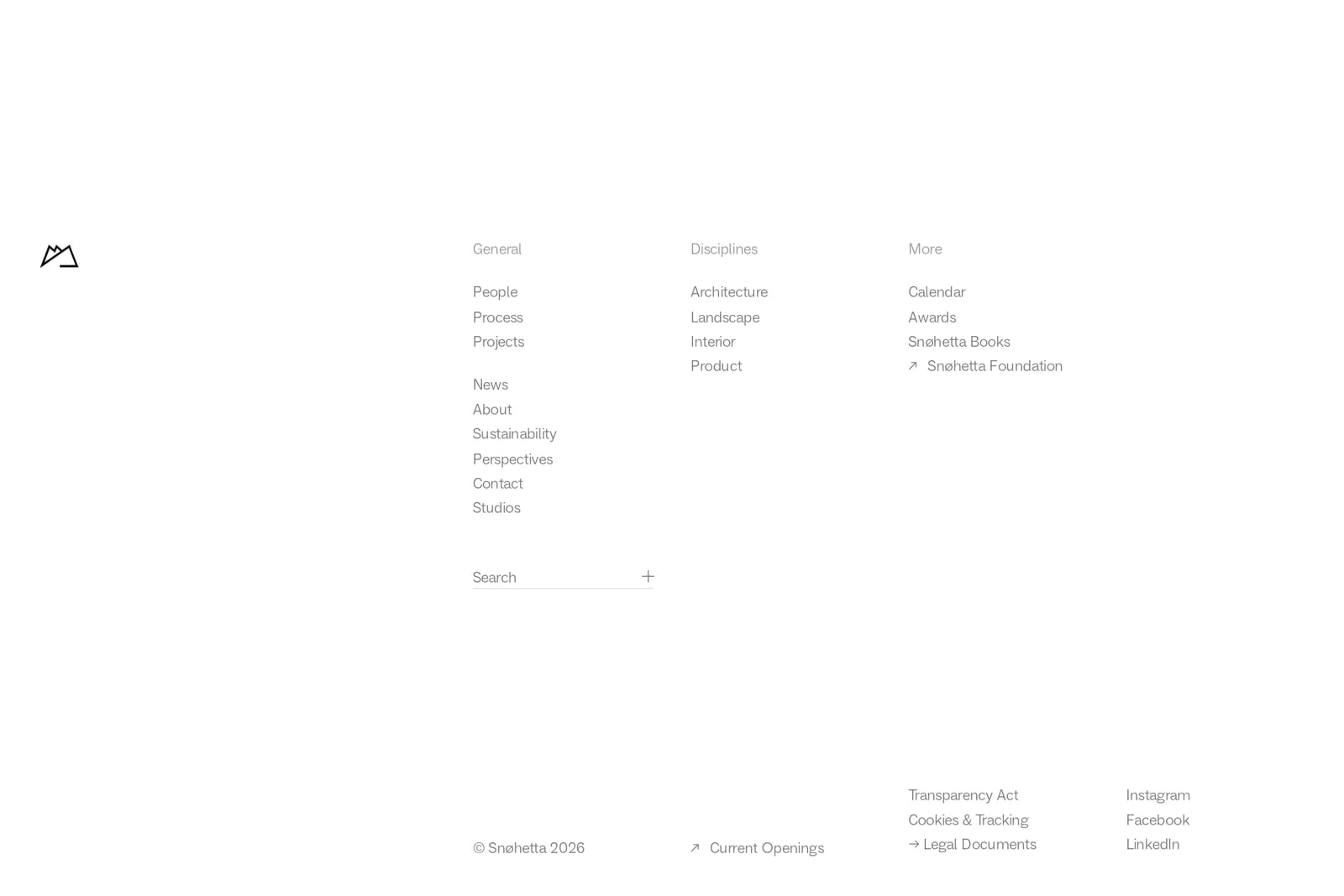
The footer spreads three small navigation groups across a broad white field, with search below and legal and social links near the bottom. The result feels calm and consistent with the studio's project-led page. The considerable whitespace strengthens that identity, but small, pale link text makes contrast and readability important checks.
tengilemalamala.com
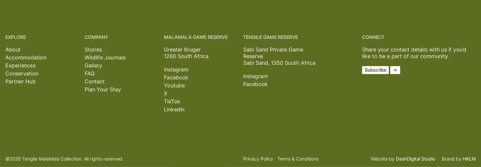
An olive background holds distinct groups for exploration, company information, the two reserves and a subscription invitation. Addresses and social channels sit beside the relevant reserve rather than in one undifferentiated list. A separate bottom row handles legal and credit links, keeping practical travel information easier to locate.
vercel.com
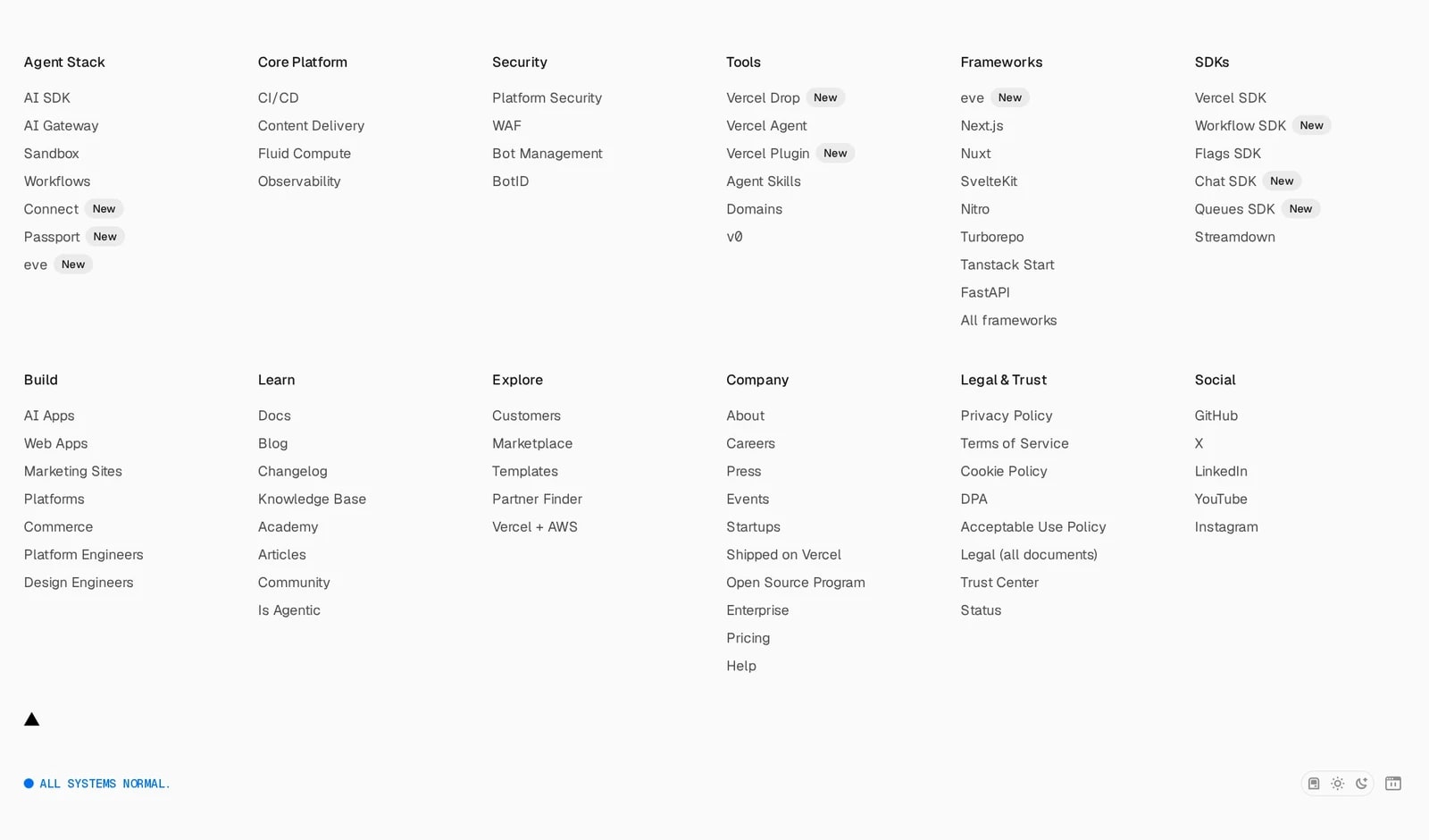
A large link inventory is divided into two orderly rows of labeled columns. Product families occupy the upper row; learning, company, legal and social routes sit below. The small system-status indicator is separated at the bottom. Consistent spacing makes the density manageable, although this breadth would overwhelm a much smaller site.
usefathom.com
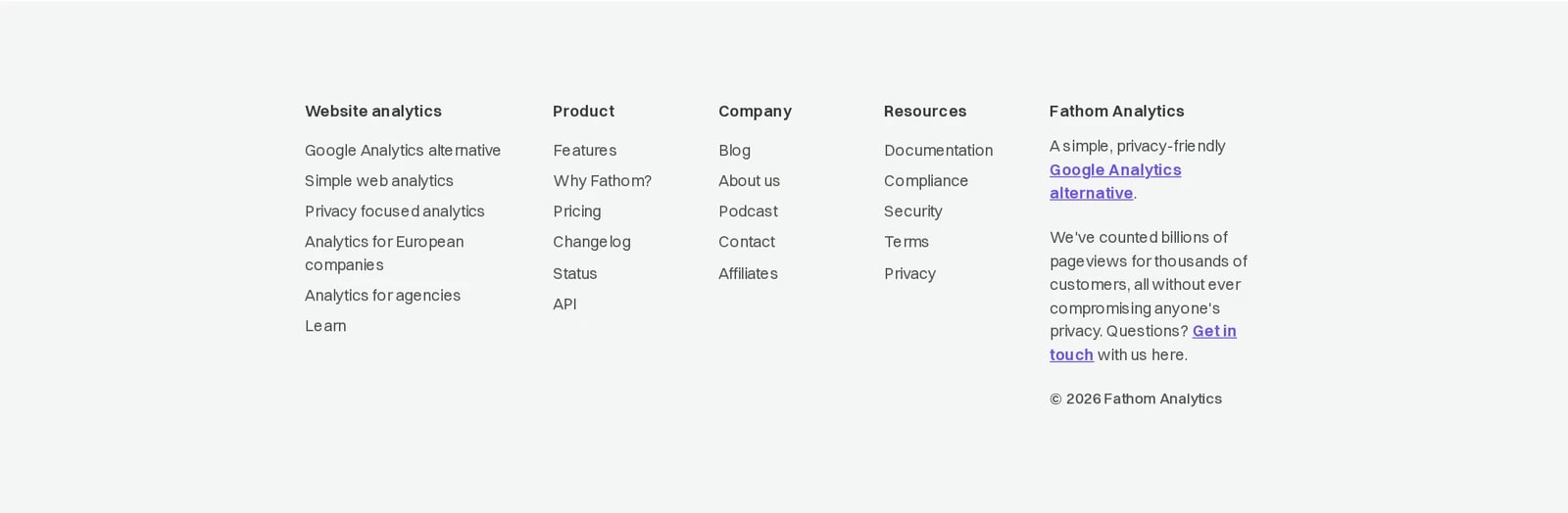
Four compact navigation groups sit beside a short company explanation and a direct contact link. The pale background and modest typography make this a quiet finish to the page. The explanatory block adds context beyond a link directory, but its narrower column creates a denser reading area than the surrounding lists.
zapier.com
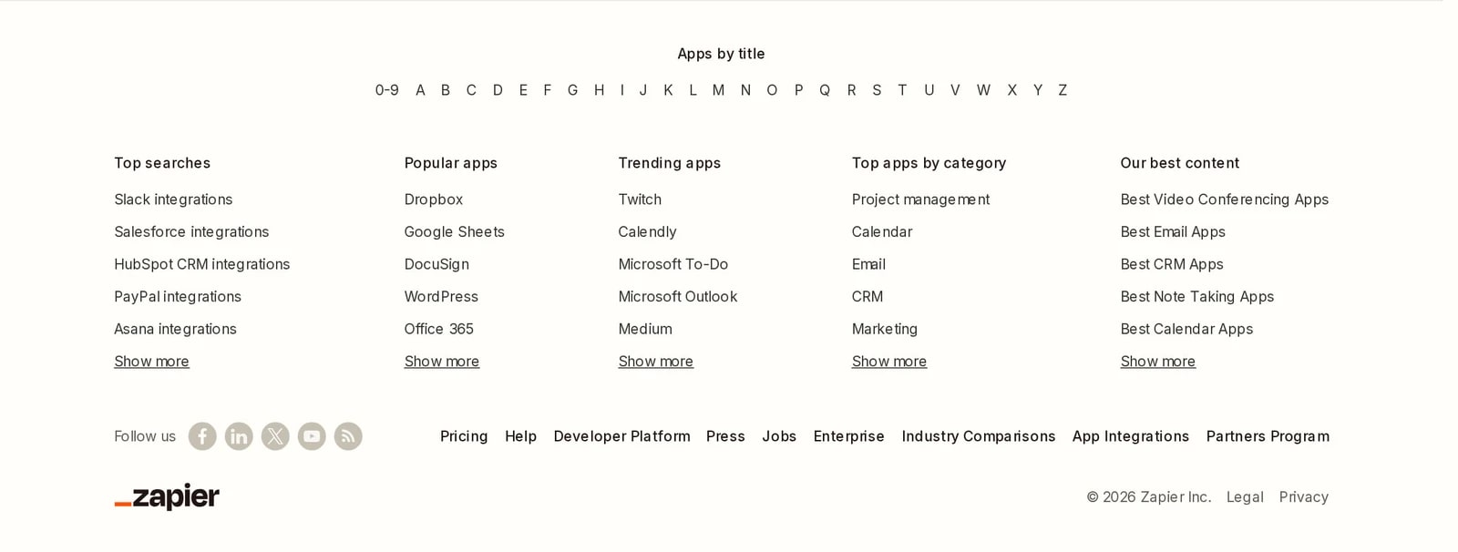
An alphabetical app index leads into columns organized by popular searches, apps, categories and editorial content. This makes the footer another discovery surface for a broad integration catalog. A lower utility row separates corporate links and social channels from that browsing task; the volume of links requires clear labels and disciplined spacing.
shipfa.st
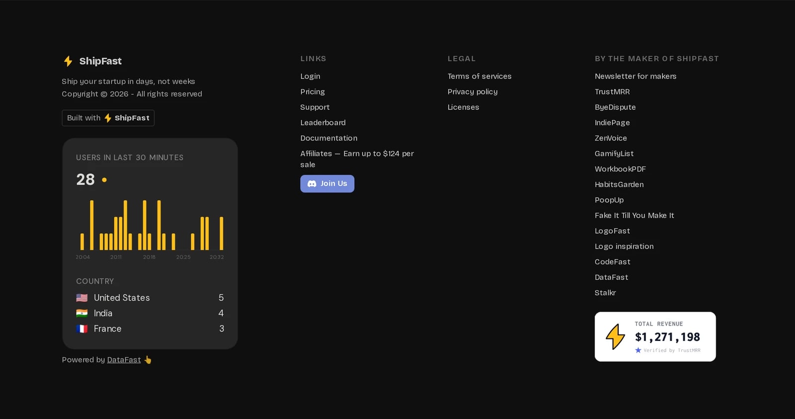
A dark four-column layout combines product identity, support links, legal information and the maker's related projects. A traffic widget and revenue badge add visual weight alongside the navigation. Those elements make the footer distinctive, but they also compete with practical routes; the screenshot is not independent verification of their displayed metrics.
sentry.io
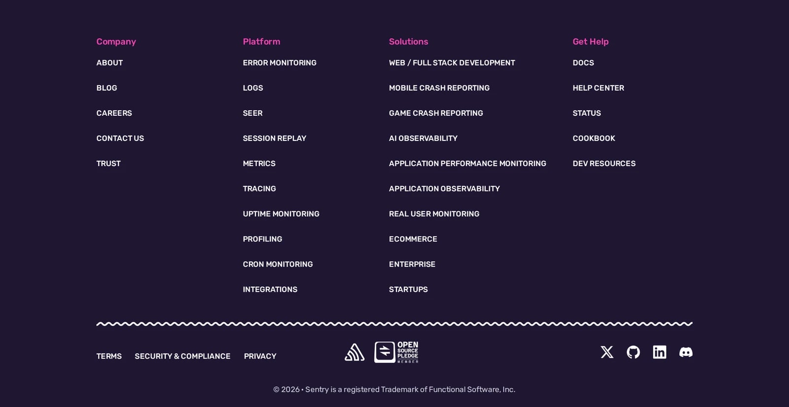
Pink group labels and white links give the purple footer a strong hierarchy. Company, platform, solutions and support routes remain separate, while a wavy divider introduces the legal, community and social row below. It is a useful example of carrying an expressive brand treatment into a largely utilitarian part of the page.
savvycal.com
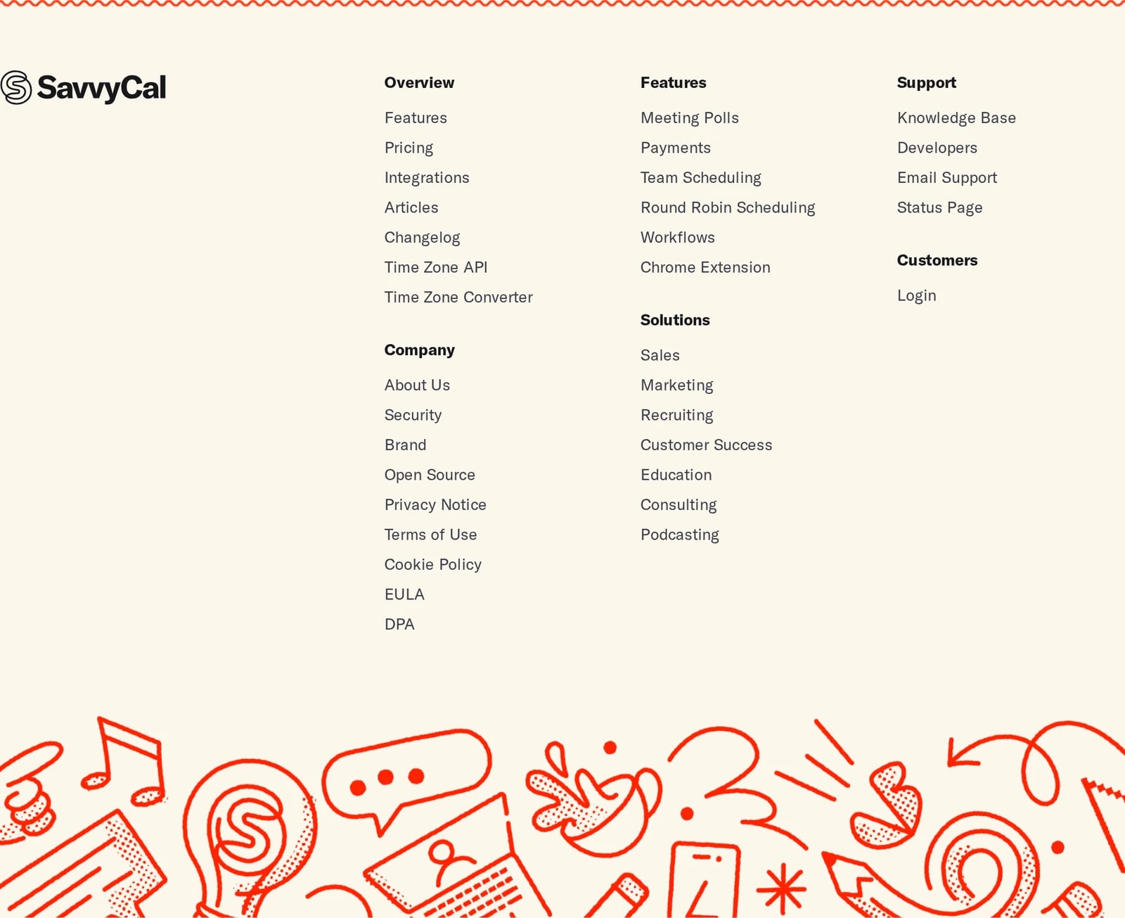
The logo anchors a cream-colored footer with clearly named groups for product, features, support, customers and company information. Some columns stack a second group rather than spreading everything into a single long row. An illustrated orange band closes the page with personality while leaving the link area visually simple.