

Sentry website analysis
A detailed critique of the homepage's craft, originality, usability, and ability to move visitors toward its intended goal.
Our observations
An excellent and distinctive SaaS marketing homepage with strong product storytelling and brand expression. It is suitable for publication, with accessibility and implementation-quality issues that should be addressed in a future pass.
Best practices
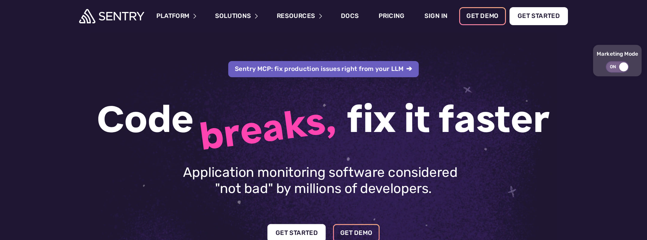
The page has a clear semantic structure, one detected H1, an identified main region, conventional navigation, multiple calls to action, product evidence, security messaging, and a visible newsletter form.
What works
- The headline and supporting actions establish the product purpose immediately.
- The page uses a coherent sequence from capability explanation to proof, onboarding, security, and retention.
- Detected heading structure has one H1 and no heading skips.
- Product screenshots, code examples, customer logos, testimonials, and security badges provide varied forms of evidence.
Opportunities
- Automated evidence reports 36 contrast failures across sampled elements, including buttons, links, and syntax-highlighted code.
- Eight duplicate-ID findings may interfere with reliable labeling, fragment navigation, or assistive-technology interpretation.
- Review focus states, form labeling, icon alternatives, and motion preferences manually; these outcomes cannot be established from the supplied evidence.
Design
The visual system is confident, cohesive, and unusually expressive for an observability product. Its combination of technical UI, vivid gradients, and character illustration creates a memorable branded experience.
What works
- The dark purple foundation gives the page a consistent visual identity from hero through footer.
- Pink and violet emphasis makes key words, controls, and feature transitions easy to recognize.
- Illustration and product UI are integrated into the narrative rather than treated as unrelated decoration.
- The long page maintains a recognizable component language across cards, code panels, testimonials, and forms.
Opportunities
- Several sections combine bright gradients, screenshots, code, and illustration, which can compete for attention on a long scroll.
- The repeated dark background reduces tonal variation between sections; stronger changes in scale, spacing, or surface treatment could improve wayfinding.
- Some text and code areas appear small at the narrow screenshot width and deserve review for comfortable reading.
Uniqueness
The page has a clear point of view that differentiates it from generic enterprise observability sites, especially through its playful illustration, space-themed imagery, and bold syntax-like color treatment.
What works
- The illustrated developer characters and UFO-like visual motif create a recognizable brand world.
- The page balances serious security and monitoring content with an approachable, slightly irreverent tone.
- The “broken code to fix” narrative gives the product story a concrete emotional frame.
Opportunities
- The broad use of contemporary dark-purple SaaS conventions means some individual patterns, such as gradient cards and logo strips, are familiar.
- More distinctive information visualization or a sharper explanation of the product’s unique workflow could further separate the experience from competitors.
User experience
The page appears thoughtfully organized for technical evaluators, with concrete implementation paths and progressively deeper evidence. Its length, density, and reported contrast issues introduce friction.
What works
- Primary and secondary hero actions support both self-serve users and higher-consideration buyers.
- The setup section offers a direct path into installation and includes language-oriented code examples.
- Feature content covers monitoring, root-cause analysis, agent tracing, and workflow continuity in a progression relevant to developers.
- Testimonials, logos, security content, and a newsletter provide support for different stages of evaluation.
Opportunities
- The long single-page journey would benefit from stronger persistent section orientation or clearer in-page landmarks.
- Review the narrow presentation of screenshots, code, and testimonials on mobile to ensure that essential information remains legible and scannable.
- Improve contrast for affected labels, links, and code syntax while preserving the intended color hierarchy.
- Validate duplicate IDs and interactive control naming across navigation, toggles, accordions, and forms.
Conversion optimization
Conversion is strong for a developer SaaS homepage: the page offers immediate signup and demo routes, demonstrates implementation effort, supplies proof, and addresses security concerns before the final retention and footer paths.
What works
- The hero places “Get Started” and “Get Demo” together, serving both product-led and sales-led journeys.
- Installation guidance reduces uncertainty for developers who want to evaluate quickly.
- Customer proof and security messaging appear before the end-of-page calls to action.
- The newsletter form creates a lower-commitment conversion option for visitors not ready to start.
Opportunities
- The page could make the distinction between self-serve signup, demo requests, and documentation more explicit for different visitor intents.
- Repeated calls to action should be checked for consistent visual prominence and accessible contrast.
- A concise benefit summary near the setup section could help visitors who arrive there after scanning rather than reading the full narrative.
What we'd improve
- 01high
Resolve contrast failures in interactive and code content
Audit the reported 36 contrast failures, prioritizing navigation actions, primary buttons, inline links, and muted syntax colors. Preserve the expressive palette through adjusted luminance, text weight, borders, or supporting backgrounds.
- 02high
Remove duplicate IDs and verify labeling relationships
Consolidate repeated SVG and interface IDs, then recheck navigation, accordions, toggles, image references, and form labels so each relationship is unique and dependable.
- 03medium
Strengthen long-page orientation
Add clearer section landmarks, a restrained progress or anchor treatment, or more pronounced transitions between major narrative chapters so users can scan and return to key areas.
- 04medium
Optimize the narrow layout for reading comfort
Review mobile type scale, code-panel wrapping, screenshot crops, testimonial density, and touch target spacing at several widths rather than relying only on the supplied narrow capture.
- 05low
Clarify conversion paths by intent
Use concise supporting labels or nearby microcopy to distinguish immediate product setup, sales-assisted evaluation, documentation, and newsletter enrollment without adding competing calls to action.