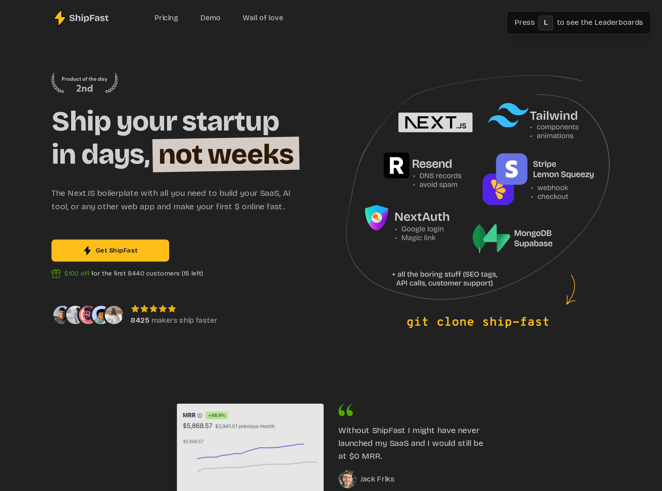


ShipFast website analysis
A detailed critique of the homepage's craft, originality, usability, and ability to move visitors toward its intended goal.
Our observations
A strong and publishable developer-tool landing page with a memorable dark-and-yellow identity, clear commercial structure, and unusually rich community proof. Its main opportunities are reducing narrative density, improving text contrast and link labeling, and making motion preferences more inclusive.
Best practices
The page has a clear semantic structure, one detected H1, no heading skips, one main landmark, strong section organization, and a high automated accessibility score. The reported issues are meaningful but limited in count.
What works
- Uses a clear single-page information architecture with recognizable product, pricing, FAQ, testimonial, and footer regions.
- Automated structure checks report one H1, no duplicate IDs, no heading skips, and one main landmark.
- Primary actions are visually prominent and repeated at relevant decision points.
- The page includes substantial explanatory content and purchase-objection handling rather than relying only on promotional claims.
Opportunities
- Resolve the reported serious text-contrast failure in the highlighted hero copy.
- Give the reported unnamed link an accessible, descriptive name.
- Audit small supporting text, muted labels, badges, and embedded social content at real viewport sizes.
- Verify keyboard focus visibility, accordion semantics, external-link behavior, and reduced-motion behavior through manual testing.
Design
A cohesive, energetic visual system gives the page a strong developer-product presence. The dark canvas and yellow accent remain recognizable across a very long page, although the number of visual modules creates occasional crowding.
What works
- The dark neutral foundation and warm yellow accent create strong brand recognition and visual hierarchy.
- The hero combines headline, CTA, social proof, and technical visual cues in a commercially effective composition.
- Pricing cards, testimonials, code imagery, and technology references reinforce the product category.
- Rounded cards, avatar groups, badges, and borders form a consistent component vocabulary.
Opportunities
- Reduce competing proof modules around the middle of the page so the main product story remains dominant.
- Create more breathing room or stronger grouping within the dense maker showcase.
- Use a more deliberate contrast scale for secondary copy instead of relying heavily on opacity and muted neutrals.
- Consider a less repetitive visual treatment for supporting screenshots and testimonial tiles.
Uniqueness
The page is recognizable within the startup-boilerplate category because of its yellow-on-charcoal palette, technical imagery, and expansive maker gallery. Its underlying sales-page conventions remain familiar, so the differentiation is strongest in execution and community presentation rather than in interaction design.
What works
- The large community showcase gives the page a distinctive, evidence-rich identity.
- The combination of code visuals, product examples, technology badges, and founder-style testimonials feels specific to a startup-launch toolkit.
- The warm yellow accent is more characterful than the common blue or purple developer-tool palette.
Opportunities
- Develop a more ownable visual motif beyond the accent color and standard card-based SaaS patterns.
- Turn the product’s workflow or technical advantage into a more original visual explanation near the hero.
- Curate fewer, stronger community examples so the showcase feels editorial rather than exhaustive.
User experience
The page supports a broad evaluation journey, from initial value proposition through pricing and objections. However, its considerable length and dense content may increase cognitive load, particularly for visitors who only need a quick comparison or technical proof.
What works
- The page answers common evaluation questions through feature explanations, pricing, FAQ content, and testimonials.
- The primary CTA is easy to identify in the hero and recurring purchase sections.
- Navigation anchors and clearly separated sections support scanning on a long page.
- The component patterns are familiar enough for visitors to understand quickly.
Opportunities
- Add stronger in-page wayfinding or a persistent section navigation for the long scroll experience.
- Surface a concise comparison of what is included, who the product is for, and expected setup effort earlier.
- Improve the visual separation of secondary testimonials and community content from core product education.
- Test the narrow layout for text wrapping, pricing-card order, gallery scanning, and touch-friendly accordion controls.
Conversion optimization
Conversion execution is one of the page’s strongest areas. The hero makes the product promise and action clear, while repeated pricing CTAs, social proof, testimonials, FAQs, and a closing CTA support visitors at multiple stages of consideration.
What works
- The hero establishes a direct outcome-oriented proposition and immediately provides a primary action.
- Pricing is prominent, visually comparable, and includes a featured option with stronger accent treatment.
- Social proof appears in several forms, including avatars, external-feature references, testimonials, and a large community gallery.
- FAQ content and repeated calls to action address late-stage hesitation without requiring a separate page.
Opportunities
- Clarify the primary conversion path by distinguishing purchase, demo, documentation, and secondary community actions more explicitly.
- Add concise plan-selection guidance so visitors can choose among pricing cards without reading every feature line.
- Reduce or defer lower-intent external links near key CTA areas to limit distraction.
- Validate that testimonial and community claims remain current, since visible update badges and third-party references can affect trust.
What we'd improve
- 01high
Fix the two reported accessibility blockers
Correct the serious contrast failure in the highlighted hero text and provide an accessible name for the unnamed link. Recheck muted labels, badges, and small testimonial metadata afterward.
- 02high
Reduce the page’s cognitive load
Condense or progressively reveal the maker showcase and secondary proof modules. Keep a smaller curated set near the main story and link to the full collection if needed.
- 03high
Add explicit reduced-motion handling
Respect prefers-reduced-motion for button-pop, pulse, opacity, and transition effects, while preserving clear non-animated hover and focus states.
- 04medium
Strengthen evaluation guidance above pricing
Add a compact summary of audience fit, included capabilities, setup expectations, and the practical difference between plans before visitors reach the pricing cards.
- 05medium
Improve long-page navigation
Provide a compact sticky or accessible section navigation for hero, features, pricing, FAQ, and testimonials, with clear active-state feedback that does not obscure content.
- 06low
Make the visual identity more ownable
Introduce a distinctive product or workflow visualization near the hero so the page is differentiated by its explanation of value, not only by its dark palette, yellow accent, and card system.


