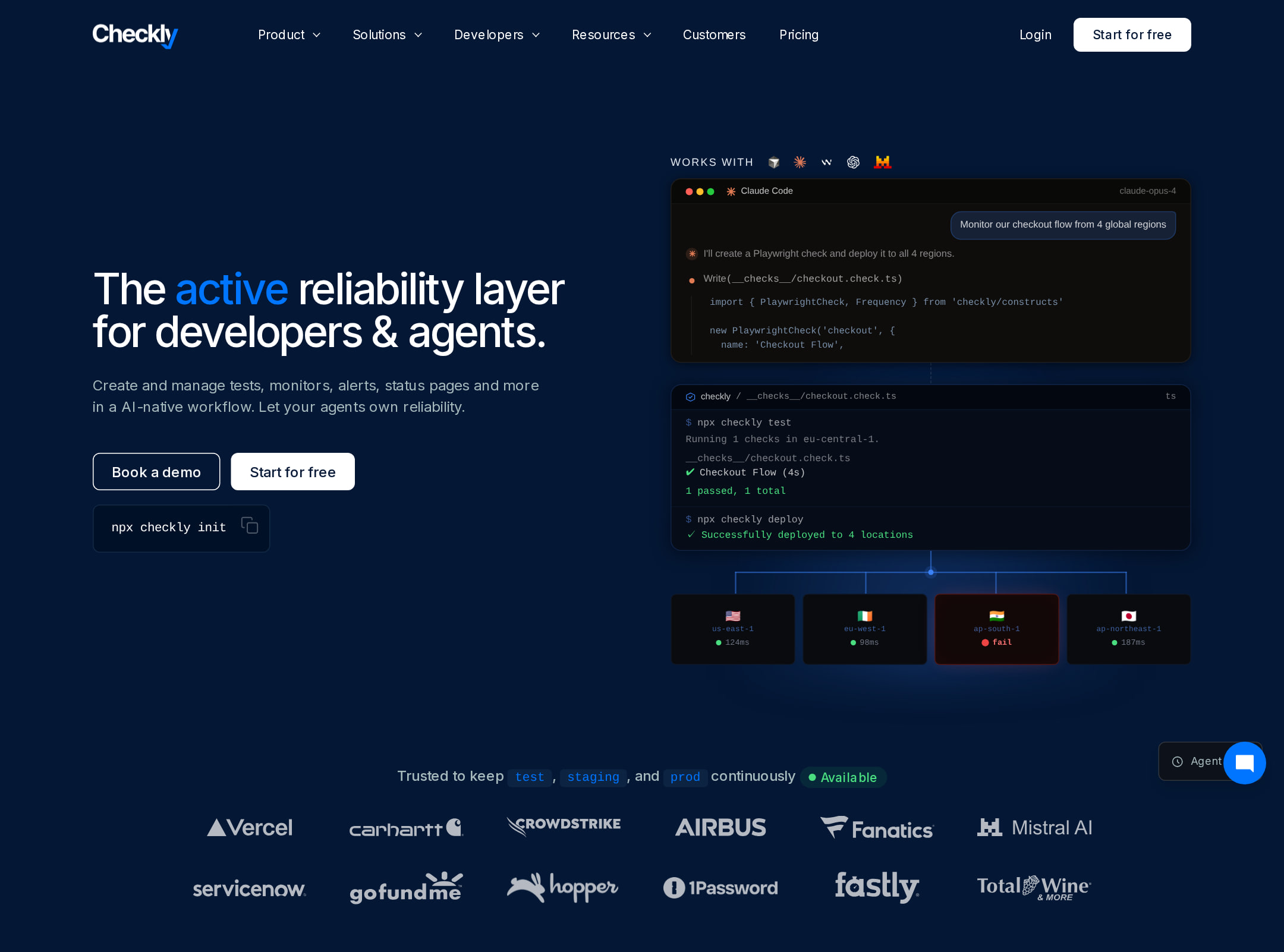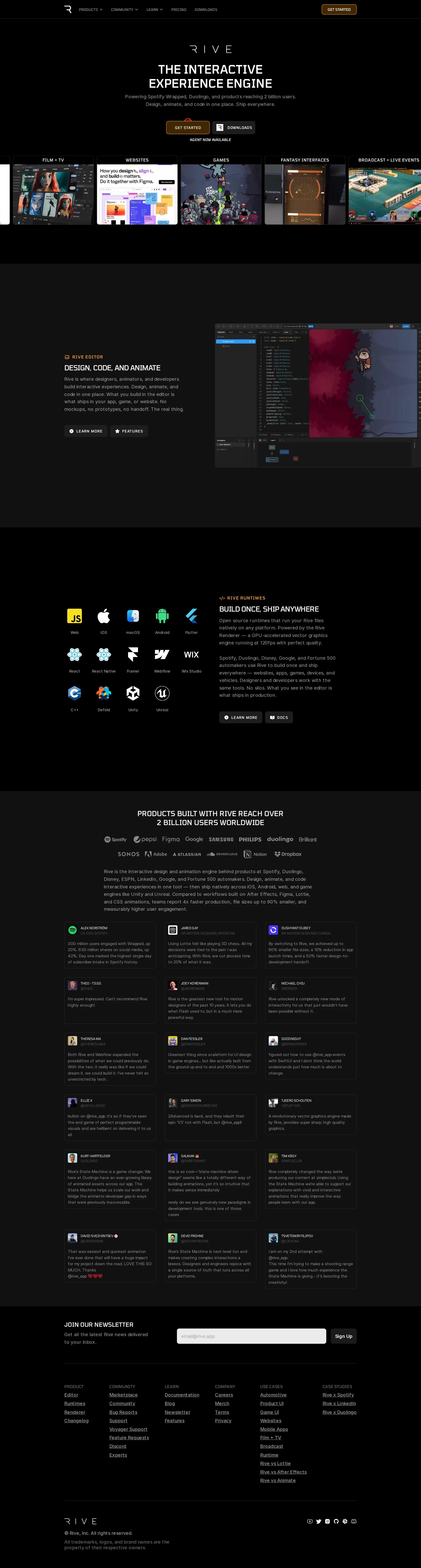
Rive website analysis
A detailed critique of the homepage's craft, originality, usability, and ability to move visitors toward its intended goal.
Our observations
Publish with an accessibility review; the visual system is strong and gallery-worthy, but the interaction and semantic layer needs remediation.
Best practices
The page has a coherent hierarchy, a single H1, and no detected heading skips or duplicate IDs. However, the accessibility evidence identifies several serious issues, including unlabeled links, unlabeled form controls, a contrast failure, and no detected main landmark.
What works
- Clear page hierarchy with one H1 and logically grouped section headings.
- Consistent navigation, product sections, testimonials, newsletter capture, and footer structure.
- No duplicate IDs or heading-level skips were detected.
- Primary actions and product pathways are visually easy to locate.
Opportunities
- Provide accessible names for the 23 reported unnamed links, especially image- and canvas-based navigation items.
- Add explicit labels or equivalent accessible naming to both newsletter inputs.
- Resolve the reported text-contrast failure and review muted copy across dark surfaces.
- Add a semantic main landmark and verify keyboard focus visibility and ordering.
Design
A polished dark-mode presentation with strong editorial pacing, disciplined contrast between product imagery and empty space, and a distinctive emphasis on real interface evidence rather than generic illustration.
What works
- The black and charcoal foundation creates a premium, technically focused atmosphere.
- Colorful editor screenshots and runtime marks are used as focal points without overwhelming the page.
- Alternating feature compositions create rhythm across a long page.
- The testimonial section uses a consistent card system that supports scanning and credibility.
Opportunities
- Increase the size or contrast of selected secondary copy without sacrificing the restrained aesthetic.
- Make the primary hero action more visually dominant relative to the secondary download action.
- Consider a stronger visual transition between the feature sections and the adoption proof section.
Uniqueness
The page stands apart through its combination of animation-editor imagery, runtime ecosystem coverage, canvas/video-led presentation, and an unusually restrained black visual language. The overall SaaS structure is familiar, but the subject matter and media treatment provide a clear identity.
What works
- Product screenshots and runtime coverage communicate a specialized category rather than a generic software product.
- The page balances developer credibility with visual craft and animation culture.
- The use of platform logos and customer work gives the product story tangible specificity.
Opportunities
- Push the brand signature further in the hero or section transitions so the page is recognizable even without the logo.
- Use a more distinctive testimonial or case-study treatment to differentiate the social-proof section from common SaaS grids.
User experience
The information architecture is understandable and the sequence supports progressive product education. Dense small text, a long scroll, and reported naming and contrast problems create avoidable barriers, particularly for keyboard and assistive-technology users.
What works
- The journey from what Rive is to how it is used, where it runs, and who uses it is easy to understand.
- Navigation labels expose major product, community, learning, pricing, and download pathways.
- The page provides several forms of proof: product media, platform support, adoption claims, and testimonials.
- The newsletter and footer are positioned after the main product narrative rather than interrupting it.
Opportunities
- Add descriptive accessible names to visual links and canvas-based content.
- Improve text sizing and contrast in testimonials, footer navigation, and supporting descriptions.
- Offer clearer grouping or progressive disclosure for the long testimonial section.
- Verify that video and canvas demonstrations have equivalent textual descriptions and usable reduced-motion behavior.
Conversion optimization
For a product-marketing homepage, the page communicates capability and credibility effectively, with downloads, learning pathways, runtime documentation, and a newsletter capture. Conversion intent is somewhat diffuse because the hero presents multiple similarly weighted actions and the strongest product CTA is not strongly differentiated.
What works
- The product value proposition is immediately visible in the hero.
- Download, learn-more, features, docs, and newsletter pathways address different stages of evaluation.
- Customer adoption claims and testimonials provide substantial social proof before the signup section.
- The editor and runtime sections connect visual appeal to practical product functionality.
Opportunities
- Define one primary hero conversion goal, such as starting the editor or downloading Rive, and make it unmistakably primary.
- Add concise audience-specific pathways for designers, developers, and teams.
- Pair the adoption claim with a more direct case-study or proof link.
- Label the newsletter purpose and expected cadence near the form, while preserving a visible input label for accessibility.
What we'd improve
- 01high
Repair accessible naming and form semantics
Give every visual, canvas, and icon-only link a meaningful accessible name, and add explicit labels or equivalent programmatic names to both newsletter inputs. Re-test the full page with keyboard and screen-reader navigation.
- 02high
Resolve contrast and landmark issues
Fix the reported contrast failure, review muted text against the black and charcoal backgrounds, and ensure the primary page content is exposed through a semantic main landmark.
- 03medium
Clarify the primary hero conversion
Select the most important first action for the target audience and give it stronger visual priority than the secondary action, supported by a short audience-oriented explanation.
- 04medium
Provide media alternatives and motion controls
Add concise text alternatives or captions for canvas and video demonstrations, and verify that autoplaying or looping media respects reduced-motion preferences.
- 05low
Strengthen the brand signature in transitions
Introduce a more distinctive recurring transition, framing device, or editorial motif between product and proof sections so the page feels less dependent on familiar SaaS conventions.