Eli Horn website analysis
A detailed critique of the homepage's craft, originality, usability, and ability to move visitors toward its intended goal.
Our observations
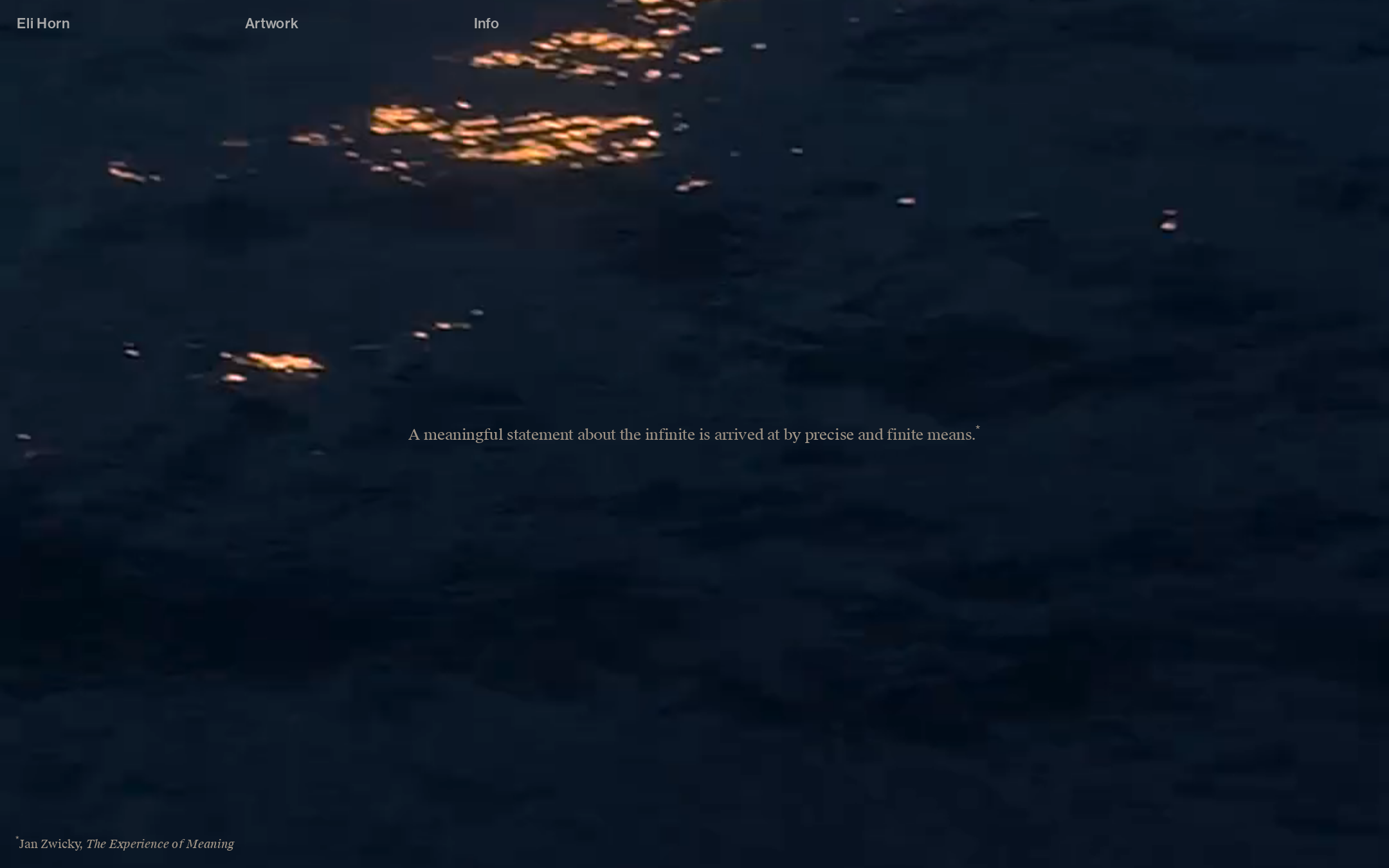
A visually compelling and distinctive artist portfolio homepage with strong art direction, but it needs contrast and semantic improvements before it can be considered fully polished.
Best practices
The page has a clear primary canvas, a simple navigation model, and a focused visual hierarchy. Accessibility evidence lowers the score: three navigation text samples fail contrast checks, and no h1 is detected.
What works
- Clear single-purpose homepage composition
- One main navigation structure and one primary hero area
- No duplicate IDs or heading skips detected
- Compact, consistent typographic system
Opportunities
- Raise navigation contrast against both the static and changing artwork
- Add a meaningful h1 for the artist or portfolio introduction
- Confirm keyboard focus visibility and interaction states
- Test the fixed navigation and attribution across viewport sizes
Design
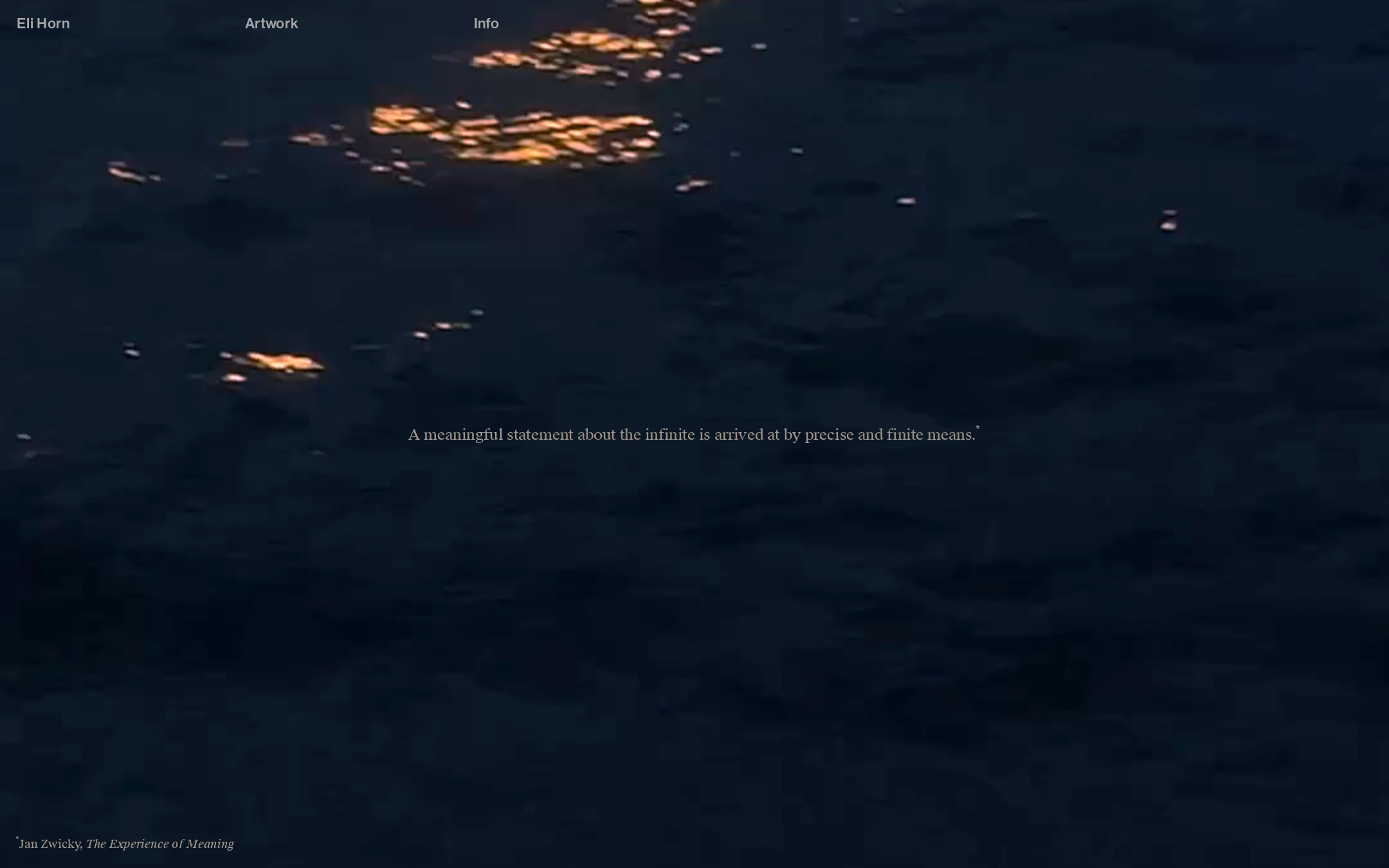
The design is highly controlled and atmospheric, with a strong relationship between the artwork, typography, and negative space. The subdued interface supports the artist’s presentation without competing with it.
What works
- Distinctive nocturnal art direction
- Strong use of negative space and visual restraint
- Warm artwork highlights create an effective focal counterpoint to the navy field
- Typography feels appropriate to an editorial art portfolio
Opportunities
- Improve text separation from the artwork without compromising the mood
- Give the primary introduction more typographic prominence
- Consider a subtle, brand-consistent treatment for active or hovered navigation states
Uniqueness
The homepage feels authored rather than assembled from a generic portfolio template. Its visual identity comes from the atmospheric artwork and the unusually restrained presentation.
What works
- Immersive visual-first opening
- Memorable contrast between dark field and warm reflective forms
- Minimal navigation supports a gallery-like experience
- Conceptual text and attribution add an art-context layer
Opportunities
- Make the artist’s individual practice more immediately identifiable from the first screen
- Use the Info or Works destination to reinforce the distinctive visual language across the broader site
- Avoid relying solely on darkness and sparse layout as the identity system
User experience
The interaction model appears simple, but the opening screen offers limited orientation and has confirmed contrast and semantic issues. The page is easy to scan visually, yet less robust for users who need clear text hierarchy or strong wayfinding.
What works
- Navigation labels are concise and easy to locate
- The visual focus is immediate and unambiguous
- The composition avoids clutter and competing calls to action
Opportunities
- Add a semantic heading that identifies the artist or portfolio
- Increase contrast for all navigation links
- Ensure artwork remains understandable when text overlays vary in brightness
- Provide clearer indication of where the primary artwork experience begins and what the central statement represents
Conversion optimization
For an artist portfolio, the likely conversion is continued exploration, viewing the work, or opening the information page. The homepage creates intrigue, but it does not strongly guide visitors toward those next steps beyond the small top navigation.
What works
- The Artwork and Info paths are visible immediately
- The distinctive opening may encourage curious visitors to continue
- The sparse presentation reinforces a premium, authored impression
Opportunities
- Make Artwork the clearest primary next step through hierarchy or contextual prompting
- Expose a concise artist descriptor or practice cue on the first screen
- Consider a visible contact, representation, or inquiry route within the portfolio flow
- Use the hero text or attribution area to provide more useful context without weakening the artwork
What we'd improve
- 01high
Correct navigation contrast
Adjust the navigation text treatment or add a controlled contrast layer so all links remain readable across the artwork, including lighter and darker regions.
- 02high
Add a semantic primary heading
Introduce a meaningful h1 that identifies Eli Horn and/or the portfolio introduction while preserving the current visual hierarchy through visually restrained styling.
- 03medium
Strengthen the path into the work
Make the Artwork destination more prominent or add a subtle contextual cue so visitors understand the intended next step after entering the homepage.
- 04medium
Clarify the artist context
Add a concise descriptor of the artist’s practice or discipline near the opening experience, particularly for first-time visitors arriving without referral context.
- 05low
Validate narrow-screen behavior
Test the fixed navigation, overlay text, canvas crop, and lower-left attribution on mobile and intermediate widths, with attention to legibility and touch spacing.