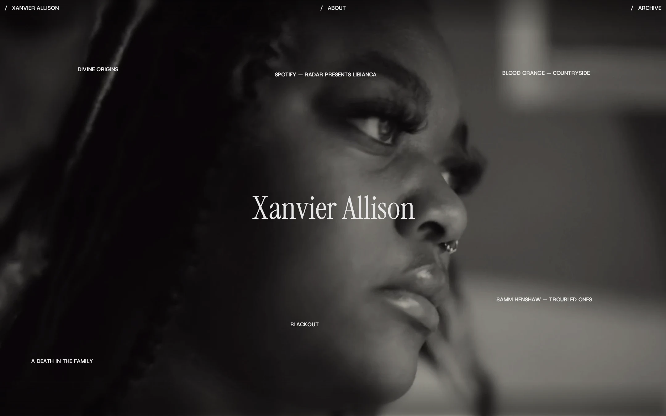
Xanvier Allison website analysis
A detailed critique of the homepage's craft, originality, usability, and ability to move visitors toward its intended goal.
Our observations
A distinctive and professionally art-directed portfolio homepage with excellent visual focus and strong gallery appeal. It merits publication, with improvements chiefly centered on context, discoverability, and accessibility validation beyond automated sampling.
Best practices
The page demonstrates disciplined hierarchy, a single clear H1, concise navigation, and a focused project index. The automated evidence reports no sampled contrast failures, duplicate IDs, or heading skips, although the absence of a main landmark is a structural opportunity.
What works
- Clear primary identity through one prominent H1.
- Consistent visual hierarchy between navigation, project labels, and the hero image.
- Automated checks found zero contrast failures across 236 samples, zero duplicate IDs, and zero heading skips.
- Project and contact links provide direct paths into the work and external channels.
Opportunities
- The automated evidence reports mainCount 0, so the page should be reviewed for an appropriate main landmark and broader semantic structure.
- Validate keyboard focus visibility and keyboard access for the text-led project controls, especially where interaction is layered over canvas media.
- Confirm that canvas-based visuals have meaningful alternatives or supporting text for users who cannot perceive the imagery.
Design
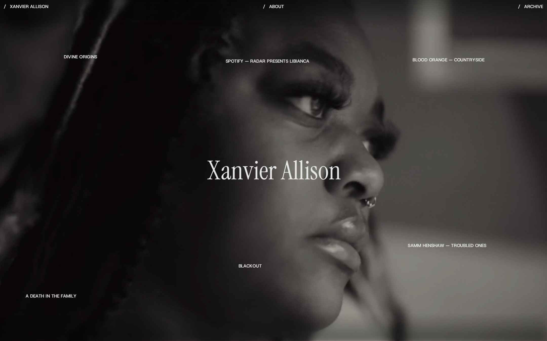
The homepage has a confident, coherent art direction. The portrait, restrained monochrome palette, sparse labels, and contrasting serif title create a memorable editorial signature.
What works
- Strong above-the-fold image selection and composition.
- Effective contrast between expressive serif display type and compact sans-serif utility text.
- Excellent restraint: no visible borders, cards, shadows, or decorative elements compete with the image.
- Project labels are distributed across the frame to create an art-directed index rather than a generic grid.
Opportunities
- Some project labels sit over visually complex or dark areas, so their legibility should be checked across changing imagery and viewport crops.
- A brief role descriptor or introductory line could clarify the creator’s discipline without weakening the minimalist direction.
Uniqueness
The page feels authored rather than template-driven. Its full-frame portrait index and annotation-like project placement give the portfolio a clear point of view.
What works
- The project list is integrated into the hero composition instead of presented as conventional cards.
- The monochrome portrait and centered name create a recognizable opening moment.
- The combination of film-title references and sparse navigation supports a coherent creative practice identity.
Opportunities
- The visual language is strong enough that project-specific transitions or supporting case-study framing could further differentiate the archive experience, provided they remain subordinate to the work.
- More explicit indication of the creator’s role could make the authorship proposition as distinctive as the visual presentation.
User experience
The page is easy to understand at a high level and keeps navigation minimal, but it prioritizes atmosphere over orientation and detailed project discovery.
What works
- About and Archive are immediately visible in the top navigation.
- Project titles are visible without requiring a conventional menu or dense content block.
- The centered name provides an unmistakable page identity.
- Contact and social links are present in the supplied page structure.
Opportunities
- Make the interaction state and destination of each project entry unambiguous on keyboard, touch, and reduced-motion settings.
- Provide more context for each project after selection, such as role, format, or year, so visitors can evaluate the portfolio efficiently.
- Test text placement and crop behavior on narrow screens, where the distributed desktop composition may become crowded or less legible.
Conversion optimization
For an auteur portfolio, the page succeeds at creating interest and directing visitors toward work. It is less effective at quickly communicating professional positioning or prompting a commission inquiry.
What works
- The visual opening creates a strong memory cue and encourages exploration.
- Visible project titles act as multiple entry points into the portfolio.
- The page structure includes a direct email address and social links for follow-up.
- About and Archive provide clear secondary paths without adding visual clutter.
Opportunities
- Add a concise, high-value descriptor near the opening or About entry explaining the creator’s role and type of work.
- Give the contact path slightly stronger prominence for prospective commissioners while preserving the editorial tone.
- Use project detail pages to surface credits, outcomes, collaborators, and a clear inquiry action.
- Confirm that project labels remain understandable when imagery or canvas layers change.
What we'd improve
- 01high
Clarify the professional proposition
Add a short description of Xanvier Allison’s role and creative focus near the hero or at the start of About, so new visitors understand the practice before exploring the archive.
- 02high
Strengthen semantic and interaction accessibility
Review the missing main landmark, heading semantics, focus treatment, keyboard access, and canvas alternatives. Test the project controls with screen readers and without pointer interaction; do not rely solely on the reported automated contrast score.
- 03high
Validate responsive project navigation
Test the distributed project-label composition at narrow widths, with zoom, and on touch devices. Ensure labels do not overlap the focal image or become difficult to activate.
- 04medium
Improve project decision-making
On project detail views, include concise role, format, year, and credit information so visitors can assess relevance without sacrificing the minimal homepage.
- 05medium
Make contact intent more explicit
Retain the direct email and social links, but add a restrained inquiry-oriented label or sentence for professional visitors who want to commission or collaborate.
- 06low
Document motion preferences
Because the evidence indicates canvas layers, blur treatments, and transitions, provide and test a reduced-motion experience that preserves navigation and project access without depending on movement.