Metalab website analysis
A detailed critique of the homepage's craft, originality, usability, and ability to move visitors toward its intended goal.
Our observations
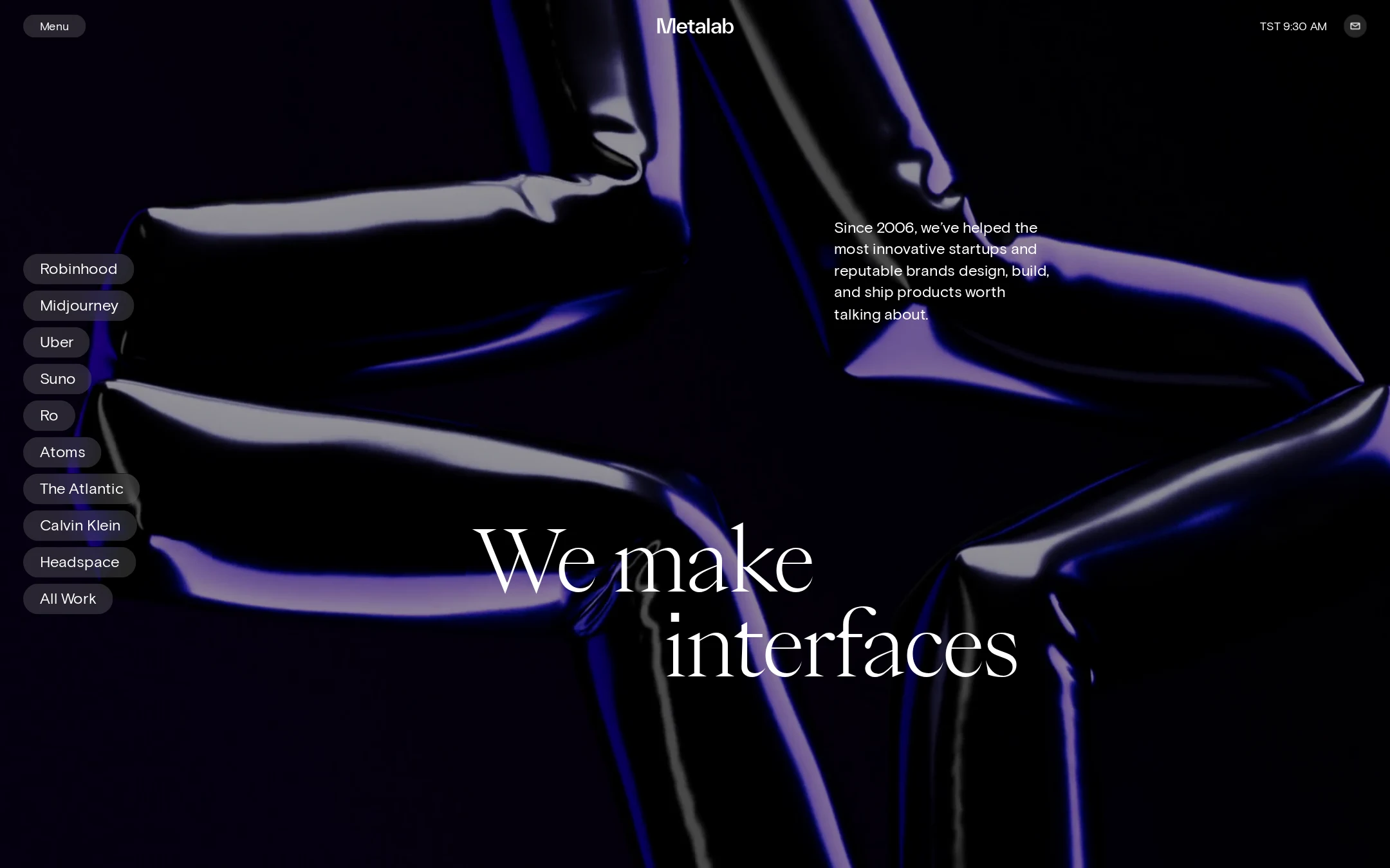
An exceptional, highly distinctive agency portfolio homepage with strong visual authorship and solid measured structure. It is best suited to a curated gallery as an example of art-directed editorial presentation, with modest opportunities to improve contact-path clarity and responsive assurance.
Best practices
The supplied accessibility and structural checks are unusually strong for an experimental visual homepage.
What works
- The page has one H1, one main region, and no recorded heading skips or duplicate IDs.
- The supplied automated check reports zero contrast failures across 32 sampled combinations.
- Primary navigation, client work, and contact access are all represented in the visible interface.
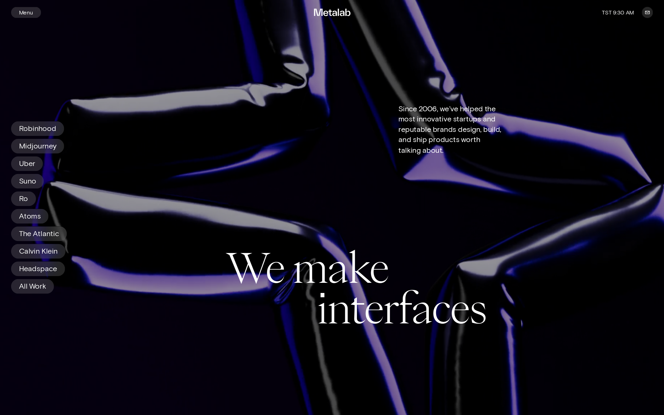
- The visual hierarchy is deliberate, with a clear distinction between brand, portfolio navigation, supporting copy, and hero statement.
Opportunities
- Validate focus visibility, menu semantics, video labeling, and keyboard access in an interactive audit; the supplied checks do not cover all of these behaviors.
- Test the experience under reduced-motion preferences, especially given the presence of videos, transitions, and smooth scrolling.
- Confirm that the time display and icon-only contact control have meaningful accessible names and do not distract from core navigation.
Design
The page demonstrates exceptional art direction, typographic contrast, and compositional control.
What works
- The black canvas, luminous abstract media, and restrained white interface create a coherent cinematic atmosphere.
- The contrast between the grotesque interface type and large editorial serif headline gives the brand a memorable voice.
- The client list is visually integrated into the hero rather than treated as a generic portfolio grid.
- The supporting paragraph is placed away from the headline, preserving both readability and visual tension.
Opportunities
- Provide a slightly clearer visual relationship between the hero statement and the portfolio controls so the headline does not dominate the first interaction.
- Ensure the abstract imagery remains sufficiently legible and purposeful when the page is viewed on lower-quality or smaller displays.
Uniqueness
The homepage has a strong point of view and avoids the interchangeable appearance common to agency portfolio sites.
What works
- The combination of cinematic abstract media, an editorial serif statement, and a vertical client index feels authored rather than templated.
- The interface is sparse without being generic because the motion-oriented presentation and typographic contrast carry the identity.
- The work selector foregrounds recognizable client categories while retaining a distinctive visual system.
Opportunities
- The agency category frequently uses dark, motion-heavy presentation; future iterations could deepen differentiation through more specific evidence of Metalab’s process or point of view.
- Consider introducing a small amount of outcome-oriented context near the work index without diluting the current restraint.
User experience
The page is easy to orient visually and offers direct access to work, but its immersive presentation may make task-oriented exploration less immediate.
What works
- The client list is persistent and scannable on the left side of the composition.
- The supporting copy quickly explains that the agency designs, builds, and ships digital products.
- The compact header keeps global controls available without competing strongly with the hero.
- The measured semantic structure provides a sound foundation for navigation and assistive technology.
Opportunities
- Make the next action after viewing the hero more explicit, particularly for visitors who want to discuss a project rather than browse case studies.
- Test whether the menu, left-side work index, and contact control remain discoverable when motion is disabled or when the viewport is narrow.
- Assess the visual prominence and labeling of the contact affordance relative to the importance of lead generation.
Conversion optimization
The page establishes substantial credibility through recognizable client work and a clear agency proposition, but conversion is secondary to brand atmosphere.
What works
- Recognizable client names provide immediate social proof and create multiple entry points into the portfolio.
- The supporting message communicates a broad value proposition above the fold.
- A visible contact affordance is present in the header.
- The portfolio-first structure is appropriate for an agency whose prospects are likely evaluating craft and experience.
Opportunities
- Increase the prominence of the contact route or add a concise invitation to start a conversation near the hero or portfolio transition.
- Pair selected client names with short outcome, category, or capability cues so visitors can quickly identify relevant experience.
- Measure whether visitors reach contact after interacting with the client selector, since the current design emphasizes exploration more strongly than inquiry.
What we'd improve
- 01high
Clarify the primary inquiry path
Give the contact action stronger visual priority or introduce a short, non-intrusive invitation near the hero so prospective clients can move from admiration to engagement without opening the broader menu.
- 02high
Audit motion and media fallback behavior
Test videos, transitions, smooth scrolling, and the abstract hero media with reduced motion enabled, slow connections, keyboard navigation, and paused media. Provide a stable still-image fallback where needed.
- 03medium
Strengthen case-study scanning
Add concise capability or outcome cues to selected work entries, preserving the pill-based visual language while helping visitors decide which case study to open.
- 04medium
Verify narrow-screen composition
Test the 88px-scale serif hero, vertical client list, absolute-positioned copy, and full-bleed media across mobile widths, zoom levels, and larger text settings.
- 05low
Expose more of the agency point of view
Use a later homepage section or a compact transition statement to explain Metalab’s distinctive approach, balancing the strong visual introduction with more substantive differentiation.