

COLLINS website analysis
A detailed critique of the homepage's craft, originality, usability, and ability to move visitors toward its intended goal.
Our observations
Publish. This is a visually strong and clearly authored creative-agency homepage with a memorable editorial system. It has material accessibility implementation issues, especially missing image alternative text, but the page remains suitable for a curated design gallery after review of those concerns.
Best practices
The page has solid semantic foundations and a clear content hierarchy, but implementation quality is held back by image accessibility and duplicate SVG identifiers.
What works
- The audit detects one main landmark, one H1, and no heading-level skips.
- The page exposes recognizable navigation, hero, service, case-study, and footer regions.
- The audit found zero contrast failures across 49 sampled combinations.
- The footer includes a newsletter form and the page provides multiple navigation destinations.
Opportunities
- Add meaningful alt text to the 11 identified image elements, or mark purely decorative imagery as intentionally decorative.
- Replace repeated SVG clip-path or symbol IDs with unique identifiers to avoid possible rendering and assistive-technology conflicts.
- Test keyboard focus order and visible focus treatment, especially for the compact menu, carousel controls, case-study cards, and newsletter form.
- Validate the layout at smaller widths; the screenshot shows a wide desktop composition and does not establish mobile usability.
Design
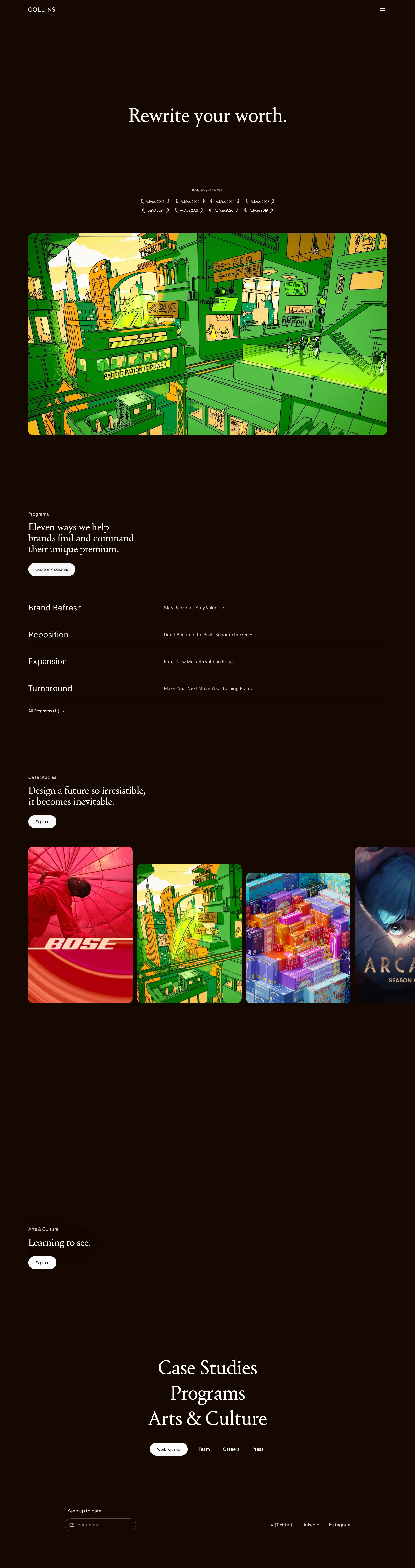
The visual system is exceptional: it combines a near-black espresso field, delicate serif display type, restrained utility navigation, and highly saturated illustration without feeling generic.
What works
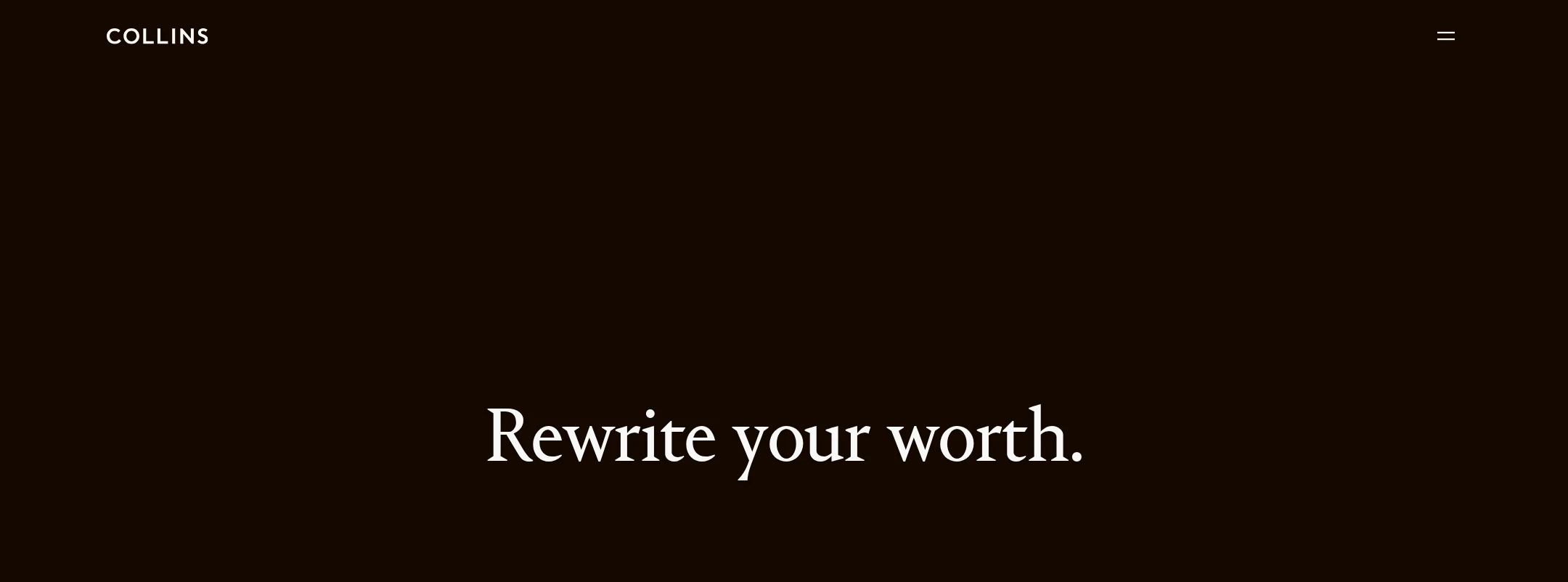
- The hero uses a short, memorable proposition with substantial negative space and clear visual priority.
- Vivid illustrated work creates immediate portfolio recognition and gives the dark palette a strong focal contrast.
- The repeated editorial treatment across Programs, Case Studies, and Arts & Culture makes the long page feel intentionally composed.
- The restrained header and small rounded buttons keep attention on the work rather than on interface chrome.
Opportunities
- Increase the visual distinction between secondary informational sections and the major case-study showcase so the long page has clearer pacing landmarks.
- Consider slightly stronger labeling or visual affordances around horizontally arranged work cards; their interaction model is not established by the screenshot.
- Audit the smallest supporting text at actual viewing sizes, since the highly refined typography may reduce practical legibility despite the sampled contrast results.
Uniqueness
The homepage has a highly recognizable art direction and avoids the interchangeable visual language common to agency sites.
What works
- The combination of espresso brown, luminous green illustration, coral/red artwork, and literary serif typography is unusually specific.
- The hero composition and gallery-like image treatment communicate an authored point of view before users reach detailed case studies.
- The inclusion of Arts & Culture alongside programs and client work broadens the brand world beyond a standard services page.
Opportunities
- Make the agency’s specific point of view or working method more explicit earlier in the page; the visual identity is clearer than the differentiating explanation.
- Use more descriptive project context near the image cards if the goal is to help visitors distinguish strategic outcomes from purely visual case-study appeal.
User experience
The page provides a coherent scroll narrative from positioning to programs, work, culture, and contact, but its sparse layout and compact controls may make discovery slower for users seeking concrete information.
What works
- The H1 establishes the page’s central positioning immediately.
- Programs and Case Studies are presented as distinct content groups, supporting both service discovery and proof of work.
- The visible footer contains navigation, social links, and a newsletter entry point.
- The strong image hierarchy makes portfolio exploration inviting.
Opportunities
- Add persistent or more discoverable navigation cues for long-page users, particularly when key sections are separated by large empty intervals.
- Provide clearer labels for image-based cards and carousel actions, including accessible names and state information.
- Reduce unnecessary ambiguity around small text links and buttons by improving their size, labeling, or surrounding affordance.
- Confirm that motion and media have pause, mute, and reduced-motion behavior; the metadata indicates transitions and animation but does not describe controls or fallback states.
Conversion optimization
For a reputation- and inquiry-driven branding agency, the page effectively sells taste and capability, but the primary path from inspiration to qualified contact is comparatively understated.
What works
- The hero communicates a confident positioning statement rather than leading with generic agency terminology.
- Programs and case studies provide two complementary routes toward understanding the agency’s offer.
- The visible buttons and footer contact links create conversion opportunities without overwhelming the art direction.
- The work carousel supplies social proof through recognizable, visually differentiated projects.
Opportunities
- Introduce a more prominent, persistent inquiry CTA or contact route after the hero and again after the case-study section.
- Add concise outcomes, client names, or engagement context beside selected projects where available, so prospects can connect visual quality with business value.
- Clarify the action behind generic-looking buttons such as “View” or “Explore” with more specific labels tied to the destination.
- Place a short qualification or contact prompt near the end of the case-study narrative rather than relying primarily on footer navigation.
What we'd improve
- 01high
Resolve missing image alternative text
Add concise, content-specific alt text to the 11 flagged images, describing the project or illustration when it conveys meaning. For decorative artwork, use empty alt attributes and ensure adjacent text carries the information.
- 02high
Fix duplicate SVG identifiers
Generate unique IDs for repeated clip paths, masks, or symbols, then verify the illustrations render correctly across repeated cards and browsers.
- 03high
Strengthen the inquiry path
Add a clearly labeled “Start a project” or equivalent CTA near the hero and after Case Studies, linking directly to the contact route while preserving the minimal visual treatment.
- 04medium
Improve portfolio discoverability
Give each case-study card a descriptive accessible name and visible project context, and expose carousel position and controls to keyboard and screen-reader users.
- 05medium
Validate long-page responsive behavior
Test the large gaps, horizontal card shelf, typography scale, menu interaction, and footer form at mobile and tablet widths; adjust pacing where scrolling becomes excessive.
- 06low
Make project value easier to assess
Add brief, factual outcome or challenge summaries to selected case studies so the page communicates strategic capability alongside its strong art direction.