Beth-Emily | Brand Strategy & Design website analysis
A detailed critique of the homepage's craft, originality, usability, and ability to move visitors toward its intended goal.
Our observations
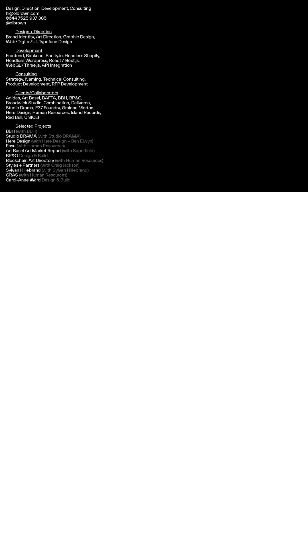
A strong, highly art-directed agency homepage with a memorable visual identity, held back from exceptional status by weak semantic introduction and documented accessibility defects.
Best practices
The page has a clear primary navigation and a focused visual presentation, but the supplied audit identifies meaningful structural and accessibility gaps.
What works
- Navigation labels are concise and directly support the apparent portfolio-agency purpose.
- The visual hierarchy is focused rather than cluttered, with the work taking priority.
- The page appears to use a dedicated slider structure with previous and next controls.
Opportunities
- Add a single, descriptive H1 and ensure the page exposes a main landmark; the supplied audit reports zero H1 elements and zero main elements.
- Provide accessible names for the two reported unnamed links, including the logo or home links where applicable.
- Re-test the four reported text-contrast failures across all navigation states and image backgrounds.
- Verify keyboard focus visibility, slider announcements, and pause or control behavior; these outcomes cannot be confirmed from the supplied evidence.
Design
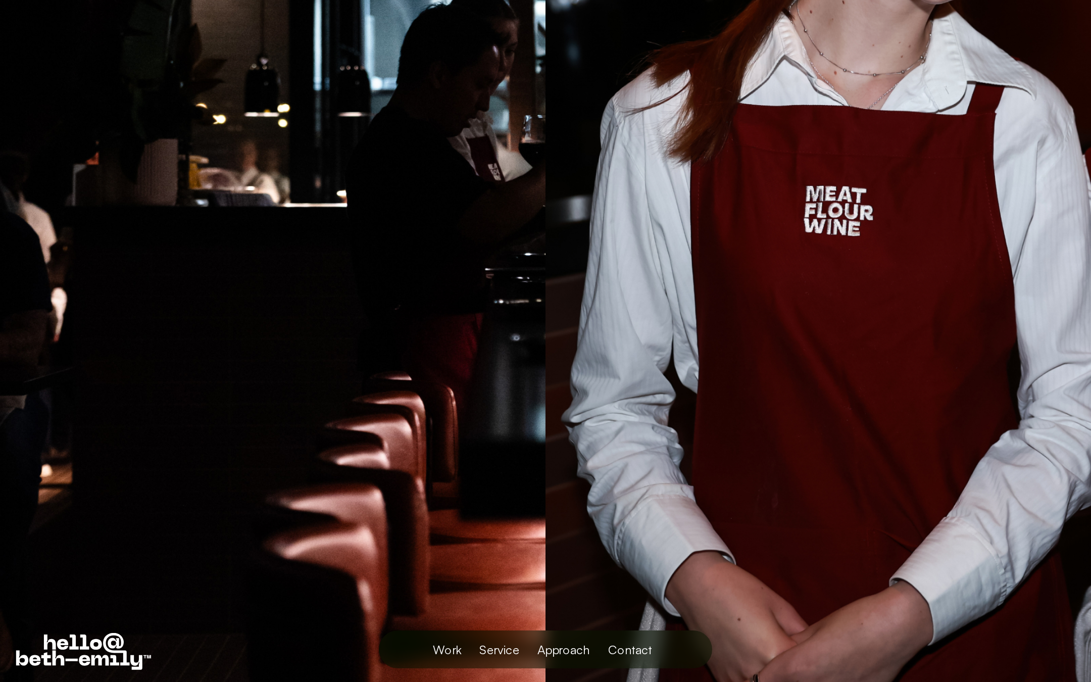
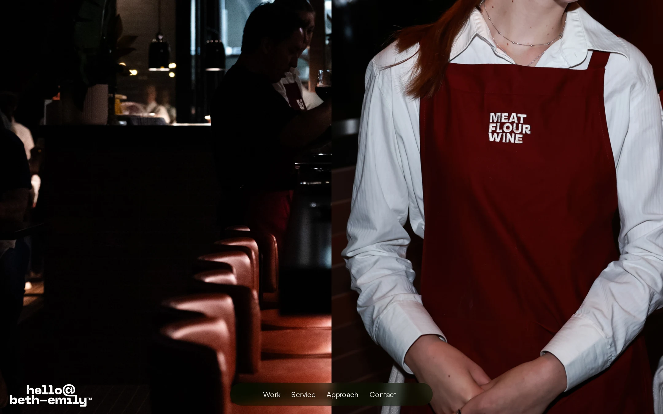
The visual direction is confident, cohesive, and unusually atmospheric for a studio homepage.
What works
- The split photographic frame creates immediate tension and a strong editorial point of view.
- The red, black, and warm photographic palette feels coherent with hospitality and culture-oriented brand work.
- The restrained rounded navigation element adds interface contrast without competing with the imagery.
- The treatment feels purposefully art-directed rather than template-led.
Opportunities
- Introduce a small amount of visible positioning copy so the design communicates the studio’s offer without requiring navigation or exploration.
- Ensure the wordmark and navigation remain legible over every image state and crop.
- Create more explicit visual separation between branding, navigation, and slider controls at narrower widths.
Uniqueness
The image-first composition and moody hospitality imagery give the homepage a recognizable creative-studio character.
What works
- The juxtaposition of an atmospheric interior and close-up portrait is more distinctive than a conventional project-grid opening.
- The low-positioned navigation and restrained interface support a strong signature presentation.
- The visual language feels specific to a brand and design practice rather than generic corporate marketing.
Opportunities
- Use supporting project context or a short point of view to make the studio’s strategic differentiation as distinctive as its art direction.
- Avoid depending solely on dark editorial imagery as the signature; a broader but related image system could improve memorability across the site.
User experience
The primary routes are discoverable, but the absence of a visible heading and the reported link and contrast issues create avoidable barriers.
What works
- Work, Service, Approach, and Contact are visible in a compact navigation group.
- The uncluttered opening makes the intended browsing path easy to understand at a glance.
- Large image areas create an immersive entry point for a portfolio audience.
Opportunities
- Add a concise introductory statement that identifies the studio and its services immediately.
- Resolve unnamed links and verify that logo links have useful accessible labels.
- Improve contrast for navigation items and test all states against changing imagery.
- Confirm that slider controls are operable by keyboard and touch, with meaningful slide labels and a non-motion fallback.
Conversion optimization
For a portfolio-led agency, the page successfully signals taste and capability, but it does not visibly make the value proposition or next action explicit enough.
What works
- The strong opening image can attract prospective clients who value visual craft and brand expression.
- Contact is present in the primary navigation rather than being hidden in a footer.
- The Work and Service routes provide plausible paths for evaluating capability.
Opportunities
- Pair the opening visual with a clear service-oriented proposition and a low-friction contact prompt.
- Add brief project or client context near the first interaction point so visitors can connect the visual quality to commercial capability.
- Make the next best action explicit for different audiences, such as viewing selected work or starting a project conversation.
- Use descriptive labels and accessible states so conversion paths remain usable beyond the visual experience.
What we'd improve
- 01high
Add semantic introduction and landmarks
Create one descriptive H1 and a main landmark that identify the practice and its core offer. Keep the copy concise so it supports, rather than dilutes, the art-directed opening.
- 02high
Resolve reported accessibility failures
Give the two unnamed links accessible names and rework the four reported text-contrast failures across default, hover, focus, and image-overlay states.
- 03high
Make the first action clearer
Add a short above-the-fold explanation and a prominent, accessible route to either selected work or a project enquiry, without relying on the viewer to infer the studio’s role from imagery.
- 04medium
Audit slider interaction
Verify keyboard and touch operation, focus visibility, slide announcements, meaningful control labels, and a reduced-motion or static presentation. The supplied evidence confirms the slider structure but not its interaction quality.
- 05medium
Validate responsive composition
Test mobile and intermediate widths for image cropping, fixed-layer overlap, navigation wrapping, control sizing, and readability over every image state.