Redo Bureau website analysis
A detailed critique of the homepage's craft, originality, usability, and ability to move visitors toward its intended goal.
Our observations
A highly memorable, art-directed agency homepage with excellent visual confidence, but accessibility and content hierarchy issues keep it from being exceptional as a complete first-touch experience.
Best practices
The page is visually coherent and presents clear top-level navigation, but the supplied audit identifies meaningful semantic and contrast shortcomings.
What works
- Clear navigation labels for Work, Studio, and Contact.
- Consistent, restrained visual treatment across the visible interface.
- The page communicates a clear creative-agency context through its positioning copy and artwork.
Opportunities
- Address the seven reported text-contrast failures, particularly in navigation and introductory copy.
- Add a meaningful H1 and a main landmark so the page has a clearer semantic structure.
- Verify keyboard focus visibility, screen-reader labeling, and motion alternatives; these behaviors are not established by the supplied screenshot.
Design
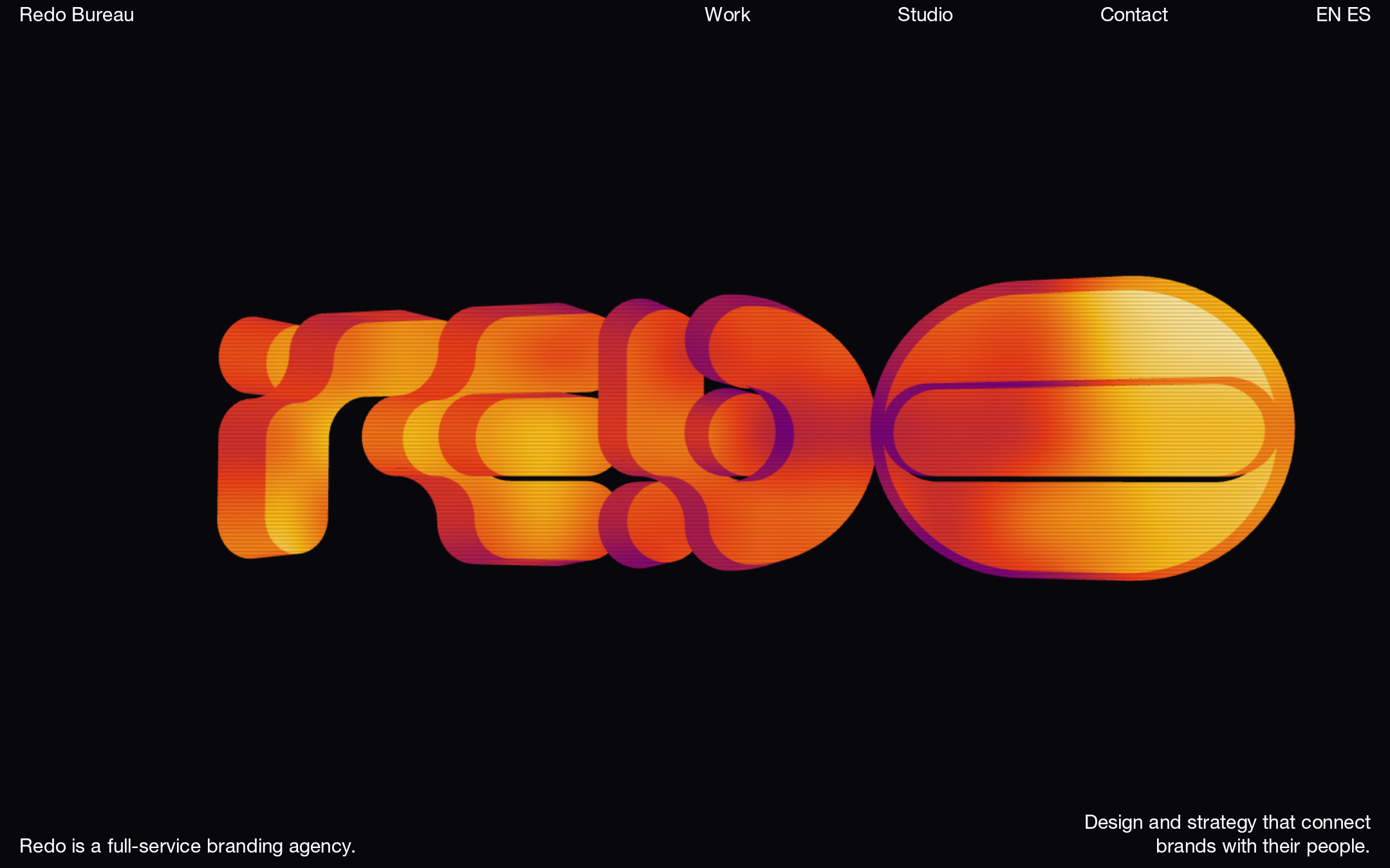
The homepage demonstrates strong art direction, scale control, and visual restraint, with a central image that is immediately recognizable and ownable.
What works
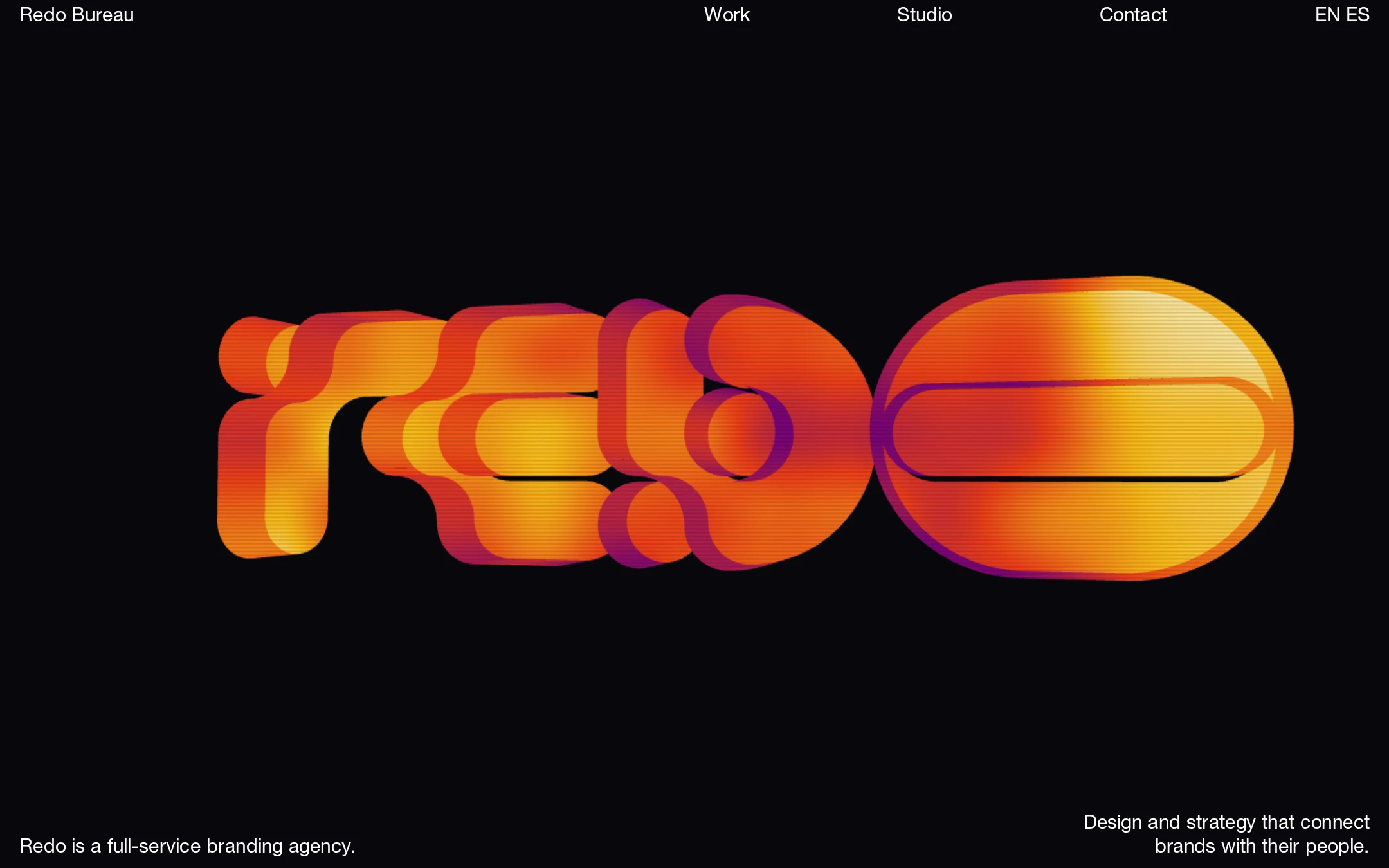
- The oversized abstract lettering creates a powerful focal point and distinctive brand signature.
- The black background gives the warm gradient artwork strong visual presence.
- Sparse navigation and generous negative space prevent the composition from feeling crowded.
- Bottom-aligned copy adds context without competing with the hero artwork.
Opportunities
- Ensure the abstract centerpiece is supported by an accessible text alternative or adjacent description.
- Introduce a small amount of supporting work or service context without weakening the intentionally minimal composition.
Uniqueness
The combination of abstract dimensional lettering, saturated warm gradients, and an almost empty black canvas feels substantially more distinctive than a conventional agency hero.
What works
- The hero artwork functions as a memorable visual identity rather than generic stock imagery.
- The composition makes a clear aesthetic choice and sustains it consistently.
- The restrained interface leaves room for the studio’s visual point of view.
Opportunities
- Use subsequent project presentation to demonstrate that the visual distinctiveness extends beyond the opening animation.
- Avoid allowing the hero treatment to become the sole source of differentiation if the same visual language is not carried through the site.
User experience
The visible navigation is easy to scan, but the first viewport provides limited practical information and the audit raises concerns for low-vision and assistive-technology users.
What works
- The main destinations are visible without exploration.
- The short statements at the bottom clarify that the studio provides branding and strategy services.
- The visual hierarchy is immediately legible at a glance.
Opportunities
- Improve contrast for all flagged text and verify readability across display conditions.
- Provide a semantic heading structure and main landmark.
- Make the path from the hero to selected work more explicit for visitors evaluating the studio.
- Test the animated area for loading, pause behavior, reduced-motion support, and meaningful fallback content.
Conversion optimization
For a branding-studio homepage, the page establishes an appealing point of view and exposes Contact, but it delays evidence of capability and client value.
What works
- Contact is prominent in the top navigation.
- The positioning line identifies the studio as a full-service branding agency.
- Work is available as a primary navigation destination.
Opportunities
- Add a concise, visible route from the hero into selected case studies or featured work.
- Clarify the studio’s service scope and locations earlier, especially for first-time visitors.
- Support the Contact route with a stronger invitation or context about the type of collaboration sought.
- Preserve the artwork-led opening while ensuring the next scroll or interaction answers why a prospective client should continue.
What we'd improve
- 01high
Repair contrast and semantic structure
Resolve all seven reported text-contrast failures, add a single meaningful H1, and provide a main landmark. Recheck the header, language switcher, and introductory copy at their actual rendered sizes and states.
- 02high
Make the hero accessible beyond its visual form
Provide an informative text alternative or nearby description for the abstract animated artwork, and define a static fallback if the iframe or motion content does not load.
- 03medium
Expose proof of work sooner
Add a clearly signposted featured-work or selected-project entry immediately after the opening statement so visitors can evaluate the studio’s capabilities without relying on the Work navigation alone.
- 04medium
Document and test motion behavior
Verify loading performance, keyboard access, pause or stop controls where appropriate, reduced-motion behavior, and responsive cropping across viewport sizes.
- 05low
Strengthen the contact invitation
Keep Contact in the global navigation but add a concise collaboration prompt or project-fit cue near the first substantive content section.