POSTHUMAN website analysis
A detailed critique of the homepage's craft, originality, usability, and ability to move visitors toward its intended goal.
Our observations
An exceptional art-directed portfolio homepage with a memorable visual signature. It is ready for gallery inclusion, though accessibility, semantic hierarchy, and visitor orientation need refinement.
Best practices
The page demonstrates disciplined restraint, strong contrast, a clear main region, and a compact navigation system. Automated evidence reports no contrast failures, duplicate IDs, or heading skips. However, the missing accessible link name and absence of an H1 are important structural shortcomings.
What works
- No sampled contrast failures were detected.
- The fixed navigation and footer create a consistent frame around the work.
- The page uses a single main region and avoids visible interface clutter.
- The visual hierarchy is led by content rather than decorative UI.
Opportunities
- Add a meaningful accessible name to the currently unnamed link.
- Introduce one visible or screen-reader-accessible H1 that identifies the agency or homepage purpose.
- Verify that all portfolio media have useful alternative text or are correctly treated as decorative.
- Test the fixed navigation and footer at zoom and on narrow screens.
Design
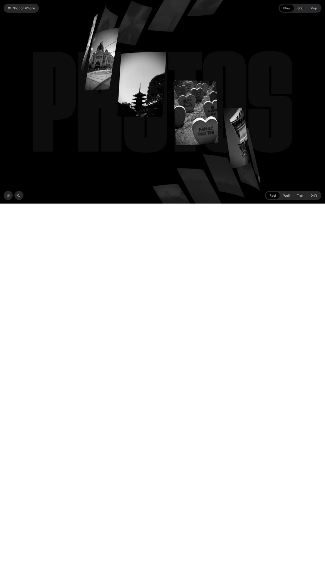
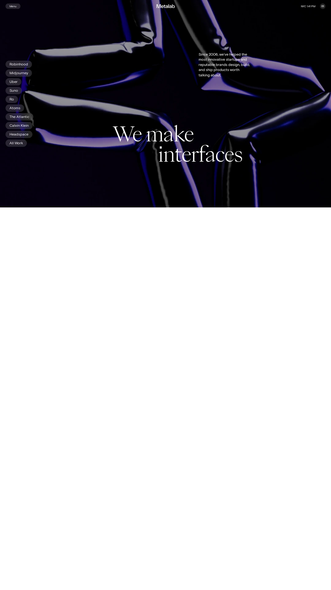
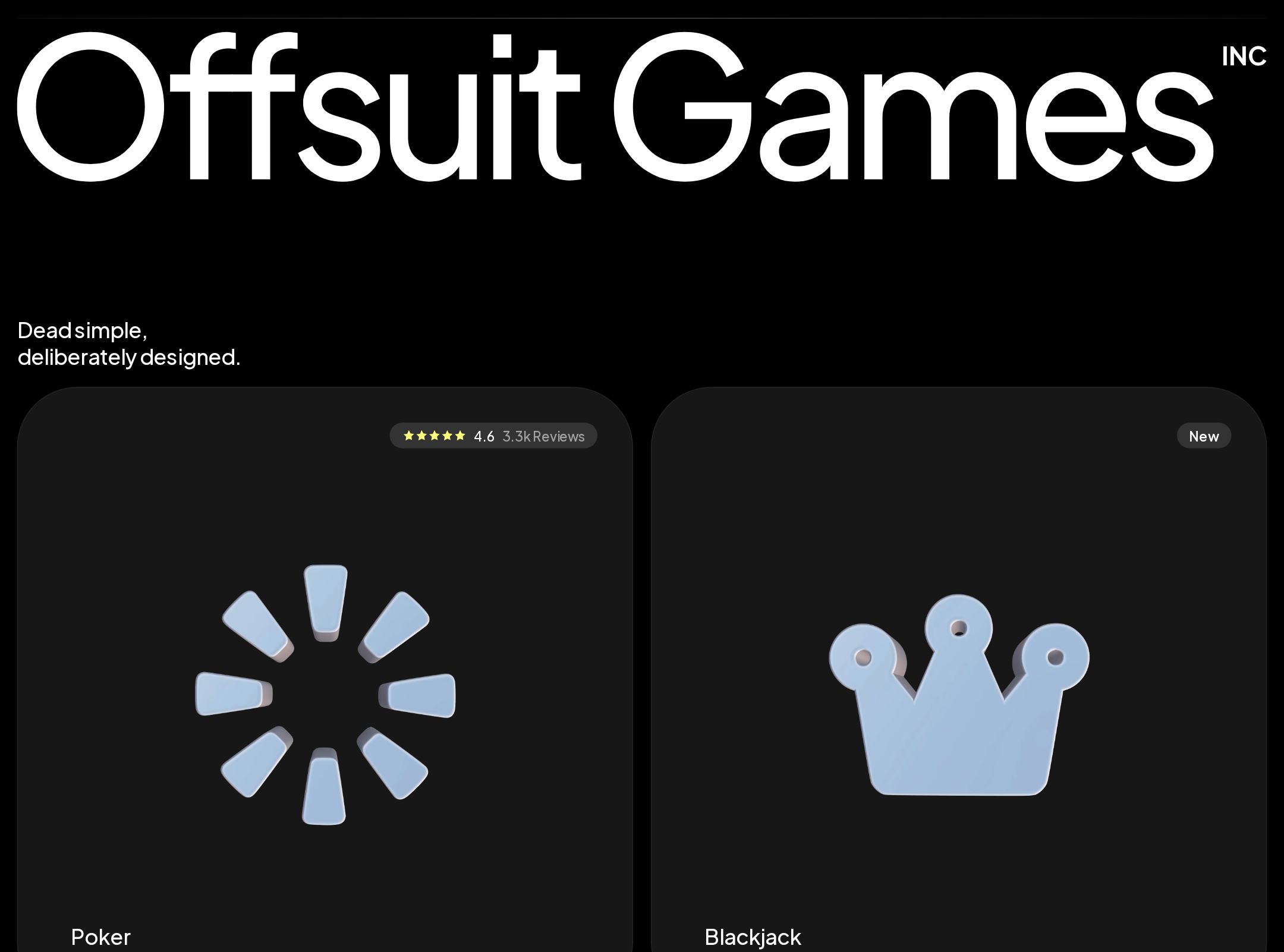
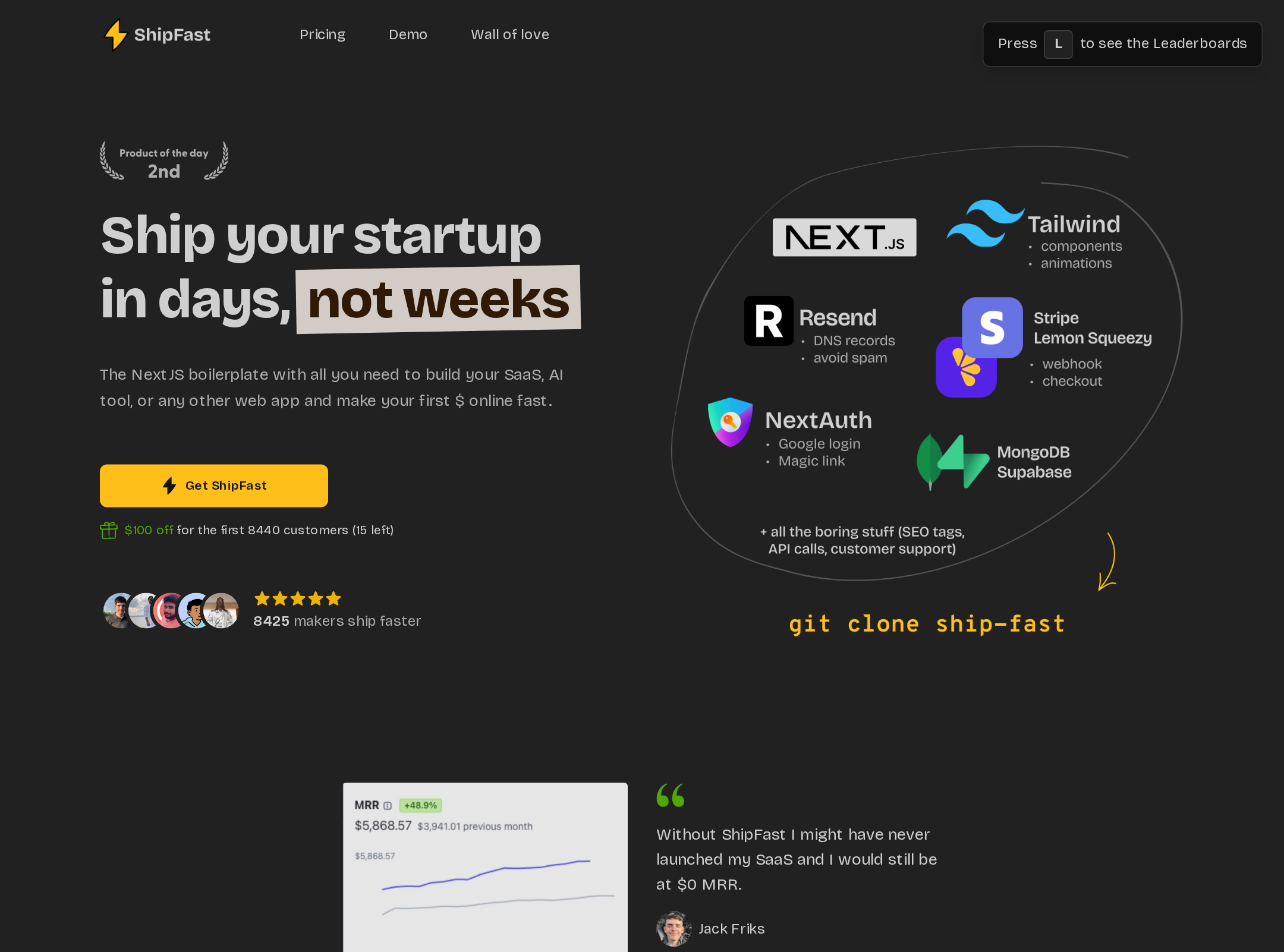
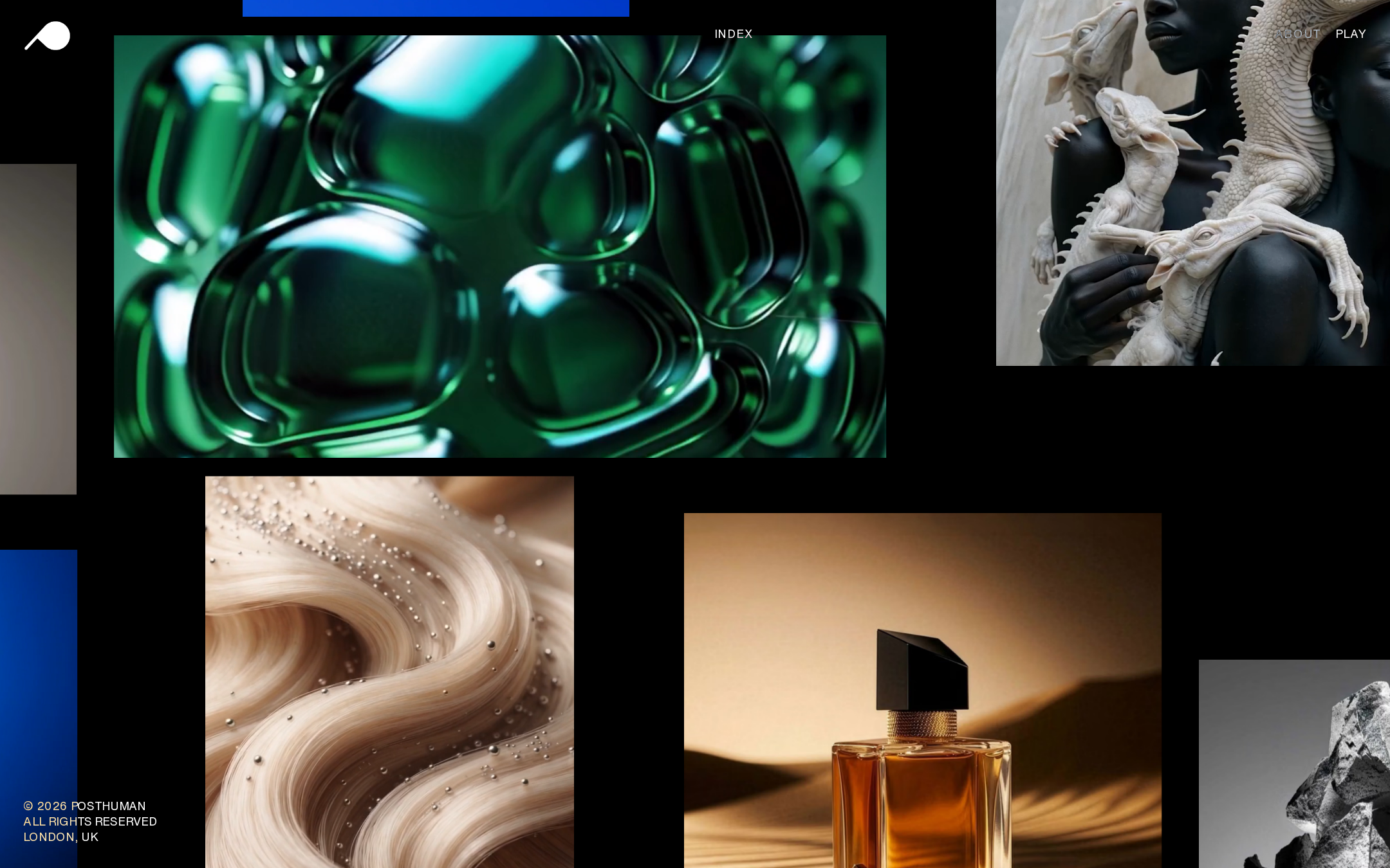
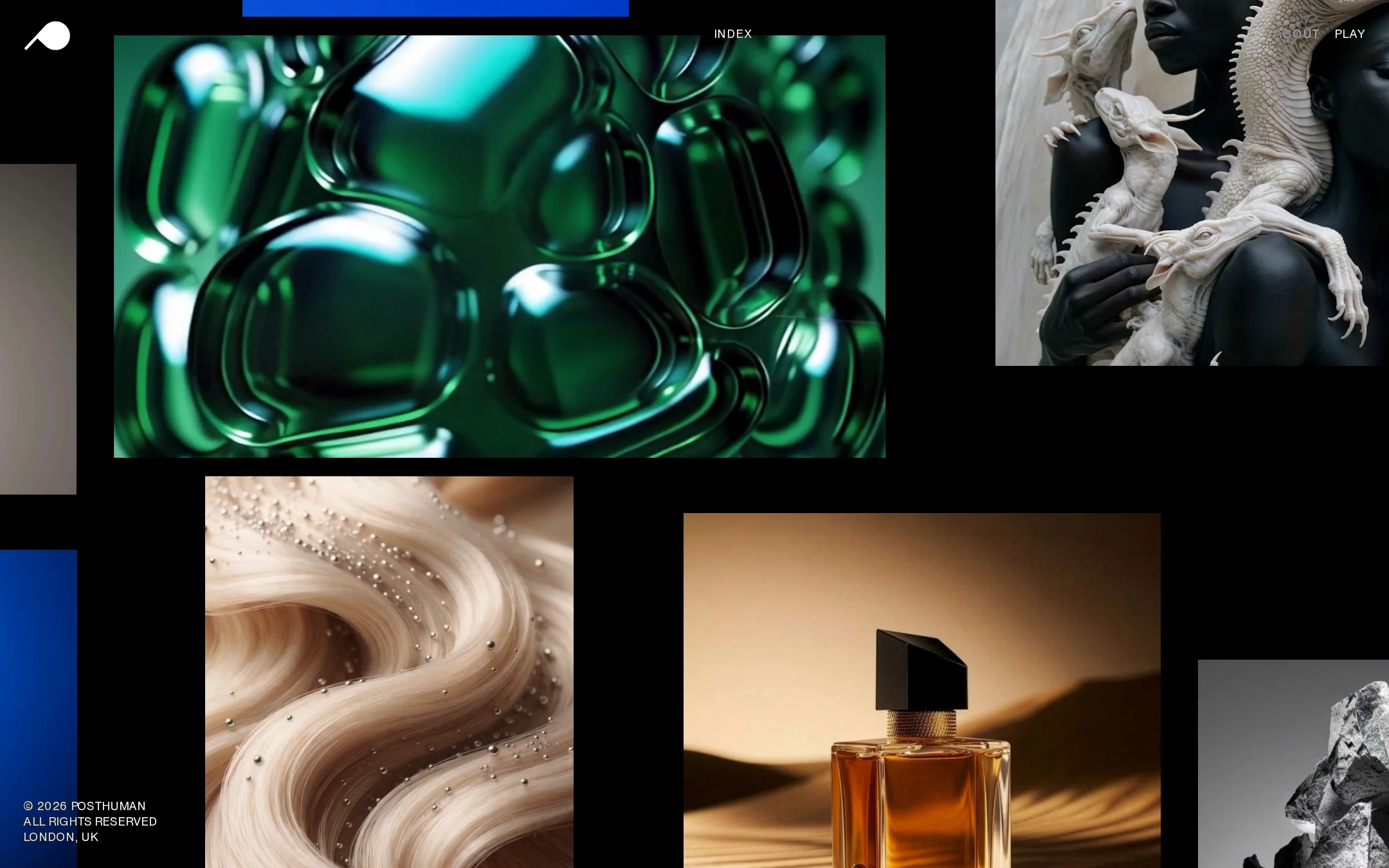
The design is highly resolved and visually confident. Its black field, irregular image placement, and varied visual subjects create the feel of a contemporary creative archive rather than a generic agency template.
What works
- The imagery establishes a distinctive mood immediately.
- The restrained monochrome interface lets the portfolio assets dominate.
- Asymmetry and negative space create rhythm across the page.
- The art direction is coherent across abstract, product, figurative, and monochrome imagery.
Opportunities
- Add subtle project names or categories to improve meaning without weakening the visual composition.
- Use a clearer introductory moment before or alongside the image field.
- Ensure image crops preserve important subjects across viewport sizes.
Uniqueness
The homepage has a strong individual point of view. The combination of speculative imagery, editorial spacing, fixed micro-navigation, and a black exhibition-like canvas is more distinctive than a conventional agency portfolio grid.
What works
- The visual system is immediately recognizable from the supplied screenshot.
- The composition avoids a standard card grid and predictable hero treatment.
- The imagery and interface operate as one art-directed identity.
Opportunities
- Make the agency’s particular point of view explicit in copy, not only implied by imagery.
- Use project sequencing or thematic grouping to turn visual distinctiveness into a more ownable browsing experience.
User experience
The page is compelling for visually oriented visitors but provides limited orientation and discoverability. The supplied evidence confirms a strong hero region and semantic navigation, but not how projects are labeled, selected, or experienced beyond the screenshot.
What works
- Navigation remains visible and concise.
- The high-contrast interface is easy to distinguish from the image content.
- The page creates an immediate sense of quality and creative ambition.
Opportunities
- Provide clear focus states and accessible names for all interactive media and controls.
- Expose project context on focus, hover, or selection rather than requiring visitors to infer destinations.
- Add a direct route to agency information and contact details with stronger explanatory labeling.
- Respect prefers-reduced-motion; the supplied evidence does not show reduced-motion handling.
Conversion optimization
For an agency portfolio, the page successfully communicates taste and capability, but it under-explains the service proposition and makes the next business action less prominent than the visual experience.
What works
- The work is presented as premium and differentiated, which supports trust with visually led prospects.
- The navigation includes routes for agency information and play or exploration.
- The portfolio-first approach is appropriate for a production and creative studio.
Opportunities
- Place a concise positioning statement near the opening viewport.
- Make contact or project-enquiry access persistent or clearly available from the primary navigation.
- Add project credits, capabilities, or client context where appropriate to connect visual quality with commercial expertise.
- Use a clear closing invitation on the About or contact destination rather than relying on discovery alone.
What we'd improve
- 01high
Repair semantic and accessible navigation
Give the unnamed navigation link a descriptive accessible name, add a meaningful H1, and verify focus visibility for fixed navigation and portfolio interactions.
- 02high
Clarify the agency proposition
Add a short, original introductory statement that explains what the studio makes and who it works with, while keeping the image field visually dominant.
- 03high
Define the next action
Expose a clear contact or enquiry route in the persistent navigation or footer so prospective clients can move from admiration to conversation.
- 04medium
Add project context without clutter
Provide concise project titles, categories, or client/context metadata on focus, hover, or selection, with equivalent keyboard and screen-reader access.
- 05medium
Verify motion and responsive behavior
Test the fade-based image changes with prefers-reduced-motion enabled and validate that the asymmetric composition, fixed controls, and image crops remain usable on mobile and at zoom.
- 06low
Strengthen the closing experience
Use the end of the portfolio or About destination to summarize capabilities and provide a memorable, direct invitation for relevant collaborators or clients.