Joshua Baker — Software engineer and designer website analysis
A detailed critique of the homepage's craft, originality, usability, and ability to move visitors toward its intended goal.
Our observations
A distinctive and commercially credible portfolio presentation with excellent art direction and strong scanning structure. It merits gallery consideration, but accessibility remediation is needed before it can be regarded as fully exemplary.
Best practices
The page has a clear semantic content sequence, one detected H1, a main landmark, navigation, footer, project links, and a direct work CTA. Automated checks also identify 48 contrast failures and duplicate IDs, which materially reduce the score.
What works
- Clear hero-to-work-to-proof-to-contact progression.
- One detected H1 and no heading-level skips in the supplied evidence.
- Projects are presented as recognizable linked cards with concise metadata.
- Sticky navigation and section anchors support orientation.
Opportunities
- Resolve the reported duplicate SVG IDs to prevent possible assistive-technology conflicts.
- Increase contrast for muted project, sector, and client-label text.
- Verify visible keyboard focus states and canvas fallbacks; these are not established by the supplied evidence.
- Test reduced-motion behavior, since animation is present but prefers-reduced-motion was not detected.
Design
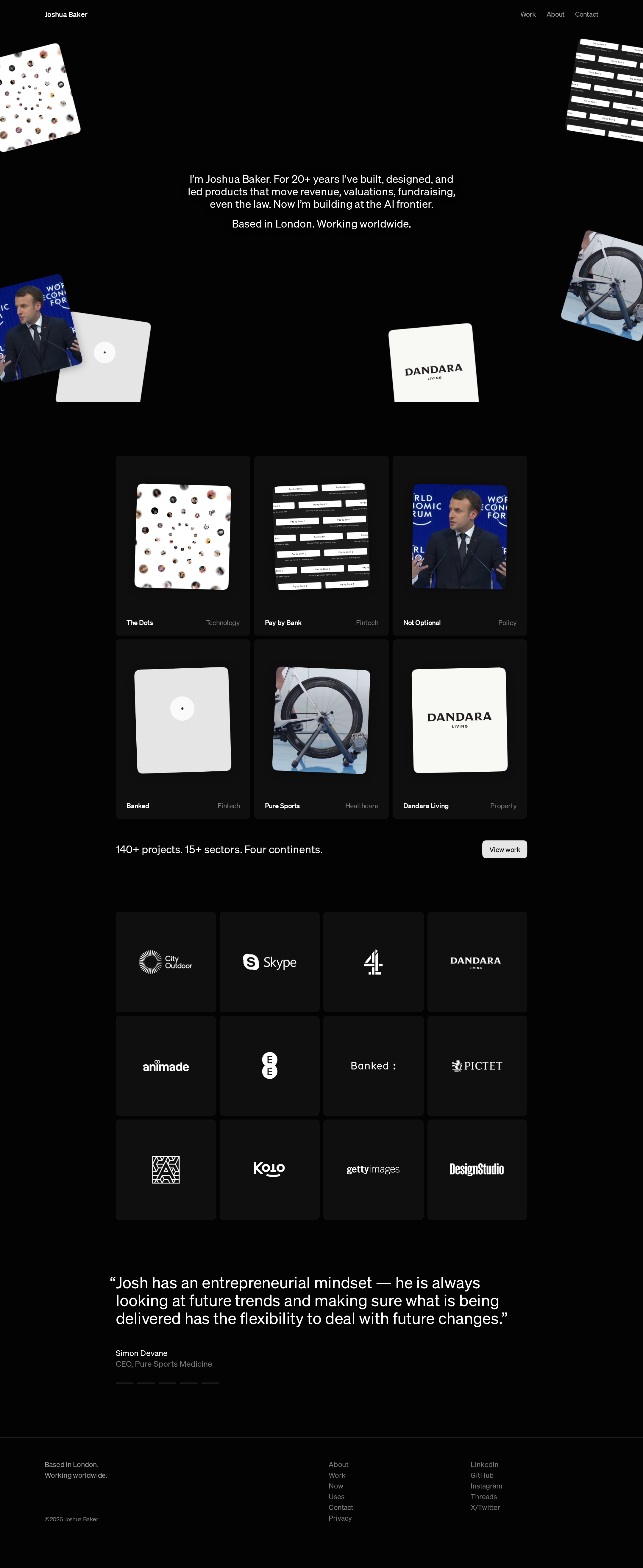
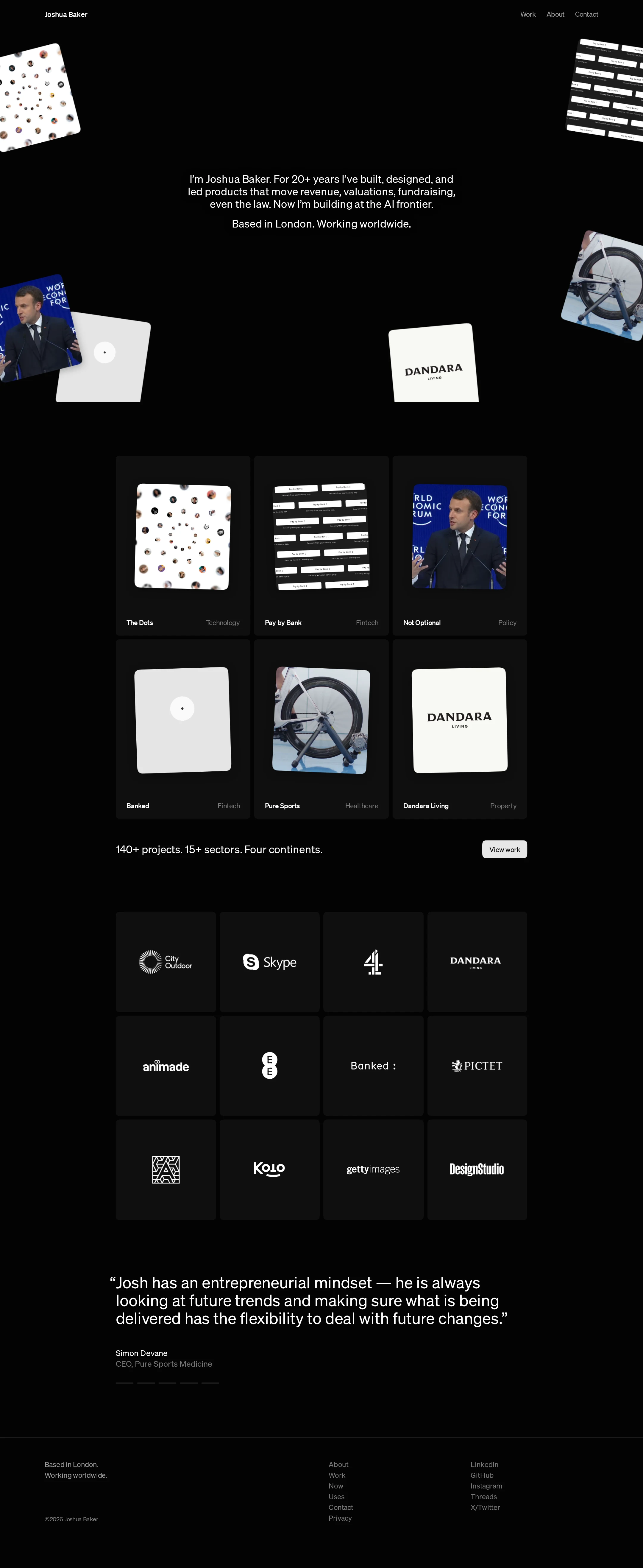
The visual system is unusually coherent and confident. The black field, floating artifacts, soft card corners, and restrained typography create a premium independent-practitioner identity without relying on excessive decoration.
What works
- Strong contrast between spacious hero composition and structured project grid.
- Consistent card geometry and monochrome treatment across projects and client marks.
- Project imagery gives the page personality and makes the work immediately scannable.
- The testimonial and footer maintain the same disciplined visual language.
Opportunities
- Provide more visual or typographic emphasis for the primary contact path.
- Consider slightly stronger differentiation between project titles and sector labels.
- Ensure decorative floating media does not compete with the hero statement at smaller widths.
Uniqueness
The combination of floating project fragments, compact editorial grids, and a dark monochrome presentation feels authored rather than template-driven. The visual identity is memorable while remaining legible as a portfolio.
What works
- The hero uses selected work as an atmospheric composition rather than a generic banner.
- Client marks and project tiles are integrated into one consistent visual vocabulary.
- The page balances professional credibility with an individual design sensibility.
Opportunities
- Add a more explicit signature device or point of view in the written positioning to make the identity less dependent on art direction.
- Use project-specific outcomes or role markers to distinguish the work beyond imagery and sector labels.
User experience
The page supports rapid browsing well: the hero states the proposition, the six projects are visible in a compact grid, and the later proof sections reinforce credibility. The experience is more visual than explanatory, so visitors seeking detailed case-study context must continue into project links.
What works
- Strong initial proposition and immediate location cue.
- Six projects are presented in a predictable, easy-to-scan arrangement.
- Client marks and testimonial content provide social proof without interrupting the main flow.
- Navigation labels are concise and familiar.
Opportunities
- Make project roles, outcomes, or contribution clearer before requiring a click.
- Confirm that animated canvases have meaningful accessible names or adjacent text alternatives.
- Test the page with keyboard navigation and screen readers, especially around animated content and testimonial controls.
- Validate mobile layout and touch targets; the supplied evidence is primarily a desktop view.
Conversion optimization
For a personal portfolio, the page does a good job converting attention into work exploration and credibility. The work CTA is visible after the project grid, but the route to initiating a new engagement is comparatively understated.
What works
- The work summary provides a useful credibility signal: project volume, sector breadth, and geographic reach.
- A visible View work action follows the gallery at a natural decision point.
- Client marks and a named testimonial strengthen professional trust.
- Contact is available in the primary navigation and footer.
Opportunities
- Promote a clear engagement or availability CTA alongside the hero statement.
- Add a short explanation of ideal project types, collaboration model, or current availability.
- Place a stronger contact invitation after the testimonial, where trust is highest.
- Preserve the visual restraint while making the next action more explicit for prospective clients.
What we'd improve
- 01high
Repair contrast failures
Raise the contrast of muted project metadata, sector labels, and client-grid captions, then re-run contrast checks across the full page and hover/focus states.
- 02high
Remove duplicate SVG identifiers
Make inline SVG clip-path and mask IDs unique per instance, or scope them safely, and verify that repeated project and logo artwork renders correctly with assistive technology.
- 03high
Verify motion accessibility
Add and test a reduced-motion presentation for hero reveals, project artwork, and cycling testimonials; ensure the testimonial content remains readable and controllable without animation.
- 04medium
Strengthen the engagement path
Add a clear hero or post-testimonial invitation explaining how prospective clients can start a conversation, without turning the page into a sales-heavy layout.
- 05medium
Improve project context
Expose each project’s role, contribution, or outcome in the card or linked detail view so visitors can assess expertise before opening individual work.
- 06low
Complete responsive and input testing
Review mobile stacking, canvas cropping, focus order, touch targets, and footer density at narrow widths; these behaviors are not established by the supplied desktop evidence.