Build UI website analysis
A detailed critique of the homepage's craft, originality, usability, and ability to move visitors toward its intended goal.
Our observations
A visually strong and commercially focused developer-education landing page with a distinctive dark editorial treatment, held back from exceptional status by accessibility defects, long-page density, and limited purchase-detail clarity.
Best practices
The page has a clear heading structure, one detected h1, no heading skips, a single main landmark, and a recognizable conversion path. Automated accessibility findings materially reduce the score.
What works
- Clear page structure from hero through proof, content, team credibility, pricing, and signup.
- One detected h1, logical heading progression, and a single main landmark.
- Primary actions are visually identifiable and repeated at useful points.
Opportunities
- Resolve the 12 links missing accessible names, including the logo and testimonial avatar links.
- Add a programmatic label to the newsletter input.
- Correct the six reported text-contrast failures and recheck contrast across all responsive states.
- Verify focus visibility, keyboard access, embedded social content, and touch target sizing manually.
Design
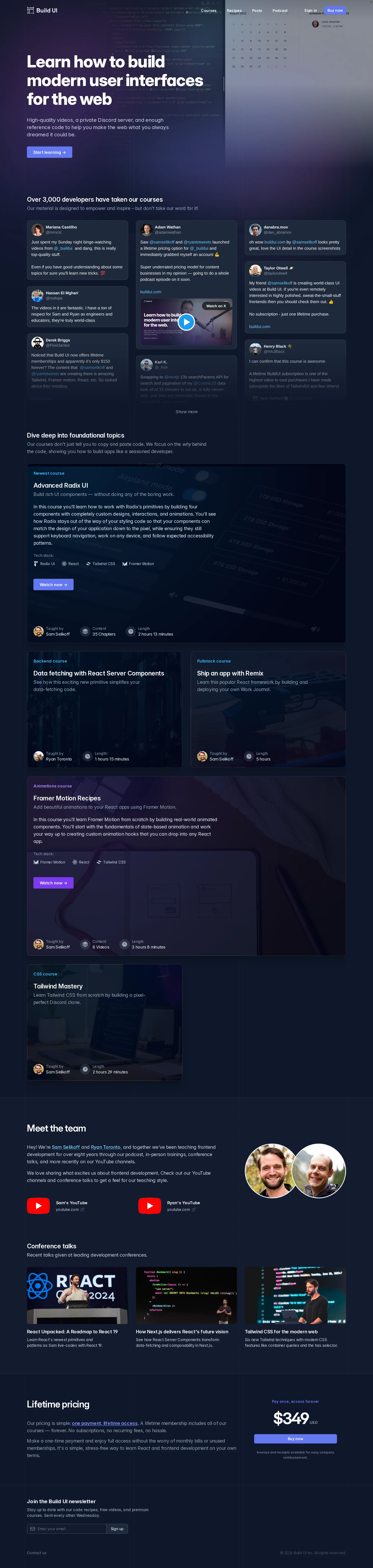
A cohesive dark visual system and well-composed course catalog give the page a confident, premium editorial character.
What works
- Atmospheric code imagery and restrained blue-violet accents fit the frontend education audience.
- Featured and secondary course cards create useful visual pacing and clear content grouping.
- Thin rules, generous spacing, and consistent metadata produce a considered editorial rhythm.
- Team photography and conference imagery add human credibility to an otherwise interface-heavy page.
Opportunities
- Reduce competing background imagery in card-heavy sections where text and media compete for attention.
- Give the pricing block more visual weight so the purchase decision does not feel like a late-page footnote.
- Standardize image treatment and content density across the different card sizes.
Uniqueness
The combination of advanced frontend subject matter, code imagery, embedded developer testimonials, and an editorial dark catalog feels more specific than a generic course template.
What works
- Course topics such as Radix UI, server components, Remix, and Framer Motion are highly relevant and audience-specific.
- The page blends education, social proof, talks, and instructor authority rather than relying on generic feature claims.
- The visual language has a recognizable technical-publication quality.
Opportunities
- Make the brand signature more ownable through a distinctive illustration, diagram, or recurring editorial motif.
- Clarify what makes the teaching approach different beyond the breadth of technical topics.
User experience
The page supports a sensible discovery-to-purchase journey, but its length, embedded testimonial density, and reported accessibility defects create friction.
What works
- The hero states the learning proposition immediately and provides a direct start-learning action.
- Course cards expose topic, format, instructors, and video or learning actions in a scannable pattern.
- Testimonials, learner count, instructor profiles, and talks provide multiple forms of credibility.
Opportunities
- Add stronger section navigation or progressive disclosure for the long catalog and testimonial areas.
- Replace or simplify dense social embeds where they interrupt scanning and page continuity.
- Ensure every icon-only or image-based link has an accessible name and meaningful focus state.
- Make the pricing terms, access scope, updates, refund policy, and expected learner outcome easier to find near the purchase action.
Conversion optimization
For a paid course landing page, the page establishes trust effectively and repeats its primary action, but the final buying case could be more explicit and less dependent on scrolling.
What works
- The hero CTA appears early and is reinforced by course-level actions and the pricing section.
- Learner count, testimonials, instructors, course previews, talks, and lifetime pricing address several common objections.
- The pricing presentation is visually prominent once reached and communicates a concrete offer.
Opportunities
- Surface a concise pricing or access summary closer to the hero for visitors who are ready to evaluate cost.
- State the complete value of lifetime membership in a short, scannable checklist near the price.
- Add clearer purchase reassurance such as payment details, refund terms, update policy, or course completion expectations.
- Test a shorter proof sequence or a sticky mobile CTA to reduce the cost of navigating the long page.
What we'd improve
- 01high
Repair the reported accessibility blockers
Provide accessible names for the logo, avatar, video, and other unnamed links; associate a visible or visually hidden label with the newsletter input; and remediate all six contrast failures before publication.
- 02high
Strengthen the pricing decision
Place a concise access summary near the first major CTA and expand the pricing area with inclusions, update expectations, refund or payment information, and a direct explanation of who lifetime access is for.
- 03medium
Reduce long-page scanning friction
Introduce clearer course catalog grouping, anchor navigation, or progressive disclosure for testimonials and secondary content so visitors can reach relevant topics and pricing faster.
- 04medium
Improve card readability
Audit image overlays and text contrast across every course-card variant, especially where dark photography, badges, metadata, and body copy overlap.
- 05low
Add a stronger brand signature
Develop a recurring visual device tied to the teaching method—such as an original diagram language, lesson map, or distinctive editorial illustration—to make the experience more memorable without increasing visual noise.