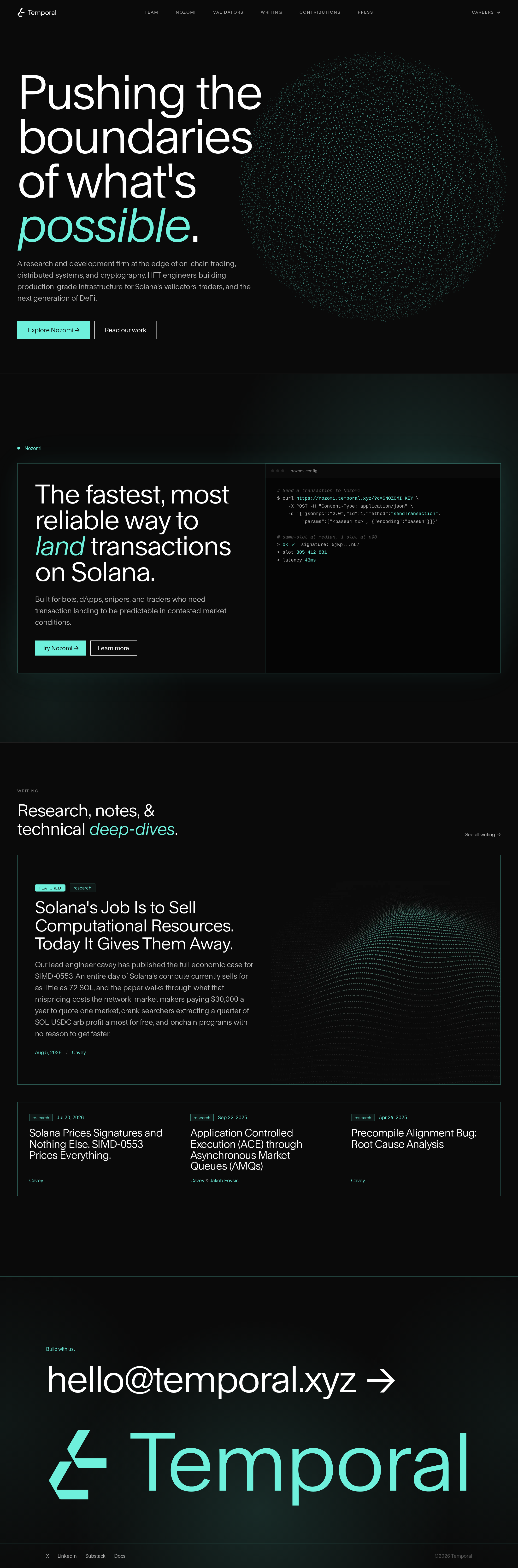
Temporal website analysis
A detailed critique of the homepage's craft, originality, usability, and ability to move visitors toward its intended goal.
Our observations
A highly polished and distinctive technical marketing homepage with strong art direction and clear content progression. It is suitable for a curated design gallery, with accessibility and audience-clarity improvements recommended before treating it as a benchmark.
Best practices
The page has a clear semantic structure, one detected H1, logical heading progression, a main landmark, a footer, navigation, and a skip link. Deterministic inspection found no duplicate IDs or heading skips. Four serious text-contrast failures reduce the score, and the supplied evidence does not establish complete keyboard, focus, or reduced-motion behavior.
What works
- Clear semantic landmarks and heading hierarchy.
- Single focused hero heading with a coherent page sequence.
- Skip-link presence and no detected duplicate IDs.
- Consistent navigation and call-to-action patterns.
Opportunities
- Resolve the four detected text-contrast failures, especially terminal comments, separators, and footer metadata.
- Verify visible keyboard focus states across navigation, buttons, cards, and footer links.
- Test the very small navigation and metadata at common viewport sizes and zoom levels.
- Confirm that particle and reveal effects provide an appropriate reduced-motion experience.
Design
The design is exceptionally cohesive, balancing oversized typography, technical imagery, and restrained accent color. The particle sphere, terminal panel, editorial research cards, and oversized contact treatment create a recognizable visual narrative without relying on excessive ornament.
What works
- Strong visual identity built from a disciplined black, white, and mint palette.
- Excellent typographic scale contrast between hero, section headings, research titles, and metadata.
- Clear transition from abstract hero atmosphere to concrete product and research content.
- Flat borders and restrained surfaces reinforce the engineering-oriented brand.
Opportunities
- Increase the visual distinction between secondary research cards and surrounding dark surfaces without adding clutter.
- Make the terminal content more legible as a visual sample rather than primarily atmospheric decoration.
- Consider a more explicit visual cue for the firm's broader services beyond the featured product.
Uniqueness
The combination of particle-based computational imagery, terminal-inspired product presentation, and large editorial research typography feels specific to a technical crypto R&D firm. It avoids the more common bright-gradient or dashboard-heavy crypto presentation.
What works
- The particle hero supplies an immediate and memorable signature.
- Technical research is treated as a primary brand asset rather than an afterthought.
- The footer's oversized contact treatment gives the page a strong closing frame.
Opportunities
- Develop one additional signature device for the research or open-source dimension so the identity is not carried mainly by the hero particle system.
- Clarify the relationship between Temporal, the featured product, and the research archive through more explicit storytelling.
User experience
The information architecture is easy to scan: positioning, featured capability, research, then contact. The page is visually calm despite its technical subject matter, but small navigation and metadata, specialist language, and low-contrast secondary copy create avoidable comprehension barriers.
What works
- Strong above-the-fold hierarchy and immediately visible primary and secondary actions.
- Predictable section order supports exploration and credibility building.
- Research cards expose topic, date, title, and author context in a compact format.
- Contact information is prominent and easy to locate at the end of the page.
Opportunities
- Add a concise explanation of who Temporal serves and what engagements or products it offers.
- Improve readability of supporting copy and metadata, particularly in the research section and footer.
- Use clearer labels or supporting context for technical terms aimed at visitors outside the core Solana audience.
- Validate mobile stacking, terminal overflow, and card readability; these behaviors are not visible in the supplied evidence.
Conversion optimization
For a credibility-led research and product homepage, the page offers appropriate paths into the featured product, published work, and direct contact. Conversion is limited by a broad, abstract hero promise and insufficient explanation of the firm's commercial or partnership value.
What works
- Two distinct hero CTAs serve product exploration and credibility-building research readers.
- Product section repeats action paths at the point of highest relevance.
- Writing previews provide evidence of expertise and a reason to continue browsing.
- Direct email contact is highly prominent in the footer.
Opportunities
- Replace or supplement the broad hero statement with a more concrete value proposition for partners, traders, developers, or protocol teams.
- Add a short services or capabilities summary before the research section.
- Give the primary CTA more context about what visitors will find after clicking.
- Add trust signals such as selected integrations, open-source projects, measurable outcomes, or clearly framed collaborators where appropriate.
What we'd improve
- 01high
Fix secondary-text contrast
Audit the four detected contrast failures and raise the contrast of terminal comments, research separators, and footer metadata while preserving the dark visual hierarchy.
- 02high
Clarify the audience and offer
Add a concise statement explaining who Temporal works with, what it builds or researches, and why a prospective partner should continue to the product or contact path.
- 03medium
Make technical content more approachable
Introduce plain-language summaries or supporting labels for the product and research topics so visitors can understand relevance before encountering specialist terminology.
- 04medium
Validate responsive and motion behavior
Test mobile layouts, headline wrapping, particle performance, terminal overflow, focus visibility, and reduced-motion behavior across supported browsers and viewport sizes.
- 05low
Strengthen proof near conversion points
Place selected open-source work, integrations, outcomes, or partner context near the product and contact sections to connect the visual confidence with verifiable credibility.