

Linear website analysis
A detailed critique of the homepage's craft, originality, usability, and ability to move visitors toward its intended goal.
Our observations
An exceptional visual system and strong product storytelling make this a compelling gallery candidate. Publication should include a review flag for contrast, semantic structure, duplicate IDs, and unnamed links.
Best practices
The page has a clear primary heading, semantic navigation, a main landmark, multiple structured sections, and a footer. However, the automated accessibility results reveal material implementation weaknesses.
What works
- One detected H1 supports a clear page-level hierarchy.
- The page includes semantic navigation, main content, and footer regions.
- The long page is divided into recognizable product-capability sections.
- The primary product message is visible near the top of the page.
Opportunities
- Address all 112 detected text-contrast failures, especially in product-interface details and secondary text.
- Provide accessible names for the two detected unnamed links.
- Remove or namespace duplicate SVG IDs; 29 duplicate-ID findings can create labeling and rendering conflicts.
- Correct the detected heading-level skip and audit heading order throughout the page.
Design
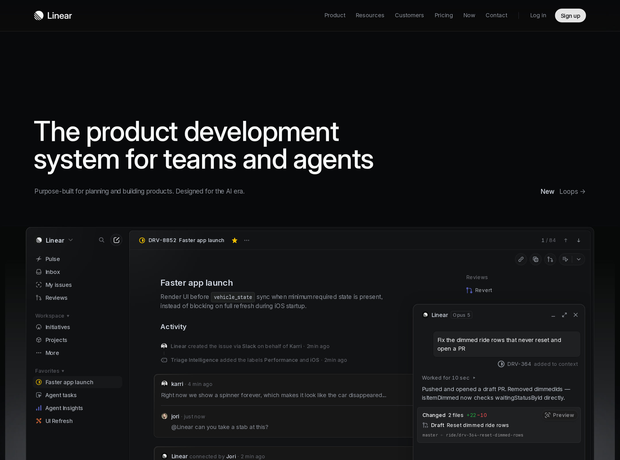
The visual execution is exceptional: cohesive dark surfaces, precise product mockups, disciplined spacing, and subtle motion create a premium technical presentation.
What works
- The near-black visual foundation gives the interface demonstrations strong focus.
- Product screenshots are integrated into the page rather than treated as generic decorative imagery.
- Consistent typography, thin dividers, restrained color accents, and generous spacing create a coherent system.
- The sequence of feature sections provides visual rhythm across a very long homepage.
Opportunities
- Increase the visual distinction between some low-contrast text blocks and their dark backgrounds without losing the restrained aesthetic.
- Make the small pre-footer calls to action more visually prominent relative to the surrounding dark space.
- Consider stronger visual wayfinding between the major capability sections on a page of this length.
Uniqueness
The page stands out through highly specific product-interface storytelling and an editorial, system-oriented presentation rather than relying on generic SaaS illustrations.
What works
- The product UI is the central visual language, making the offering immediately recognizable as a product-development tool.
- AI workflow concepts are shown alongside planning, code, review, and shipping surfaces.
- Animated grid-dot treatments and layered interface compositions add distinctive motion and texture.
- The changelog section extends the product narrative beyond a standard feature grid.
Opportunities
- The dark developer-tool aesthetic is recognizable within the SaaS category, so the brand could further differentiate through more proprietary visual motifs or clearer founder/product perspective.
- Reduce repeated interface-panel patterns where they do not add new explanatory value.
User experience
The information architecture is logical and the product story is easy to scan at a section level, but the long scroll, small text, and documented contrast problems may impair comprehension for some users.
What works
- The hero establishes the audience and category quickly.
- Section labels such as intake, planning, AI automations, and shipping create a sensible product journey.
- Visual product evidence appears close to the relevant feature messaging.
- The footer exposes multiple navigation groups for deeper exploration.
Opportunities
- Improve readability of secondary copy and interface annotations, particularly where the contrast scanner reports failures.
- Add clearer section-level navigation or persistent wayfinding for the approximately 9,948-pixel page.
- Ensure animated elements respect reduced-motion preferences; the supplied metadata reports animation but no detected prefers-reduced-motion handling.
- Review the repeated and small interface text at mobile widths, which cannot be fully validated from the screenshot alone.
Conversion optimization
For a product-led SaaS marketing page, the homepage provides strong product understanding and credibility through interface demonstrations. Conversion intent is present, but the CTA treatment appears relatively subdued in the dark layout.
What works
- The hero communicates a differentiated product position rather than a generic productivity promise.
- Feature sections progressively explain the scope of the platform before the closing CTA.
- Product visuals function as evidence and can help visitors understand the product without relying solely on claims.
- A final availability-oriented section gives the page a clear conversion endpoint.
Opportunities
- Strengthen the primary hero CTA's size, contrast, and visual priority so the next step is unmistakable.
- Pair the main CTA with a low-friction secondary action, such as a product tour or representative workflow preview, if those destinations exist.
- Add concise proof points near the hero or feature transitions, such as customer outcomes or integration breadth, rather than leaving credibility primarily to UI visuals.
- Test whether the long sequence delays conversion and consider repeating a contextually relevant CTA after major capability groups.
What we'd improve
- 01high
Resolve text contrast failures
Audit the 112 detected contrast failures across secondary copy, activity panels, and product annotations. Increase foreground contrast or adjust surface colors while preserving the dark visual system.
- 02high
Fix accessible naming and SVG IDs
Add meaningful accessible names to the two unnamed links and make all repeated SVG IDs unique or locally scoped to eliminate the 29 duplicate-ID findings.
- 03high
Repair heading hierarchy
Correct the detected heading-level skip and verify that each capability section follows a logical heading order for screen-reader navigation.
- 04medium
Clarify the primary conversion path
Increase the prominence and contrast of the hero CTA and consider repeating a similarly clear action after the major product-capability sequence.
- 05medium
Add long-page wayfinding
Introduce a compact section index, anchored navigation, or stronger progress cues so visitors can move efficiently among intake, planning, AI, and shipping sections.
- 06low
Audit motion preferences
Review the 193 animated elements and add or verify reduced-motion alternatives for grid-dot and transition effects, especially on lower-powered devices.