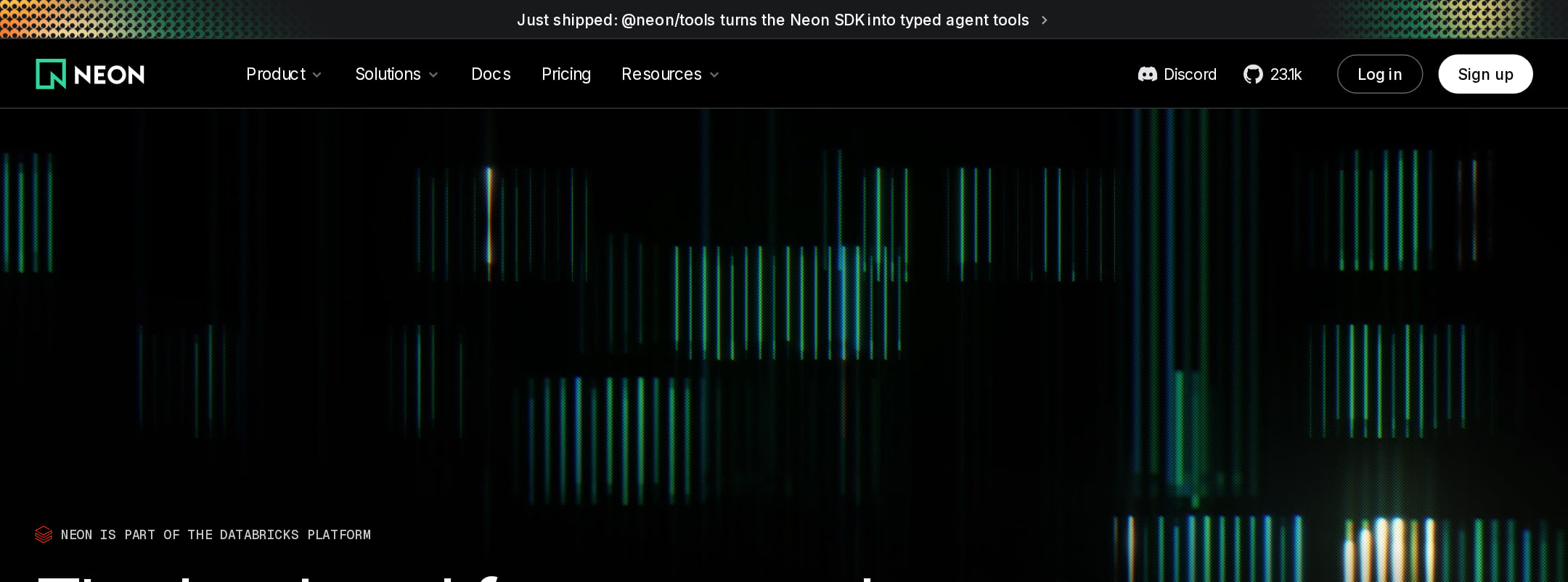


Neon website analysis
A detailed critique of the homepage's craft, originality, usability, and ability to move visitors toward its intended goal.
Our observations
A visually distinctive and commercially credible developer-platform homepage with excellent art direction and strong product storytelling. It merits gallery inclusion, subject to accessibility review and modest conversion-focused simplification.
Best practices
The page has a clear semantic structure, one detected H1, no heading skips, a main landmark, a semantic footer, and visible primary actions. Automated evidence also identifies repeated SVG IDs and contrast failures that reduce the implementation score.
What works
- One clear H1 and a coherent heading progression were detected.
- The page includes semantic navigation, main, and footer regions.
- Primary actions are visible in the hero and repeated later in the page.
- Product claims are supported by interface visuals, charts, code examples, and proof sections.
Opportunities
- Resolve the six detected text-contrast failures, especially muted navigation or supporting links on dark surfaces.
- Remove or scope repeated SVG IDs to eliminate the 23 duplicate-ID findings.
- Verify keyboard focus visibility and interaction behavior for dropdown navigation and sticky section navigation.
- Test animation and video behavior with prefers-reduced-motion enabled; the supplied evidence does not confirm an alternate reduced-motion experience.
Design
The homepage demonstrates unusually controlled art direction for a technical infrastructure brand. Its near-black and pale-mint alternation, data-rich visuals, tight typography, and editorial spacing produce a premium, credible result.
What works
- The dark code-oriented visual system is consistent and strongly aligned with the developer audience.
- The pale mint feature and trust sections create effective rhythm and prevent the long page from feeling visually flat.
- Large, concise headlines provide strong section-level orientation.
- Charts, terminal commands, product UI, and customer proof make the visual language specific to infrastructure software rather than generic SaaS.
Opportunities
- Some product demonstrations are visually dense at the narrow screenshot width and could benefit from stronger focal annotations.
- The page could establish a slightly clearer distinction between core platform benefits and supporting capabilities.
- The repeated dark sections share a similar tonal range, so additional structural cues could improve rapid scanning.
Uniqueness
The combination of Postgres infrastructure visuals, command-line details, restrained mint signaling, and editorial feature sequencing feels authored and category-specific. It avoids the more common glossy gradient treatment of developer SaaS sites.
What works
- The visual identity is grounded in real technical artifacts rather than abstract decoration.
- Data visualization and product UI are integrated into the story instead of appearing as isolated screenshots.
- The contrast between operational detail and institutional proof gives the page a distinctive narrative arc.
Opportunities
- The broad category of dark developer tooling is familiar, so the brand could push one or two signature visual motifs further.
- More distinctive customer-story framing could make the proof sections as memorable as the product demonstrations.
User experience
The information architecture supports exploration through dropdown navigation, sticky section navigation, and a sequential feature story. However, the very long page, dense content, muted secondary text, and complex navigation create discoverability and accessibility risks.
What works
- Hero actions offer both an immediate entry point and a documentation path.
- The feature sequence follows a reasonable progression from platform primitives to autoscaling, branching, authentication, pricing, and trust.
- Sticky navigation and section anchors can help users orient themselves within the long page.
- The narrow rendering retains the major narrative sections rather than simply hiding them.
Opportunities
- Reduce or regroup secondary claims so visitors can identify the primary product value faster.
- Increase the legibility of muted navigation and supporting text identified by contrast testing.
- Make the active section state and scroll position more explicit for users navigating the long feature narrative.
- Validate dropdown menus, videos, and interactive product demonstrations with keyboard and touch input.
Conversion optimization
The homepage has a credible conversion structure for a developer platform: a direct hero CTA, documentation access, product evidence, institutional trust, and a final broad CTA. Conversion intent is somewhat diluted by the number of competing messages and destinations.
What works
- The hero places a direct getting-started action next to a lower-commitment documentation action.
- Technical commands and product demonstrations reduce abstraction for developer visitors.
- Customer logos, usage or scale statistics, and Databricks affiliation provide meaningful trust signals.
- A closing CTA gives visitors another decision point after the product narrative.
Opportunities
- Make the dominant conversion route more consistent in wording and prominence across the page.
- Pair the final CTA with a concise explanation of what happens after clicking, such as setup time or required commitment, if accurate.
- Add more explicit audience routing for individual developers, teams, and enterprise evaluators.
- Avoid allowing extensive navigation and feature breadth to compete with the primary getting-started path.
What we'd improve
- 01high
Fix contrast and duplicate SVG identifiers
Raise the contrast of the six flagged muted text samples and generate unique IDs for repeated inline SVG definitions, then rerun automated accessibility checks across navigation, proof, and feature states.
- 02high
Clarify the primary conversion path
Choose a consistently dominant getting-started action and use secondary actions for documentation or evaluation. Repeat the same intent near the end of the page with supporting expectation-setting copy.
- 03medium
Improve long-page orientation
Make the active feature section, progress state, and section names more apparent in the sticky navigation, while reducing competing navigation density where possible.
- 04medium
Strengthen narrow-screen visual hierarchy
Review the smallest product charts, code panels, and logo groups for legibility and interaction size; preserve one clear focal detail per demonstration instead of compressing every data point equally.
- 05low
Differentiate proof storytelling
Turn the trust and customer evidence into more specific outcome-led proof, so the institutional credibility section carries a distinctive narrative rather than functioning primarily as a logo and statistic block.