Neon
01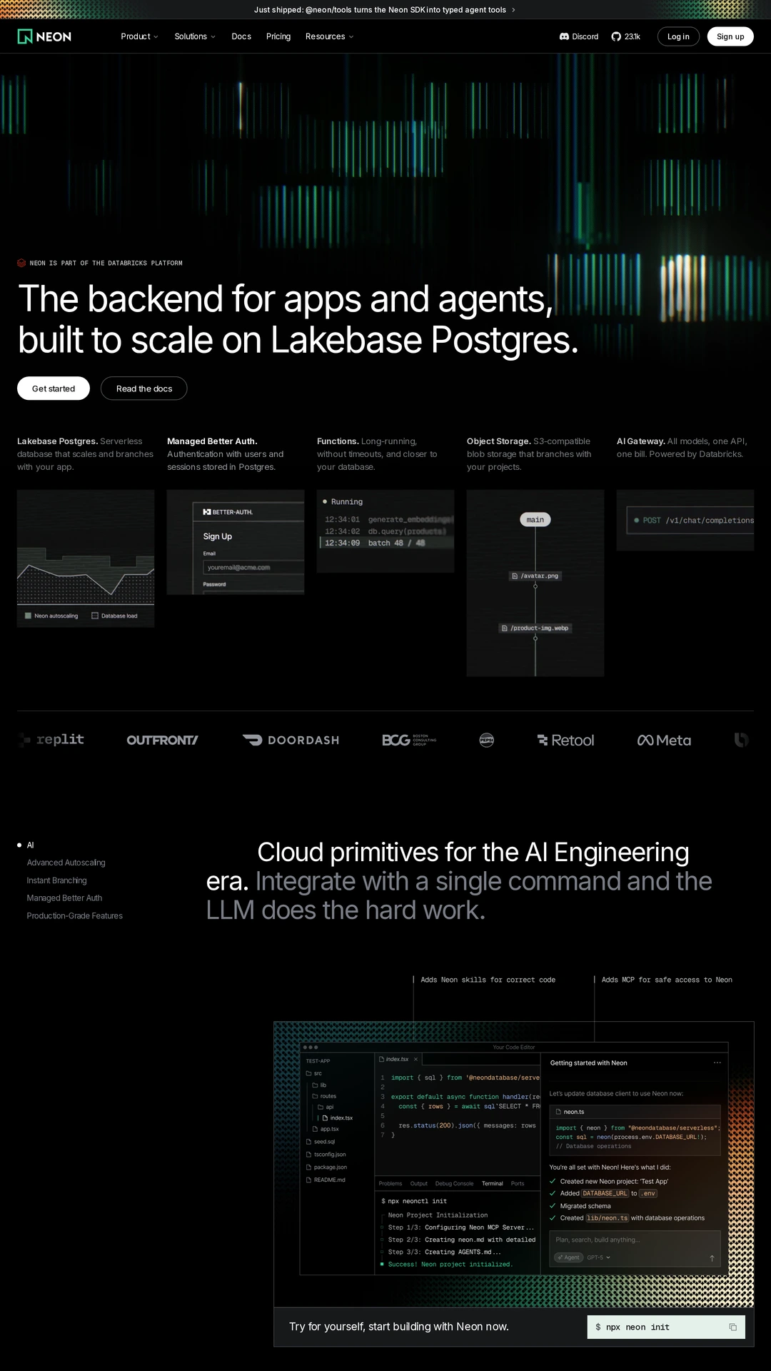
neon.comdark-mode
These eight websites show different roles for motion: a changing product example, an atmospheric background, a physical product arrangement or a project presentation. We checked the live desktop pages for visible changes as well as reviewing their gallery screenshots. The notes describe what was observed on September 10, 2026. Static screenshots cannot demonstrate timing or interaction, so visit the source to experience each example. Treat these as comparisons, not accessibility endorsements: keyboard controls, pause behaviour, mobile performance and reduced-motion alternatives still need to be evaluated for any pattern you adopt.
Open a website to explore the full capture and design details.
Neon uses moving green and blue vertical bars across a dark hero while the proposition and actions remain anchored below. The changing field establishes a technical mood. Compare whether continuous background motion supports the identity or competes with the product explanation.
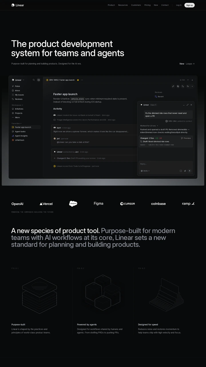
Linear reveals a detailed product interface below a restrained headline on a near-black surface. The live page uses opacity changes within its presentation. Study the transition from the introductory message to readable interface evidence, including whether the final state remains useful when motion is reduced.
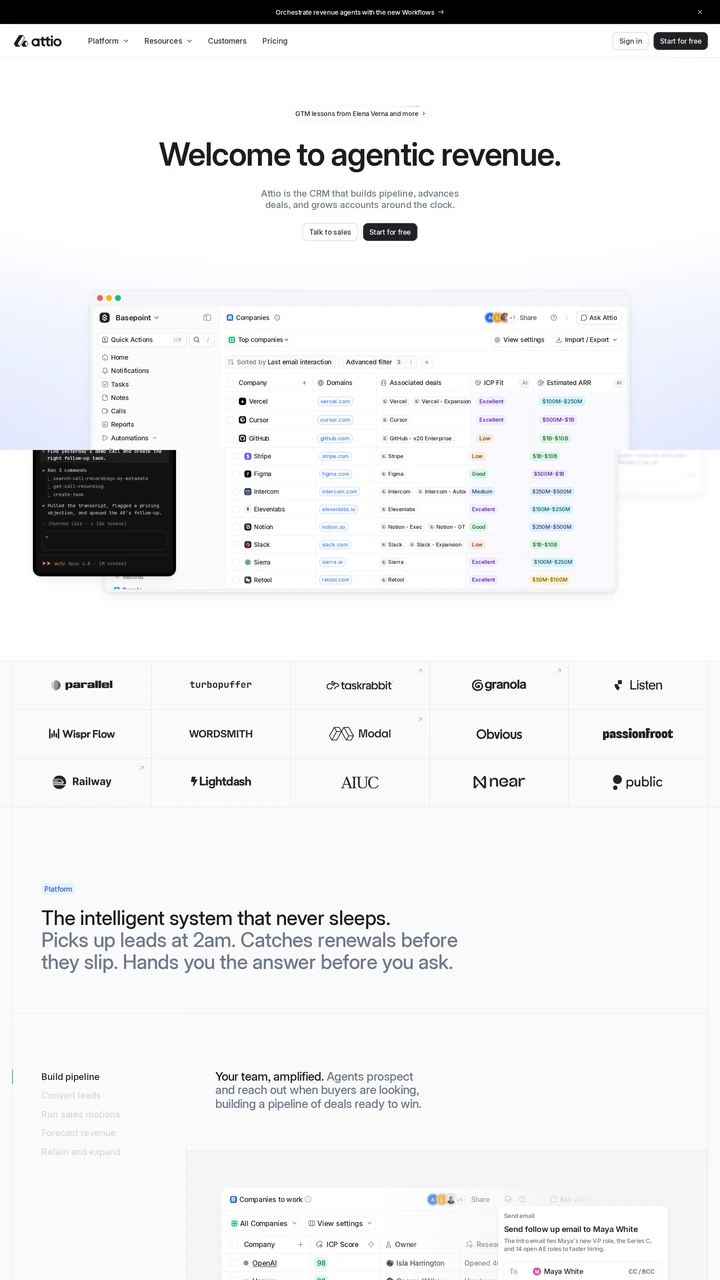
Attio shows a changing prompt inside a CRM product preview beneath a centred proposition. The animation gives a concrete example of an action in the product. Compare the time needed to understand that example with a static screenshot and a short caption.
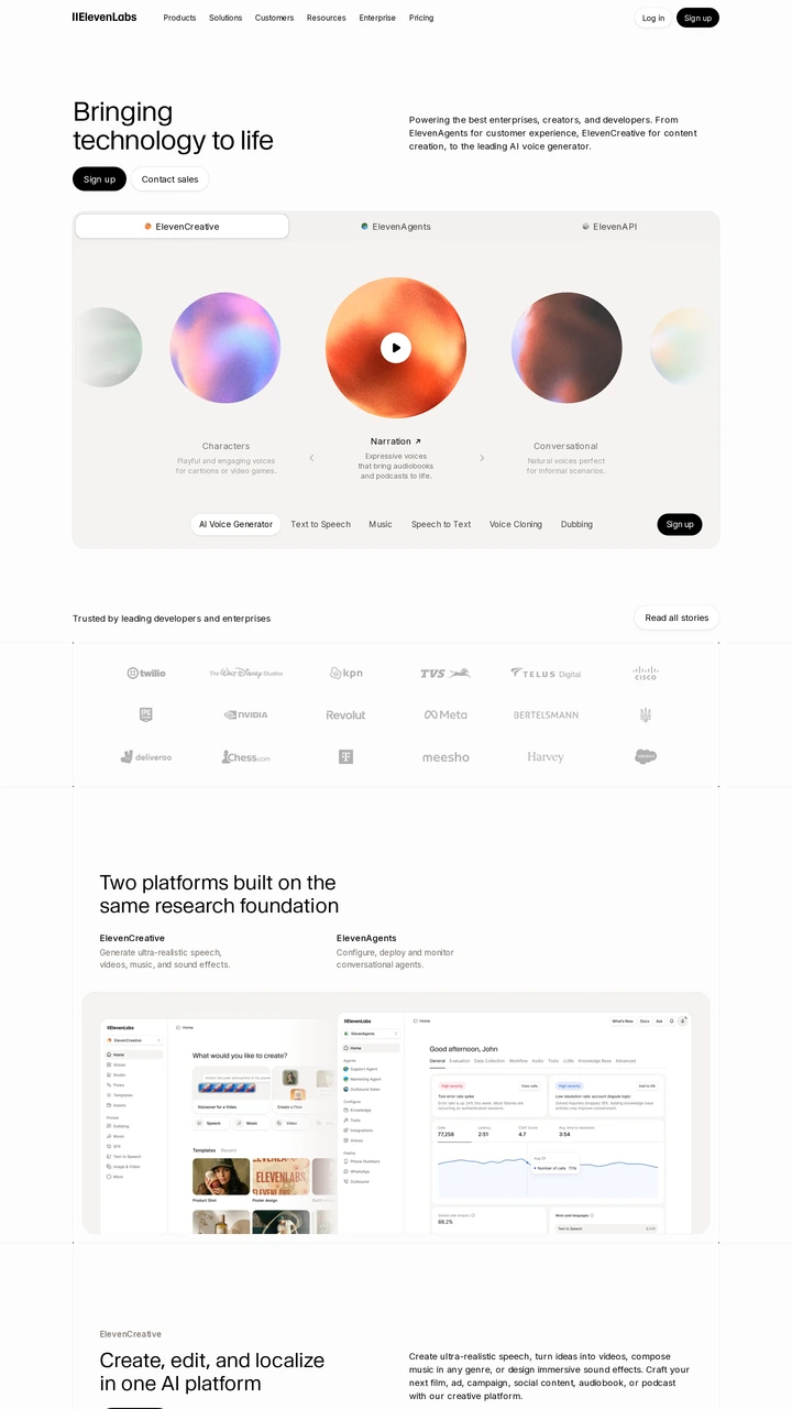
ElevenLabs presents slowly changing, colourful orbs around a prominent play control in its voice demo. The motion gives the audio interface a visible identity before playback. Study how the controls, labels and animated surface work together; animation alone cannot explain the sound.
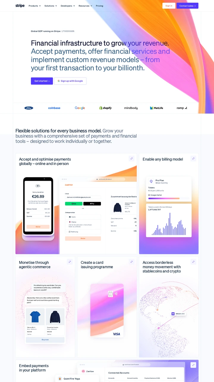
Stripe places a flowing orange and pink visual behind a text-led financial-infrastructure proposition. The main copy and actions remain fixed while the background changes. Compare this decorative use of motion with Attio's product demonstration, which communicates a specific workflow.
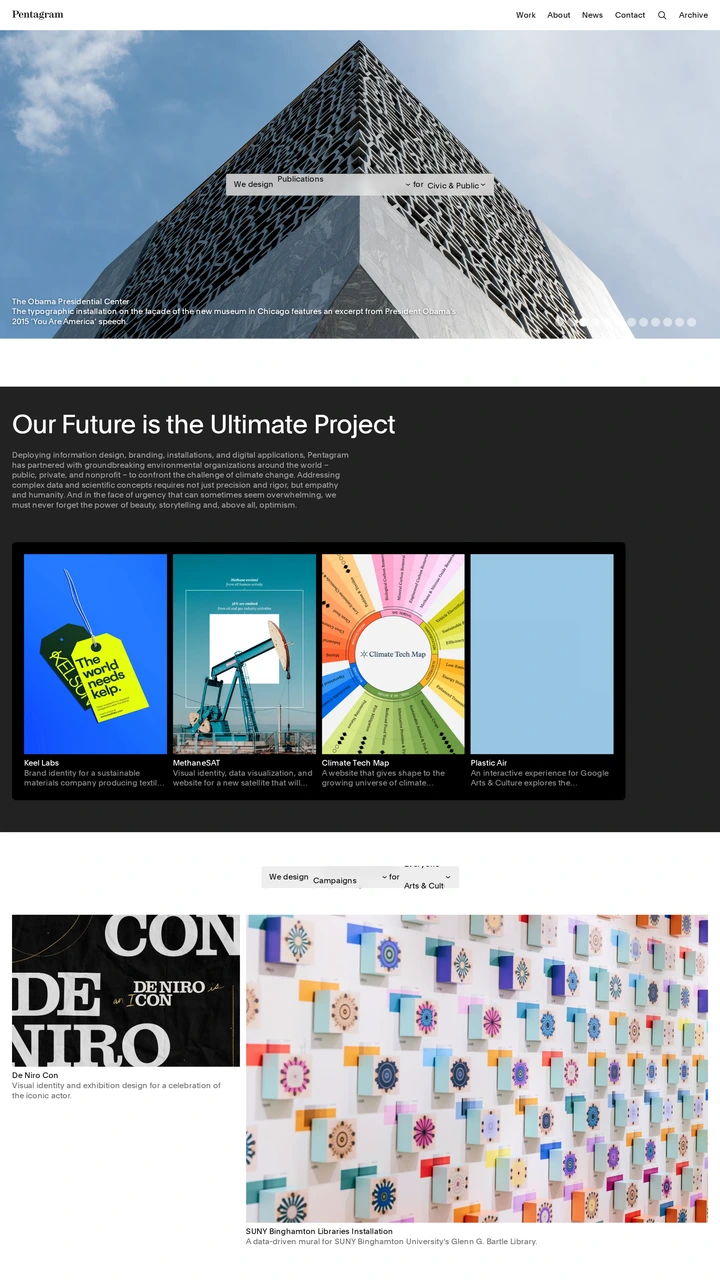
Pentagram gives a project image most of the first screen and uses transitions within that presentation, with further moving project media on the live page. The work becomes the main visual event. Check that project names, navigation and manual selection remain understandable while imagery changes.
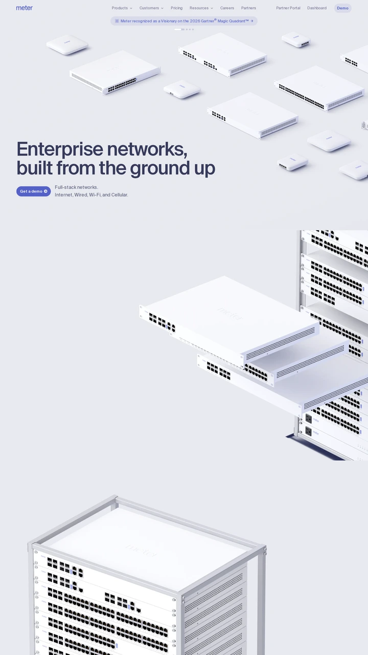
Meter animates pale network hardware across a spacious hero above an enterprise-networking proposition. The equipment remains recognisable as its arrangement changes. Compare how motion explains the physical product range with what a single carefully composed image would communicate.
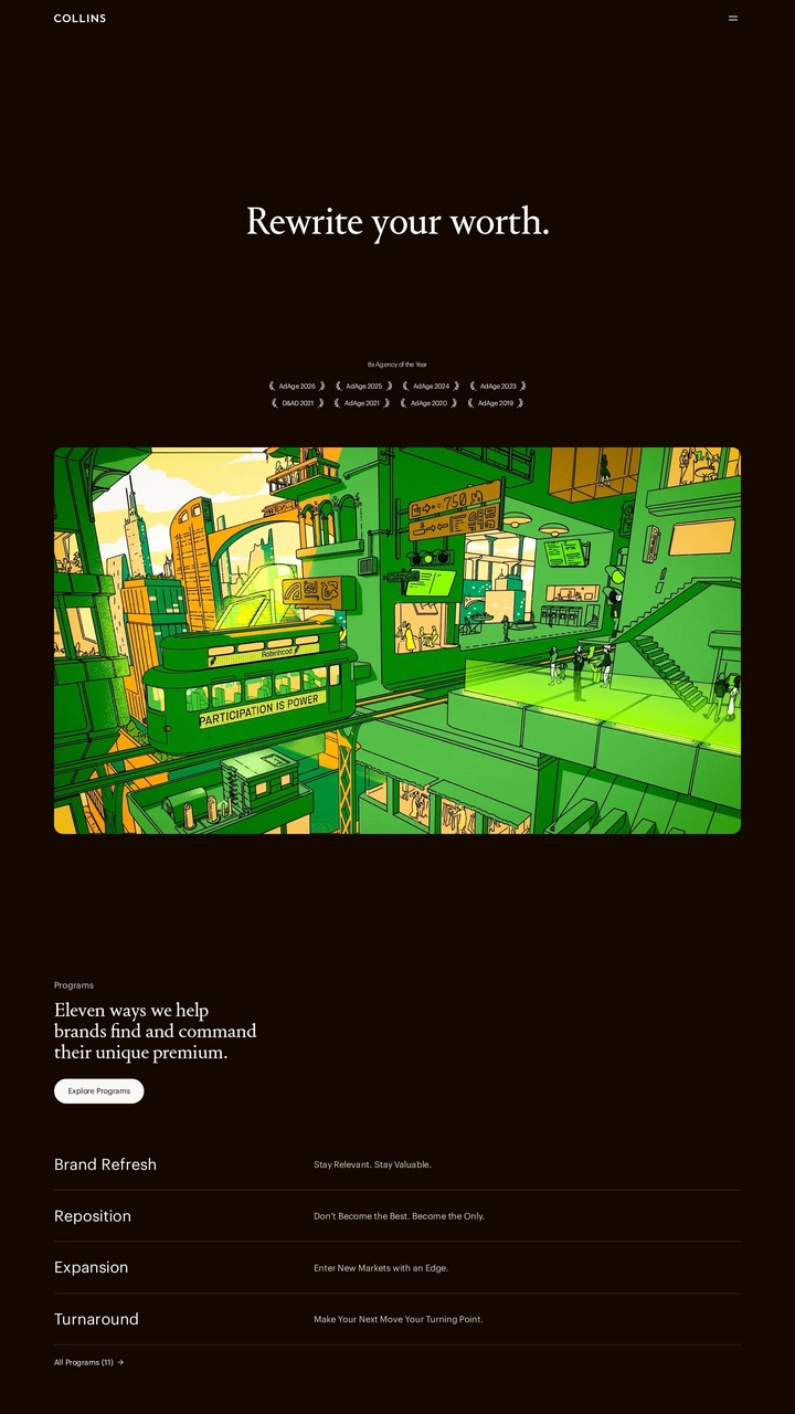
COLLINS places a large serif statement above moving project imagery. The restrained introduction gives the work room to supply colour and change. Compare this project-led use of motion with a decorative hero background, and check how much context a visitor receives before the imagery changes.