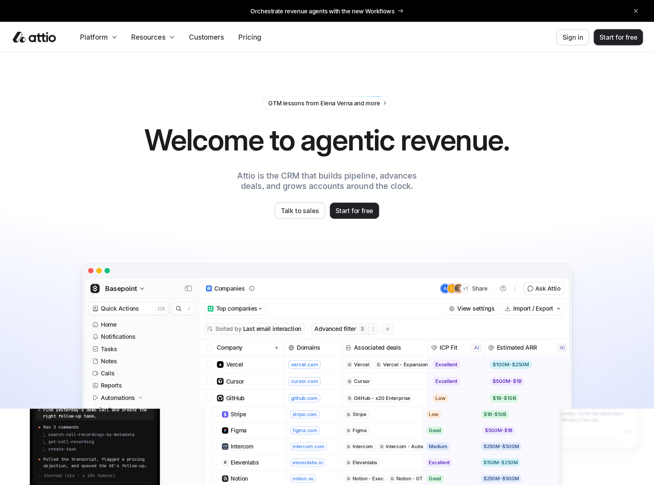


Attio website analysis
A detailed critique of the homepage's craft, originality, usability, and ability to move visitors toward its intended goal.
Our observations
Visually excellent and commercially persuasive, but the page should receive an accessibility and interaction review before being treated as a gallery-quality reference implementation.
Best practices
The page has a clear semantic structure, one detected H1, a main landmark, navigation, footer, and a coherent feature narrative. However, automated checks expose substantial accessibility debt.
What works
- The homepage has one detected H1 and no heading-level skips in the supplied observations.
- Navigation, main content, footer, and a form are detectable as meaningful page regions.
- The content is organized around recognizable user problems and product capabilities rather than an undifferentiated feature list.
Opportunities
- Address the 43 detected text-contrast failures, prioritizing body copy, labels, code examples, and text over dark or tinted UI surfaces.
- Provide accessible names for the nine reported unlabeled controls, including the button groups used in product demonstrations.
- Remove or namespace the duplicated SVG ID #clip0_19835_2442 to prevent possible assistive-technology and rendering conflicts.
- Review the animated elements and provide an intentional reduced-motion experience; the supplied data reports animation but does not confirm reduced-motion handling.
Design
A refined, highly controlled SaaS visual system with strong product visualization and effective light/dark pacing.
What works
- Product screenshots and UI simulations give the value proposition concrete visual support.
- The mostly white canvas, thin rules, compact typography, and restrained green/blue accents create a consistent product-brand language.
- The dark Universal Context section functions as a strong visual anchor in an otherwise light, repetitive page.
- The mix of Inter, display typography, and JetBrains Mono appropriately balances approachable marketing with technical credibility.
Opportunities
- Reduce the number of near-identical feature compositions or introduce more varied visual storytelling to improve pacing across the very long page.
- Increase the scale or contrast of supporting copy in sections where the interface previews dominate the visual hierarchy.
- Make the primary conversion path more visually persistent or periodically reintroduced as users move through the extended narrative.
Uniqueness
The execution is more distinctive than a conventional CRM landing page, especially in its agent-oriented framing and simulated product surfaces, though it remains recognizably within the premium B2B SaaS genre.
What works
- The page positions the CRM around autonomous revenue agents and a unified context layer rather than only contact and pipeline management.
- The blend of product UI, code-oriented content, integrations, and enterprise messaging gives the site a broader systems narrative.
- The “Universal Context” visualization provides a memorable tonal and compositional departure from the surrounding sections.
Opportunities
- Strengthen a distinctive brand motif beyond interface diagrams, dark grids, and technical terminology, which are common in current AI SaaS marketing.
- Use a more explicit visual or editorial point of view to differentiate Attio from other AI CRM and revenue-operations sites.
User experience
The information architecture is understandable and the product story is well sequenced, but length, density, small text, and reported control-label issues can make exploration less efficient and less accessible.
What works
- The sequence moves logically from agent use cases to setup, context, integrations, API/SDK/MCP, scale, and social proof.
- Multiple interface previews help visitors understand workflows without requiring immediate product access.
- The page appears visually usable at the supplied desktop viewport, with clear section boundaries and a sticky navigation region.
Opportunities
- Add stronger section-level wayfinding or a compact contents pattern so visitors can skip to workflows, integrations, developers, or enterprise information.
- Improve text contrast and control naming before relying on interactive demos as primary explanatory elements.
- Validate responsive layouts, focus order, keyboard access, and animation behavior separately; these cannot be established from the screenshot and supplied DOM observations alone.
- Consider shortening or consolidating repetitive sections for visitors who already understand the core CRM proposition.
Conversion optimization
The homepage is well suited to a complex B2B SaaS evaluation journey: it explains the product in depth, addresses technical stakeholders, and supports both self-serve and enterprise consideration. Conversion friction is likely introduced by the long scroll and accessibility issues.
What works
- The page covers distinct buyer concerns, including workflow automation, data context, integrations, developer extensibility, scale, and customer adoption.
- Product previews reduce abstraction and help visitors assess whether the software fits revenue-team workflows.
- The “30,000+ customers” positioning and enterprise-scale section provide social-proof and risk-reduction signals, as supplied in the heading observations.
- A developer section can support technical validation rather than forcing all visitors through a purely marketing-led narrative.
Opportunities
- Repeat a concise primary CTA after major decision points instead of concentrating conversion opportunities around the opening and later form area.
- Pair enterprise messaging with a clearly differentiated sales/demo path and self-serve messaging with a low-friction trial path, if both are offered.
- Clarify the next step beside interactive product demonstrations so visitors know whether to explore, start free, book a conversation, or read documentation.
- Ensure the reported unlabeled controls and low-contrast text do not affect CTA discovery or form completion.
What we'd improve
- 01high
Resolve accessibility failures in interactive product sections
Give every reported unlabeled button an accessible name and state, including the four control buttons and four product-grid buttons. Verify focus visibility, keyboard operation, and screen-reader announcements for any simulated tabs, carousels, or selectors.
- 02high
Repair text contrast across the design system
Audit the 43 reported contrast failures by component token, especially muted copy, code snippets, labels, and text layered over dark or colored product surfaces. Update tokens rather than applying isolated overrides.
- 03high
Fix duplicated SVG identifiers
Make clip-path and other SVG IDs unique per instance or scope them safely, then retest the repeated product illustrations for rendering and assistive-technology issues.
- 04medium
Improve long-page navigation
Add a compact sticky or in-page contents mechanism for the major themes—workflows, context, integrations, developers, scale, and enterprise—and make the active section apparent where practical.
- 05medium
Strengthen recurring conversion moments
Place contextual CTAs after the core workflow, developer, and enterprise sections, with copy that reflects the visitor’s likely intent rather than using one generic action throughout.
- 06low
Create more visual pacing variation
Consolidate repetitive feature blocks and introduce a small number of more editorial proof points, customer outcomes, or diagrams to break the repeated screenshot-plus-copy rhythm.