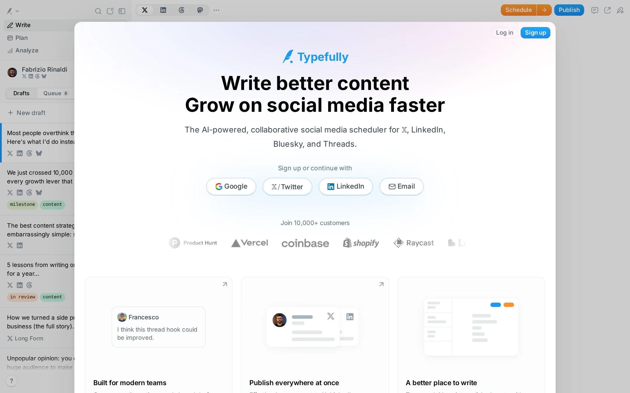
Typefully website analysis
A detailed critique of the homepage's craft, originality, usability, and ability to move visitors toward its intended goal.
Our observations
A strong, polished product landing page with clear positioning and convincing interface-led storytelling. It merits gallery consideration after accessibility issues—particularly missing names and labels, contrast failures, and heading structure—are addressed.
Best practices
The page follows many effective SaaS landing-page conventions, but automated findings indicate substantial accessibility and semantic weaknesses.
What works
- One H1 is present and the hero establishes the product category and primary benefit immediately.
- The page includes multiple sign-up methods and visible Log in and Sign up actions.
- Feature sections are organized with descriptive headings, supporting a clear product narrative.
- Next.js, JSON-LD, and a defined visual system suggest a structured implementation.
Opportunities
- The automated audit reports 29 text-contrast failures across 269 samples, including muted interface text and control labels.
- Twelve links are missing accessible names, which can make feature-card or image-linked navigation ambiguous to assistive technology.
- Twenty-five controls are reported without labels, including buttons inside the product demonstrations and social-platform controls.
- The audit reports no main landmark and one heading-level skip from H1 to H3; add semantic landmarks and normalize heading hierarchy.
Design
A highly coherent and polished visual system with strong product visualization, generous spacing, and restrained use of blue.
What works
- The white, pale-gray, and blue palette makes the product feel approachable and contemporary.
- Rounded cards and simplified interface illustrations make complex scheduling and collaboration features easy to scan.
- The hero combines headline, supporting copy, authentication actions, and social proof without relying on a dense photographic composition.
- Inter provides consistent, legible typography across the marketing content and product UI.
Opportunities
- The visual language is close to the prevailing modern SaaS aesthetic, limiting distinctiveness.
- The application chrome visible behind the main panel competes slightly with the landing-page hierarchy.
- Some low-contrast gray labels and logos appear intentionally subdued but reduce clarity and visual authority.
Uniqueness
The page has a credible product-led identity and relevant interface storytelling, but its overall composition is recognizable within the social-media SaaS category.
What works
- The combination of writing, scheduling, multi-network publishing, and collaborative review is reflected directly in the product visuals.
- The use of social-network identities and realistic editor fragments makes the demonstrations specific to the product rather than generic dashboard decoration.
- The prominent creator-and-team positioning gives the page a broader audience frame than a single-purpose scheduler.
Opportunities
- Develop a more ownable visual motif or editorial voice beyond rounded cards, pale gradients, and dashboard snippets.
- Make the differentiator around voice-aware AI, agent collaboration, or workflow depth more visually prominent in the initial viewport.
- Reduce reliance on generic customer-logo treatment as the primary credibility device; stronger evidence-based outcomes could feel more distinctive.
User experience
The information hierarchy is easy to follow and the primary action is obvious, although the sign-up-first presentation and accessibility defects create meaningful friction for some visitors.
What works
- The hero answers what the product does, who it serves, and which networks it supports in a few lines.
- Google, X/Twitter, LinkedIn, and email sign-up options are visible without requiring a pricing or feature detour.
- The feature grid supports progressive exploration, moving from team workflows and publishing to writing, analytics, and previews.
- The page appears visually usable at the supplied desktop viewport, with clear grouping and generous spacing.
Opportunities
- The screenshot is dominated by an authentication-oriented panel, so visitors may perceive the experience as an immediate sign-up gate rather than an exploratory marketing homepage.
- Add accessible names to icon-only or image-linked elements and explicit labels to every interactive control in the product demonstrations.
- Improve contrast for subdued copy, metadata, and control text, especially where the audit identifies failures.
- Use a proper main landmark and sequential heading levels to improve navigation for screen-reader users.
Conversion optimization
The page is well optimized for a product-led acquisition goal, pairing a direct promise with low-friction registration and trust signals. The available evidence does not establish whether the claims or flow perform well in practice.
What works
- The hero has a clear action path immediately below the product description.
- Multiple authentication methods reduce account-creation friction for different audiences.
- The 10,000+ customer statement and recognizable company logos provide social proof before the feature content.
- The free-plan message and visible pricing section create a natural path for visitors who need commitment details.
Opportunities
- Clarify the free plan's limits, trial expectations, and whether a payment method is required near the primary sign-up action.
- Add a concise product outcome or differentiator beside the sign-up controls so the CTA is not supported mainly by broad growth language.
- Ensure the logo row has sufficient contrast and is not treated as the sole proof of value; add specific testimonials or measurable, substantiated outcomes.
- Consider a secondary action such as viewing the product or pricing for visitors who are not ready to register immediately.
What we'd improve
- 01high
Repair accessible names, labels, and contrast
Give every linked feature visual and icon-only control an explicit accessible name, associate labels with the reported unlabeled buttons, and revise the muted text palette or component backgrounds until the reported contrast failures are resolved.
- 02high
Fix page semantics
Add a main landmark, change the hero supporting heading to the appropriate next level, and preserve a sequential H1/H2/H3 structure throughout the feature and pricing sections.
- 03medium
Separate exploration from account creation
Keep the prominent sign-up path, but add a clearly visible product-tour or pricing route near the hero so visitors can evaluate the service without feeling forced into registration.
- 04medium
Strengthen differentiated proof
Replace or supplement the subdued logo strip with specific customer outcomes, short testimonials, or transparent workflow examples that demonstrate why Typefully is preferable to other social schedulers.
- 05low
Make the hero composition more ownable
Reduce the competing application chrome behind the central panel or integrate it more deliberately into the narrative, and introduce a distinctive brand motif that can carry through the feature sections.