

Intercom website analysis
A detailed critique of the homepage's craft, originality, usability, and ability to move visitors toward its intended goal.
Our observations
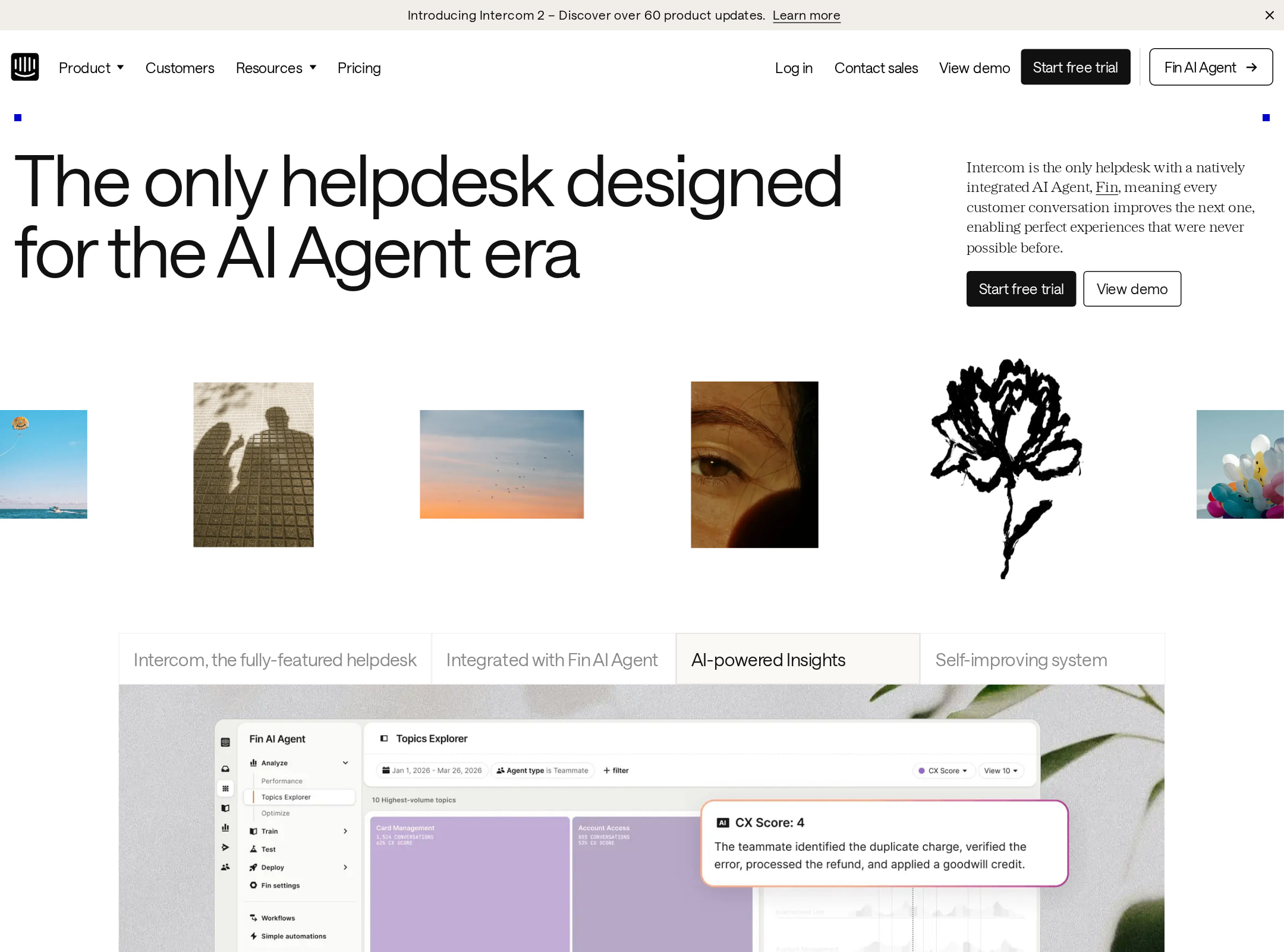
Publish. This is an exceptionally polished SaaS marketing homepage with strong visual craft, clear product storytelling, and unusually consistent brand expression. Its main weaknesses are the extreme page length, potential interaction density, and duplicate HTML IDs that merit technical cleanup.
Best practices
The page has a clear semantic structure, a single H1, one main landmark, no detected heading skips, and a visible pricing section. Automated contrast sampling found no failures. Duplicate IDs are a material implementation issue, though they do not make the supplied page visually unusable.
What works
- The page exposes a clear primary proposition in the H1: “The only helpdesk designed for the AI Agent era.”
- The supplied structure includes semantic navigation, a main landmark, pricing, and a semantic footer.
- Automated inspection reports one H1, no heading skips, and zero contrast failures across 112 sampled combinations.
- Pricing is included within the long-form page rather than hidden behind a separate discovery path.
Opportunities
- Resolve the seven duplicate IDs, including repeated SVG identifiers such as jamf_svg__a and prizepicks_svg__a, to reduce risks for fragment targeting, scripting, and assistive technology relationships.
- Audit carousel and animated content for keyboard controls, pause behavior, focus visibility, and meaningful labels; these behaviors cannot be confirmed from the screenshot or metadata.
- Review the heading structure around repeated feature modules to ensure the visual grouping and document outline remain understandable when content is consumed non-visually.
Design
The visual system is exceptionally controlled: editorial typography, generous whitespace, restrained surfaces, and product UI imagery are combined with distinctive illustrations and color accents. The work feels premium without relying on a generic dark-gradient SaaS pattern.
What works
- The off-white, chalk, white, and near-black surfaces establish a calm, high-end foundation.
- Saans and SaansMono provide a coherent branded typographic system, while the supplied Serrif usage adds editorial contrast.
- Product screenshots are framed, layered, and composited with artwork and photography to create visual rhythm across a very long page.
- The blue and orange accents are used sparingly enough to retain hierarchy while adding energy to key moments.
Opportunities
- The extensive sequence of feature sections can make the visual hierarchy feel flatter over time; stronger section-level navigation or more pronounced chapter breaks could improve orientation.
- Some decorative artwork appears to compete with adjacent product explanations at the same scale; confirm that decoration remains subordinate to the message on smaller screens.
- Standardize screenshot framing and annotation density where possible so the product story remains immediately legible rather than requiring close inspection.
Uniqueness
Intercom’s combination of editorial art direction, hand-drawn marks, product UI composites, and a warm neutral palette is distinctive within the SaaS category. The page communicates a specific brand world rather than using interchangeable dashboard cards and gradients.
What works
- The visual language combines interface showcases with abstract illustrations, textured imagery, and customer portraits.
- The page’s warm, paper-like palette and black typography create a recognizable alternative to conventional blue-heavy enterprise SaaS pages.
- Repeated visual motifs provide continuity across AI, helpdesk, engagement, and pricing sections.
Opportunities
- The editorial treatment is strong enough to support a more explicit recurring visual metaphor for the AI-agent narrative, which could make the long page even more memorable.
- A small number of highly distinctive visual moments could be given more breathing room so they function as anchors instead of blending into the overall abundance.
User experience
The information architecture appears comprehensive and the product is explained through progressive feature sections, but the page is extremely long and includes animated or carousel-like modules. That creates a meaningful orientation and interaction-cost risk, especially for visitors seeking a quick comparison or pricing answer.
What works
- The page moves from the core promise into solution areas, detailed capabilities, customer experiences, and pricing.
- Visible product interfaces help connect abstract AI claims to concrete workflows.
- The repeated section pattern makes a large amount of information scannable through headings and compact supporting copy.
- A visible navigation and strong section hierarchy provide a foundation for exploration.
Opportunities
- Add or strengthen a persistent in-page contents pattern with section anchors so visitors can jump directly to AI, channels, integrations, customer proof, or pricing.
- Make carousel state, controls, and progress especially clear; metadata reports autoplay and 14 animated elements, but does not confirm how discoverable or controllable they are.
- Provide a concise summary or comparison layer near the top for visitors who do not need the full narrative.
- Test cumulative loading and scrolling performance for the numerous screenshots, transitions, and long-form sections; performance cannot be inferred reliably from the supplied screenshot.
Conversion optimization
For a B2B SaaS marketing page, the conversion path is strong: the value proposition is immediate, product evidence is extensive, customer proof is present, and transparent pricing appears before the footer. The main opportunity is reducing the effort required to reach the right proof point or call to action.
What works
- The hero establishes a clear category and AI-focused differentiation above the fold.
- Multiple product UI demonstrations support the claims with concrete visual evidence rather than relying only on headline copy.
- Customer imagery and proof-oriented content add credibility throughout the page.
- A transparent pricing section supports evaluation and reduces the need for a separate pricing-discovery step.
Opportunities
- Repeat a context-sensitive primary CTA after major solution chapters so visitors can act without returning to the header or reaching the footer.
- Pair pricing with a compact explanation of plan fit, implementation expectations, or next-step guidance to help qualified buyers choose an action.
- Use stronger local CTAs beside the most persuasive product demonstrations, especially the AI agent and agent-workspace sections.
- Measure whether the long narrative increases qualified engagement or causes abandonment before pricing; this requires analytics or user testing and cannot be concluded from the screenshot.
What we'd improve
- 01high
Fix duplicate SVG and element IDs
Generate unique IDs for repeated inline SVG assets and audit all references such as aria-labelledby, href fragments, and CSS selectors. Re-run accessibility and interaction checks after the change.
- 02high
Improve long-page wayfinding
Add a persistent or easily reopened section index with anchors for the major solution areas, product capabilities, customer proof, and pricing. Preserve the existing visual language rather than adding a heavy utility bar.
- 03high
Make motion controls explicit
Ensure autoplay carousels expose labeled previous/next controls, active-state indication, keyboard access, and a pause option. Honor reduced-motion preferences by disabling autoplay and replacing decorative transitions with static states.
- 04medium
Distribute conversion actions through the narrative
Place clear, context-specific CTAs after the hero, the AI-agent proof section, and the detailed helpdesk capability section, with labels that distinguish demo, trial, and sales paths if those actions differ.
- 05medium
Create a faster evaluation path
Add a compact overview near the upper portion of the page summarizing core capabilities, ideal customer fit, and the location of pricing. This would complement rather than replace the editorial story.
- 06low
Reduce visual competition in dense modules
Review decorative illustrations and screenshot annotations at responsive breakpoints, prioritizing product comprehension and ensuring ornamental elements do not obscure or overwhelm supporting copy.