

Things website analysis
A detailed critique of the homepage's craft, originality, usability, and ability to move visitors toward its intended goal.
Our observations
A visually refined and commercially clear product page with strong product imagery and credible social proof, held back from exceptional status by accessibility defects, small supporting text, and a somewhat extended scroll journey.
Best practices
The page has a coherent semantic section structure, a single main region, navigation, footer, product availability information, and a focused email capture. Automated evidence also reports zero duplicate IDs and no heading skips. However, the lack of a detected h1, 27 unnamed links, eight images without alternative text, two unlabeled form controls, and 29 contrast failures represent material implementation weaknesses.
What works
- Clear navigation categories for features, support, and blog content.
- Distinct sections support product explanation, platform selection, proof, and retention.
- No duplicate IDs or heading skips were detected.
- Pricing and operating-system requirements are presented close to platform actions.
Opportunities
- Add a real, accessible h1 to the hero and verify the heading hierarchy.
- Provide descriptive accessible names for icon-only, image-based, and download links.
- Add explicit labels and useful error messaging to the newsletter fields.
- Audit all low-contrast text, especially metadata, secondary links, and pale-background copy.
Design
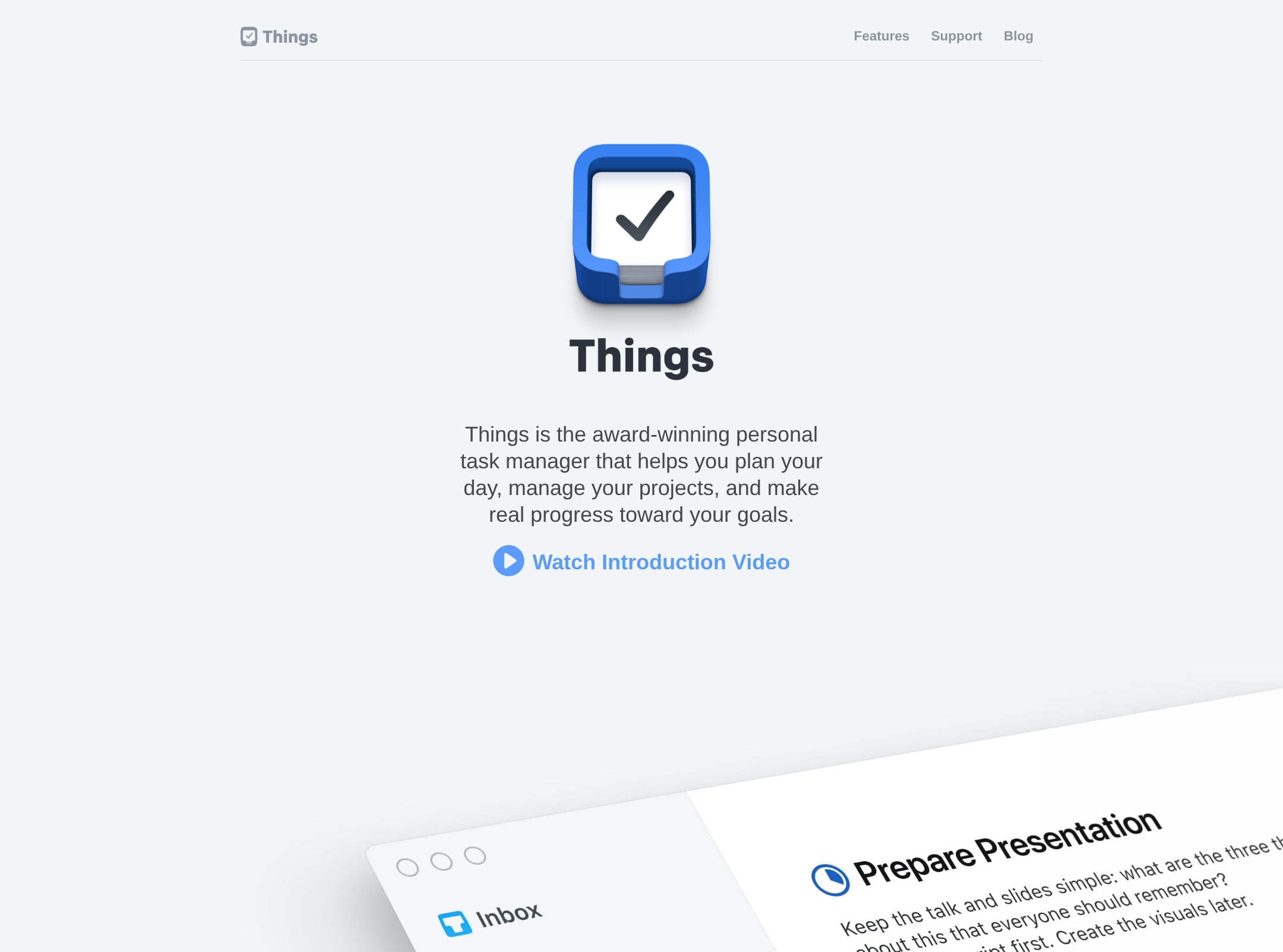
The visual system is disciplined and premium. Strong interface imagery, restrained color, generous whitespace, and repeated card patterns create a cohesive product narrative. The main limitation is that the page’s refinement depends on very small copy and a long sequence of similarly centered sections.
What works
- Consistent pale surfaces and charcoal typography create a calm, recognizable atmosphere.
- Large product imagery communicates the cross-device experience more effectively than feature text alone.
- Platform cards, testimonial tiles, and press quotes provide useful visual rhythm.
- Shadows and rounded cards are used sparingly rather than as a generic decoration.
Opportunities
- Increase the scale and contrast of supporting copy for faster scanning.
- Introduce more variation in section composition or add a compact contents cue to reduce scroll fatigue.
- Make the primary product promise more visually dominant than the surrounding social-proof content.
Uniqueness
The page is distinctive through its unusually quiet, platform-native presentation and its emphasis on editorial validation. Its broader structure—hero, features, pricing, testimonials, and newsletter—is familiar for software marketing sites.
What works
- The restrained Apple-platform visual language is consistent across product imagery and layout.
- The combination of user comments and press coverage gives the page a layered proof model.
- The device compositions feel more tailored to the product than generic dashboard mockups.
Opportunities
- Use a more ownable narrative device or branded visual motif beyond the product icon and screenshots.
- Replace some generic testimonial-grid density with a more memorable product story or interaction.
- Clarify the product’s differentiating philosophy earlier, before the page transitions into proof sections.
User experience
The information sequence is logical and the platform choices are easy to locate, but the experience is weakened by small text, a very long page, and accessibility findings that affect navigation, nonvisual use, and form completion.
What works
- The page moves from product understanding to capabilities, availability, proof, and retention in a sensible order.
- Platform cards distinguish Mac, iPhone and Watch, iPad, and Vision Pro offerings.
- The feature imagery makes the product understandable without requiring extensive reading.
- The newsletter form is visually simple and located after the trust-building content.
Opportunities
- Add a persistent or repeated primary action so users do not need to reach the platform section to proceed.
- Improve focus states and accessible names for all download, navigation, and carousel controls.
- Offer a shorter summary of key benefits before the long testimonials and press section.
- Test the dense grids and large screenshots on narrow screens and with zoomed text.
Conversion optimization
For an app landing page, the page supports conversion well through platform-specific purchase paths, pricing, product demonstrations, testimonials, press mentions, and a newsletter. Conversion clarity is reduced by the lack of an immediately prominent hero action and by ambiguous image-based links identified in the automated evidence.
What works
- Platform-specific cards align the action with the visitor’s device.
- Pricing, eligibility requirements, and promotional messaging appear near purchase controls.
- Social proof and press coverage are placed before the newsletter request.
- The product is demonstrated visually rather than relying only on claims.
Opportunities
- Place a prominent hero-level download or trial action alongside the introductory product statement.
- Give every app-store badge and icon link a descriptive action label.
- Explain trial, purchase, and upgrade paths with consistent terminology across platforms.
- Make the newsletter value proposition and privacy expectations more explicit near the form.
What we'd improve
- 01high
Repair the accessibility foundation
Add a visible or visually hidden h1, descriptive alt text for meaningful imagery, empty alt attributes for decorative assets, explicit labels for both newsletter controls, and accessible names for every image-based or icon-only link.
- 02high
Resolve contrast failures
Review the 29 reported contrast failures across hero copy, secondary links, social metadata, and pale-background sections. Increase text contrast and verify the result for normal and large text states.
- 03high
Strengthen the hero conversion path
Add one prominent, clearly labeled hero action such as downloading or starting a trial, while retaining the more detailed platform cards lower on the page.
- 04medium
Improve scanability on the long page
Increase supporting-text size, tighten repetitive testimonial content, and add a concise benefit summary or section navigation so visitors can understand the product without reading the entire scroll.
- 05medium
Validate responsive and zoom behavior
Test the platform grid, wide product panoramas, testimonial tiles, and newsletter form at mobile widths and 200% zoom, ensuring no horizontal overflow or loss of action clarity.
- 06low
Make the product story more ownable
Develop a stronger branded narrative element—such as a concise workflow story or distinctive product principle—to differentiate the page beyond polished screenshots and familiar social-proof patterns.