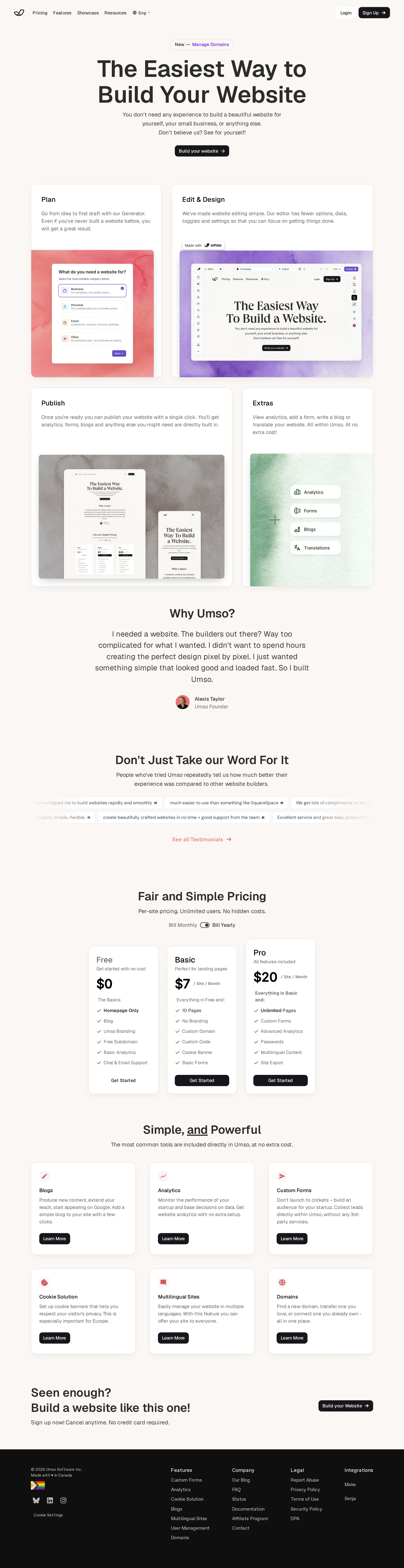
Umso website analysis
A detailed critique of the homepage's craft, originality, usability, and ability to move visitors toward its intended goal.
Our observations
A strong, publishable SaaS homepage with clear structure, polished visual execution, and credible conversion fundamentals. It is more refined than distinctive, and accessibility cleanup is needed before treating it as an exemplary reference.
Best practices
The page follows sound marketing-page conventions: one clear H1, visible navigation, a prominent hero CTA, workflow explanation, social proof, pricing, feature detail, and a final CTA. Automated observations identify several semantic and accessibility defects.
What works
- The H1 is present above the fold and communicates the product category and primary benefit clearly.
- The page exposes pricing, plan differences, and feature groupings rather than hiding key commercial information.
- The long-form sequence has a sensible narrative: product workflow, rationale, testimonials, pricing, capabilities, and signup.
- The screenshot shows a consistent visual system across cards, buttons, typography, and section spacing.
Opportunities
- Four links are reported without accessible names, including a navigation link and three footer or supporting links.
- One control is missing a label, and one text sample fails contrast testing; these issues can materially affect assistive-technology and low-vision users.
- Duplicate IDs and skipped heading levels reduce document robustness and should be corrected in the source markup.
- The automated report indicates no main landmark, which should be added to improve page navigation for screen-reader users.
Design
The visual design is cohesive, calm, and carefully composed. It achieves strong hierarchy through typography, spacing, cards, and product imagery rather than visual overload.
What works
- The warm off-white background gives the page a distinctive softness compared with the more common pure-white SaaS template.
- The workflow section uses varied card proportions and colorful framed interface previews to make the product process easy to scan.
- The pricing cards are compact, aligned, and visually subordinate to the content hierarchy without losing prominence.
- The dark footer creates a clear end-state and provides useful contrast after the light main content.
Opportunities
- The page relies on a familiar combination of hero, testimonials, pricing, and feature cards, so its visual identity is polished but not radically original.
- Some text in the testimonial and supporting areas appears very small or faint in the screenshot, reducing legibility at a glance.
- The design could use one stronger brand signature—such as a more distinctive illustration system, interaction motif, or typographic contrast—to improve memorability.
Uniqueness
The warm palette, product-preview collage, and restrained editorial spacing give Umso a recognizable personality, but the information architecture remains conventional for a no-code SaaS product.
What works
- The soft coral, lavender, gray, and green image treatments add personality to otherwise restrained product cards.
- The workflow-first presentation makes the product feel approachable and process-oriented rather than feature-dense.
- The concise, direct tone and visible pricing support a relatively transparent brand impression.
Opportunities
- The core page pattern is common across website-builder and productivity-product marketing sites.
- Customer proof appears visually compressed and lightly styled, limiting its ability to create a highly distinctive trust moment.
- A sharper articulation of who Umso is best for, or a more product-specific interactive demonstration, would differentiate the page from broader no-code competitors.
User experience
The page is easy to scan and supports both exploratory browsing and high-intent pricing evaluation. Its length is substantial but logically segmented, with clear section headings and repeated CTAs.
What works
- The hero communicates the proposition quickly and provides an obvious primary action.
- The four workflow cards make the product journey understandable before the visitor reaches pricing.
- Pricing is presented in a dedicated section with multiple plans and concise feature lists, supporting comparison.
- The closing CTA repeats the primary action after the visitor has seen the product and pricing context.
Opportunities
- The page is long, and the supplied view does not show a sticky navigation, in-page index, or other mechanism for quickly returning to pricing or signup.
- The automated heading report shows H4 sections appearing after the H1 without an intervening heading structure, which can make semantic navigation confusing.
- Small body copy and low-contrast labels may be harder to scan on smaller displays.
- Responsive behavior, keyboard interaction, focus states, and reduced-motion behavior cannot be verified from the screenshot and metadata alone.
Conversion optimization
Conversion fundamentals are strong for a website-builder acquisition page: the primary CTA is visible early and late, product value is demonstrated visually, testimonials appear before pricing, and plan costs are exposed.
What works
- The hero CTA is positioned directly beneath the main value proposition.
- Product screenshots show concrete outcomes rather than relying only on abstract claims.
- Testimonials and a pricing section address trust and purchase friction in the same scrolling journey.
- The final CTA is paired with a low-friction reassurance that no credit card is required, according to the visible page copy.
Opportunities
- The hero could make the intended first step more explicit by clarifying what happens after clicking the primary CTA and how quickly a site can be published.
- The testimonial area appears visually faint and compressed; stronger attribution, company context, or a more prominent quote treatment could improve trust.
- Pricing should make billing cadence, plan limitations, and the most suitable plan even more immediately comparable if those details are not already available in the interaction.
- The page could provide a secondary demo or preview path for visitors not ready to create an account, while keeping signup as the dominant action.
What we'd improve
- 01high
Repair accessible names and contrast
Add descriptive accessible names to the four unnamed links, label the reported unlabeled button/control, and adjust the failing text color or background combination. Verify the fixes with keyboard and screen-reader checks.
- 02high
Fix document semantics
Add a single main landmark, restore a logical heading hierarchy instead of jumping to H4, and remove duplicate IDs, including the reported duplicated page and cookie-settings IDs.
- 03medium
Strengthen the trust section
Increase testimonial text size and contrast, add clearer customer/company context where available, and give the testimonial block a stronger visual hierarchy before the pricing section.
- 04medium
Clarify the primary conversion path
Use CTA microcopy or nearby supporting text to explain the signup flow, expected time to first site, and whether the visitor can explore the builder before committing.
- 05low
Add a stronger product-specific signature
Introduce a distinctive interactive product preview, branded illustration behavior, or a clearer audience-specific use case to make the page more memorable than a conventional SaaS marketing layout.