

monday.com website analysis
A detailed critique of the homepage's craft, originality, usability, and ability to move visitors toward its intended goal.
Our observations
Exceptional visual and storytelling craft, but material accessibility and structural defects make this a review rather than publish decision.
Best practices
The page has a clear heading hierarchy and strong content grouping, but automated checks identify significant implementation-level accessibility problems.
What works
- One H1 and no detected heading skips provide a coherent high-level outline.
- Navigation, product demonstrations, customer proof, and enterprise trust are separated into recognizable sections.
- Primary actions are visually prominent and repeated throughout the page.
Opportunities
- Resolve 56 detected contrast failures, especially in light supporting copy and accordion content.
- Add an appropriate main landmark to improve document navigation for assistive technology.
- Provide an accessible name for the unnamed footer link.
- Remove or scope the 21 duplicate IDs contributing to 118 duplicate-id findings, particularly where SVG and interactive behavior may depend on unique references.
Design
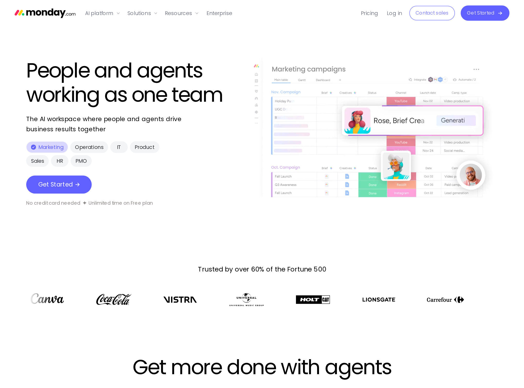
A confident, highly art-directed SaaS homepage that balances product evidence with expressive AI imagery.
What works
- The visual system consistently connects vivid agent illustrations with concrete product interfaces.
- Large section titles create strong rhythm across a very long page.
- Rounded cards, pill controls, diagrams, and restrained neutral surfaces form a cohesive component language.
- The page communicates breadth without relying solely on generic dashboard screenshots.
Opportunities
- Reduce visual density in the middle sections so the strongest product moments receive more attention.
- Increase the legibility and scale of secondary copy in high-density modules.
- Use more consistent visual emphasis between decorative character art and actionable product evidence.
Uniqueness
The combination of work-management UI, illustrated AI agents, and playful enterprise art direction is distinctive within SaaS marketing.
What works
- Character-led storytelling gives the AI proposition a recognizable emotional layer.
- The page presents AI through use-case-specific scenes rather than a single abstract promise.
- Workflow diagrams and floating interface fragments create a strong proprietary-feeling visual vocabulary.
Opportunities
- Make the central differentiator more explicit earlier; the breadth of sections can make the core product distinction feel diffuse.
- Trim or consolidate familiar trust and capability patterns where they do not add new evidence.
User experience
The information architecture is understandable, but the extremely long, interaction-heavy journey creates accessibility, scanning, and orientation risks.
What works
- The progression from overview to use cases, control, extensibility, workflows, customers, and enterprise trust is logical.
- Tabs, accordions, and carousels help organize large amounts of product information.
- The screenshot shows clear sectional landmarks and recurring calls to action.
Opportunities
- Offer a stronger in-page summary or jump navigation for visitors who do not want to traverse the full narrative.
- Ensure every carousel, tab, accordion, and marquee has an accessible name, keyboard behavior, focus treatment, and a non-animated fallback.
- Test the page at zoom and on narrow viewports; the supplied evidence does not establish that the dense compositions reflow cleanly.
- Reduce or pause nonessential motion and verify an effective prefers-reduced-motion experience.
Conversion optimization
The page supports product-led conversion well through repeated calls to action, product demonstrations, customer evidence, and enterprise reassurance, though the volume of content can dilute decision-making.
What works
- A prominent Get Started action appears in the navigation and hero.
- Use-case tabs and agent cards help visitors map the platform to practical work.
- Customer stories, enterprise security content, recognition, and usage metrics address trust barriers later in the journey.
- The visual product evidence gives the conversion path more substance than a purely claim-led landing page.
Opportunities
- Keep the primary conversion path persistently clear while users move through the long interactive sections.
- Pair the broad platform message with a shorter role-specific route for visitors seeking marketing, operations, IT, product, or sales solutions.
- Make pricing, trial expectations, onboarding effort, or next-step commitment more discoverable if those details are central to conversion.
- Avoid making critical proof dependent on autoplay, marquee movement, or carousel discovery.
What we'd improve
- 01high
Repair the accessibility foundation
Address all reported contrast failures, add the missing main landmark, name the footer link, and eliminate duplicate IDs. Re-run automated checks, then manually test keyboard navigation, screen-reader landmarks, focus visibility, and interactive state announcements.
- 02high
Create a reduced-motion and static-content path
Respect prefers-reduced-motion for the orb, scroll-driven context scene, marquees, transitions, and carousel behavior. Ensure the same product meaning and calls to action remain available without animation.
- 03medium
Reduce narrative friction
Add a compact contents or role-based entry point near the hero and consolidate overlapping AI capability sections so visitors can reach relevant proof without traversing the entire page.
- 04medium
Strengthen secondary text legibility
Increase contrast and, where necessary, size or weight for supporting copy, captions, carousel descriptions, and accordion text, particularly on pale backgrounds.
- 05low
Clarify the conversion commitment
Make the outcome of the primary Get Started path explicit near the hero and repeat that expectation alongside later enterprise and use-case calls to action.