

Meter website analysis
A detailed critique of the homepage's craft, originality, usability, and ability to move visitors toward its intended goal.
Our observations
An exceptional visual presentation for an enterprise infrastructure company, with clear product storytelling and strong differentiation. Accessibility and interaction labeling issues should be addressed before treating the implementation as exemplary.
Best practices
The page has a clear semantic outline with one H1, logical heading progression, a main landmark, navigation, and a footer. Automated checks nevertheless identify several implementation-level accessibility problems.
What works
- The content has one identifiable H1 and no reported heading skips.
- The homepage is organized into recognizable sections covering hardware, operations, software, scale, and trust.
- Navigation and footer landmarks are present.
- The supplied technology metadata indicates a modern Next.js implementation.
Opportunities
- Resolve the 16 reported text-contrast failures, especially navigation, secondary labels, and technical interface text.
- Add accessible names to both logo links and meaningful labels to the two testimonial carousel buttons.
- Remove the duplicate #meter IDs to avoid ambiguous programmatic references.
- Verify animation timing and interaction behavior with reduced-motion preferences; the supplied observations report animated elements but no reduced-motion support.
Design
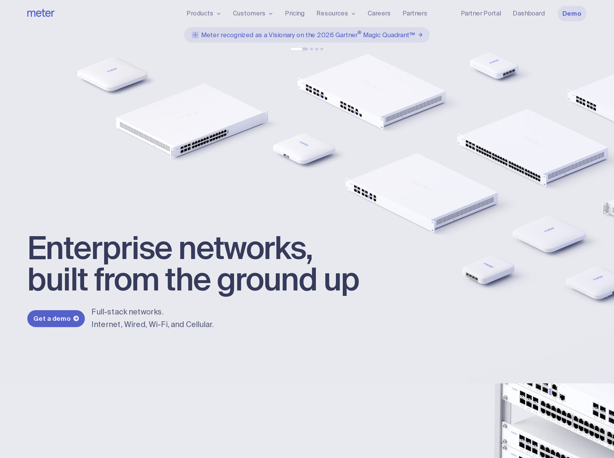
A highly cohesive and distinctive visual system that makes complex networking infrastructure feel tangible. The combination of rendered hardware, diagrams, interface panels, and atmospheric geographic imagery is more considered than a conventional enterprise software page.
What works
- The light technical canvas and dark scale section create effective visual pacing across a very long page.
- Isometric hardware renders and infrastructure diagrams reinforce the product category rather than serving as generic decoration.
- Product UI screenshots are integrated into the narrative and show configurability, security, visibility, and operational controls.
- The restrained blue-violet accent color gives calls to action and interface states a consistent visual anchor.
Opportunities
- Some sections are visually dense and may compete with the explanatory copy; stronger spacing or more explicit content grouping could improve scanning.
- The atmospheric globe sequence is visually impressive but may be less directly informative than the hardware and software demonstrations.
- Ensure rendered interface text remains legible at smaller viewport sizes, since the screenshot shows several dense product mockups.
Uniqueness
The homepage has a clear point of view: it sells networking through physical infrastructure, operational detail, and systems visualization instead of relying on generic dashboard imagery. The art direction is memorable within the enterprise technology category.
What works
- The blend of physical hardware, network topology, floor-plan-like diagrams, and software controls creates a unified product world.
- Technical visualizations appear tailored to networking rather than being interchangeable abstract graphics.
- The transition from individual equipment to global-scale network imagery gives the page a strong sense of progression.
Opportunities
- The overall visual language is polished but still draws on familiar premium enterprise-tech conventions such as dark maps, glowing data points, and floating UI panels.
- A more explicit visual signature in the typography, iconography, or data visualization treatment could make the brand even more immediately recognizable.
User experience
The apparent information architecture is strong and the page communicates product breadth through a deliberate scroll narrative. However, its length, animation, dense visuals, and reported accessibility defects create usability risks that are not visible from the screenshot alone.
What works
- The sequence moves from what the product is to how it is installed, managed, scaled, and trusted.
- The visible heading hierarchy makes major topics distinguishable despite the page length.
- Software screenshots provide concrete evidence of the platform rather than describing it only with abstract claims.
- Testimonial content and a closing CTA give the journey a clear concluding phase.
Opportunities
- Provide a persistent or repeated route to the main conversion action so users do not need to traverse the full narrative before acting.
- Add visible section navigation or progress cues for a homepage of this length.
- Make carousel controls self-describing to assist screen-reader and keyboard users.
- Audit low-contrast secondary text and small technical labels, particularly in navigation and product visualizations.
Conversion optimization
The page appears well suited to an enterprise consideration journey: it establishes category authority, demonstrates both hardware and software, and ends with trust and a CTA. Conversion effectiveness is likely constrained by the length of the scroll and by the limited evidence of audience-specific paths in the supplied material.
What works
- The hero establishes the category and presents a prominent primary action.
- The product story addresses multiple enterprise concerns, including installation, control, security, visibility, resilience, and scale.
- Customer credibility appears after the product explanation, supporting a considered B2B purchase path.
- A final CTA provides a clear endpoint for interested visitors.
Opportunities
- Repeat the primary CTA after the hardware and software sections, where visitor intent is likely highest.
- Offer differentiated paths for technical evaluators, operations leaders, and prospective customers instead of relying on one general route.
- Pair product visuals with concise outcome-oriented proof points, such as deployment scope, reliability evidence, or measurable operational impact, where substantiated.
- Make the CTA destination and expected next step explicit before the user commits to a long enterprise sales process.
What we'd improve
- 01high
Fix contrast and control-label accessibility defects
Address all 16 reported text-contrast failures, add accessible names to the two logo links, label both testimonial carousel buttons, and test the revised states against keyboard and assistive-technology use.
- 02high
Reduce conversion friction across the long scroll
Repeat the primary CTA at the end of the hardware and software demonstrations, and clarify what happens after activation, such as contacting sales, requesting a consultation, or exploring documentation.
- 03medium
Add navigational orientation
Introduce a compact section index, anchor navigation, or other persistent progress cue so visitors can move directly between hardware, operations, software, scale, and customer proof.
- 04medium
Strengthen proof near product claims
Place specific, verifiable deployment or performance evidence beside the relevant hardware and software sections rather than concentrating credibility primarily near the end.
- 05low
Remove duplicate identifiers and audit responsive density
Correct the duplicate #meter IDs and review dense product mockups, small labels, and animated sequences at narrow widths to preserve comprehension and interaction clarity.