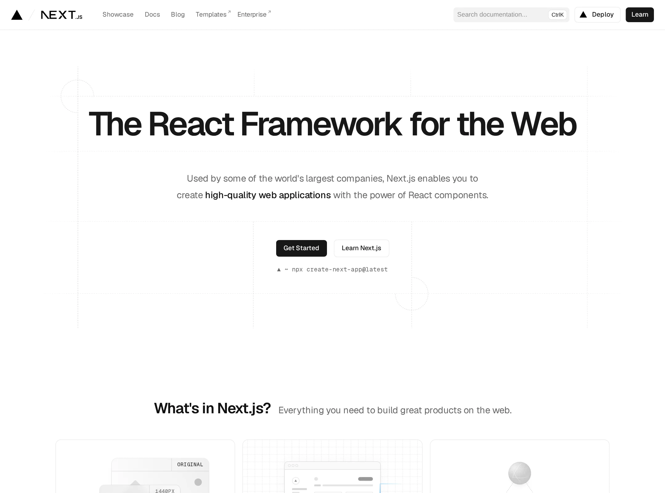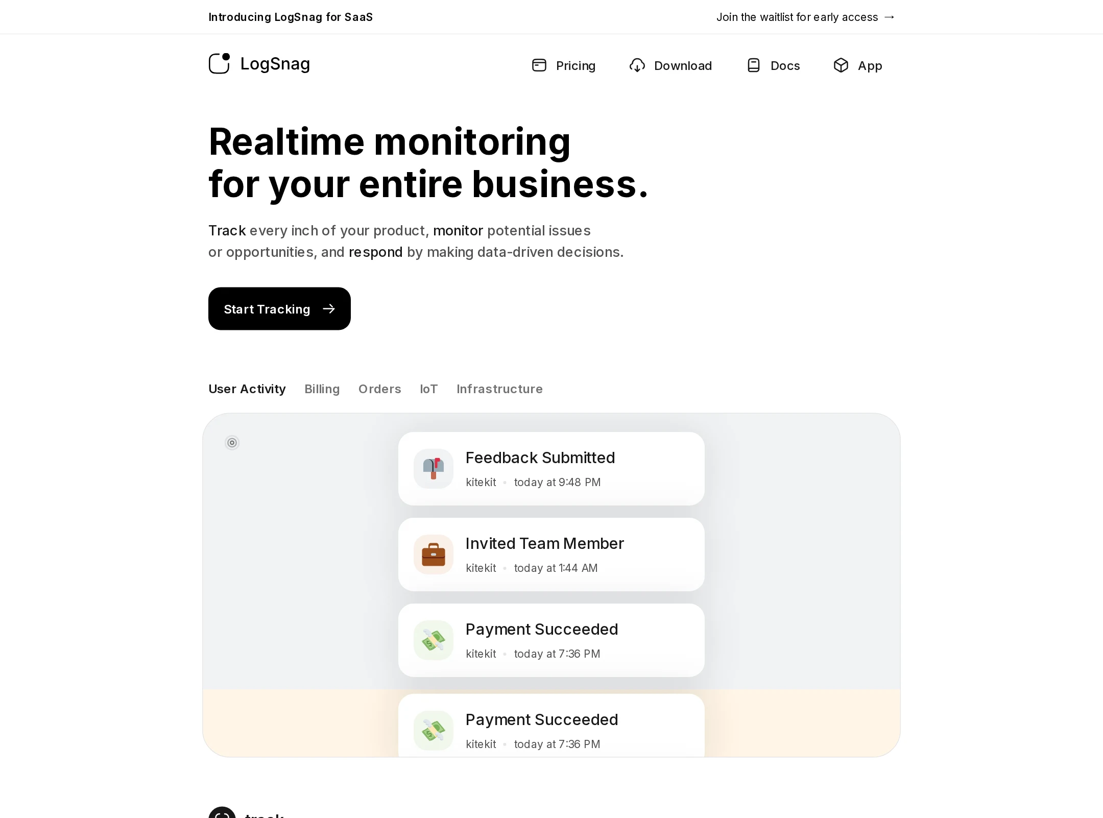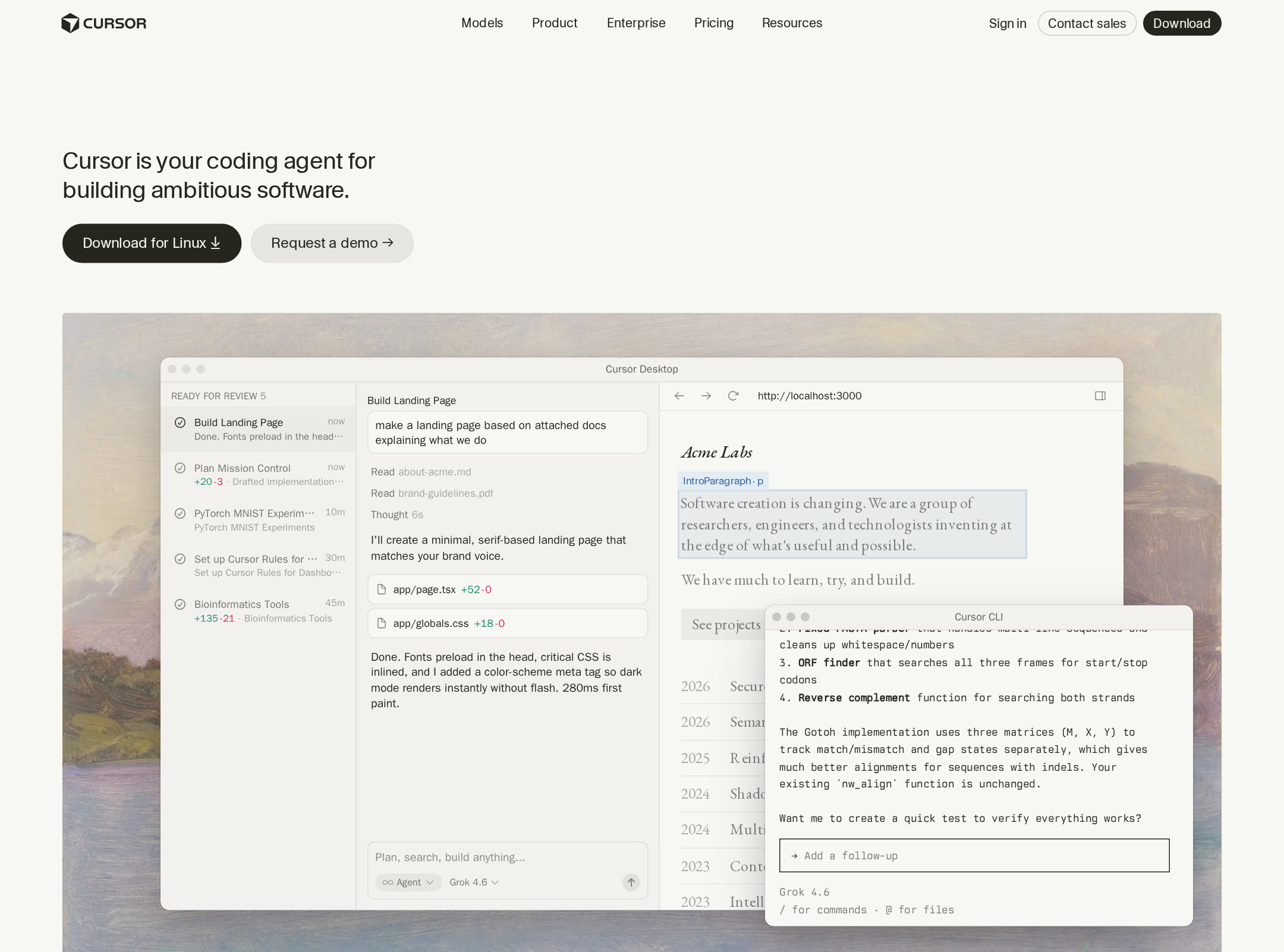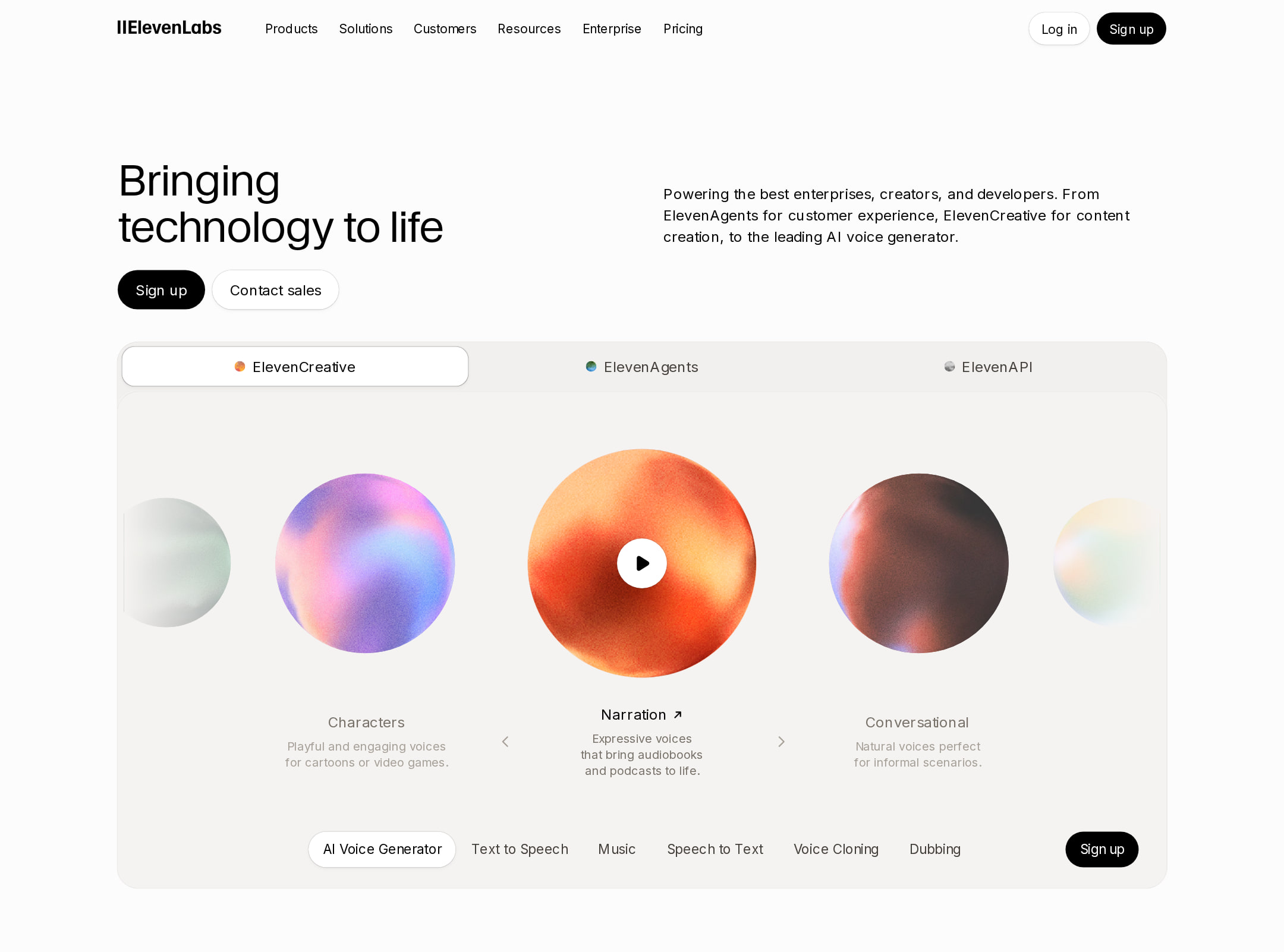


Vercel website analysis
A detailed critique of the homepage's craft, originality, usability, and ability to move visitors toward its intended goal.
Our observations
A publishable, exceptionally polished developer-platform homepage with a disciplined visual system and strong information architecture. Its main weaknesses are understated supporting text, a long browsing path, and a small set of accessibility issues identified by automated checks.
Best practices
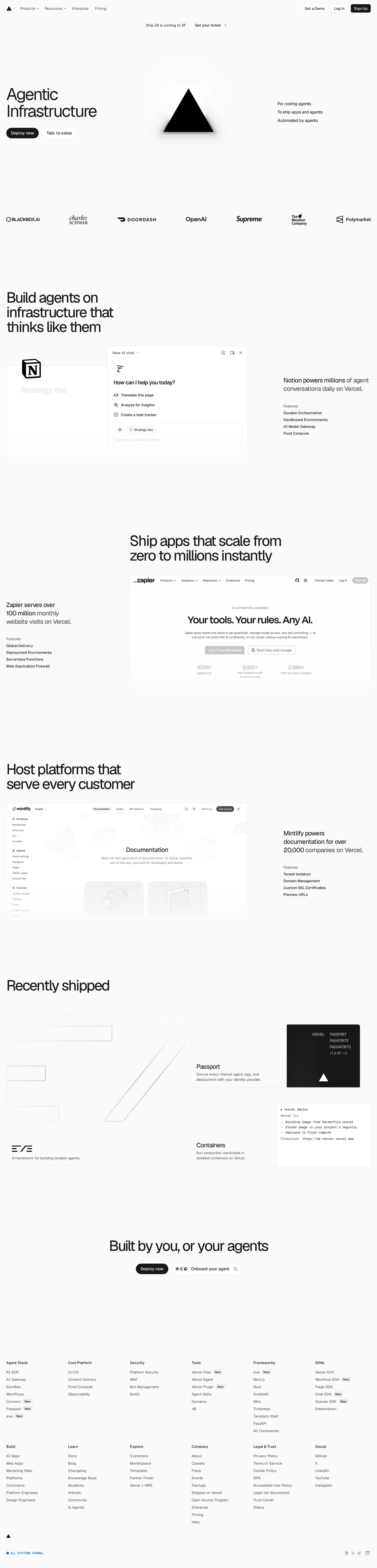
The page has a clear semantic outline, one detected H1, no heading skips, one main landmark, an established navigation pattern, and prominent primary actions. Automated accessibility scoring is strong at 88, but not clean.
What works
- Clear hero-to-content hierarchy with a single detected H1 and consistent section headings.
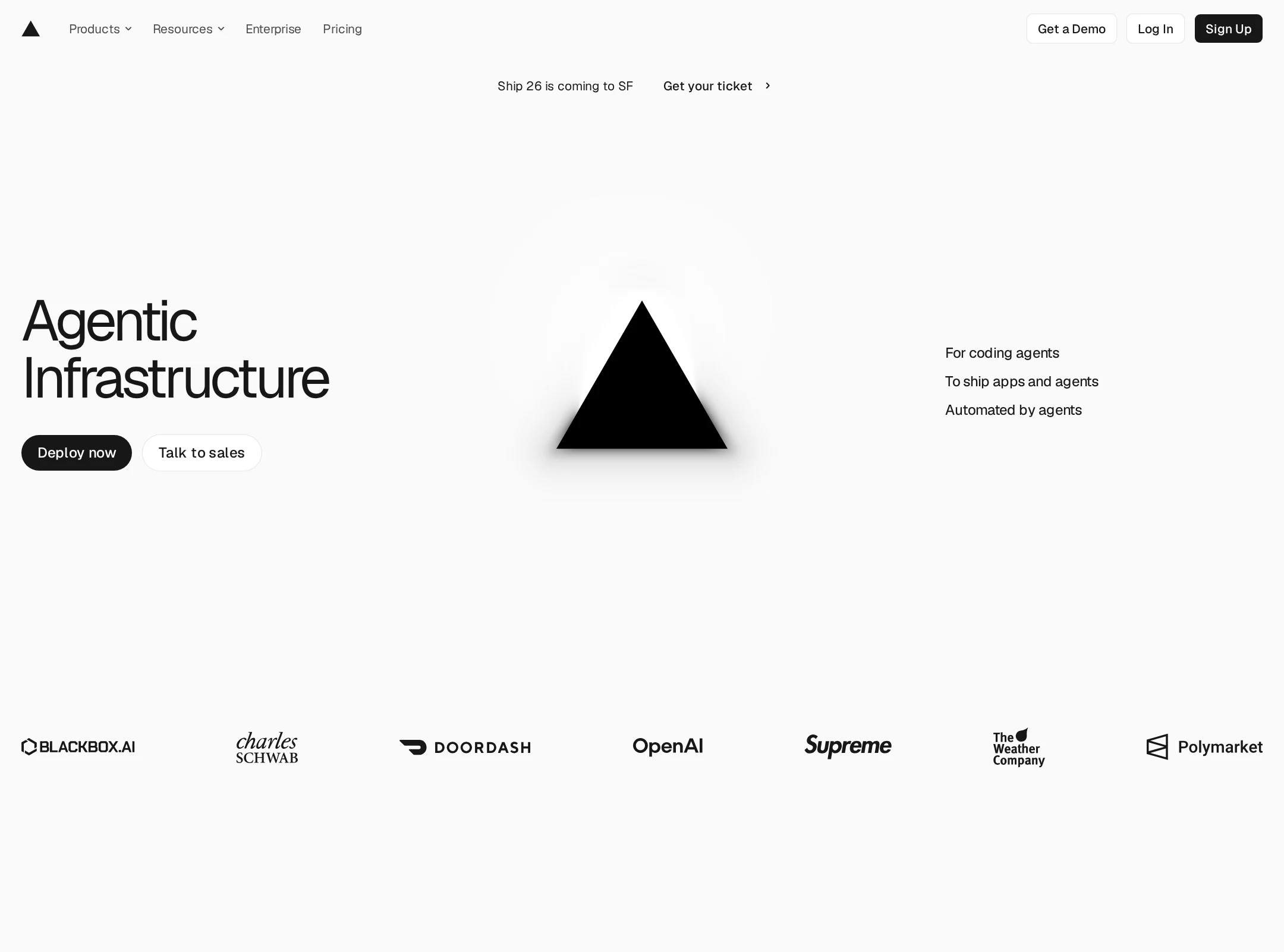
- Primary actions are visually distinct and repeated for different audience intents.
- Sticky navigation and categorized footer support orientation across a long page.
- Product screenshots and customer references provide useful credibility signals.
Opportunities
- Fix the one link missing an accessible name.
- Resolve the two reported text-contrast failures, especially in status or auxiliary UI.
- Verify focus visibility, keyboard behavior, alt text coverage, and reduced-motion behavior across the full interaction surface; these are not established by the supplied evidence.
Design
The design is exceptionally coherent, refined, and technically appropriate. It achieves a premium developer-platform tone through spacing, typographic scale, and carefully controlled product imagery rather than decorative excess.
What works
- Strong monochrome art direction makes the content feel precise and infrastructure-focused.
- Large headings and generous spacing create a confident editorial rhythm.
- Alternating media layouts prevent the long page from becoming monotonous.
- Subtle cards, thin borders, and restrained accents produce a unified component language.
Opportunities
- Increase visual differentiation between some similarly sparse sections so the page has more memorable landmarks.
- Give selected supporting statements slightly more typographic or tonal emphasis for faster scanning.
- Ensure the light product previews retain sufficient legibility at smaller viewport sizes.
Uniqueness
The homepage is distinctive within developer tooling through its extreme restraint, editorial pacing, and blend of infrastructure messaging with product-news presentation. Its visual language is influential and recognizable, though the monochrome SaaS aesthetic is increasingly common.
What works
- The combination of oversized type, near-white space, and product-documentation imagery feels deliberate and brand-specific.
- The page frames infrastructure capabilities around audience needs instead of presenting a generic feature matrix.
- The launch-focused content area adds personality beyond a standard enterprise platform page.
Opportunities
- Develop one or two more proprietary visual motifs beyond the geometric mark and product previews.
- Use customer stories, technical diagrams, or distinctive data visualization to create stronger category ownership.
User experience
The experience appears easy to understand for technically literate visitors and offers multiple paths into the platform. The sparse design improves focus but also places more responsibility on copy, wayfinding, and contrast.
What works
- Audience-oriented sections help visitors identify the infrastructure use case most relevant to them.
- The sequence moves from positioning to capabilities, recent work, and deeper exploration in a logical order.
- The compact header keeps global navigation available without visually dominating the page.
- Product previews make abstract infrastructure claims more tangible.
Opportunities
- Add stronger section signposting or a lightweight progress cue for the very long scroll journey.
- Improve the prominence of secondary explanatory text where screenshot evidence shows it fading into the background.
- Clarify the relationship between the primary deployment action and the sales-oriented path for enterprise evaluators.
Conversion optimization
Conversion is strong for a platform homepage: the page communicates a broad value proposition, presents credible customer evidence, and offers both self-serve and sales-oriented actions. The restrained approach may underperform for visitors who need pricing, proof points, or a faster product comparison.
What works
- A direct self-serve action and a separate sales path accommodate different buyer readiness levels.
- Customer logos and recognizable product examples support trust without disrupting the visual system.
- The three capability sections connect the platform to concrete user groups and workflows.
- The closing exploration area gives high-intent visitors many routes into the product ecosystem.
Opportunities
- Expose pricing, deployment scope, or a concise proof-point summary earlier for comparison-stage visitors.
- Repeat a clear CTA after the major capability sequence rather than relying primarily on the header and hero.
- Add more explicit enterprise reassurance—such as security, reliability, or migration evidence—near the sales path.
- Test whether the extremely sparse hero communicates the product category quickly enough to less technical visitors.
What we'd improve
- 01high
Resolve the identified accessibility defects
Give the unnamed link a descriptive accessible name and revise the two reported low-contrast text treatments. Re-test contrast and keyboard focus states across light and product-preview surfaces.
- 02high
Strengthen long-page wayfinding
Add clearer section anchors, a compact in-page navigation pattern, or strategically repeated calls to action so visitors can move between audience segments without scanning the entire page.
- 03medium
Increase proof density for evaluation-stage visitors
Introduce concise, verifiable evidence near the capability sections—such as performance context, security coverage, or customer outcomes—without compromising the restrained visual language.
- 04medium
Improve supporting-copy legibility
Raise the size, weight, or contrast of secondary descriptions that currently compete with pale backgrounds and product imagery, particularly at narrow viewport widths.
- 05low
Add a more ownable visual signature
Extend the existing geometric and product-preview language with a small set of original diagrams or data motifs that distinguish the platform from other monochrome developer-tool sites.