Neon
01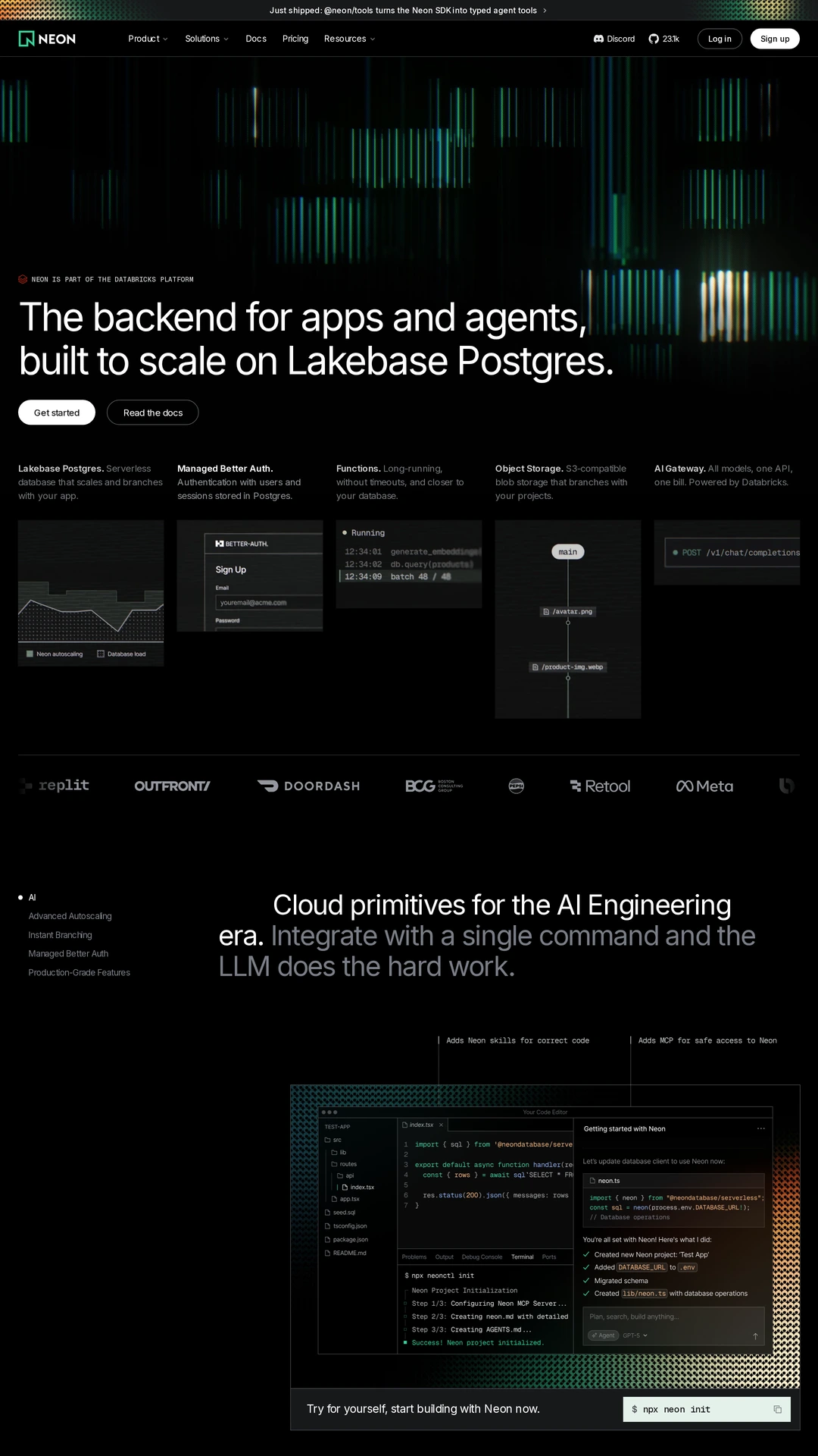
neon.comdark-mode
Developer-facing websites need to make evaluation practical. These eight examples cover infrastructure, authentication, monitoring, a framework and a product-development workflow. Compare three decisions: what the opening promises, what evidence supports it and where a developer can go next. A code sample, an installation command, a readable product interface and a documentation link each solve a different problem. The notes describe captured pages, not a benchmark of the products themselves. Follow the original website links to verify current documentation, compatibility and pricing before making a technical choice.
Open a website to explore the full capture and design details.
Neon puts a documentation link next to its get-started action, while small technical panels introduce capabilities below the proposition. This gives developers a route from the marketing claim to implementation detail. Compare the prominence of that route with the more visual, infrastructure-led opening on Vercel.
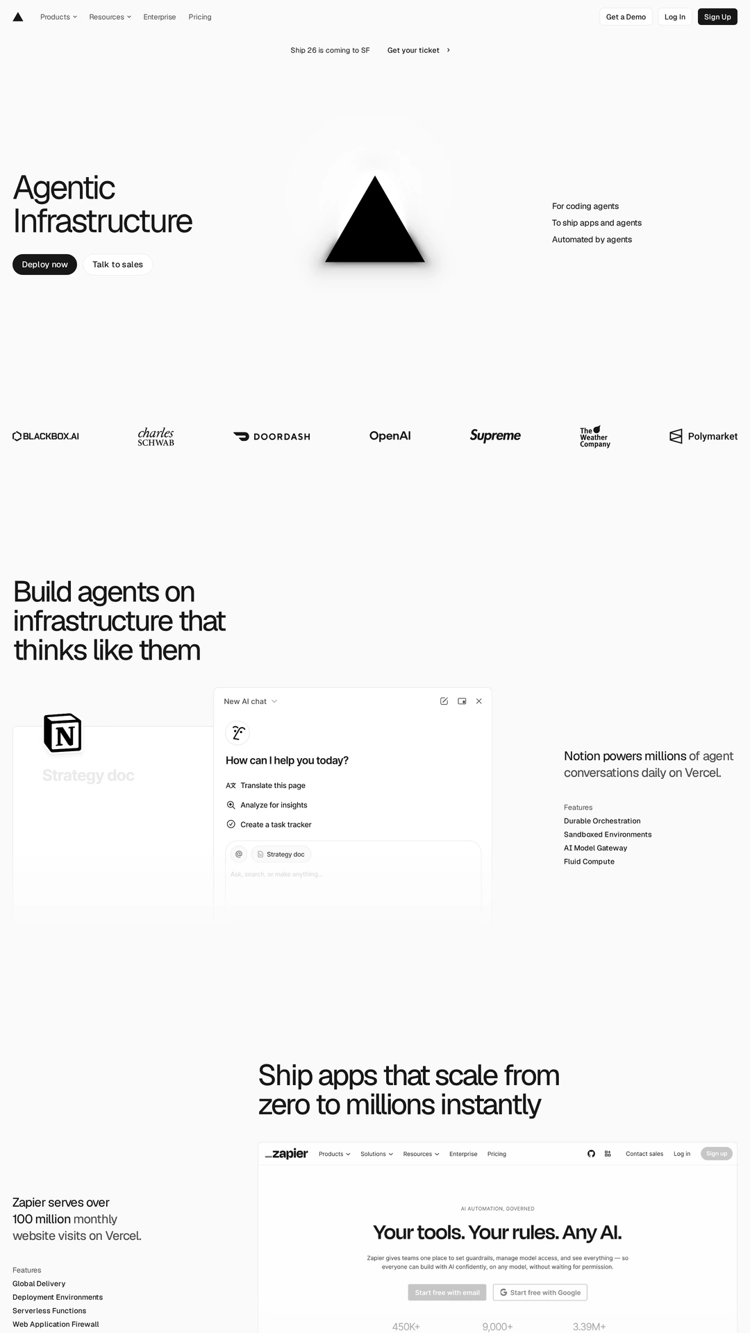
Vercel introduces infrastructure with a short proposition, a deployment action and customer logos. The opening leaves technical detail for subsequent sections. This is useful when comparing a concise entry point for familiar developers with a page that needs to teach an unfamiliar workflow first.
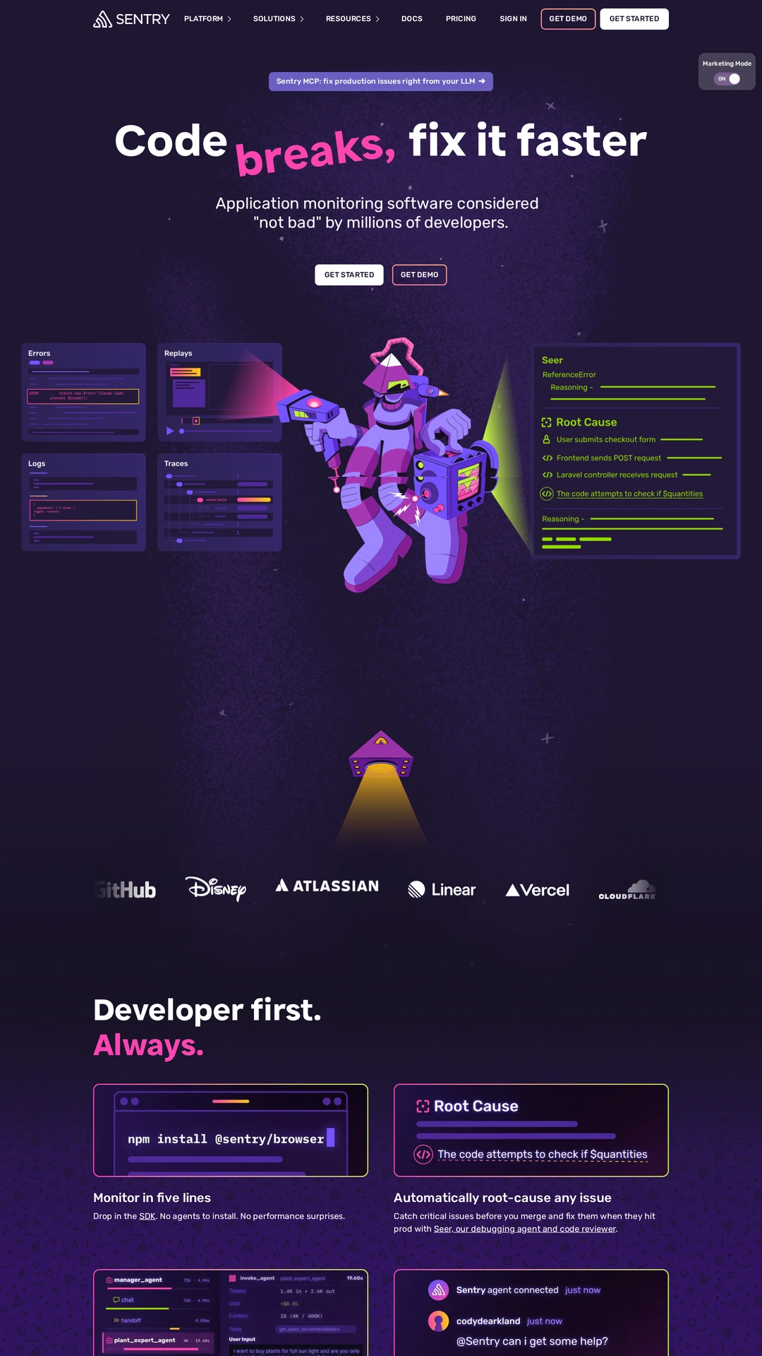
Sentry places a debugging proposition above illustrated code and error panels. Documentation and product navigation remain available in the header. The visual character is expressive, but the examples still point to a recognisable engineering task: identifying a problem and resolving it.
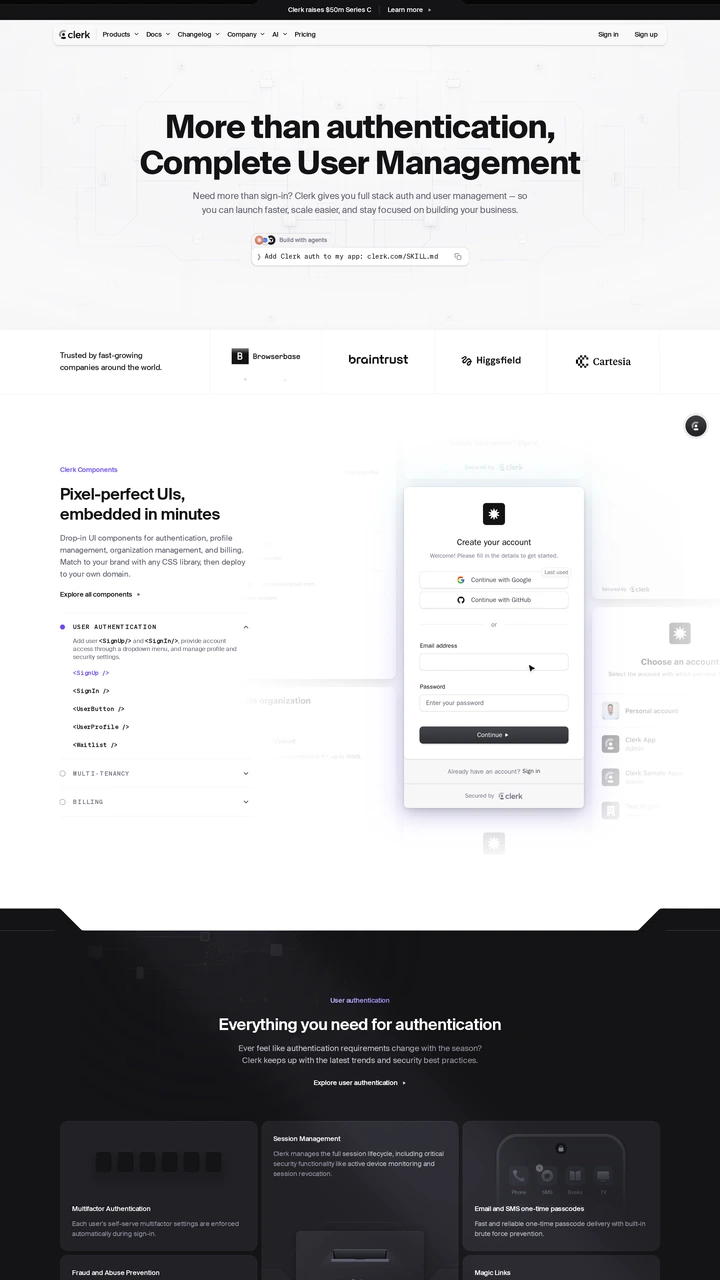
Clerk exposes an installation command near its opening, then pairs authentication UI with code. The page lets a developer inspect both the integration and the interface users will encounter. Compare how quickly that evidence becomes available with a page led entirely by benefit statements.
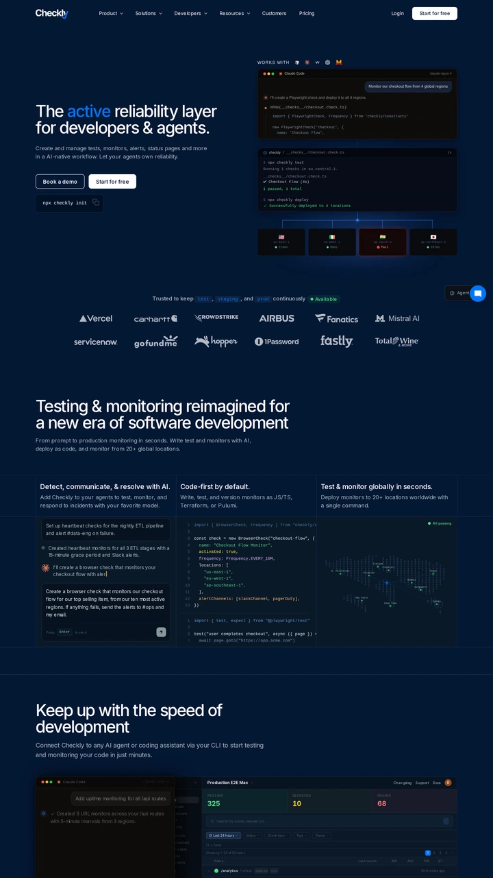
Checkly uses code and monitoring diagrams alongside its reliability proposition, with documentation in the primary navigation. This makes the implementation context visible early. Compare the balance between an immediate trial and a deeper technical evaluation before choosing a primary action for your own tool.
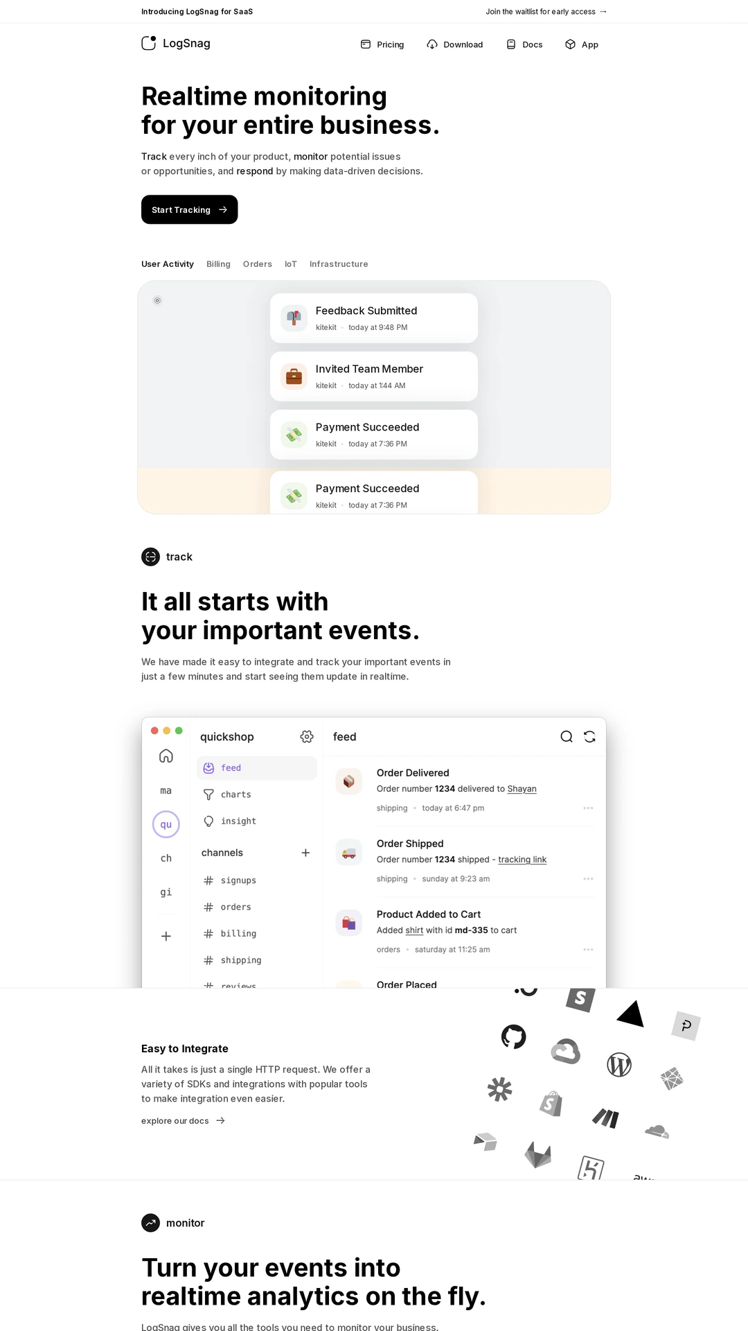
LogSnag explains monitoring through a sequence of individual events and a larger feed interface. Its navigation includes documentation and a download path. The example is useful for comparing a task-centred product demonstration with a broader list of technical capabilities.
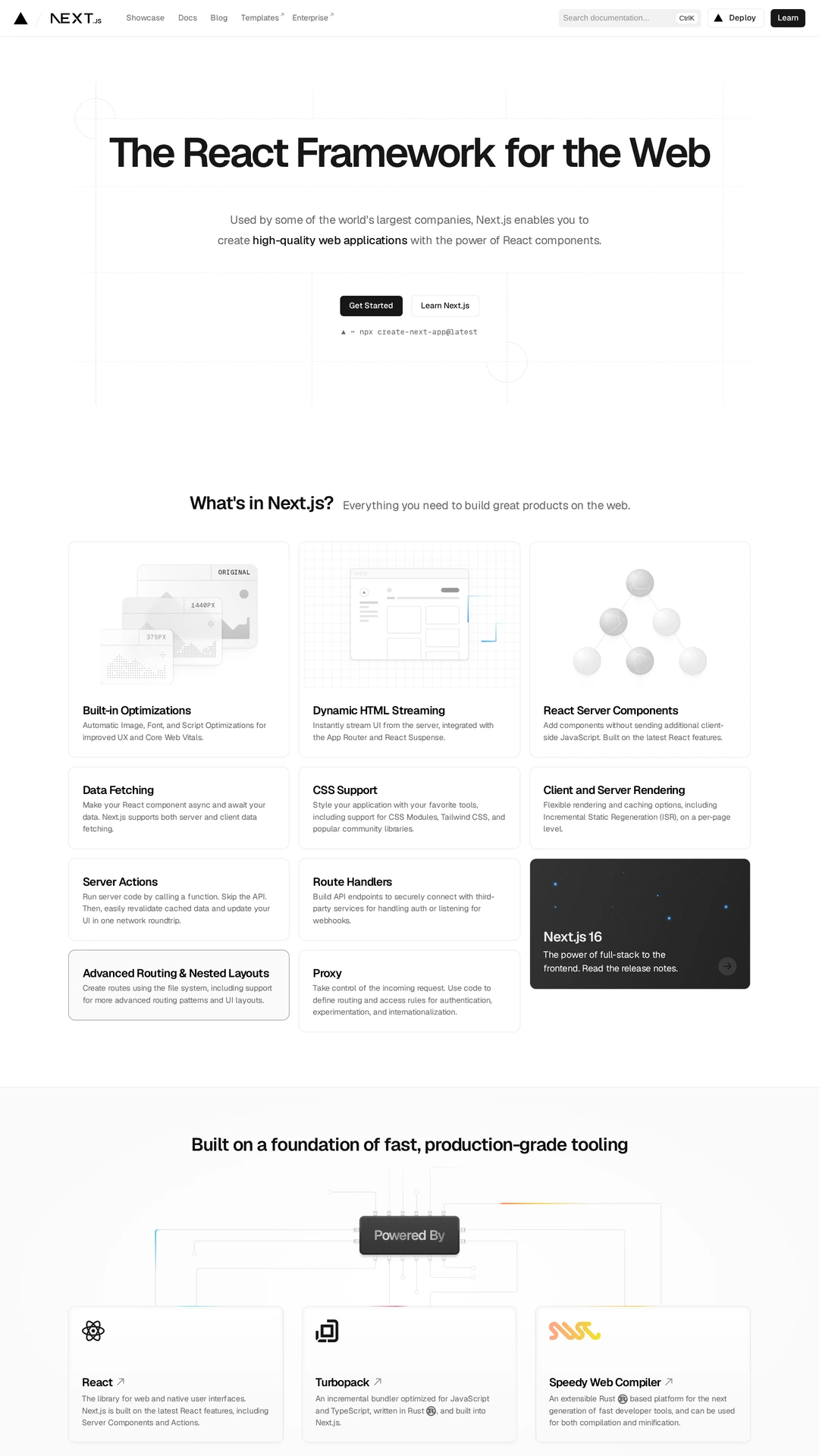
Next.js presents a framework proposition, clear entry actions and a grid of technical capabilities on a restrained white page. For a developer-facing site, compare how the opening distinguishes learning the framework from starting an implementation, and how the feature grid supports that choice.
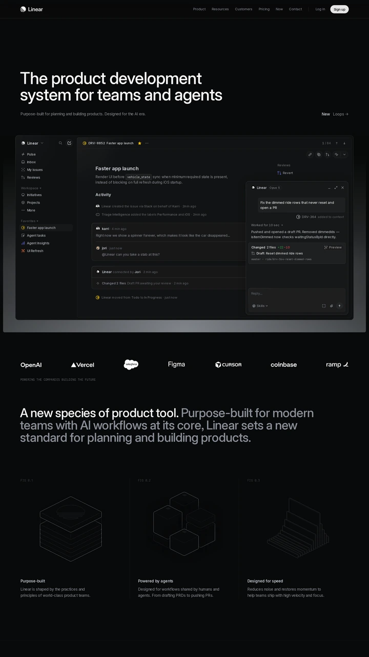
Linear shows a detailed issue-management interface directly beneath its product-development proposition. It addresses an engineering workflow rather than an SDK installation. Including it here offers a useful contrast: sometimes the strongest evidence for a developer tool is the work being organised, rather than a code sample.