Metalab
metalab.com
An agency homepage has to show the work and explain the kind of partner behind it. These eight captured examples take different approaches: a compact case-study index, an expansive portfolio, a direct product-and-brand proposition, and more experimental editorial compositions. Compare how each page introduces its expertise, gives projects context and offers a useful route to contact. The notes discuss visible design decisions and tradeoffs, rather than endorsing commercial claims or treating a distinctive composition as a template to reproduce. Visit each original website for its current interactions and content.
Open a website to explore the full capture and design details.
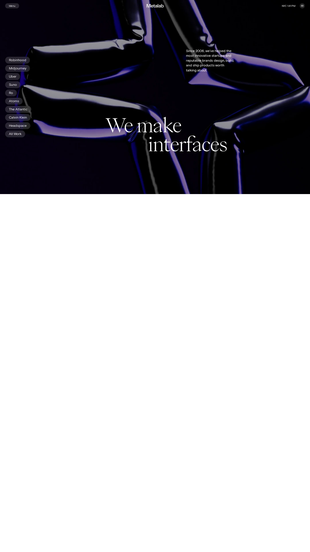
metalab.com
A dark, sculptural background supports a large serif statement, a short introduction and a compact client-work index. The small project controls make the homepage feel like a portfolio interface rather than a long marketing page. The visual hierarchy is confident, although the practical route to starting a project is quieter than the work itself.
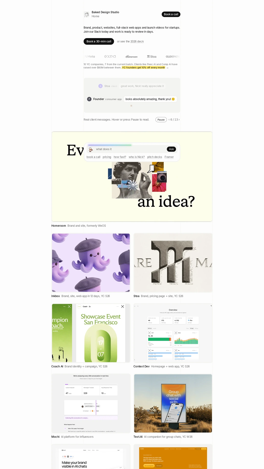
baked.design
A narrow editorial column introduces the offer and booking actions before opening into a varied project grid. Screenshots, identity work and short labels give the portfolio a consistent browsing rhythm. The long page offers breadth, but the floating question panel overlaps a project in the retained capture, illustrating the need to balance helpful controls with unobstructed work.
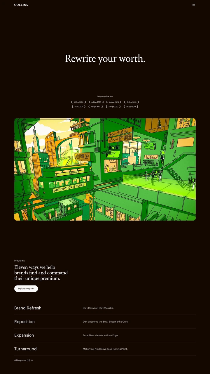
wearecollins.com
A restrained serif introduction sits on an espresso-colored background before a vivid illustrated case study. The transition from an abstract positioning statement to programs gives the page a clear sequence. The large gaps and compact navigation create an editorial pace; readers looking for a quick service comparison may need more deliberate exploration.
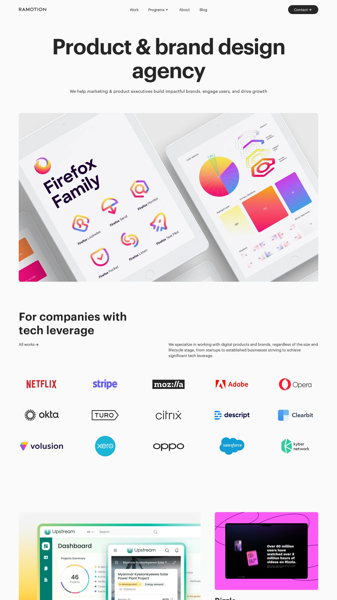
ramotion.com
A direct product-and-brand proposition leads into a large project image, client logos and a staggered work grid. A capabilities diagram and partner testimonial connect that work to a contact action farther down the page. The consistent type and spacing make a broad portfolio manageable; the long composition and dense mobile footer still demand thoughtful prioritization.
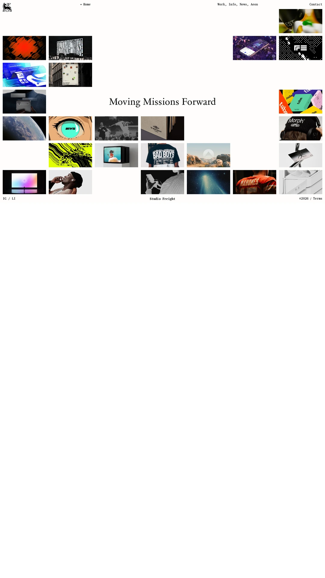
studiofreight.com
An asymmetric field of project thumbnails surrounds a central studio statement on an ivory background. The work becomes the navigation and the varied imagery supplies most of the color. This compact exhibition-like composition communicates range immediately, with the tradeoff that small labels and understated controls provide limited project context in the first view.
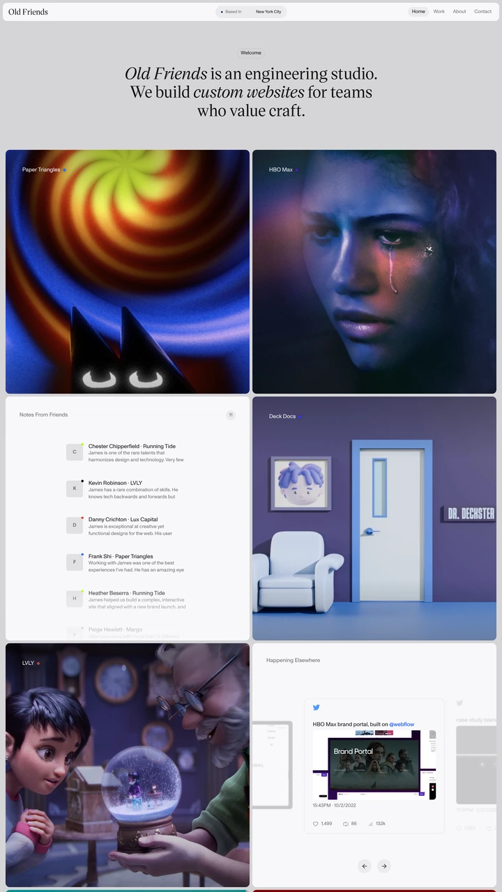
oldfriends.studio
A concise serif introduction leads directly into a two-column project grid. Bright imagery gives each project character while consistent framing keeps the page coherent. Testimonials and studio notes are integrated into the grid rather than isolated in a separate marketing section. Labels over imagery need careful contrast to remain useful navigation.
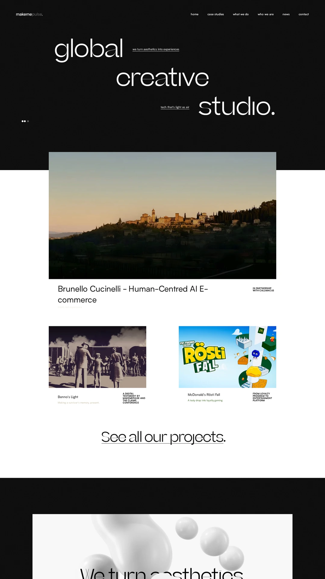
makemepulse.com
Oversized staggered typography establishes the studio identity before a large lead project and smaller supporting examples. Changes in image size and generous whitespace create a clear editorial rhythm. The page makes creative range visible quickly, while the relationship between individual projects, broader capabilities and the contact route still requires active browsing.
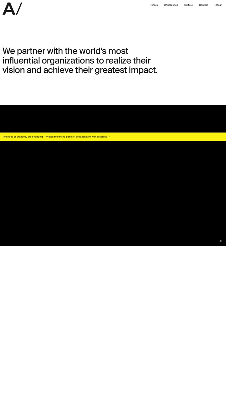
area17.com
A large plain-language introduction, compact navigation and strong light-to-dark transitions establish a restrained agency system. The opening gives positioning more room than project detail, and the wide visual fields set a deliberate pace. The captured dark media area contributes little explanatory content on its own, so clear capabilities and client-work routes matter.