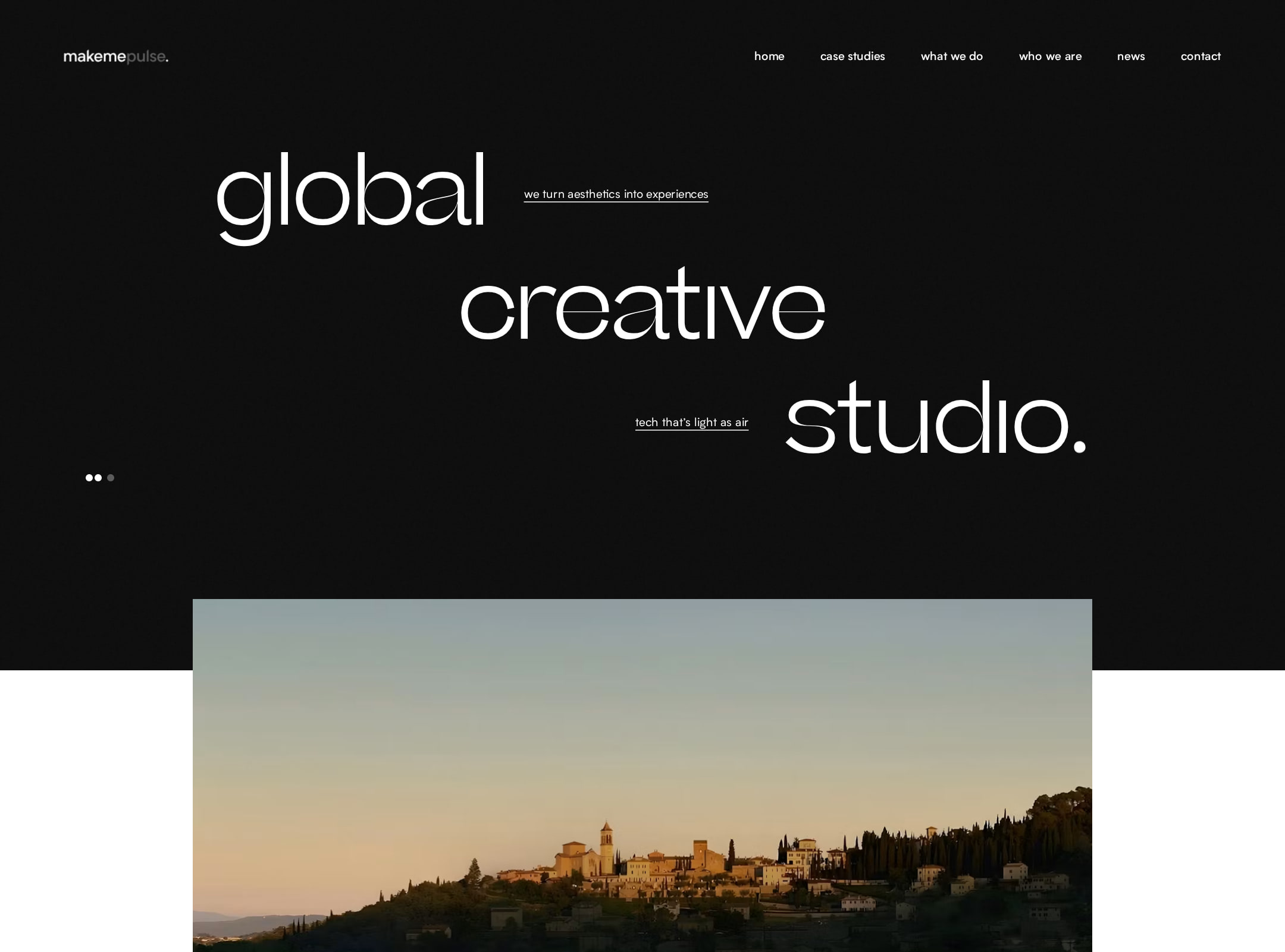


makemepulse website analysis
A detailed critique of the homepage's craft, originality, usability, and ability to move visitors toward its intended goal.
Our observations
A visually exceptional and distinctive creative-studio portfolio with a strong editorial point of view. It merits gallery consideration, subject to accessibility and semantic-structure review.
Best practices
The page has a clear main region, navigation, footer, and recognizable content groupings, but important accessibility and semantic issues remain.
What works
- Clear primary navigation and a recognizable footer/contact area.
- Project content is grouped into meaningful case-study and editorial sections.
- The page has a single main landmark and no duplicate IDs in the supplied audit.
Opportunities
- Add a semantic H1 for the primary hero statement; the audit reports zero H1 elements.
- Resolve five reported contrast failures, especially text over imagery and dark promotional sections.
- Add a programmatic label to the newsletter email field.
- Provide meaningful alternative text for the image nested in the subscribe control.
Design
A highly resolved art-directed composition that uses typography, contrast, image scale, and pacing to make a studio portfolio feel authored rather than generic.
What works
- The oversized opening statement communicates a strong visual identity immediately.
- Alternating dark and light sections create a clear visual cadence through the long page.
- Project imagery receives priority without overwhelming captions or decorative UI.
- The games feature introduces a vivid change of tone while remaining integrated with the overall system.
Opportunities
- Improve legibility in low-contrast caption and promotional treatments without weakening the visual language.
- Make section transitions slightly more explicit so the narrative is easier to scan.
- Ensure the strongest visual moments do not obscure the hierarchy of services, work, and contact paths.
Uniqueness
The page has a recognizable studio voice, combining editorial typography, image-reveal behavior, asymmetric layouts, and a dedicated games chapter in a cohesive way.
What works
- The opening typography and sparse project framing feel highly authored.
- The combination of commercial case studies, games, studio information, and news broadens the studio story beyond a standard agency reel.
- Offset imagery and restrained calls to action create a distinctive scroll composition.
Opportunities
- Clarify the studio’s unique strategic or technical proposition in text, not only through art direction.
- Use a small number of repeatable signature interaction cues consistently across project and editorial sections.
User experience
The page offers a compelling browse experience for visually oriented visitors, but its long-scroll structure and reported accessibility defects create avoidable friction.
What works
- The primary content path—from hero to selected work—is immediately apparent.
- Case-study links expose project names and short descriptors rather than relying only on imagery.
- Navigation includes direct routes to work, services, studio information, news, and contact.
Opportunities
- Add a stronger semantic heading hierarchy and verify focus visibility across the fixed navigation and animated controls.
- Improve text contrast and form labeling before release.
- Provide clear static alternatives for motion-led image reveals and interactive promotional areas.
- Validate mobile spacing, reading order, and touch-target sizing at multiple narrow widths.
Conversion optimization
For a creative-studio portfolio, the page effectively builds desire and provides several routes to continue, but the contact proposition is less prominent than the visual storytelling.
What works
- Selected work appears early, supporting credibility before the visitor reaches service and contact content.
- Calls to action include project browsing, games discovery, newsletter signup, and contact pathways.
- The studio’s editorial content adds evidence of ongoing activity and cultural relevance.
Opportunities
- Introduce a concise, persistent invitation for prospective clients alongside the visual hero or selected work.
- Make the contact outcome more explicit—for example, what kinds of projects or conversations the studio welcomes.
- Reduce ambiguity around the newsletter field with a visible label and supporting privacy or frequency context.
- Consider a compact project-category or service filter if the portfolio continues to grow.
What we'd improve
- 01high
Repair semantic and form accessibility
Add a real H1 to the hero, associate a visible or programmatic label with the email input, and supply meaningful alternative text for the image inside the subscribe control.
- 02high
Resolve contrast failures
Rework the five flagged text treatments, testing captions, dark promotional copy, and calls to action against their actual backgrounds in both static and animated states.
- 03medium
Strengthen orientation through the long scroll
Use more explicit section labels, consistent anchor behavior, or a compact progress/navigation aid so visitors can understand where they are in the portfolio narrative.
- 04medium
Make the client pathway more explicit
Add a concise statement near the first work section explaining the studio’s collaboration focus and linking directly to the preferred contact route.
- 05low
Verify responsive and reduced-motion variants
Test the composition at narrow and intermediate widths, then provide simplified image transitions and equivalent static layouts when reduced motion is requested.