Jamhot website analysis
A detailed critique of the homepage's craft, originality, usability, and ability to move visitors toward its intended goal.
Our observations
A distinctive and commercially credible agency homepage with excellent art direction and strong visual recall. It is suitable for a curated gallery, though accessibility structure and hero text contrast should be addressed before treating it as a best-practice reference.
Best practices
The page has a focused information hierarchy and clear contact visibility, but the audit identifies several structural and accessibility weaknesses.
What works
- Concise agency positioning is visible without requiring extensive navigation.
- Contact details and multiple contact channels are present in the footer.
- The page uses a small number of repeated visual patterns, which keeps the experience focused.
- No duplicate IDs or heading skips were detected in the supplied audit.
Opportunities
- Resolve the two reported text-contrast failures, particularly the logo and hero headline treatment.
- Add a valid document language attribute and a main landmark.
- Provide an accessible name for the reported nameless link.
- Reduce ambiguity around the heading structure by avoiding two simultaneous H1 elements.
Design
The visual direction is confident, cohesive, and unusually memorable for an agency homepage.
What works
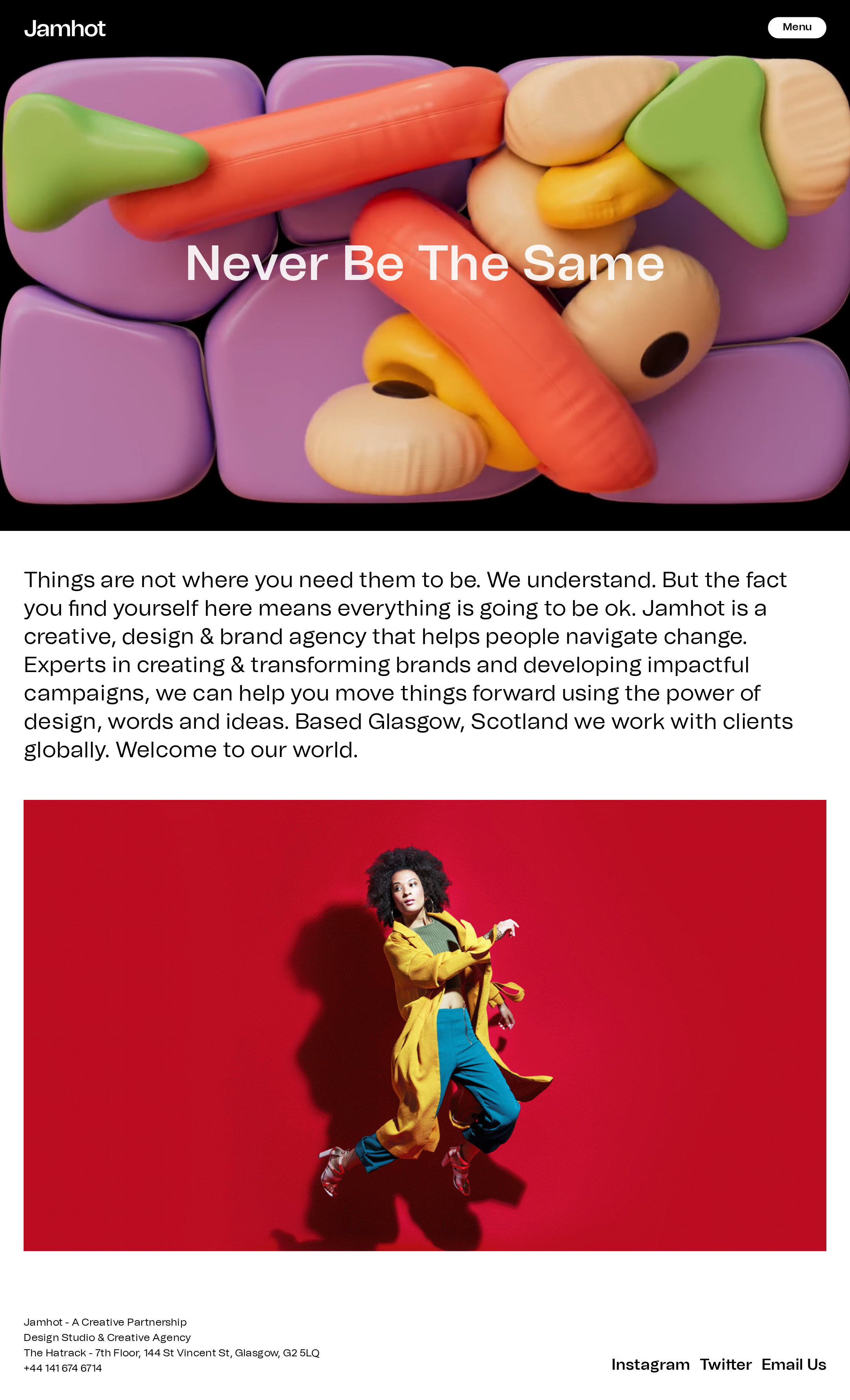
- The surreal 3D hero creates immediate differentiation and communicates creative ambition.
- The black hero and white editorial section establish a strong, legible macro rhythm.
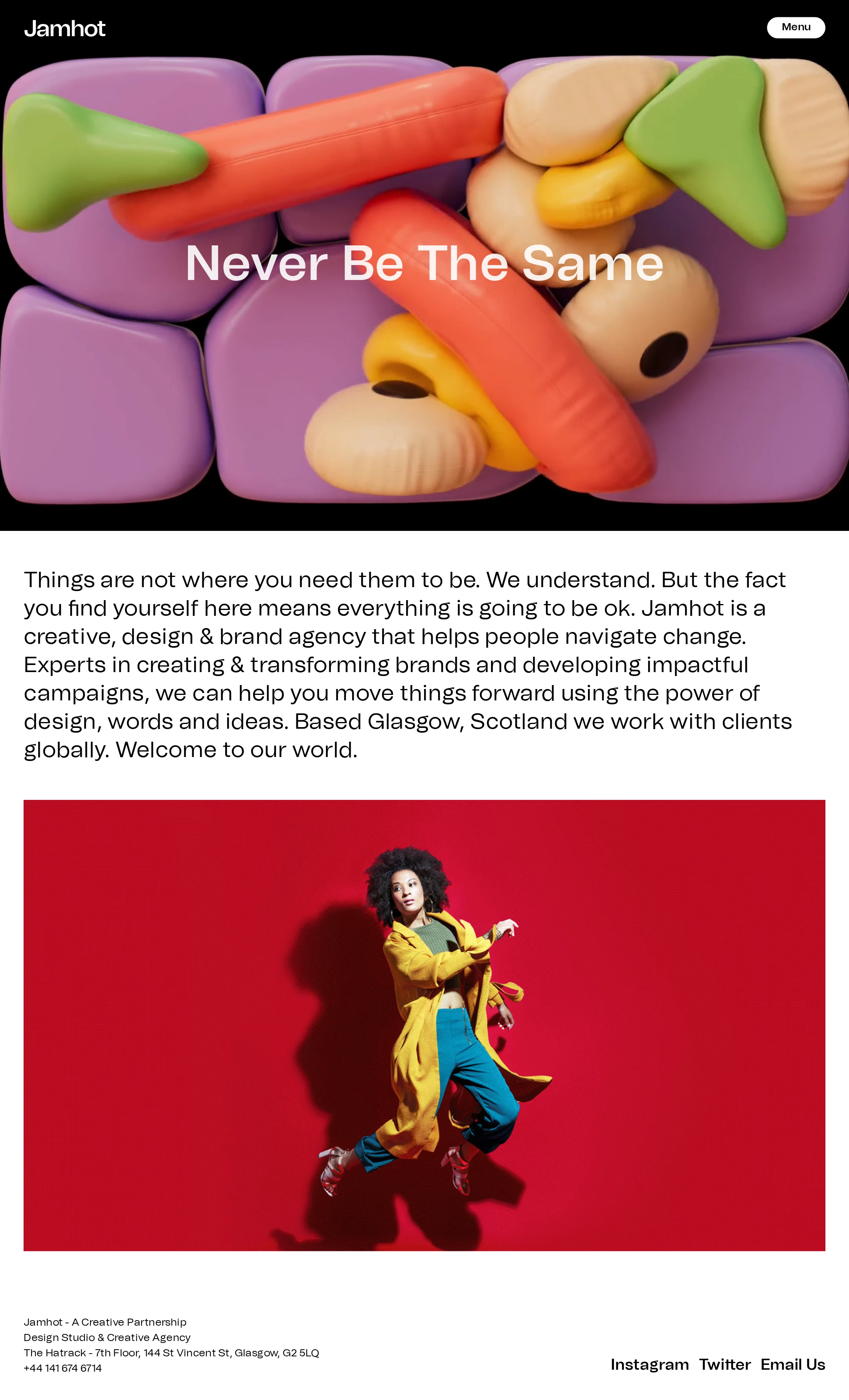
- The red photographic panel provides compelling portfolio-oriented evidence after the positioning statement.
- Large type and generous spacing give the desktop composition a strong gallery-quality presence.
Opportunities
- Improve the headline treatment over the busy hero image so visual drama does not compromise legibility.
- Introduce a slightly clearer visual relationship between the introductory copy and the following project image.
- Confirm that the color and cropping logic remains intentional across mobile and reduced-height screens.
Uniqueness
The combination of tactile 3D forms, saturated campaign imagery, and restrained editorial structure gives the page a strong point of view.
What works
- The hero art direction is immediately recognizable and avoids a generic agency template appearance.
- The shift from abstract 3D work to bold photography creates a varied but related portfolio narrative.
- The restrained navigation lets the work, rather than interface decoration, lead the experience.
Opportunities
- The visual identity is strong enough to support more distinctive project labeling or contextual storytelling.
- A more explicit signature interaction or transition could further distinguish the experience, provided it remains accessible and performance-conscious.
User experience
The page communicates who the agency is and how to contact it, but the sparse interaction model and reported accessibility issues create avoidable friction.
What works
- The primary message is immediately visible above the fold.
- The menu control is prominent and easy to locate in the supplied desktop view.
- The sequence from hero to agency description to imagery is easy to understand.
- Footer contact information is compact and discoverable.
Opportunities
- Make the next step more explicit with a visible work, services, or contact cue rather than depending mainly on the menu.
- Ensure hero text remains readable against every image state and viewport crop.
- Validate focus states, keyboard navigation, screen-reader names, and reduced-motion behavior; these are not established by the supplied evidence.
- Review the large menu typography and absolute positioning on smaller screens.
Conversion optimization
For a creative agency, the page effectively sells taste and capability through art direction, but it could guide qualified visitors more directly toward engagement.
What works
- The visual work establishes credibility quickly, which is important for a design-led service business.
- The positioning statement explains the agency’s category, location, and broad value proposition.
- Direct email, social, and address details provide multiple routes to contact.
Opportunities
- Add a prominent, context-specific call to action after the introductory statement or near the first featured project.
- Attach clearer project context or labels to major imagery so visitors can connect visual quality with services and outcomes.
- Surface a short services or capabilities summary before the footer to help prospective clients self-qualify.
- Preserve the expressive art direction while making the contact path more immediate for visitors with commercial intent.
What we'd improve
- 01high
Correct the reported accessibility failures
Increase contrast for the logo and hero headline, give the nameless link an accessible name, add the document language, and introduce a meaningful main landmark.
- 02high
Clarify heading hierarchy
Use one page-level H1 for the principal message and treat the brand mark as navigation or text branding rather than a second H1.
- 03medium
Strengthen the primary conversion path
Add a visible Work, Services, or Start a project action after the positioning statement, with a clear destination and accessible focus treatment.
- 04medium
Test responsive hero behavior
Review headline wrapping, image focal points, menu sizing, and contrast at narrow widths and short viewport heights, where the reported absolute positioning may create collisions.
- 05low
Add project context to featured imagery
Pair major images with concise project names, categories, or outcomes so the visual portfolio also communicates the agency’s capabilities.