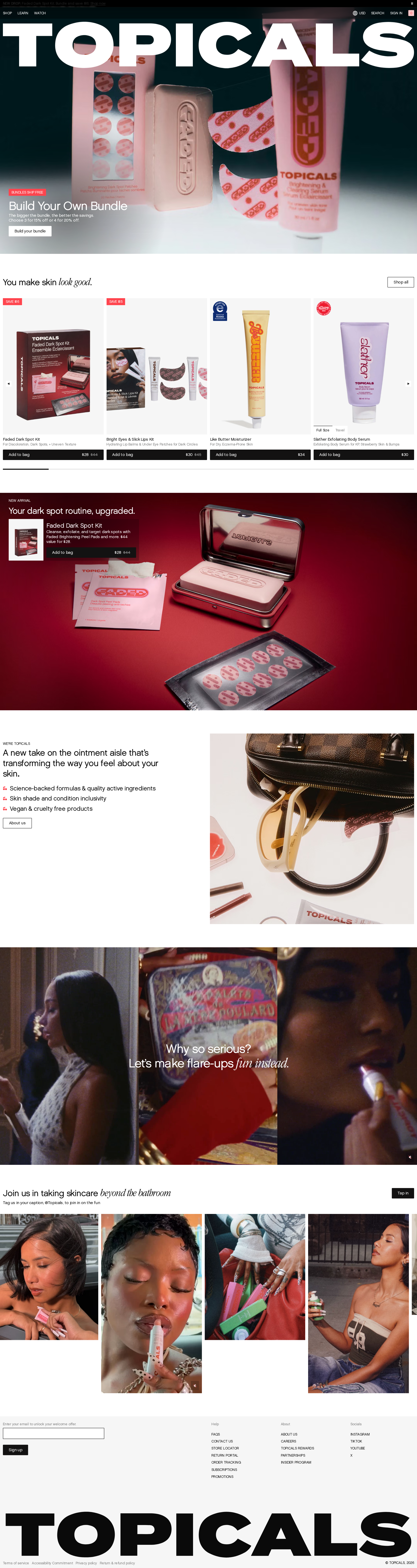
Topicals website analysis
A detailed critique of the homepage's craft, originality, usability, and ability to move visitors toward its intended goal.
Our observations
A distinctive and commercially focused skincare homepage with strong art direction and brand confidence, but it should undergo accessibility and information-structure review before being accepted as a gallery reference.
Best practices
The page has a coherent main region, visible navigation, product CTAs, forms, and a footer, but automated accessibility evidence identifies several serious issues.
What works
- A clear ecommerce purpose is established immediately through a bundle-building hero and product merchandising.
- The page includes a main landmark, semantic navigation, forms, and a semantic footer in the supplied structure.
- Product cards expose direct purchase controls rather than relying only on editorial discovery.
- There are no duplicate IDs reported in the supplied accessibility results.
Opportunities
- Resolve all 29 reported text-contrast failures, especially small navigation, utility, and image-overlay text.
- Provide accessible names for the eight links currently reported as unnamed, including product-card overlay links.
- Correct the two heading-level skips and establish one logical H1 for the homepage.
- Audit the playback control, cart control, search control, and country selector for accessible state, focus, and keyboard behavior.
Design
The homepage has a polished, high-energy visual identity with strong photography, distinctive typography, and effective shifts between commerce and editorial storytelling.
What works
- The oversized opening wordmark creates immediate recognition and a strong first impression.
- Product photography is varied and consistently art-directed, supporting both premium perception and product differentiation.
- The restrained black, white, coral, and pink palette gives the page a cohesive visual language.
- The sequence of hero, product rail, feature product, brand story, and lifestyle gallery creates a clear narrative arc.
Opportunities
- Reduce competition between oversized display typography and the hero product message so the primary shopping proposition remains instantly legible.
- Increase readability of small product metadata and overlay copy without losing the editorial tone.
- Use more consistent visual separation between editorial content and transactional product modules.
- Verify that large photographic sections retain sufficient focal-point and text-space control across viewport sizes.
Uniqueness
Topicals differentiates itself effectively through a culture-forward skincare presentation rather than a conventional clinical beauty layout.
What works
- The combination of expressive lifestyle imagery, playful copy, and product-focused composition feels more characterful than a standard skincare catalog.
- The use of a large typographic brand treatment and selective serif italics gives the page a recognizable editorial signature.
- The page connects product concerns with identity and self-expression, supporting the supplied brand positioning.
Opportunities
- Make the relationship between the advocacy narrative and individual product benefits more explicit for visitors who arrive with a specific skin concern.
- Ensure distinctive art direction is balanced with practical educational content so the experience does not depend primarily on mood and image recognition.
User experience
The page offers multiple routes to shop and learn, but dense overlays, small type, and structural accessibility defects may make discovery and navigation less reliable for some visitors.
What works
- The hero offers a prominent bundle action, while the product rail provides browse-and-buy alternatives.
- The page alternates visual intensity with lighter sections, helping create a sense of progression during a long scroll.
- Product names and visible purchase controls are repeated consistently across the product rail.
- The footer provides additional navigation and a newsletter capture point.
Opportunities
- Make product-card links and image overlays explicitly named and ensure the full card has a predictable keyboard interaction model.
- Improve heading hierarchy so screen-reader users can understand the same section sequence visible to sighted users.
- Increase the size, contrast, and spacing of small utility text and product metadata.
- Test horizontal product browsing with keyboard, touch, zoom, and reduced-motion settings; these behaviors are not established by the supplied desktop capture.
Conversion optimization
For a visually led skincare retailer, the homepage presents strong purchase intent and several useful CTAs, though clarity and accessibility improvements could reduce friction.
What works
- The first screen combines brand recognition, a specific bundle proposition, and a direct action.
- The product rail exposes multiple products with visible pricing and add-to-cart controls.
- A dedicated dark-spot feature supports a focused concern-based shopping path.
- The brand-story sections add differentiation and may strengthen trust beyond product specifications.
Opportunities
- Clarify the value and contents of the bundle directly beside the primary CTA, particularly for first-time visitors.
- Pair concern-led features with concise proof points such as routine steps, suitability guidance, or ingredient context without making unsupported claims.
- Keep purchase controls visually dominant over decorative labels and badges on smaller screens.
- Use accessible, descriptive labels for all product and promotional links so assistive-technology users have equivalent conversion paths.
What we'd improve
- 01high
Repair contrast and link semantics
Address the 29 reported contrast failures and give all eight unnamed links descriptive accessible names. Prioritize navigation, hero overlays, product metadata, and full-card product links.
- 02high
Normalize the heading structure
Reduce the homepage to one meaningful H1 and revise the reported H4 elements and other skips into a sequential section and product hierarchy.
- 03high
Re-test the commerce journey with keyboard and zoom
Verify search, country selection, cart, hero playback, product-card controls, forms, focus visibility, and horizontal product browsing at keyboard-only, 200% zoom, touch, and reduced-motion settings.
- 04medium
Strengthen the hero proposition
Keep the oversized brand treatment, but give the bundle name, value, contents, and primary action a clearer text surface so the commercial offer remains legible over the photography.
- 05medium
Connect editorial storytelling to shopping intent
Add concise, scannable paths from concern-led and brand-story sections to relevant products, routines, or educational content while preserving the editorial pacing.
- 06low
Clarify responsive behavior for image-led sections
Define focal-point, text-overlay, product-rail, and navigation behavior for narrow screens, and confirm that the large photographic compositions remain usable rather than merely decorative.